
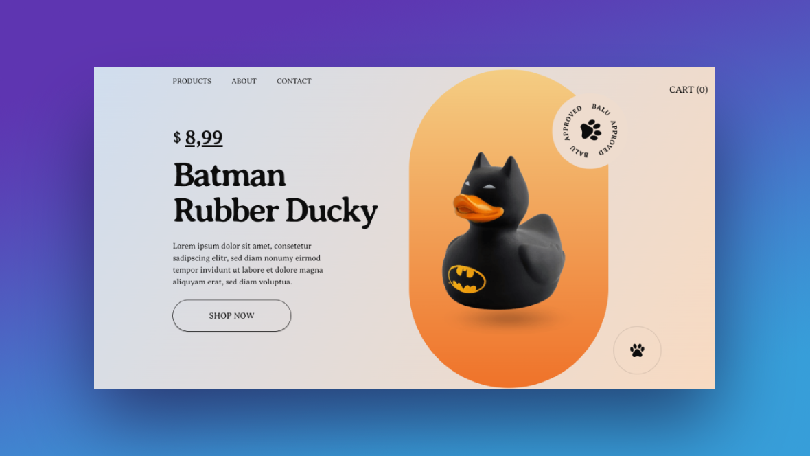
Go to any ecommerce website and you’ll find that the above-the-fold section on the product pages is laid out more or less the same way. There will be a main product image that fills one half of the section. The other half will contain details about the product — like the name, a short description, price, and “Add to Cart” button.
You don’t want to go messing with the content as that’s what consumers expect to see at the top of product pages. For many shoppers, these important details can help them make a quick judgment call about a product.
What you can experiment with, however, is the design. In this tutorial, we’re going to show you how to use the Pet Store Product Slider template to make your ecommerce product pages more engaging with creative iconography, animation, and micro interactions.
Table of Contents:
- Step 1: Delete global layers you don’t need
- Step 2: Customize the cursor icon
- Step 3: Delete four of the slides
- Step 4: Update the section background
- Step 5: Customize the product description
- Step 6: Add your product image
- Step 7: Change the product background
- Step 8: Edit the rotating stamp
How to design more engaging ecommerce product pages
This vertical slider template would be really useful for smaller shops that want to highlight best-selling or new ecommerce products on the home page.
That said, just because this template was designed as a multi-product slider, that doesn’t mean you have to use it that way. In this tutorial, we’ll demonstrate how to extract one of the slides and turn it into the above-the-fold section for your product pages.
If you need an introduction to Slider Revolution before we begin, check these out:
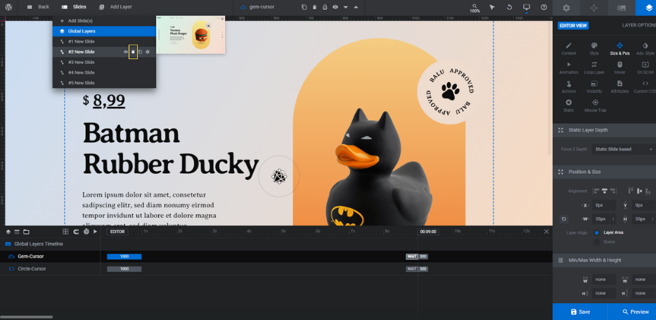
Step 1: Delete global layers you don’t need
Go to “Slides” and open up “Global Layers”.
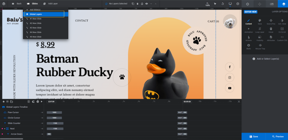
There are about a dozen layers in here, but we need to keep only two of them:
- Paw-Cursor
- Circle-Cursor
The rest make up the header, navigation, and branded elements. While they’re useful if you’re building your entire site with Slider Revolution, we don’t need them for our product pages.
To simultaneously delete multiple layers from Slider Revolution, hold down the Ctrl or command key. Then select each of the layers from the timeline editor:
- Slide Counter
- Next
- Prev
- Youtube
- Fb
- Logo
- Avatar
- Cart
- Made with Sr
- Row-15
Hit the Backspace or delete key. This will remove all of the layers at once.
Learn more:
Step 2: Customize the cursor icon
You can leave the Circle-Cursor layer alone. This is the light circle outline that appears around the custom cursor icon.
The Paw-Cursor icon is a paw print. It matches the icon inside of the rotating stamp. You can do the same thing and use a branded icon in both the stamp and as the cursor. Or you can use different icons to serve different purposes.
Either way, here’s what you’ll need to do to add a custom cursor icon to this section:
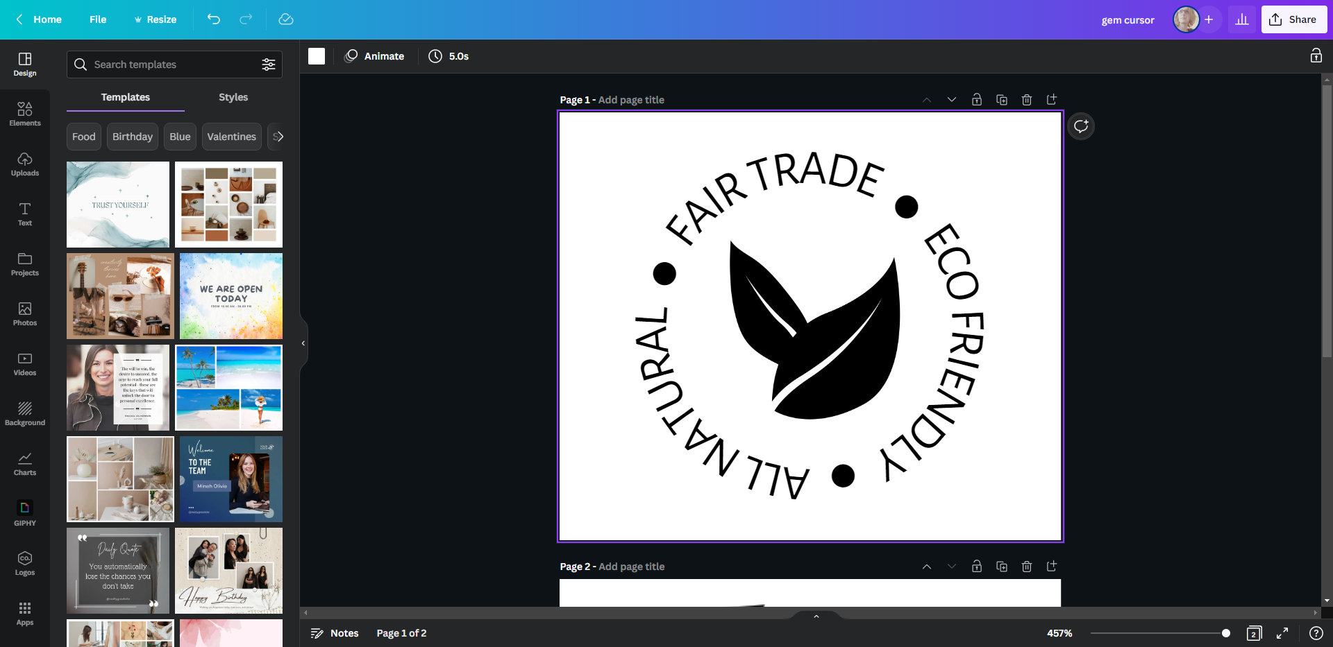
First, create your cursor icon. You can use any design tool to do this. We used Canva to create this example:
The icon should be all one solid color. Black or white works best, though you can always change this in Slider Revolution if needed.
It should be in the shape of a square — around 35px by 35px in size.
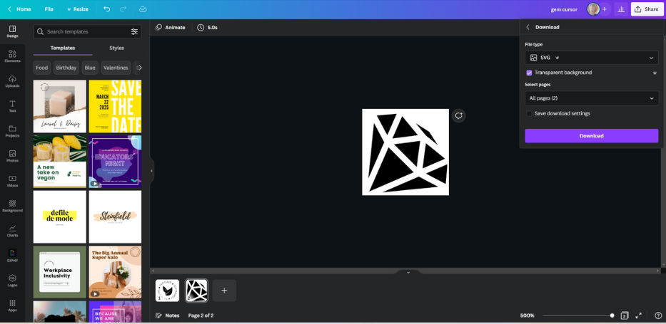
When you export it, make sure it’s an SVG file with a transparent background.
Go to “Add Layer” in the toolbar and select “Icon/SVG”. Select the “My SVG Library” from the left sidebar and click the blue Import SVG Files button at the bottom.
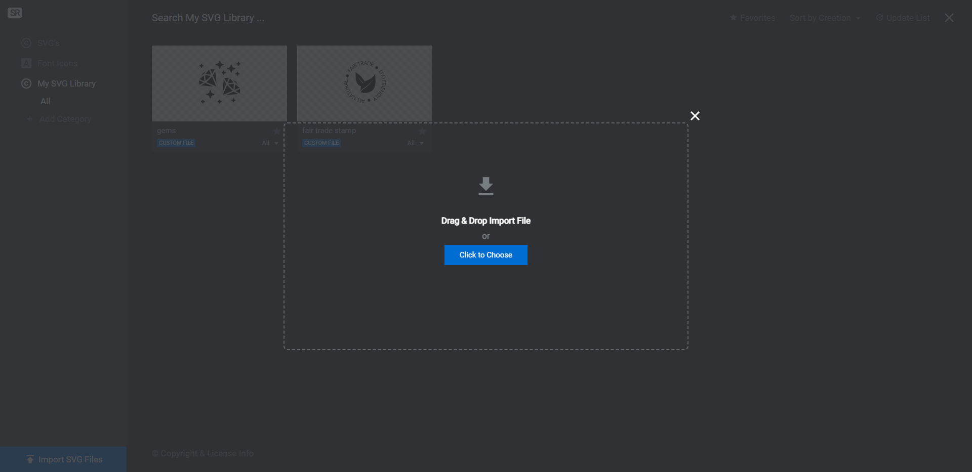
Upload your cursor icon to the library. Then click on the plus-sign icon that appears when you hover over it.
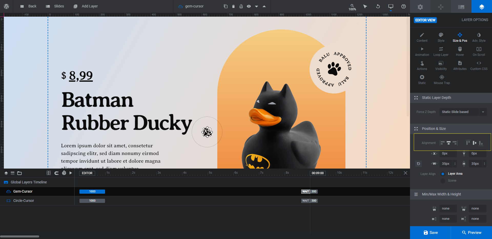
The new icon will be loaded into the top-left corner of your module. To set it up as the cursor, do the following:
- Go to “Style” and modify the colors if needed.
- Go to “Size & Pos” and change the width (W) and height (H) values if it’s too big or small.
- Go to “Animation”. For IN/Anim To, set the Duration to 1000 and the Easing to power2.inOut.
- Go to “Hover” and set the Cursor and Pointer Event to None.
- Go to “Visibility” and switch the toggle off for tablet and mobile.
- Go to “Mouse Trap” and set Use to Pointer is Over Slider. Switch on the toggle next to Center Origin.
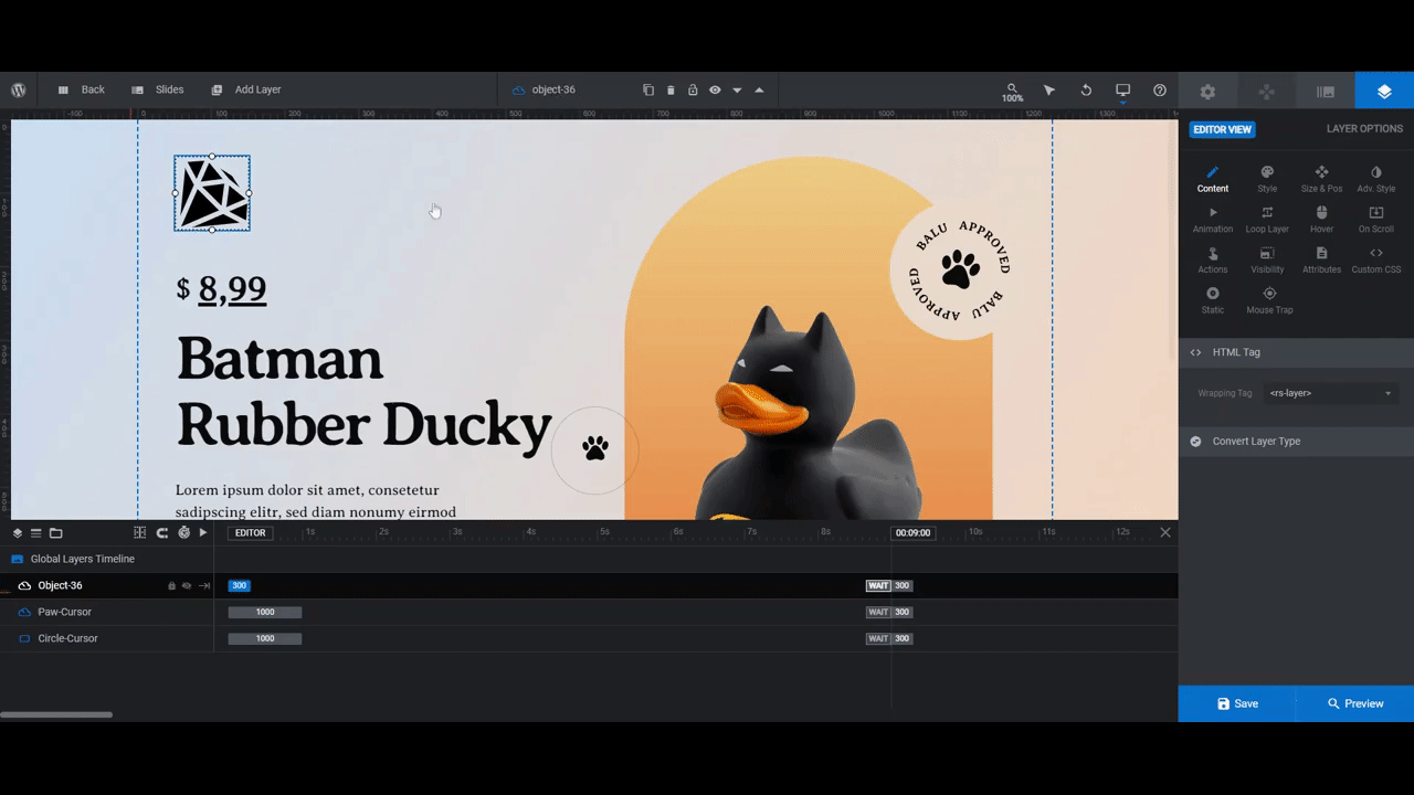
You can now delete the original Paw-Cursor icon. Next, click on your new cursor icon and go to “Size & Pos”. Set the two Alignment settings to centered.
Open the module preview and confirm that your new cursor icon works just as the old one did. Save your changes and then return to Slide #1 from the “Slides” menu.
Learn more:
Step 3: Delete four of the slides
All of the slides are designed using the same layout, so it doesn’t matter which four you delete.
To delete a slide, go to “Slides” in the toolbar. Then hover over the slides one at a time and click the trash can icon that appears to the right.
Do this until you have one slide remaining.
Learn more:
Step 4: Update the section background color
The design of this module is very colorful. While that works for this pet store that sells fun toy products, we want this section to be more toned down for our jewelry store.
We’ll start by modifying the color of the background. There are two places to do this.
The first place is under “Module Options”, “Layout”, and “Module Background”. This is the color that initially appears before the section loads.
Click on BG Color to change the color.
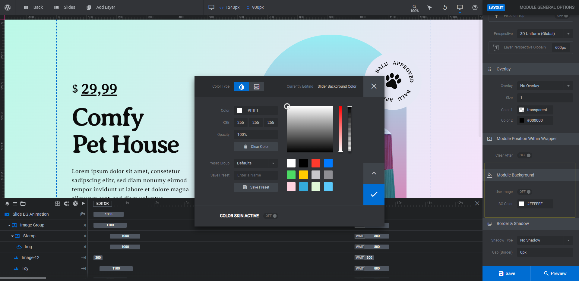
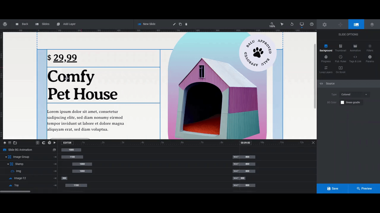
Then go to “Slide Options” and “Background”. This is the background gradient you see in the slide you’re working on. Click on BG Color to open the color selection dialogue.
You can set the background to another gradient using the presets in the bottom-right corner or create one of your own with the settings at the top. You can also use the toggle in the top-left to switch it to a solid color.
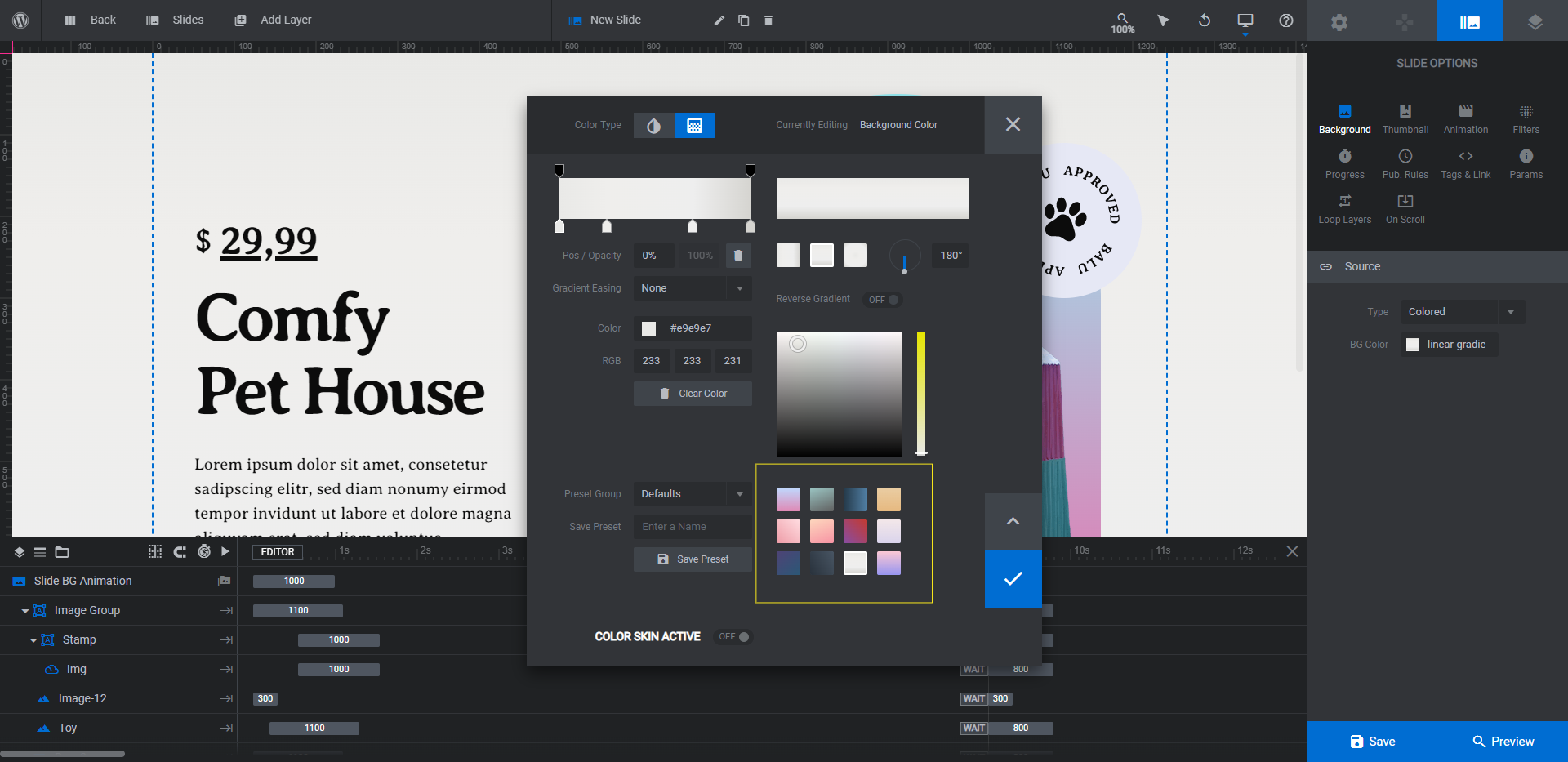
Set your new background color and save your changes.
Learn more:
Step 5: Customize the product description
There are four text layers and one button layer to the left of the ecommerce product image:
- Title
- Description
- $
- Price
- Shop Btn
To edit the text, go to “Layer Options”. Use “Content” to change what the text says and use “Style” to apply a new font, edit the color, and make other stylistic changes.
If you’d like to change the background color of the button, there are two places to do this.
One is under “Style” and “Background”. This will change the color that visitors see when they look at the section.
The other place is under “Hover” and “Style”. This will change the color that visitors see when they hover over the button.
One last thing we’re going to do here is to move the product price beneath the title. There are two fields that will need to move — $ is the currency symbol and Price is the amount.
In the canvas, drag and drop the layers one at a time beneath the title. You’ll see lines appear that let you know where your layer will be dropped.
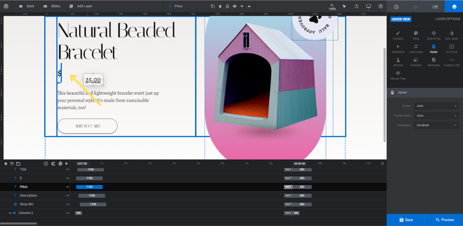
Save your changes when you’re done.
Learn more:
Step 6: Add your product image
The Toy image layers in the template are more or less in the shape of a square. So the closer you get to having identical dimensions on all sides, the better your ecommerce product imagery will fit into the allotted space.
Also, aim to size your image between 300px by 300px and 500px by 500px. That will keep the image nicely within the confines of the colorful background it’s set against.
When exporting, make sure the image has a transparent background so that it appears three-dimensional against the module.
To replace the existing image, select Toy in the timeline or canvas. Then go to “Layer Options” and “Content” to upload your new one to the Media Library.
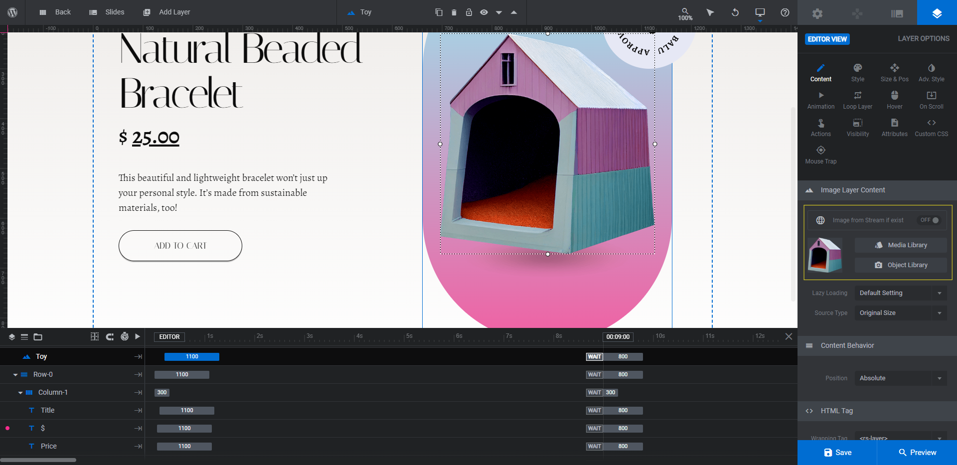
There’s also a Shadow layer (in some slides it’s called Image-12) that appears beneath the product. This adds to the feeling that it’s hovering over the colorful surface.
If you feel as though the Shadow appears too large or small for the object, you can modify its width (W) under “Size & Pos”.
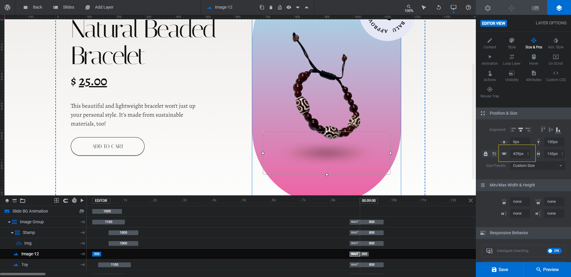
Also, if it’s too close or far away from your object, you can use the Y setting to move it up or down.
Learn more:
Step 7: Change the product background color
Here is where you’re going to change the colors that appear directly behind the product.
Select the element called Image Group. Go to “Layer Options” and “Style” to open the BG Color settings.
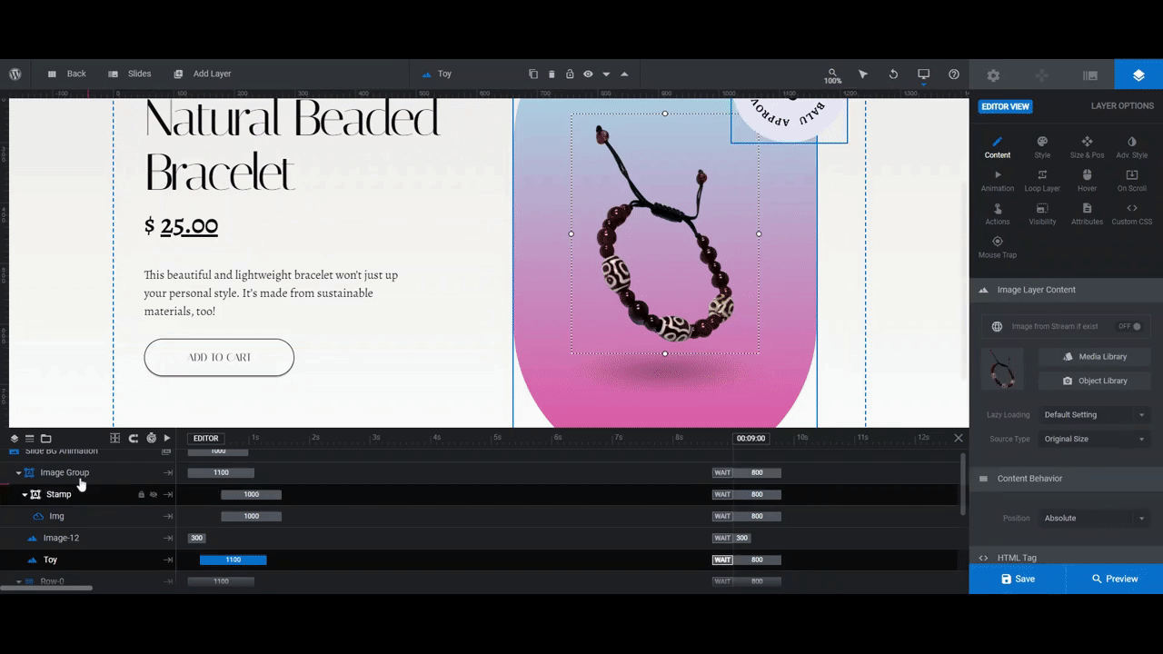
Either choose from one of the gradient presets at the bottom or create a totally custom gradient using the settings at the top.
Learn more:
Step 8: Edit the rotating stamp
The last component to customize is the rotating stamp in the top-right corner. There are different ways to handle this.
For instance, the template uses the stamp as a form of branding and trust building. It lets customers know that the product is Balu-approved. In that case, using the same icon as the cursor (and brand logo) makes sense.
However, you might prefer the Sephora-style method of stamping your products. See, for example, the green and red stamps that appear in this screenshot:
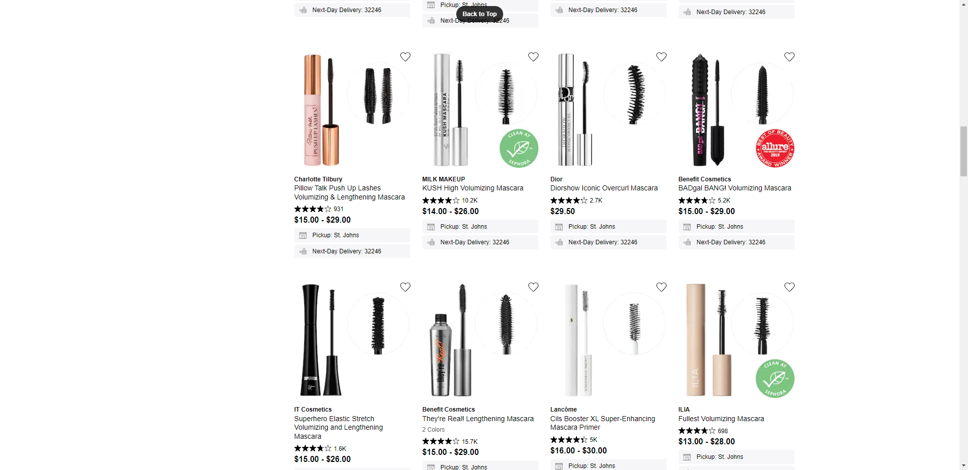
The green stamps let visitors know that these are Sephora-vetted eco-friendly products. The red stamps are Allure “Best Of” award winners.
This is the approach we’re going to take.
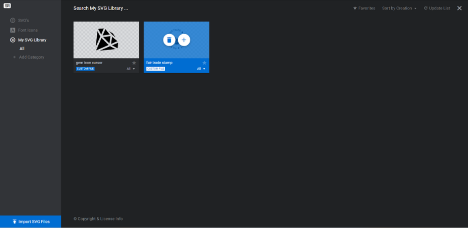
Now the first thing to do is to create the stamp’s text and icon — all in one SVG file. You can use the same design platform you used to create your cursor icon.
Make sure the text and symbol are all one color. Again, all black or all white is best. Export the image as an SVG, with a transparent background, and set the size to somewhere around 180px by 150px.
Here’s what you need to do to insert the stamp into your design and set it to rotate:
Delete the layer called Img.
Select Stamp in the timeline editor. All this is is the colorful circle that the stamp text and icon are set against. Go to “Layer Options” and “Style” to apply a new BG Color.
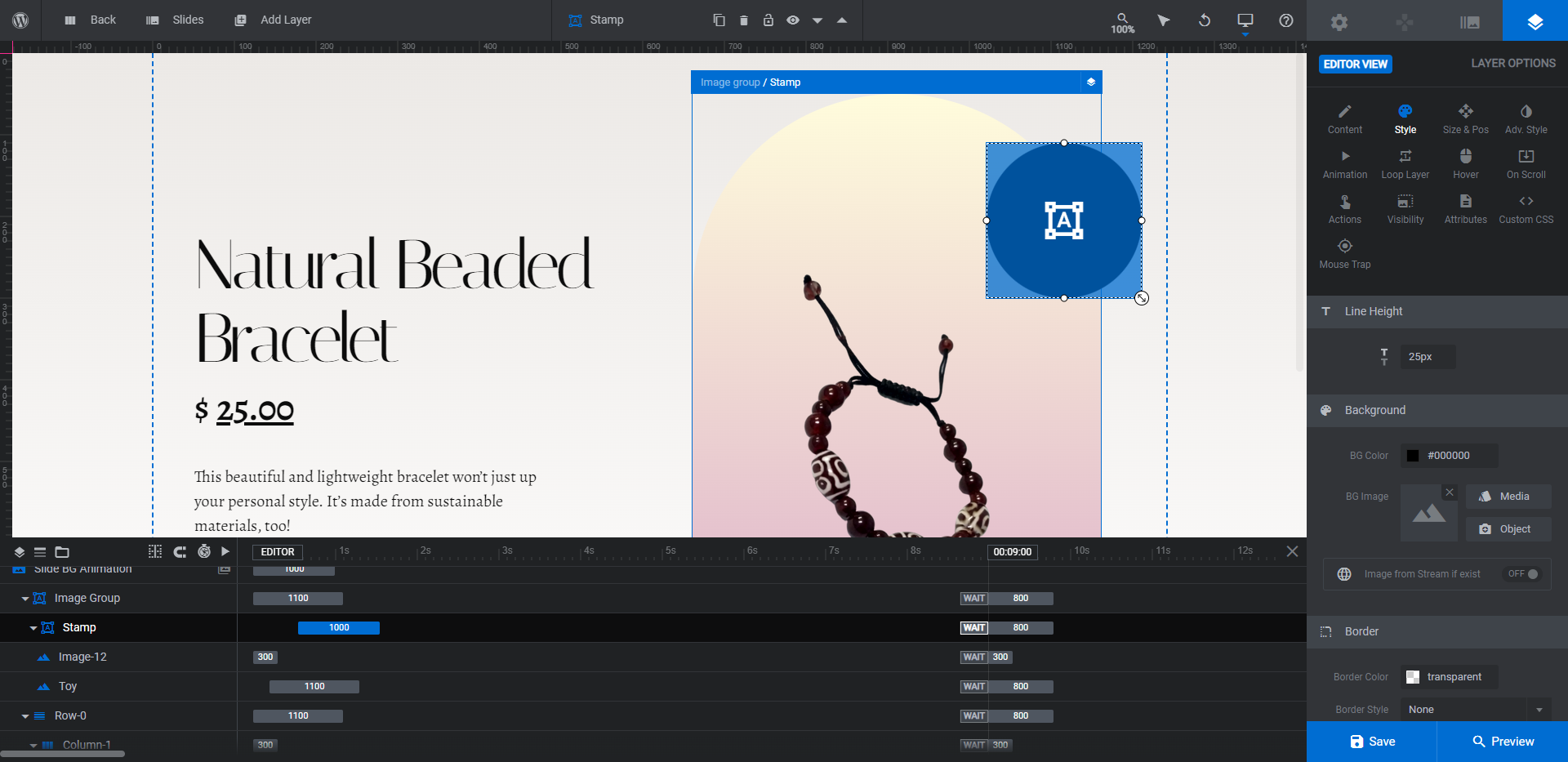
Next, go to “Add Layer” in the toolbar and click “Icon / SVG”. Upload your SVG file to the library and add it to the page.
Drag and drop the file into place over the Stamp layer. Wait until you can see the circular shape appear before letting it go.
Then make the following modifications under “Layer Options”:
- Go to “Style”. If your colors aren’t showing up well over the stamp background color, switch off the Keep Original Colors toggle and change the color here.
- Go to “Size & Pos” and resize the stamp so it fits the shape with a bit of breathing room around the edge. Then center it horizontally and vertically.
- Go to “Animation”. For IN/Anim To, set the Duration to 1000, the Start to 550,and the Easing to back.out.
- Also in “Animation”. For OUT/Anim To, set the Duration to 800, the Start to 9000, and the Easing to power3.inOut. Also set the ScaleX/Y values to 0.
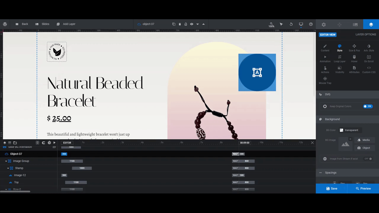
Open the Preview to see the resulting animation. If you’re happy with what you’ve done, save your changes and then add this Slider Revolution module to the top of your product page.
Learn more:
Level up your ecommerce product pages with special effects
The home page isn’t the only place where you can have fun with your designs. With the help of the Pet Store Product Slider template, you now have an easy way to liven up the above-the-fold section on your product pages. Not only will the unexpected design and color surprise your shoppers, so too will the special effects.


