
Most of us have stood in line at the grocery store and become transfixed by the headlines on the covers of magazines strategically placed before us. The same thing goes for the home pages of leading online publications. The pairing of high-impact imagery and headlines is hard to ignore.
In this tutorial, we’re going to leverage that attention-grabbing headline style to create a slider for the home page. While the Magazine Content Slider template has a retro artistic feel, we’ll show how a few changes to the design can create a whole new style for your digital publication or blog.
Table of Contents:
- Step 1: Install the STATIC version of the Magazine Content Slider template
- Step 2: Update the global layers
- Step 3: Delete every slide but one
- Step 4: Update the background graphic
- Step 5: Edit the text layers
- Step 6: Customize the arrow design
- Step 7: Duplicate the finished slide
- Step 8: Update the tabs navigation
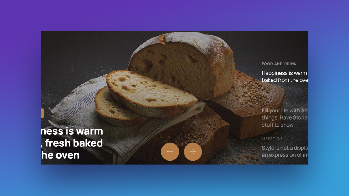
How to create a magazine-style slider to promote your top content
The home page of a digital publication gives you the chance to show off your best, most popular, or newest content before anything else.
To maximize the number of eyeballs you get on this content, you’re going to need more than just creative headlines. You’re going to need a design that begs for attention. Case in point:
In the following tutorial, we’re going to show you how to edit this magazine-style slider template and make it work for your publication’s unique style and voice:
Before we get started, make sure you’re familiar with the Slider Revolution editor basics:
Step 1: Install the STATIC version of the Magazine Content Slider template
When you search for this template under “New Module from Template”, you’re going to find two options:
- Magazine Content Slider Static
- Magazine Content Slider
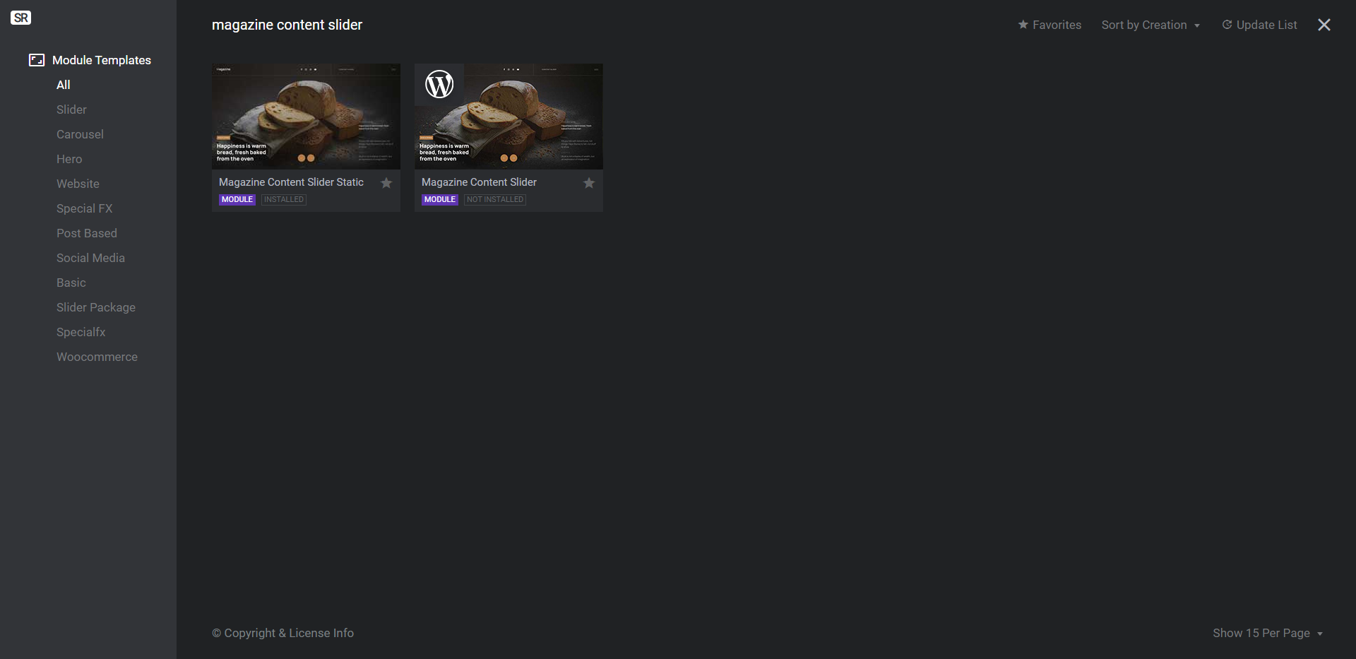
The one without the “Static” and with the WordPress logo on the thumbnail will automatically pull in content and metadata from your Posts. That’s not the one you want to use if you’re following along with this tutorial.
To add a custom line-up of top content to this module, install the Static template.
Learn more:
Step 2: Update the global layers
If you’re not planning to use the header that comes with your WordPress theme or page builder, all you’ll need to do in this step is edit the content of the global layers. If you’re going to use the header that comes with your theme, on the other hand, you’ll want to delete most of these layers.
To locate the global layers, go to “Slides” in the top toolbar and select “Global Layers”. This will open up the layers that sit on top of your slider regardless of the content that changes behind them:
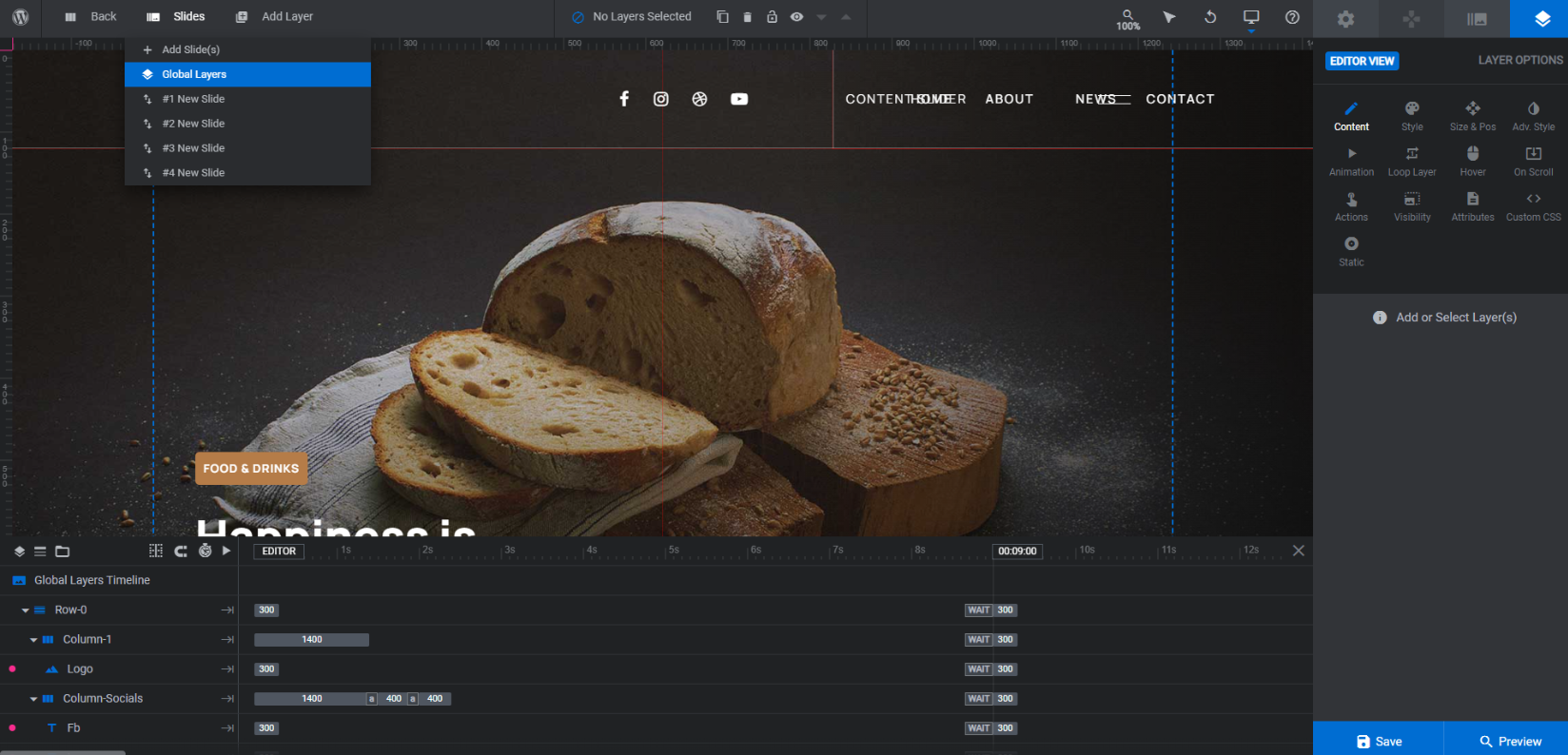
The one layer that needs to stay where it is regardless of what you’re doing with the header is called Gradient Overlay. This is a shape layer that creates a semi-transparent dark space on the right side of the slider. This is needed to enhance the visibility and readability of the magazine-style titles that appear there.
The other layers make up the header at the top of the slider. To customize them, select them one at a time and work your way through the “Layer Options” to make changes.
If you’d rather delete them, you’ll first need to unlock the Underline and Line layers. Scroll to where they are in the timeline editor. Click on the lock icon next to each to make them visible and editable:
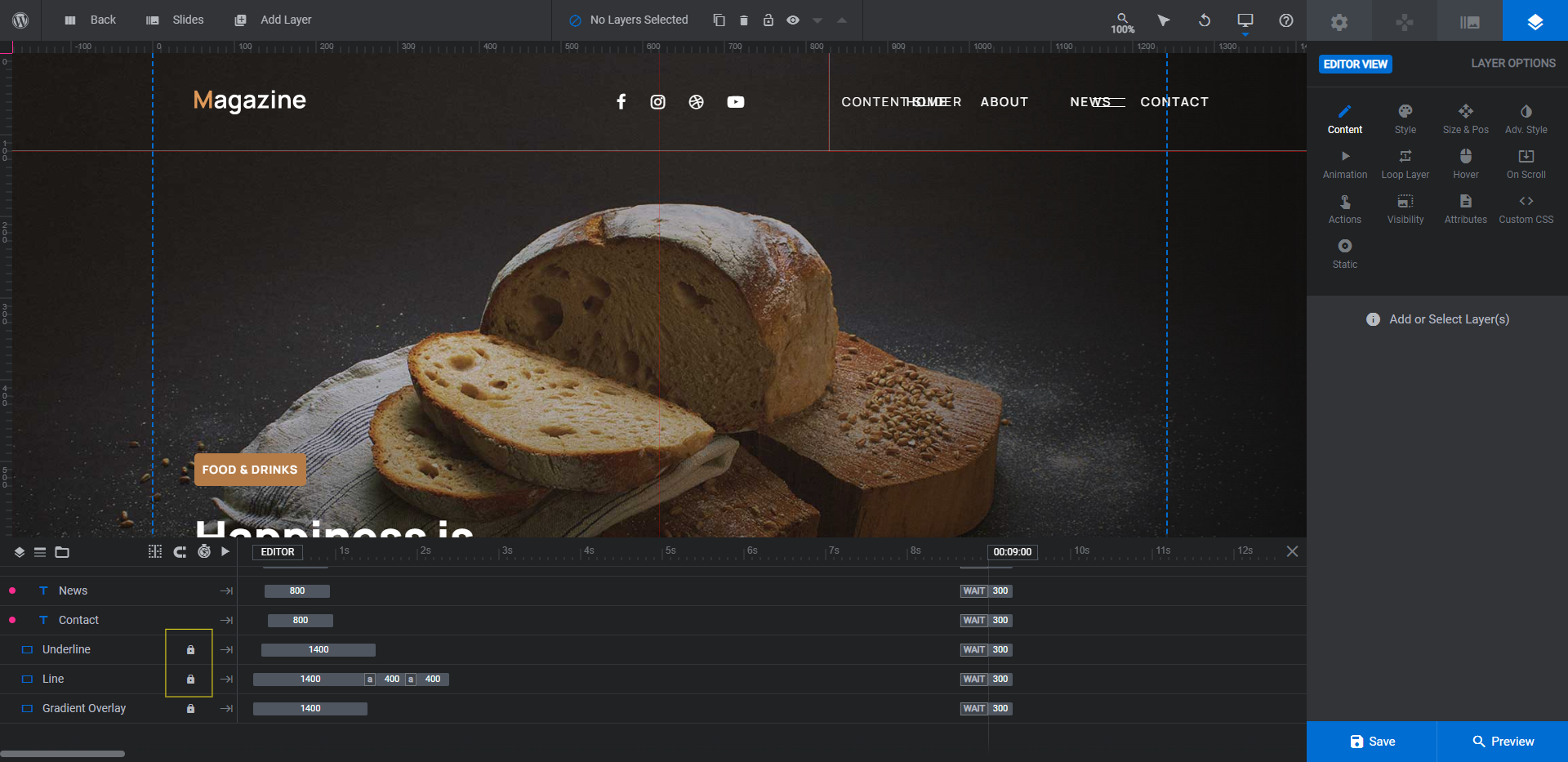
When that’s done, hold down the Ctrl or command key. Then click on these layers:
- Row-0
- Menu
- Underline
- Line
Hit the Backspace or delete key and all of them will be removed at once.
Learn more:
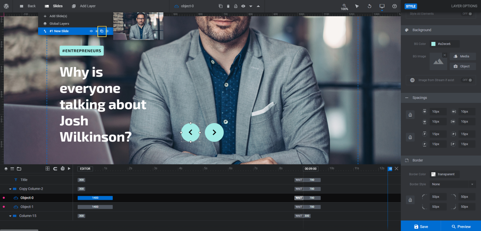
Step 3: Delete every slide but one
Because we’re going to be doing quite a bit of customization to the styles in this template, we want to get rid of all the slides but one. This will allow us to perfect the design and details. Then, when we build out the rest of the slides, all we have to worry about is editing the content instead of recreating the styles over and over.
To delete three of the four existing slides, go back to “Slides” in the toolbar. Hover over each of the slides one at a time and click the trash can icon beside them:
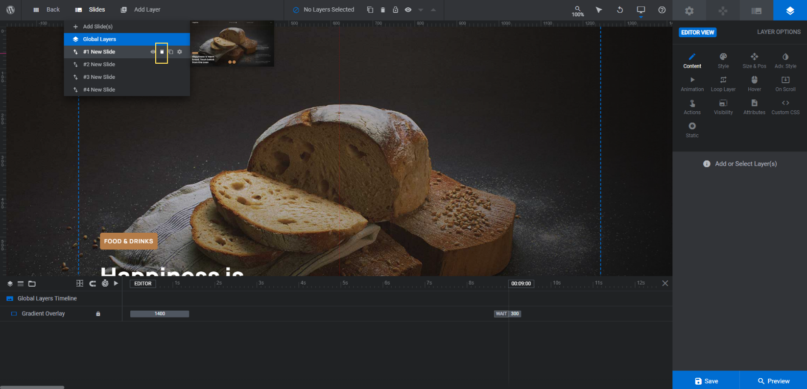
The slides are identical in terms of layout and components, so it doesn’t matter which ones you delete. Just make sure you have only one remaining when you’re done.
Learn more:
Step 4: Update the background graphic
The background image of each slide is the featured image for your story or post. To replace the one in the template, go to “Slide Options” and “Background”. Click the “Media Library” button and upload your replacement graphic:
It’s also a good idea to update the thumbnail so that your Slides controller at the top accurately reflects which slide you’re working on. Go to the “Thumbnail” tab and click the Reset button next to each thumbnail type:
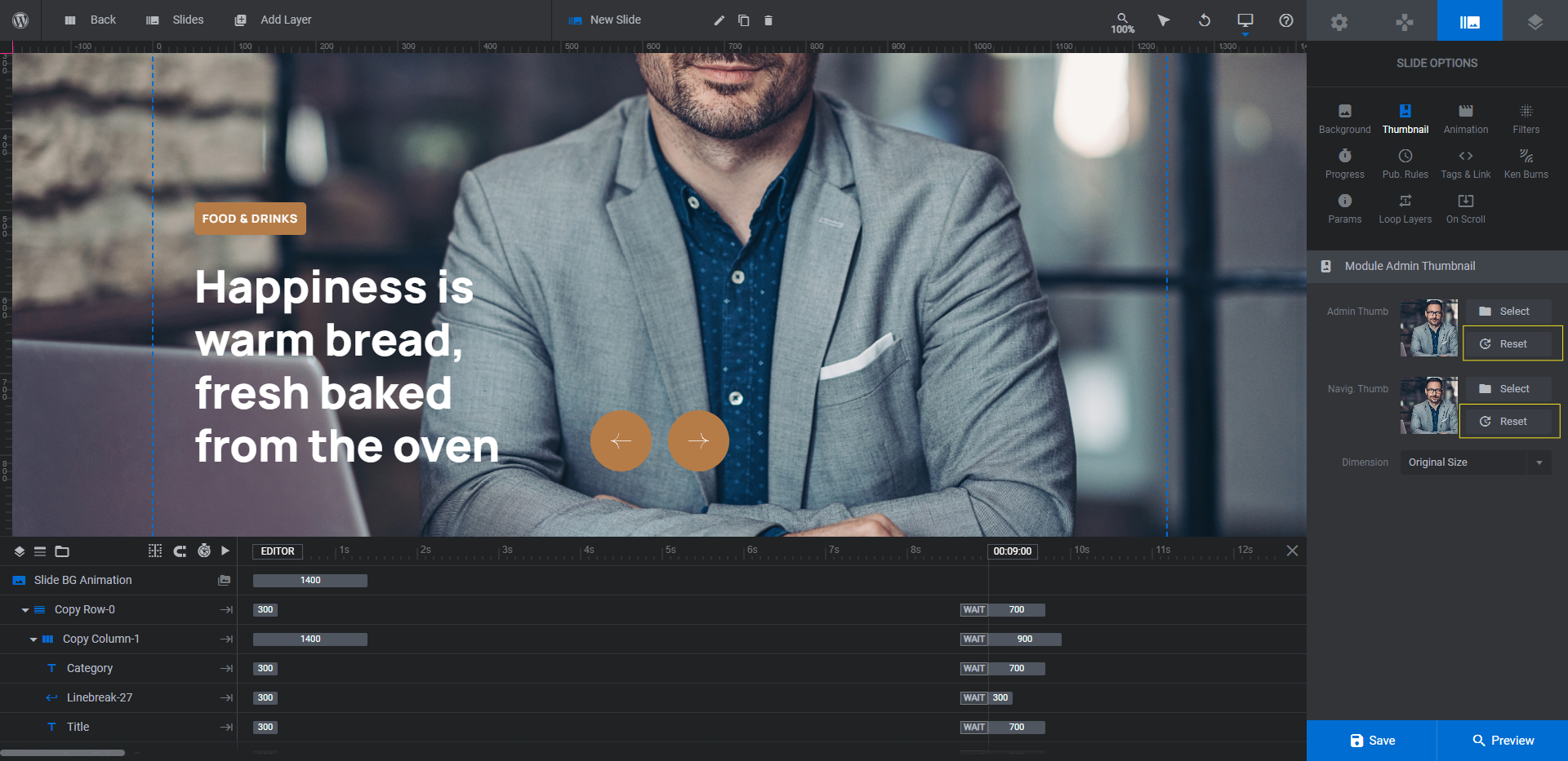
This will automatically pull in the slide’s background image.
Learn more:
Step 5: Edit the text layers
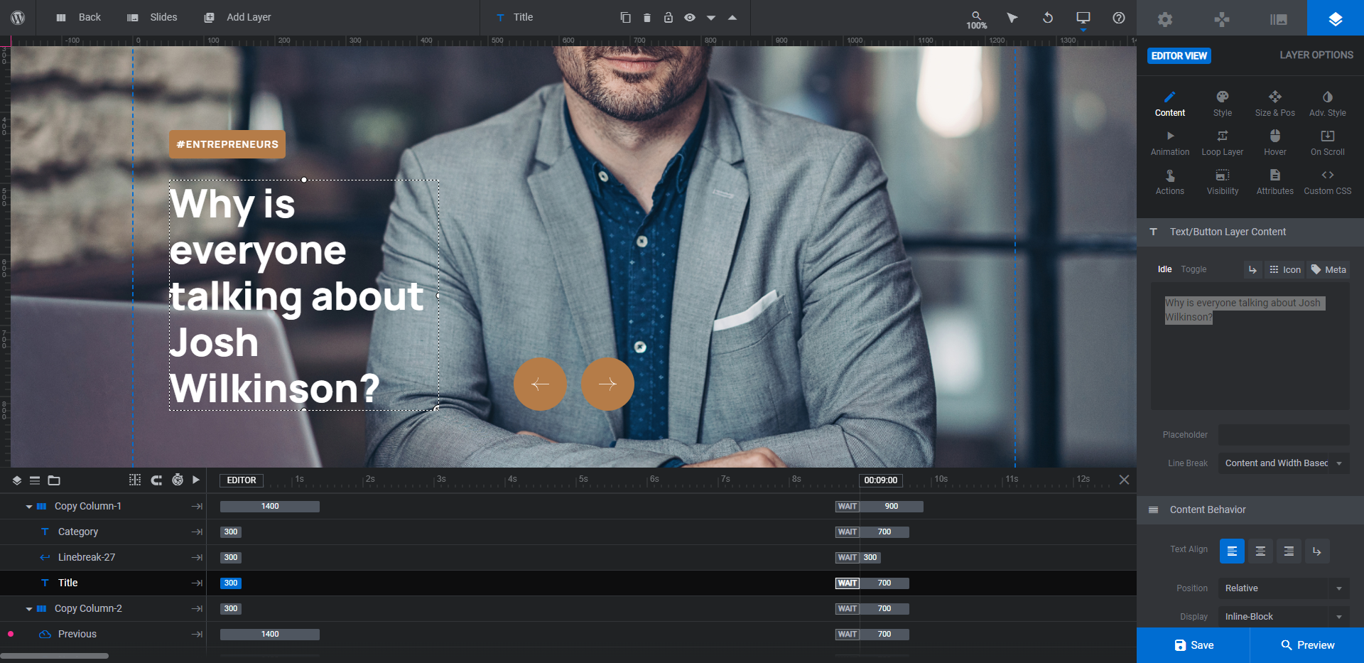
If you look at the slider template, you’ll notice a bunch of text on it. However, if you look inside the text layers of your slide, you will only find two:
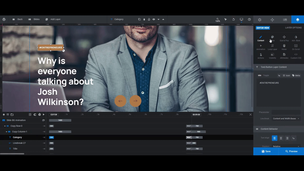
- Category — This is the category label inside the colorful block on the left.
- Title — This is the big white headline on the left.
Note: There are different things you can do with the Category label. You can use it for the date of publication, author name, a superlative (like NEWEST, MOST POPULAR, RED HOT, etc.), or some other relevant metadata.
We will edit what the text layers on the right say in a later step. For now, let’s focus on customizing these two.
To edit what the layers say, select them in the timeline editor or canvas. Then go to “Layer Options” and Content”. Replace the text in the editor box:
To customize the look of your text layers, use the “Style” tab. You can change the font, size, weight, and case, among other things here. Also, if you want to change the background color of the category label, you can do that under the “Background” section.
Another thing you’ll want to update is the “Hover” color for the Title layer. You can use the same color you used for the category label here:
For the best results, try to find a sans serif or monospaced font that works for your publication. When it comes to big headlines, these types of fonts tend to be easier to read.
Learn more:
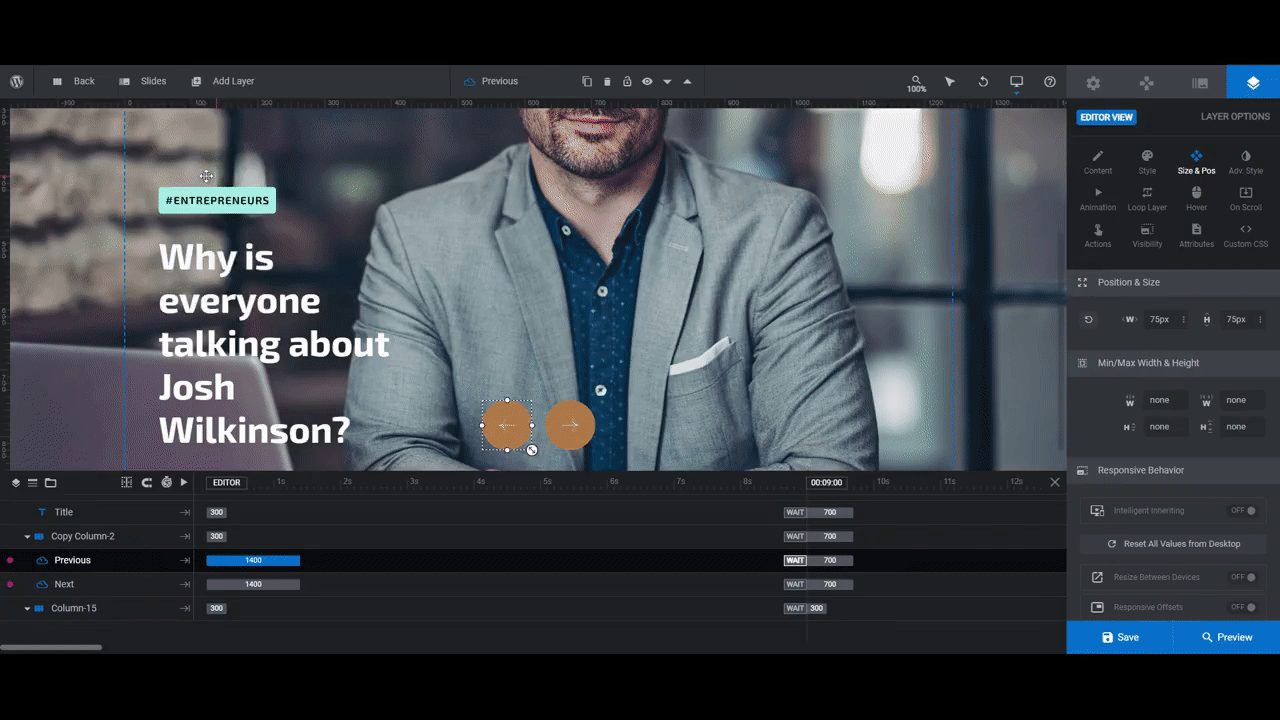
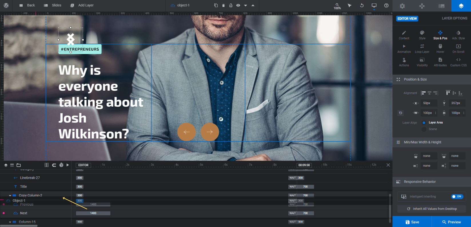
Step 6: Customize the arrow design
If you changed the style of your font to better match your publication’s vibe, then you’ll probably need to update the arrow navigation as well.
The left and right arrow that appear to the right of the headline aren’t generated using Slider Revolution’s navigation settings though. They are two SVG layers.
We’re going to have to do a number of things to replace these arrow buttons with our own:
1. Go to “Add Layer” in the toolbar and select “Icon/SVG”. Scroll through both the SVG and Icon options to find the arrow style you like best. Create one that points left and one that points right:
You can also upload your own SVG files, if you prefer.
2. The next thing to do is drag-and-drop the arrows down underneath Copy Column-2. Use the timeline editor to move your new Object layers into place:
Note: What we’re about to do is apply similar settings from the template’s arrow buttons to our new ones. We’d suggest keeping the old arrow buttons in place until you’re done customizing yours. That way, if you want to reference what the original settings were on your own, you’ll have them right there. You can then delete the Next and Previous layers when you’re done.
3. Go to “Layer Options” and “Content”. Under “Content Behavior”, set the following:
- Position = Relative
- Display = Inline-block
4. Go to the “Style” tab and do the following:
- Change the icon color.
- Create a background color.
- Adjust how much space appears between the icon and its border under “Spacings”. We set ours to 10px margins and 15px padding all the way around.
- Round out the corners of the background under “Border”. We set ours to 50px all the way around.
5. Go to “Size & Pos” to update the size of the arrow buttons. The originals were 75px by 75px, so that’s a good size to stick with.
6. Under “Animation”, both of your arrows will need to be adjusted as follows:
- IN/Anim To: Set the Duration to 1400, Start to 0, and Easing to power2.inOut.
- OUT/Anim To: Set the Duration to 700, Start to 9000, and Easing to power3.inOut.
7. Next, go to “Hover”. Change “Cursor” to Pointer and “Animation” to Enabled.
Scroll down to “Style” and “SVG Style” to create a new color pairing so users receive confirmation that the buttons are clickable. Reversing the buttons’ normal colors is always a good option.
8. Last but not least, go to the “Actions” tab. Scroll down to the “Slide Actions” section. Set the left arrow to “Previous Slide” and the right to “Next Slide”. When you’re done, close the pop-up.
If you still have the old arrow layers in your slider, delete them now.
Open the preview and give your new arrow buttons a test run to make sure they look just as you want them to. You’ll be able to make sure they work properly once you build out the rest of the slides in the next step.
Learn more:
Step 7: Duplicate the finished slide
Go to “Slides” in the toolbar and click the duplicate/copy icon next to your slide. Duplicate it for as many posts as you want to show off:
You won’t have to do anything with styling the slides at this stage. These are the only things that need updating:
- Slide background image (Step 4)
- Slide thumbnail image (Step 4)
- The Category and Title text (Step 5)
Save your changes between each slide. When you’re done, preview your work once more. Test out the arrows, make sure there’s good contrast between your font and the background, etc.
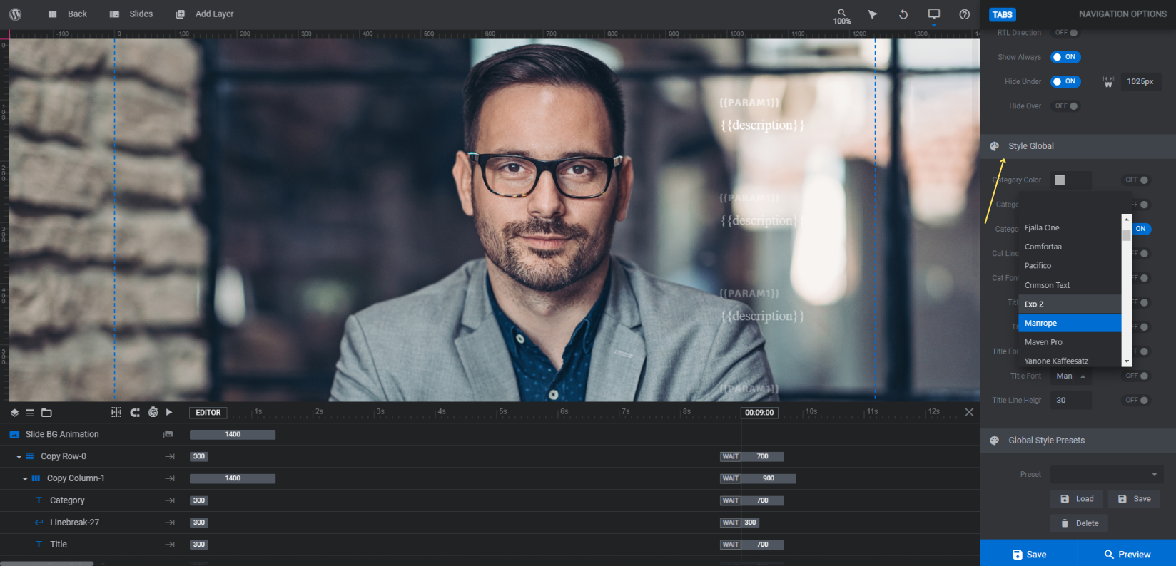
Step 8: Update the tabs navigation
The last thing to do is update the magazine-style headlines that appear along the right side of the slider.
First, go to “Navigation Options” and “Tabs”. This is where you can make adjustments to the style of the Magazine Tabs.
From here you can customize basic settings. We would advise leaving most of these settings alone in order to preserve the magazine-style headline look. What you can do, however, is modify the Cat Font and Title Font to better match the one you used in the slider.
One other thing we modified was the Visible amount under “Position”. Since we have four pieces of top content we’re promoting in the slider, we want readers to be able to see all of them at a glance. We’d suggest setting this amount to no more than 5.
The second thing to do is update what the text says in these tabs. If you’re curious to see how this was all configured, you can read up on the Navigation Editor below.
Jump back to “Slide Options” and go to “Params”. This is where you’ll fill in the values that the Magazine Tabs navigation pulls from to create the two fields in the tabs:
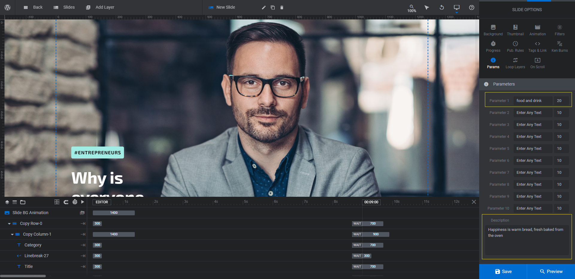
In the template, Parameter 1 is the category of the post and Description is the title. You can set these fields to be anything you like so long as they aren’t too long. Try to keep both fields to about the same length as the text from the template.
Pro tip: With a magazine cover or static home page, these would be headlines for other stories. So you could get away with putting the post category and title here. In this slider, however, they’re headlines for the same stories we’re showcasing in this slider. So you’d be better off adding a custom preview or description in these navigation fields or parameters. That way, you don’t end up with a bunch of duplicate text in your slider.
Go through your slides and edit them one at a time, making sure to save your changes between each.
After you finish, preview your work once more. When you’re happy with your slider, go ahead and add it to your publication’s home page.
Learn more:
Create a high-impact slider to promote your best content
From glossy tech magazines to whimsical photography blogs, the Magazine Content Slider template can be repurposed for all kinds of digital publications. Regardless of what type of content you publish, this slider will ensure that readers (first time and returning ones) stop and give your top content the attention it deserves.


Nice post with very helpful details with clear steps about the magazine-style slider and the tabs navigation.