
Table of Contents
Mastering Elements Visibility in Slider Revolution
Experience seamless control over the visibility of elements within your sliders with the exceptional capabilities of Slider Revolution.
Through the remarkable features that empower customizing elements’ visibility in Slider Revolution, you gain the power to effortlessly hide or disable modules [?]
A module in Slider Revolution acts as a container for slides, which in turn act as containers for layers. Modules are created and edited with the module editor.
A "module" is a single, self contained piece of content. You can think of this as being similar to the way a post or page in regular WordPress is a self contained piece of content.
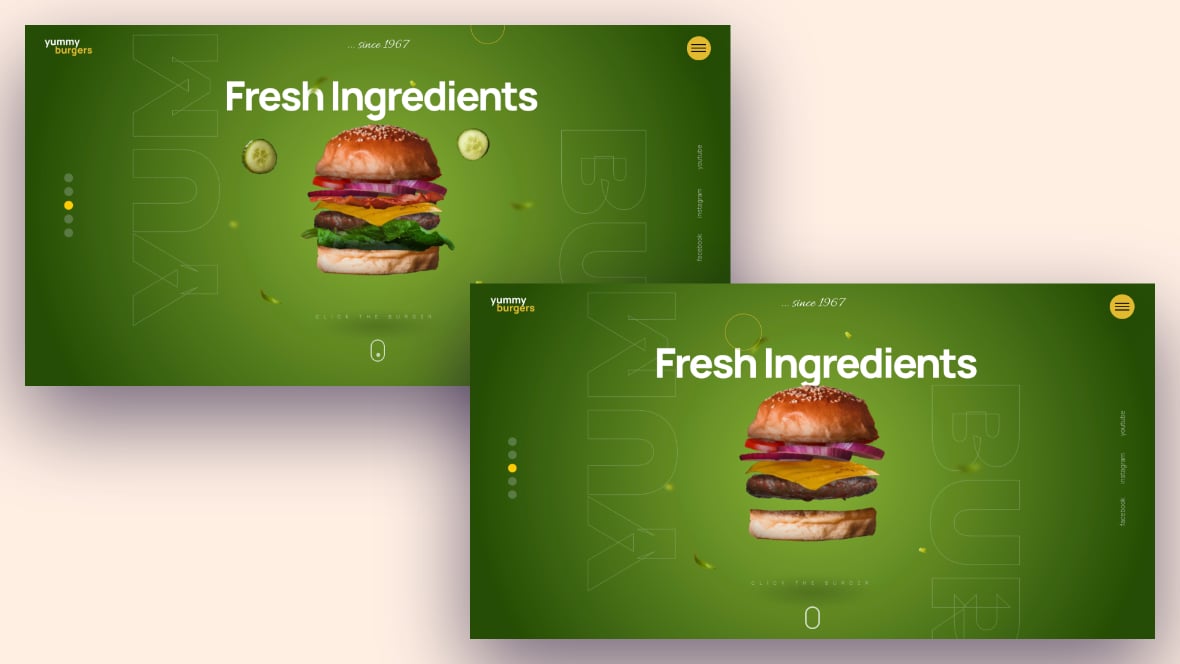
A module can represent any kind of content Slider Revolution is capable of creating, such as a slider, carousel, hero unit, navigation menu, posts display and so on.
Multiple modules can be combined to form rich content such as complete sites and landing pages., slides [?]
A "slide" in Slider Revolution is a container into which multiple layers can be added, with layers in turn acting as containers for various forms of media such as images, text, video, audio, buttons, and special effects.
Slides are added to modules and edited via the module editor.
Within the module editor, each slide has its own animation timeline, background and collection of layers.
A single module can have one or many slides. A module with one slide is called a scene, and a module with multiple slides is called a slider or carousel., and layers [?]
Layers are containers for visual, audio or layout items and are added to slides. For example, text, button, image, audio, video, group and row are all types of layers.
Layers are added to slides via the module editor. based on specific device sizes or widths.
This unparalleled level of customization empowers you to curate the user experience by selectively revealing or concealing individual elements. Consequently, Slider Revolution becomes the ultimate choice for achieving your desired visual impact.
These features not only help create different presentations on different devices but also do so using just a single module.
Let’s learn to hide modules, slides, and layers.
Note: Each of these processes begins by going to your website dashboard:
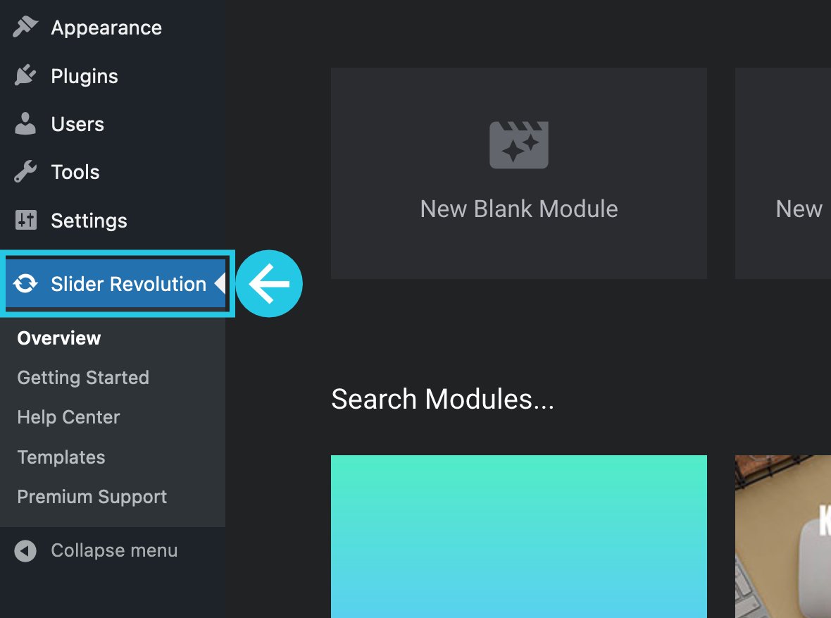
Then, Go to the Slider Revolution plugin:
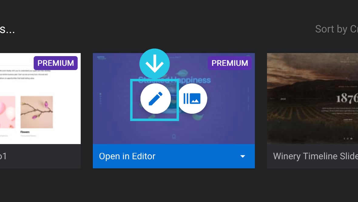
And open a module in the Module Editor:
Hide a Module
Sometimes you might have a module with rich content that’s perhaps not suitable for mobile devices, or it may have a layout that requires a minimum amount of space.
If this is the case, you can:
- Disable the module for mobile/phone size viewports, i.e.
480pxor narrower. - Hide the module under a specified browser viewport width, e.g., at
778pxor narrower. - Replace the module with a static image.
We’ll cover how to use these three techniques in the sections below to control the elements’ visibility in Slider Revolution.
Disable a Module at Mobile Size
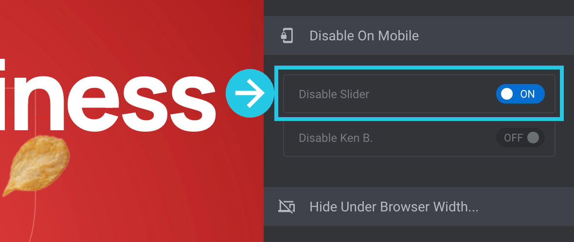
By disabling a module on mobile, it will hide the module for all visitors on mobile size devices. Moreover, in Slider Revolution Plugin, the mobile device size is considered480px or narrower.
Go to the Module General Options tab on the right sidebar:
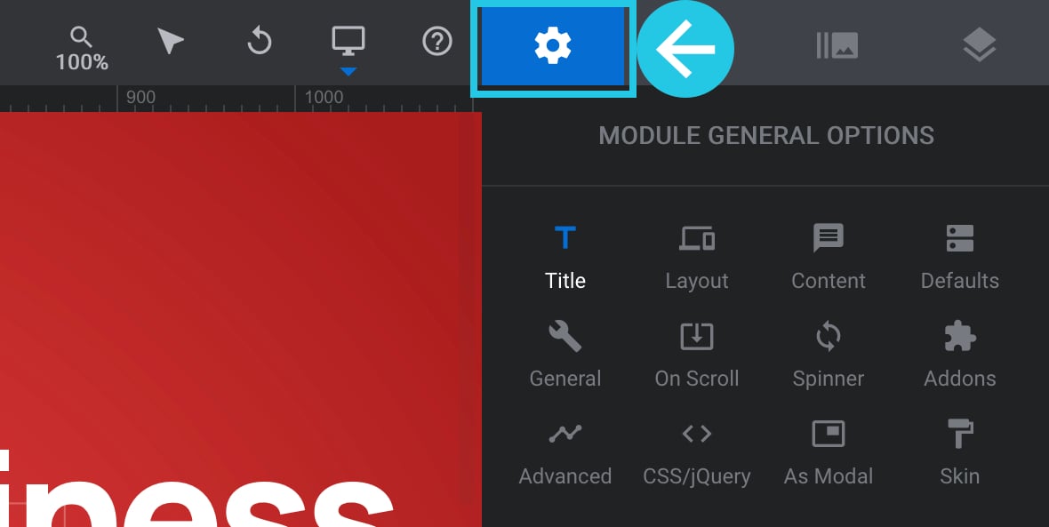
Go to the General sub-section:

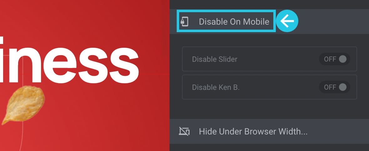
Scroll down to the Disable On Mobile panel:
Toggle the Disable Slider option to ON:
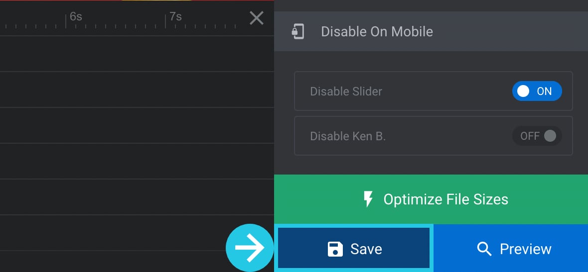
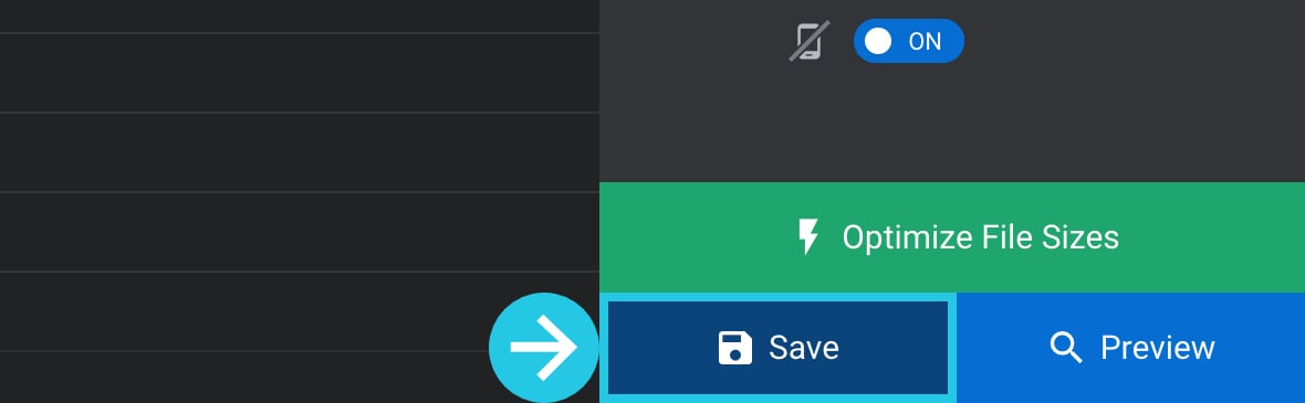
Click on the “Save” button:
Hide a Module Under Specific Browser Width
Disabling a module on mobile is effectively a shortcut to hide it at browser viewport widths of 480px or narrower. However, if you need to specify a different viewport width to hide under, you can do so.
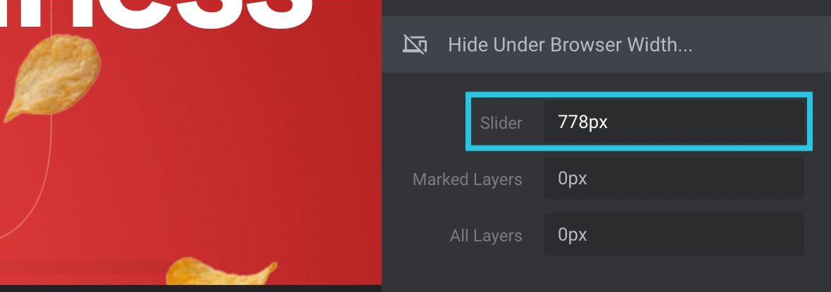
For example, you might have a layout that you want to hide on narrow viewports, like 320px or narrower. Alternatively, you might have a module that is only suited to larger screens, so you may want to hide it under a large size, such as 778px.
Go to the Module General Options tab on the right sidebar:

Go to the General sub-section:

Scroll down to the Hide Under Browser Width panel:
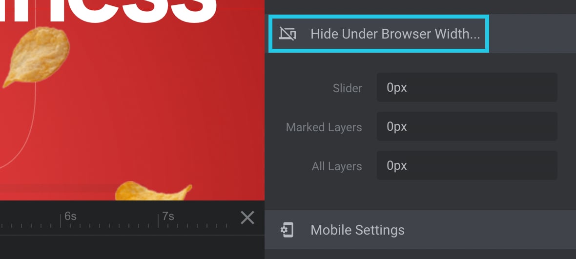
Input a numerical value in the pixel in the Slider option:
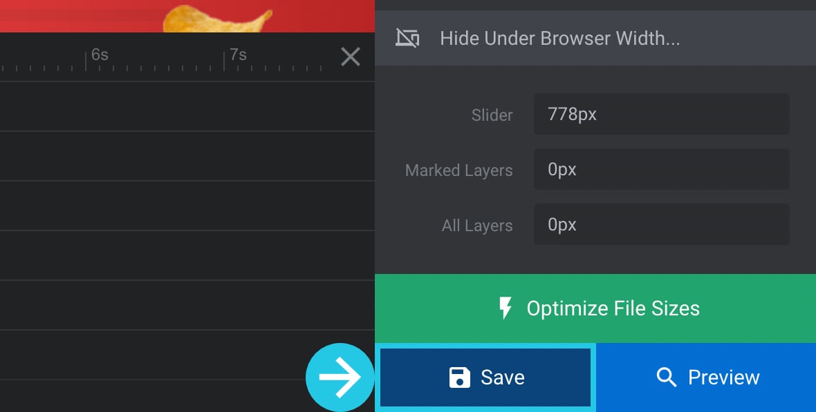
Click on the Save button:
Replace a Module With a Static Image
Rather than completely hiding a module at mobile size, you might prefer to show a static image. This method allows you to still feature your product or services for mobile users without loading a dynamic module.
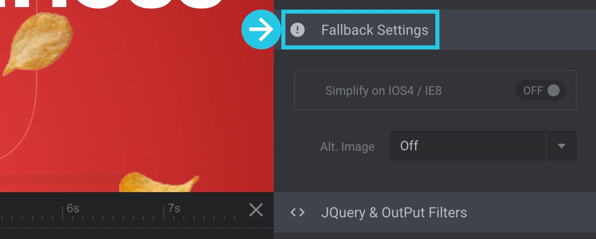
Go to the Module General Options tab on the right sidebar:

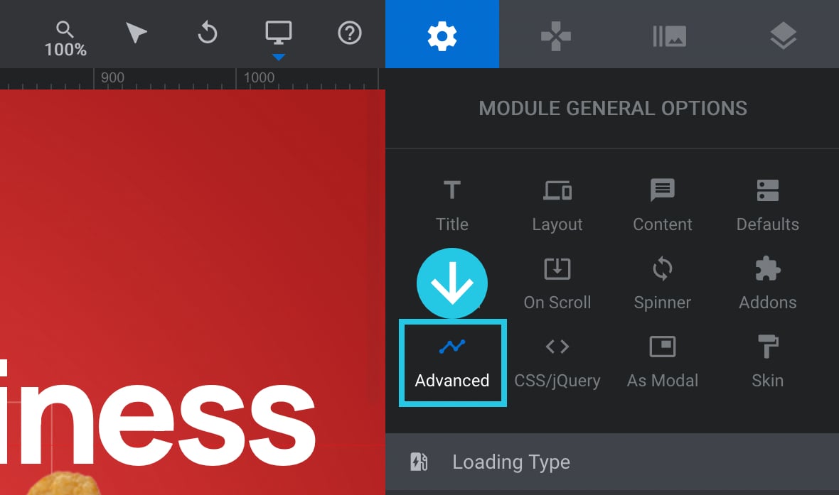
Go to the Advanced sub-section:
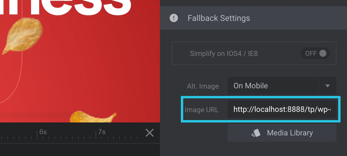
Scroll down to the Fallback Settings panel:
Click on the Alt. Image dropdown field:
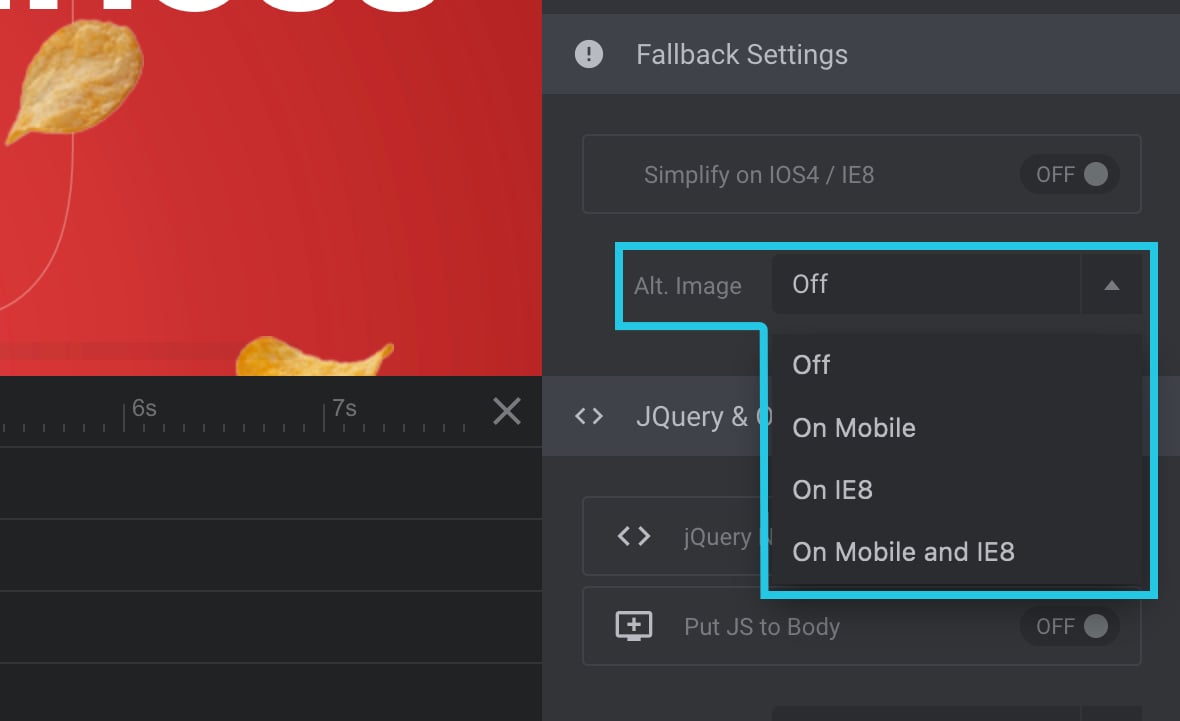
Select the On Mobile setting from the dropdown:
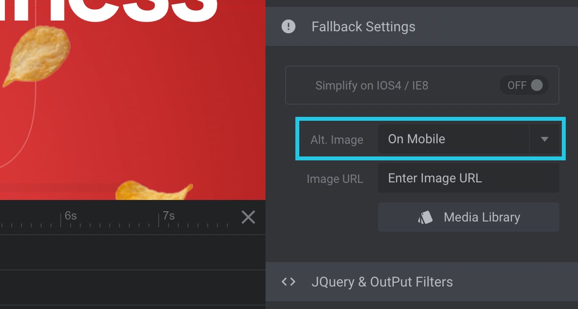
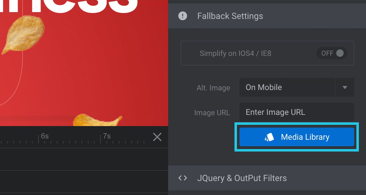
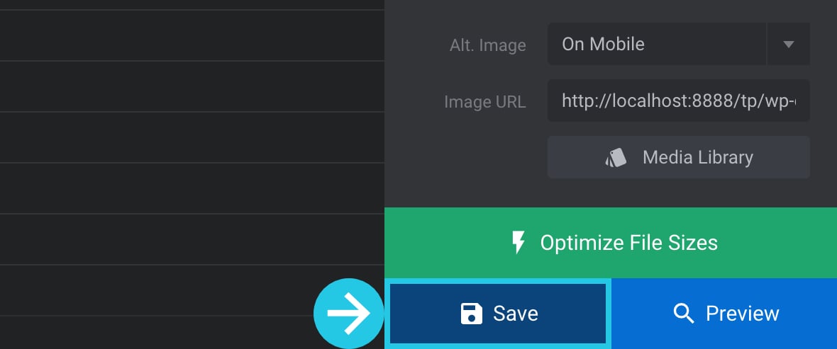
Click on the Media Library button to select an image:
Media Library popup will appear:
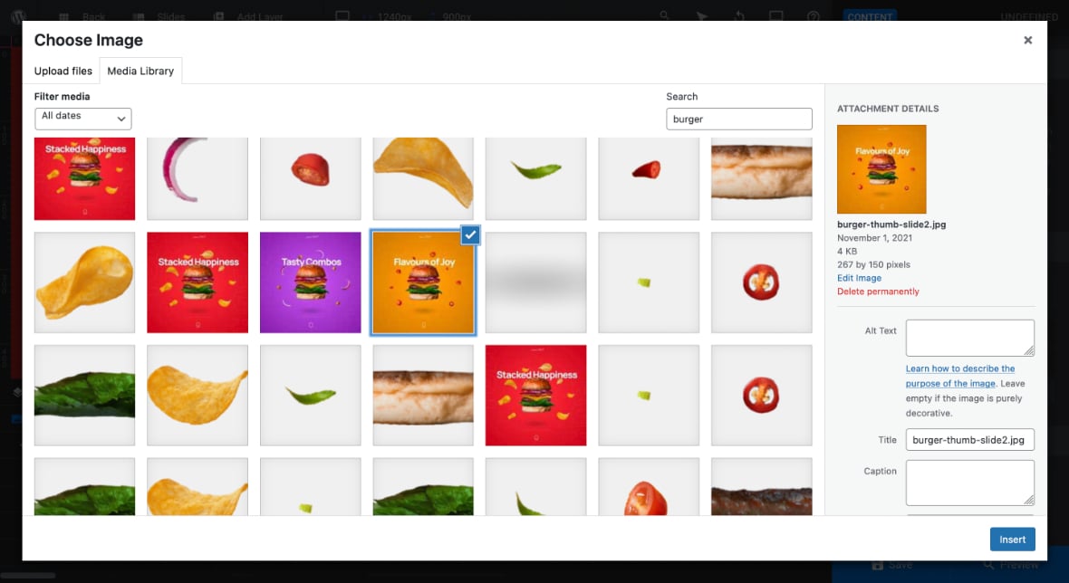
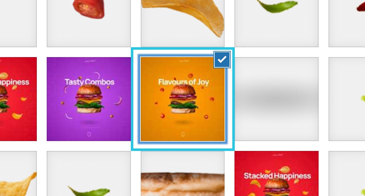
Select an image:
Click the Insert button:
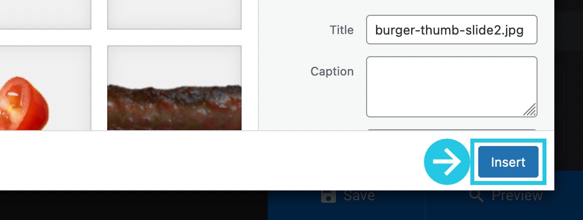
Clicking on the Insert button will input the URL of the selected image in the Image URL field.
Click on the Save button:
Hide Slides
Just as there are multiple ways you can hide entire modules, there are also ways you can hide specific slides.
You can:
- Hide slides at mobile/phone size viewports, i.e.
480pxor narrower. - Hide a slide after a module has looped through all its slides a specific number of times.
- Replace the first slide with an alternate slide.
Let’s see how to use each of these methods in the sections below.
Hide Slides at Mobile Sizes
This method is helpful if you hide a specific slide at mobile sizes but not the whole module.
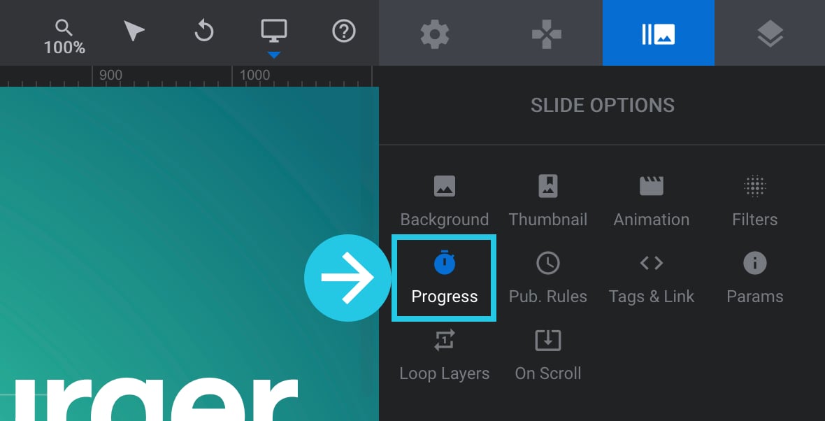
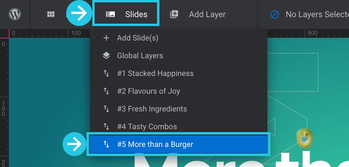
Select the slide you want to hide from the Slides dropdown on the top toolbar:

Go to the Progress sub-section:
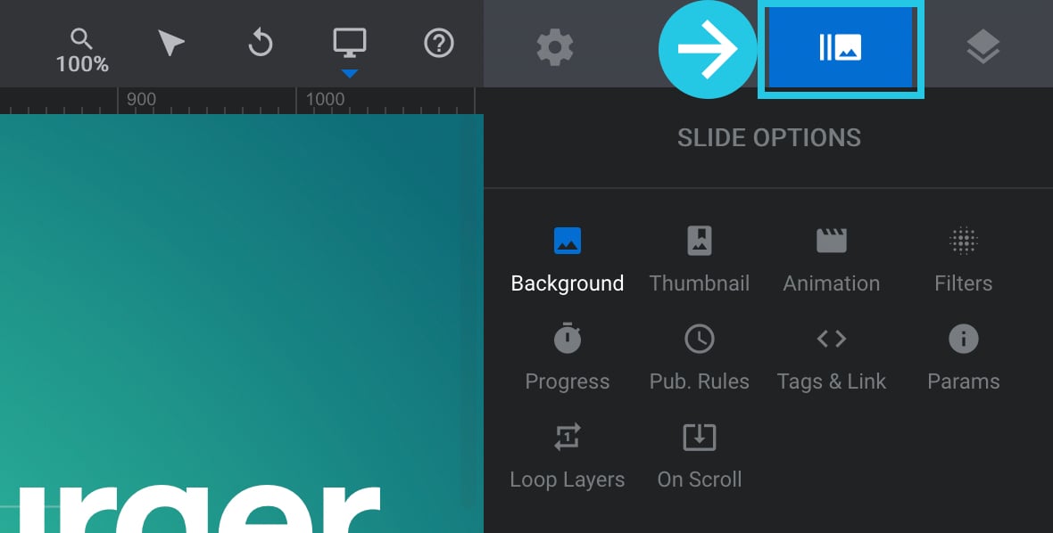
Go to the Slide Options tab on the right sidebar:
Scroll down to the Visibility panel:
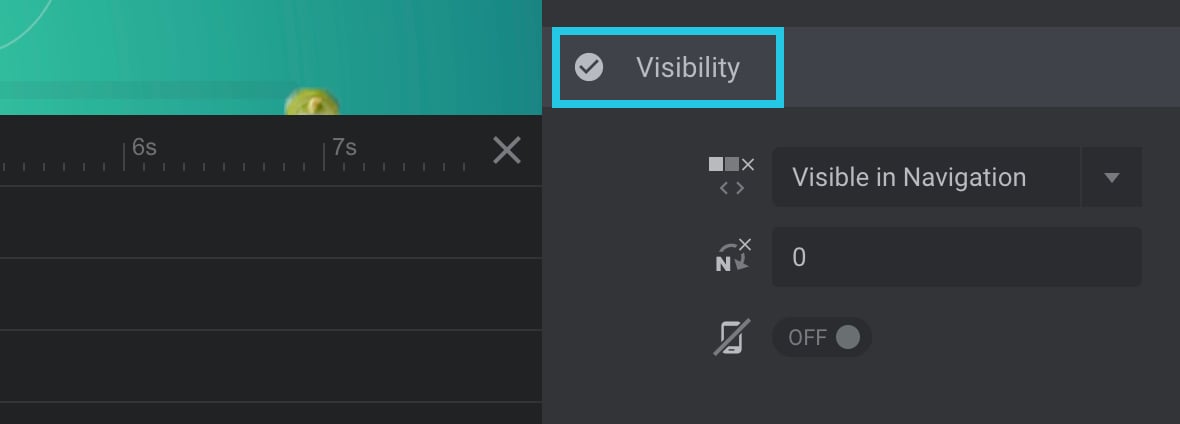
Toggle the Hide on Mobile Icon option to ON:
Click on the Save button:
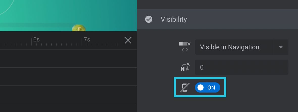
Hide a Slide After a Set Amount of Loops
You might have a slide you only want to show a specific number of times before hiding it. For example, a slide introducing the rest of the module content doesn’t need to be seen again.
This method lets you hide a slide after the module has looped through a specific number of times you can set as per your requirement.
Select the slide you want to hide from the Slides dropdown on the top toolbar:
Go to the Slide Options tab on the right sidebar:

Go to the Progress sub-section:

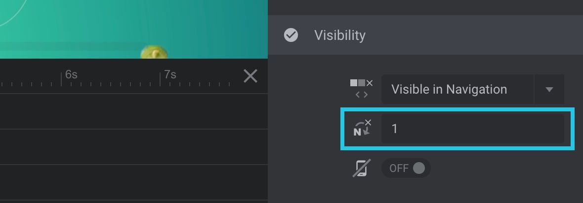
Scroll down to the Visibility panel:

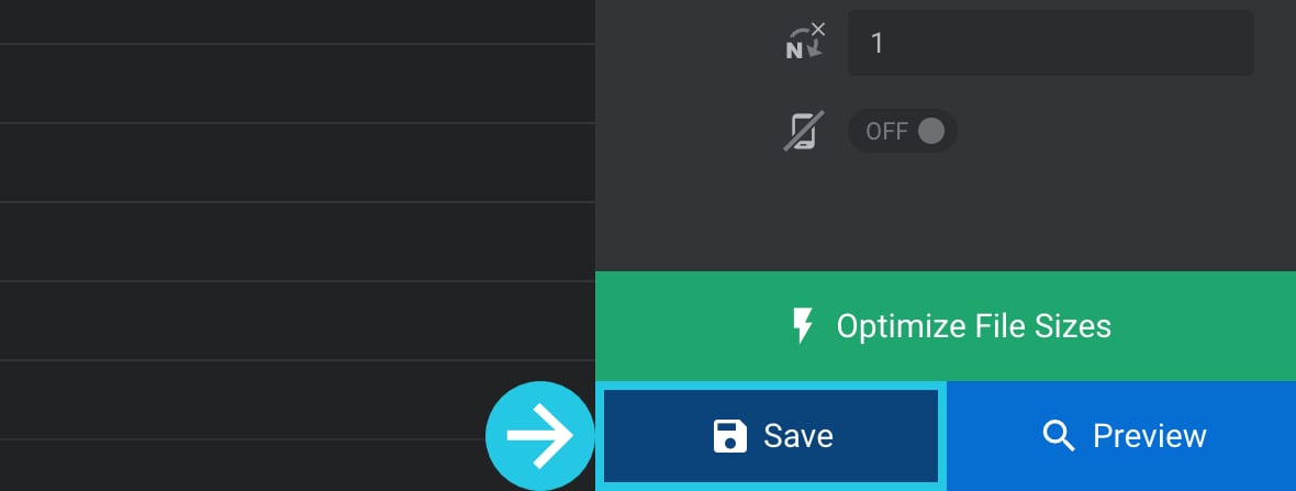
Input the number of times you want the module to loop through before the slide gets hidden in the N-x option, e.g. 1 to show the slide once, then hide it after that:
Click on the Save button:
Replace the First Slide With an Alternate Slide
It’s possible to replace the first slide of a module with an alternate slide.
Go to the Module General Options tab on the right sidebar:

Go to the General sub-section:

Scroll down to the First Slide panel:
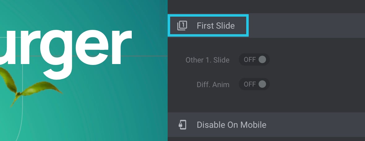
Toggle the Other 1. Slide option to ON:
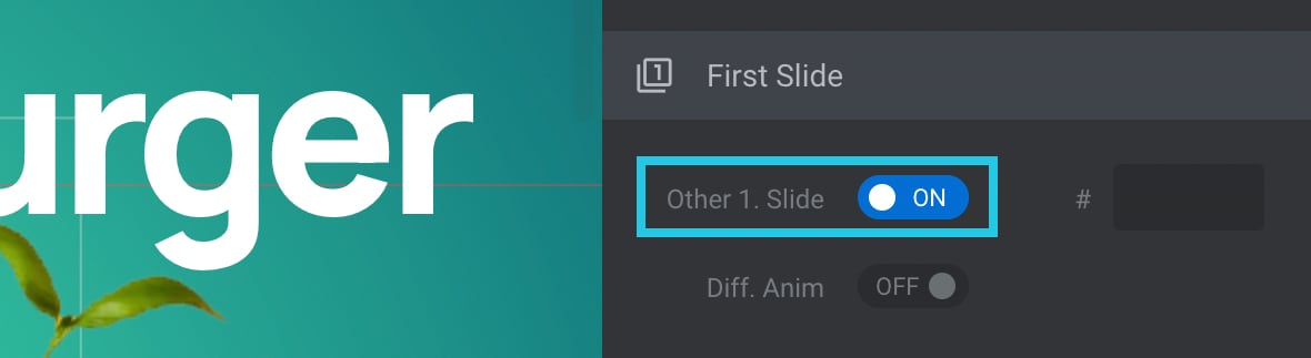
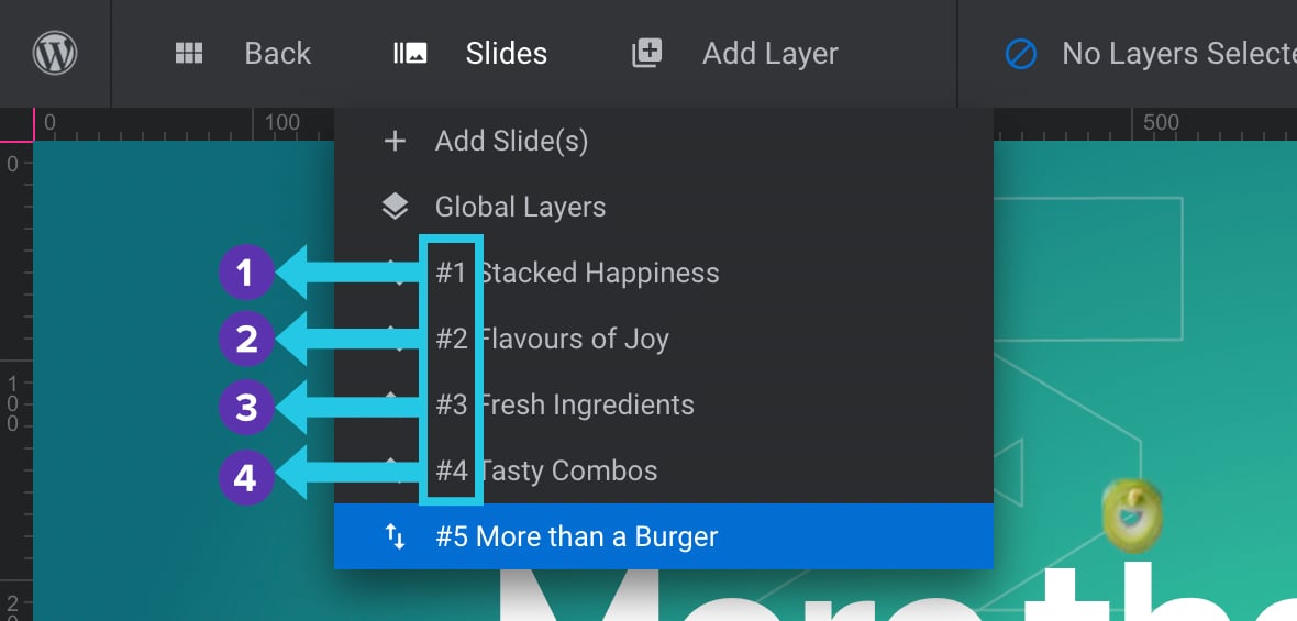
Look at the Slides dropdown on the top toolbar to find the number of the slide you want to use as an alternate:
Input the alternate numerical slide number value in the # option field:
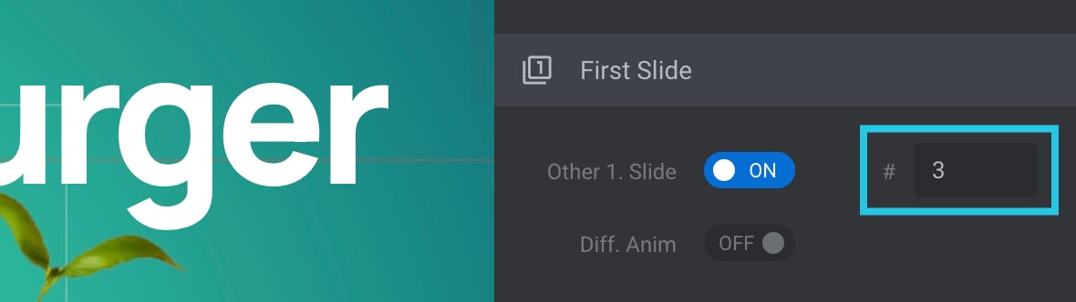
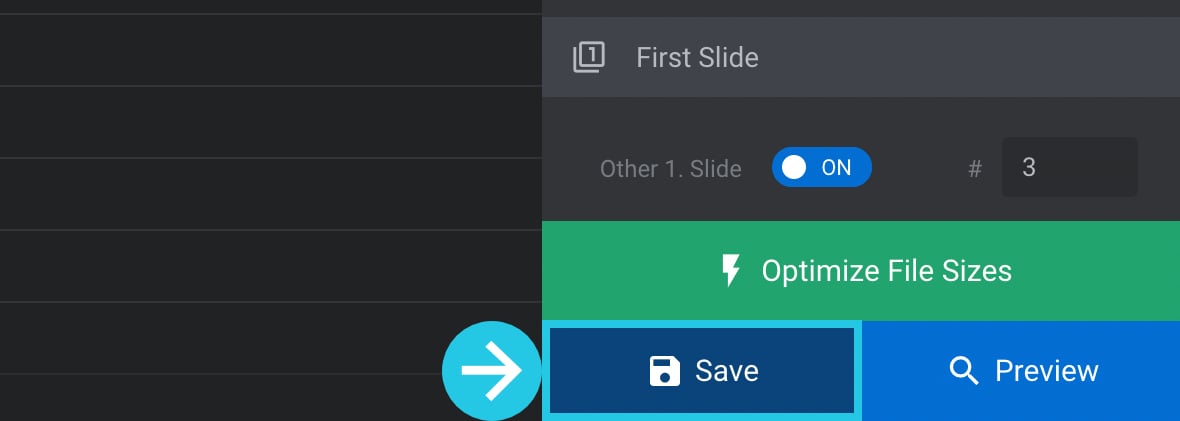
Click on the Save button:
Hide Layers
Just as you can hide modules and slides, you can also hide layers in the Slider Revolution plugin.
There are methods available to:
- Hide layers at any of Slider Revolution’s four device sizes: desktop, laptop, tablet, and mobile.
- Hide layers under a specified browser viewport width.
- Show layers only when a mouse hovers over a slide.
Let’s see how to use each of these three methods.
Hide Layers for Specific Device Sizes
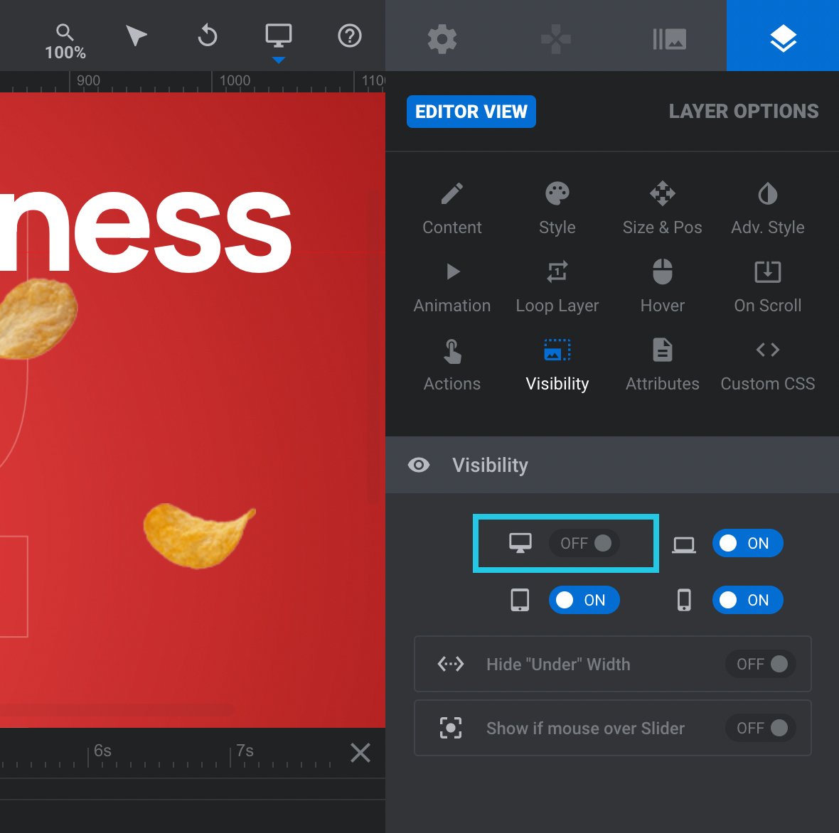
Every layer has a set of toggles that let you hide it on each of the four device sizes: desktop, laptop, tablet, and mobile.
You can use these toggles to hide layers unsuitable for specific device sizes, and in addition, show other layers better suited to those device sizes.
For example, you might make two versions of a particular layer: a large version suited to larger sizes and a smaller version suited to smaller sizes. You could then set the larger version to show on desktop and laptop sizes only and the smaller version to display on tablet and mobile sizes only. Here’s how this is done.
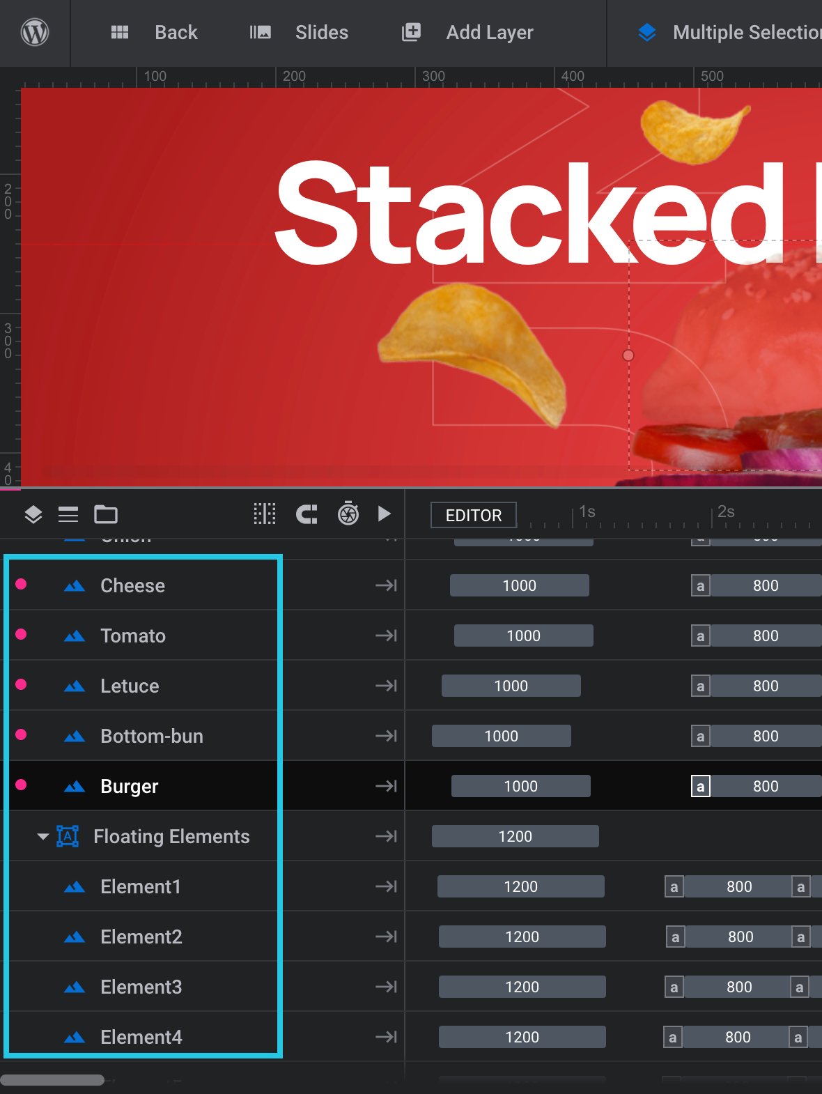
Select a layer from the timeline [?]
The timeline is the section of the module editor dedicated to animation and controlling the stacking order of layers.
From this part of the editor animations can be added, adjusted and previewed. Additionally, layers can be selected from the timeline, and can be dragged and dropped up and down on the timeline to modify which appear in front and which behind.
It can be equally compared to both a timeline in a typical video editing application, and a layers panel in a typical graphic design application at the bottom of the module editor or by clicking it on the canvas:
Go to the Layer Options tab from the sidebar:
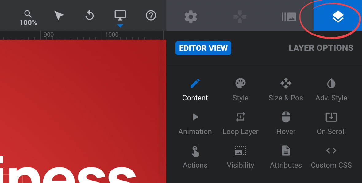
Go to the Visibility sub-section:
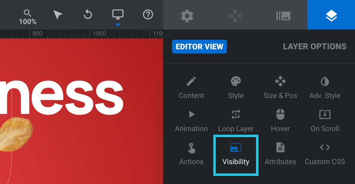
Head to the Visibility panel:
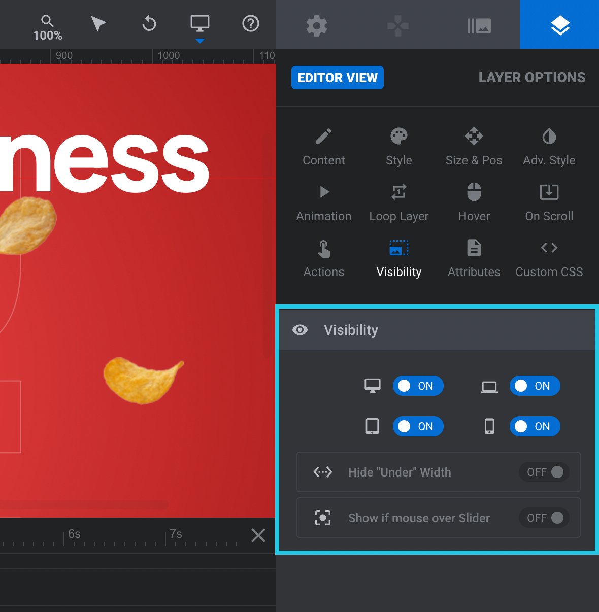
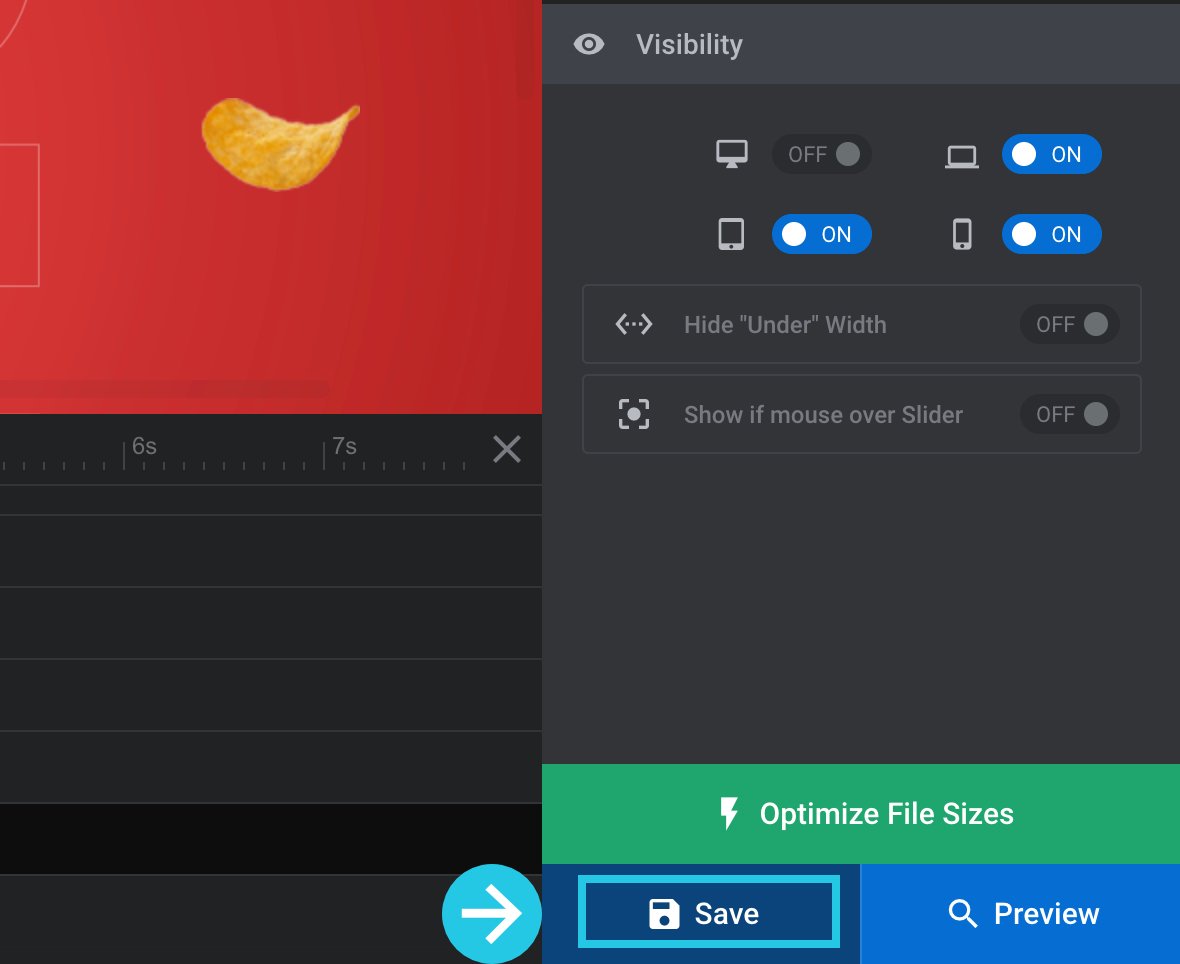
Toggle any of the four options to OFF to hide the layer on those device sizes:
Click on the Save button:
Hide Layers Under Specific Browser Width
It’s possible to set layers to be hidden under a specified browser viewport width, much like you can hide an entire module under a certain width.
There are two ways you can go about hiding layers under a specified size:
- Set a value under which all layers should be hidden
- Set a value under which marked layers should be hidden
If you hide all layers under a specific width, your module will have no content at that size except the background layer. This can be an excellent method if your slides have a cool image or video in the background layer, resulting in an impressive visual effect even without any additional layers.
Marking only particular layers to hide under a specific width allows you to prevent clutter by reducing the amount of content on smaller-width viewports.
You can use either approach alone or combine the two.
For example, you can choose a couple of layers to hide under 778px width and also hide all layers under 448px width.
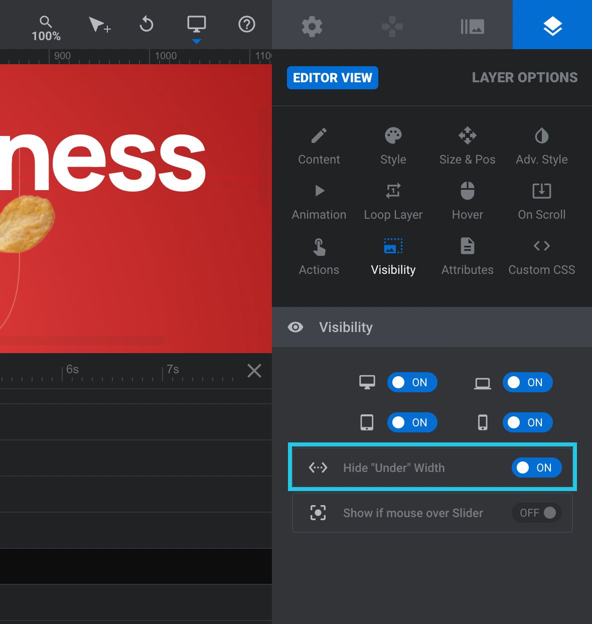
Marking a Layer to be Hidden
To mark a layer to be hidden, select it from the timeline at the bottom of the module editor or by clicking it on the canvas:
Go to the Layer Options tab from the sidebar:
Head to the Visibility sub-section:
Go to the Visibility panel:
Mark the layer to be hidden by toggling the Hide “Under” Width option to ON:
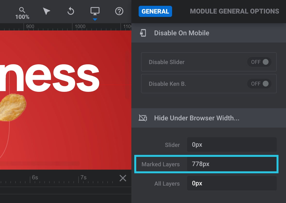
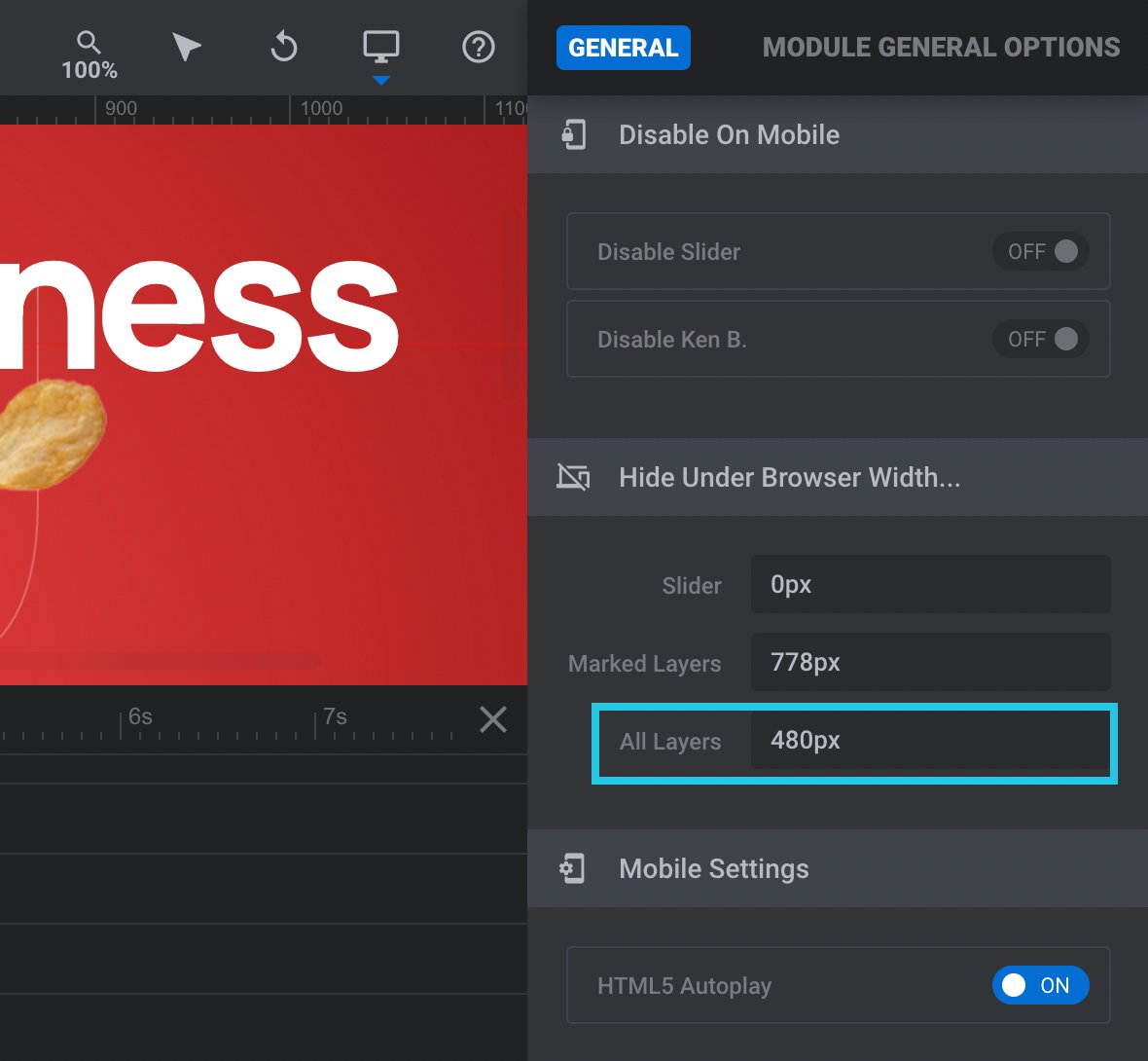
Setting Layer Hiding Widths
If you hide marked layers and all layers, you’ll need to specify the width at which you want that hiding to kick in. Both options are in the same part of the module editor, so we’ll look at them at once.
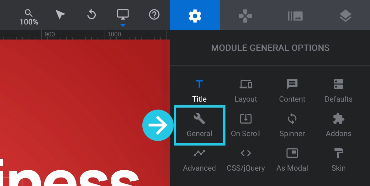
Go to the Module General Options tab on the right sidebar:

Go to the General sub-section:
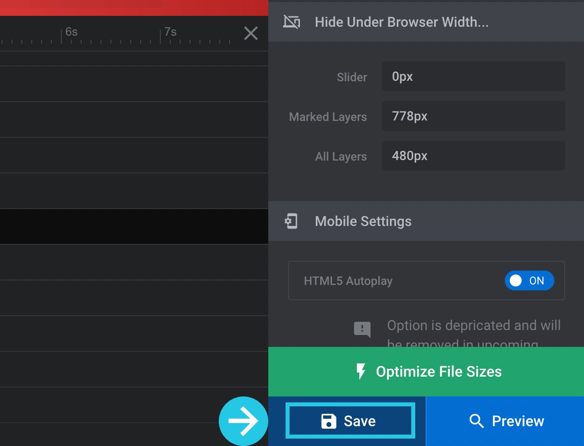
Scroll down to the Hide Under Browser Width panel:

If you want to hide marked layers, input the width under which those layers should be hidden in the Marked Layers option:
And if you want to hide all layers, input the width under which they should be hidden in the All Layers option:
Click on the Save button:
Show Layers if Mouse Over Slide
It is possible to set layers to be hidden by default and then have them reveal themselves only when a mouse hovers over the slide. This feature allows you to add an element of surprise and interactivity to your sliders. By hiding the layers initially, you can create a sense of anticipation and encourage users to engage with the content by hovering their mouse over the slide. This technique adds an extra layer of engagement and enhances the overall user experience of your sliders.
When a visitor hovers and triggers the layer’s appearance, it will use its IN animation. When the mouse has moved away again, the layer will animate out using its OUT animation.
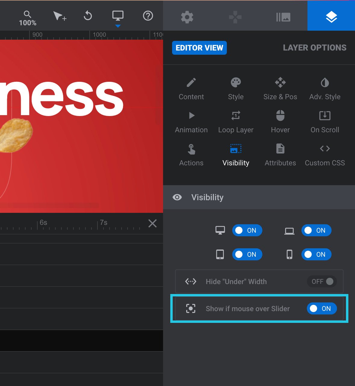
To use this technique, select a layer from the timeline or the canvas:
Head to the Layer Options tab from the sidebar:
Go to the Visibility sub-section:
Go to the Visibility panel:
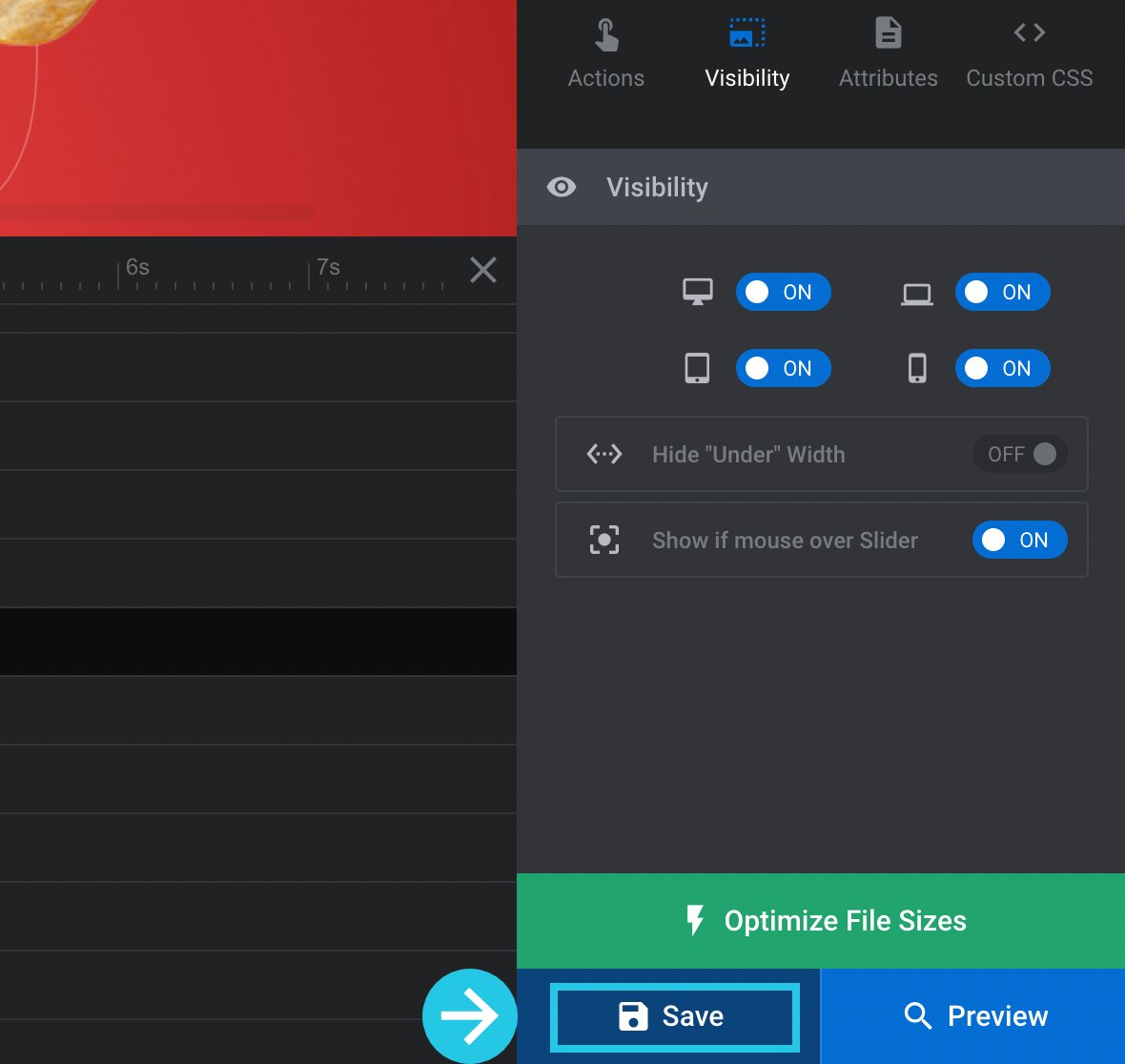
Toggle the Show if mouse over the Slider option to ON:
Click on the Save button:
By effectively controlling the visibility of elements in Slider Revolution, you can elevate the engagement and user-friendliness of your slider. With the powerful Visibility settings, along with the Show on and Hide on settings, you have the ability to fine-tune how your slider is displayed across various devices and in different scenarios. This level of control empowers you to deliver a consistent and tailored experience to your audience, ensuring that your slider showcases the desired content precisely as intended. Whether it’s hiding specific elements on certain devices or selectively revealing elements based on user interactions, Slider Revolution enables you to create a truly captivating and seamless slider experience.
Contact Our Awesome Support
If you need assistance or have any questions regarding the elements’ visibility in Slider Revolution, our support team is here to help. You can reach out to us by opening a ticket or sending an email to [email protected].


How to hide or remove the navigation menu ‘RVSLDR, FOCUS, PERSPECTIVE, POWER, BUY NOW’ from Focus Parallax template slide module.
Hi Paul,
for help on certain details of Slider templates I recommend talking to our experts at https://support.sliderrevolution.com .
Cheers, Dirk @ Slider Revolution
Hello and thanks for the very well written post.
Unfortunately I could not find the answer I was looking for, which admittedly is quite specific.
I use a separate image as layer for each device size (desktop, laptop, tablet and mobile). Under Visibility I defined that each image shall be visible only on the corresponding screen resolution range. So far it works well.
However according to the network tab of my browser’s dev tools all four images are loaded regardless of the screen resolution which might impair the performance.
Is there any solution for that?
Here a snapshot out of dev tools: [Slider-Revolution-Network-Tab.png](https://postimg.cc/N2H0PkkV). _D, _L, _T and _M are the different image sizes.
P.S. I received the plugin bundled with my WoodMart theme, so that I cannot open a ticket directly.
Hello,
thanks for contacting us! Your request requires one of our support agents to have a closer look.
In order to give our clients the best support possible, we are having a support ticket system reachable via the link below.
Please use it for your upcoming questions concerning one of our products. This will guarantee the fastest answer possible. Support requests here cannot be answered unfortunately. Thank you!
Please use our ticket systems over at:
https://support.sliderrevolution.com
Cheers Dirk @ Slider Revolution
Hello Dirk,
thanks for you reply. I was aware of the ticket support system, however I am not able to create there a ticket as my Slider Revolution came bundled with my theme. From what I see only customers who purchased directly have access. I hope this does not mean theme customers are left out without support.
Cheers.
Hi,
as you have received the free version of our plugin bundled with a theme, there are two options:
1. Please contact the theme author for support as she is responsible for supporting all bundled plugins https://help.market.envato.com/hc/en-us/articles/213762463-Bundled-Plugins#support , same goes for plugin updates https://help.market.envato.com/hc/en-us/articles/213762463-Bundled-Plugins#update
2. If you need direct support from us or live updates, you can purchase a plugin license at a great price directly from us here: https://www.sliderrevolution.com/pricing
The license key you receive will allow you to submit a ticket to our support system https://support.sliderrevolution.com where we can look into this for you.
Also, as a premium member, you will receive the benefits listed here https://www.sliderrevolution.com/premium-slider-revolution/
Cheers, Dirk @ Slider Revolution
i had a picture in the slide background, and i just want to remove that picture from the slide background, suddenly there is no solution for this !!!!!!!!!!!!!!!!!!!!!!!!!!!!
Hello,
I’m sorry to hear you’re having difficulties with the slide background. To remove a picture from the slide background in Slider Revolution:
Open the specific slide where the image is set as the background.
In the “Slide Background” section, you should see the image you’ve set.
Right next to the image, there should be an “X” or “Remove” button. Click on it.
This will remove the image from the slide background.
If you’re not seeing these options or if you’re encountering any issues, please provide a screenshot or any additional details, and we’ll be happy to assist you further. Your satisfaction is important to us, and we’re here to help!
Please raise a ticket over at https://support.sliderrevolution.com , thanks.
Best regards, Dirk @ Slider Revolution