
Table of Contents
Simple but Powerful Layout Drivers
When you open up Slider Revolution 6.6 for the first time, the new layout creation opportunities might not immediately jump out at you. But be sure to look closer, because these seemingly small changes unlock a mighty range of layout design pathways!
Let’s see what’s new, and why it’s going to make a big difference to your designs.
New Content Behavior Panel
A new panel named Content Behavior can now be found in the Layer Options tab, Content sub-section for any layer nested inside a Row/Column or Group:
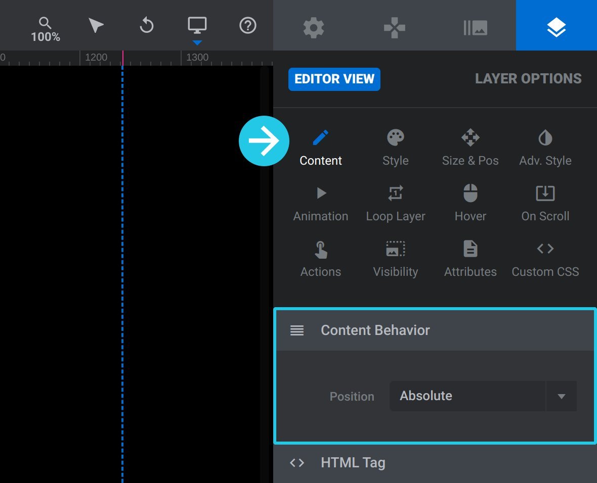
This is also the panel that will house the powerful new layout options we’ll talk about in the next section.
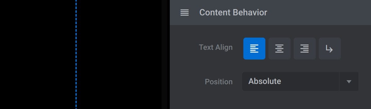
For all layers incorporating text, the Text Align settings have been moved into the new Content Behavior panel as well:
New Position “Absolute” or “Relative” Option
When a layer is nested inside a Row/Column or Group a new option named Position will appear in the Content Behavior panel:
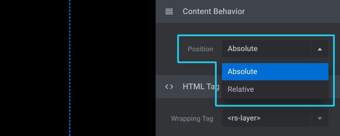
It’s this simple option that is going to level up your layout creation game, because it allows you to choose between Absolute and Relative positioning for any layer in any group or column.
We’ll have some examples of how and why this matters in just a moment. And if you’re interested in the technical underpinnings of how absolute and relative positioning work in browsers, check out the the related MDN page: https://developer.mozilla.org/en-US/docs/Web/CSS/position
If the Position option is set to Relative additional options also appear. Those options are Display, Float, Clear and the Add LineBreak Before & Add LineBreak After buttons:
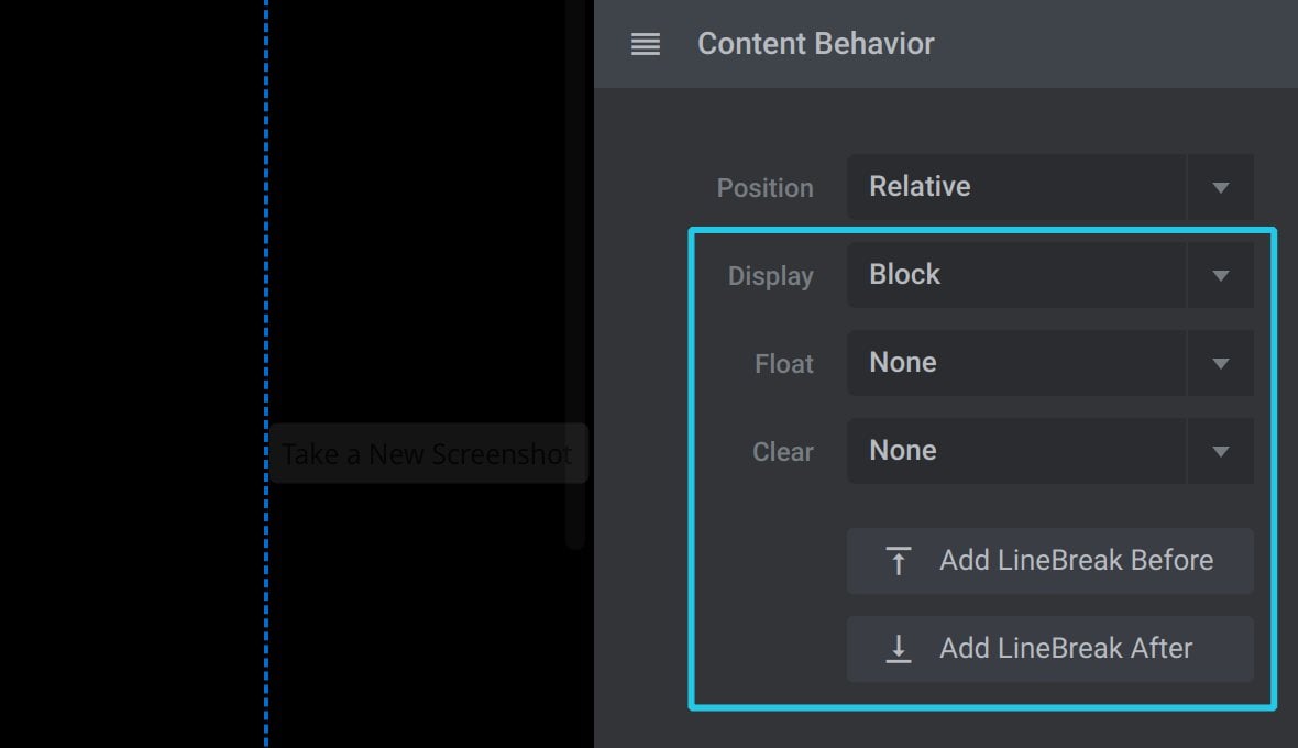
Note: The above options were formerly located in the Display Mode in Column panel, which previously appeared on layers nested in columns. That panel is now removed.
New Layout Possibilities in Rows and Groups
Previously, layers nested in Rows could not use absolute positioning, and layers nested in Groups could not use relative positioning. Now, absolute and relative positioning is available in both cases.
This means new types of layouts can be created in both Rows and Groups that were previously not possible.
New Group Layout Possibilities
Layers nested in Groups can now use relative positioning. This makes available the Display, Float, Clear options and the Add LineBreak Before & Add LineBreak After buttons. Those options in turn add all kinds of dynamic new possibilities for layout creation inside Group layers.
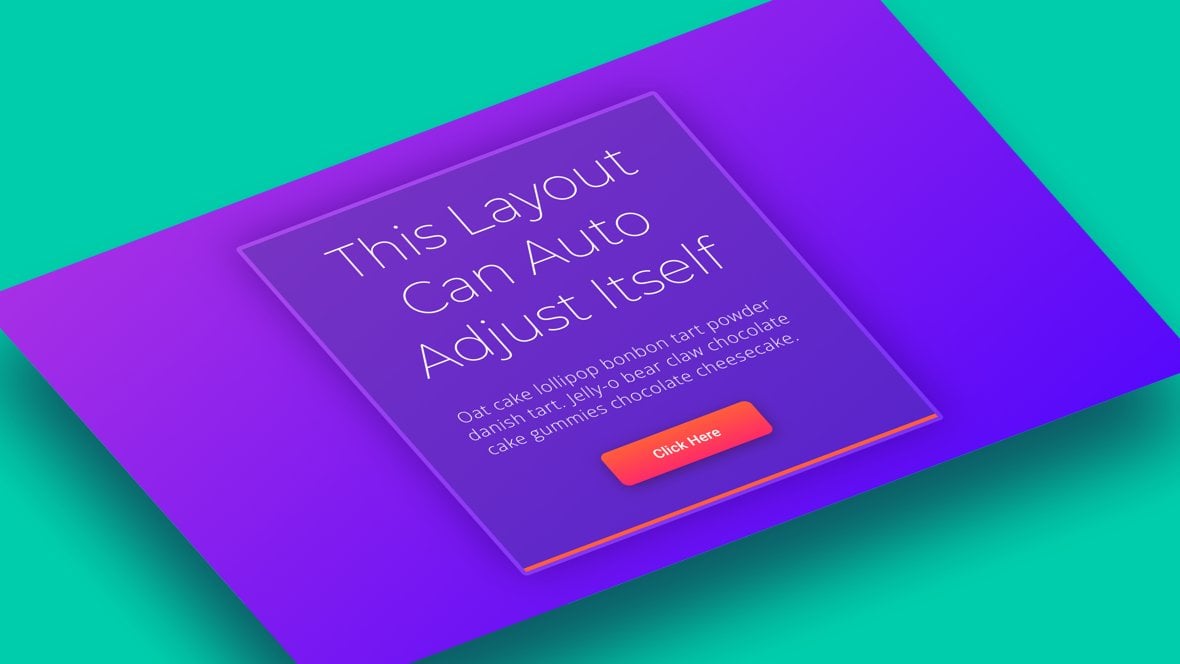
For example, this heading has its Position option set to Relative, as do the layers below it. Because of this it doesn’t matter how many lines of text are in the heading, the layers below will adjust their positions in the layout automatically:
And in the example below, these smaller groups nested inside a larger group have their Display option set to Inline-Block, meaning they can automatically position themselves in a row without needing to use a Row layer, and without needing to manually position anything:
And this also means you can keep adding duplicates of these items and they will arrange themselves into new rows automatically:
New Row Layout Possibilities
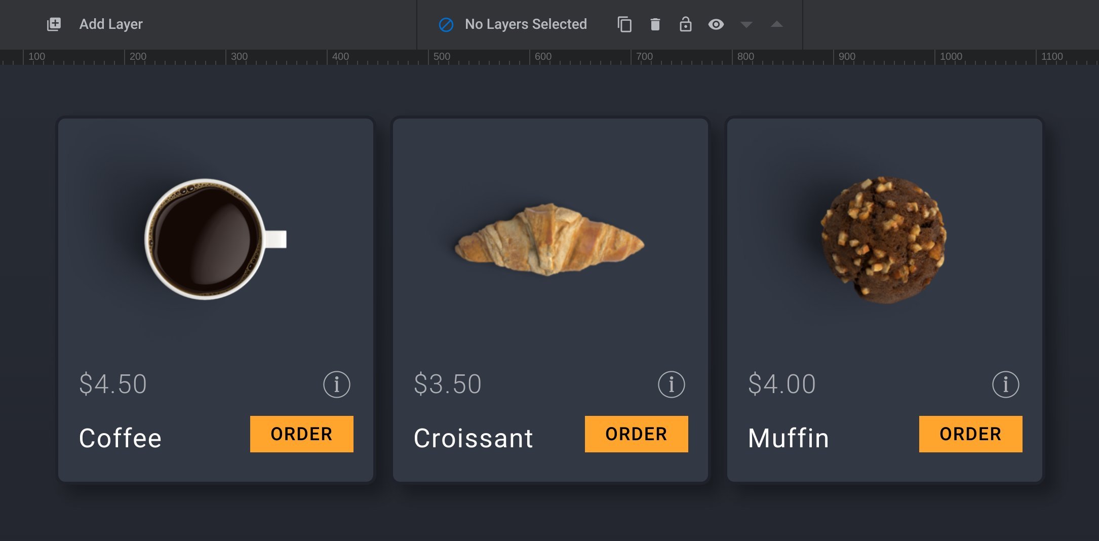
In Rows, layers can now use absolute positioning. This means you can easily take layers out of the usual flow of content in the column, controlling their position and placing them in front of or behind other layers.
For example, in the columns pictured below, the large bold numbers are absolutely positioned to the bottom right. They also also have negative bottom positions that pull them down further, and as such they can sit in front of blue border surrounding the text content:
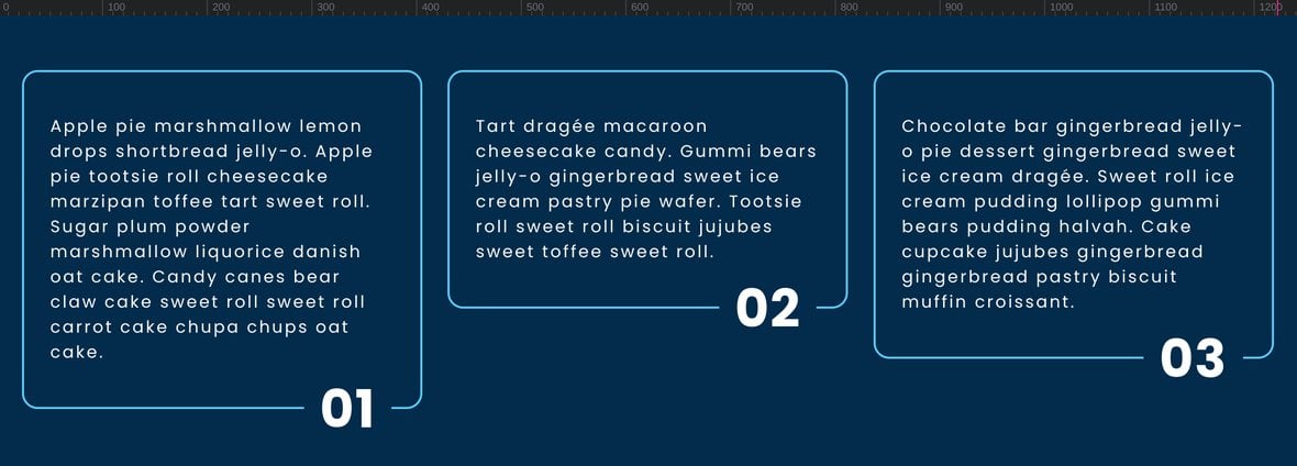
Because of the use of absolute positioning it doesn’t matter what the height of the text box is, the numbers automatically adjust their position and stay pinned to the bottom right corner:
Group Header Item Path
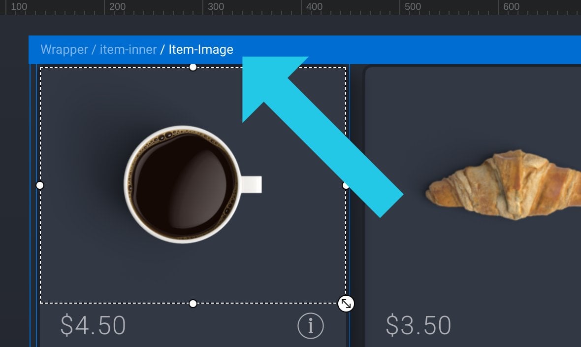
When you’re working on layouts in Groups, you’ll now find navigating nested items a bit easier. That’s because headers now show the path to any item you’re hovering over, or that you’ve selected from the canvas:
And There’s Plenty More!
The best way to summarise why these new features are so powerful is you can now:
- Make more sophisticated layouts
- With less hands-on time
- That automatically adjust themselves
- And are easier to change and update
If you’d like to dig through the examples we showed above and see how everything is made, click here to download the module that contains them.
In the interests of keeping this article short we’ve kept it to just a couple of examples of the new features in action. But there are plenty more examples to be had, and layout methods to be taken advantage of.
Keep an eye out for more articles and tutorials that dig further into this in the future.
We hope you enjoy working with Slider Revolution 6.6 as much as we do!
What’s Next?
Already own a Slider Revolution license?
Learn how to update to 6.6 here.
Looking to buy a Slider Revolution license?
And check out our brand new templates for a showcase of the new layout opportunities in Slider Revolution 6.6.
Give your website the revolution treatment today!


