
Picture this: a virtual newsstand, brimming with stories, where design dictates destiny. In the digital age, a news website’s design can spell the difference between a fly-by scroll and a deep-dive reading session.
We’re navigating an era where the presentation of news breathes life into the pixels of our screens.
Tap into a resource crafted to unravel the secrets of news website design examples worth their salt.
As you peel back the layers of each meticulously curated example, you’ll uncover the core principles that make a news portal not just functional, but intuitive. Think seamless navigation, responsive layouts, and the subtle dance of typography that guides the eye.
This isn’t a mere show-and-tell. It’s a deep dive into UX mechanics, mobile-friendly features, and the silent power of visual hierarchy.
By the end, you’ll walk away with actionable insights on crafting digital spaces where stories don’t just live—they thrive.
From grid-based frameworks to CMS platforms, each component plays its part.
Drill down on accessibility, pivot through multimedia integration, and ensure every page speed optimization technique is in your arsenal. Let’s set the stage for your content to shine.
News Website Design Examples
CBS News
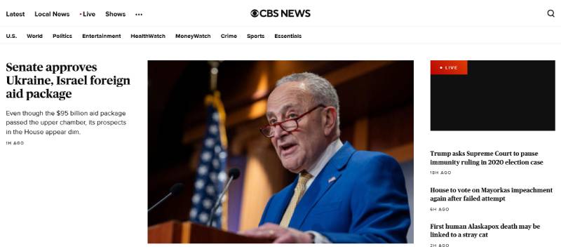
Step right up to CBS News, folks! An online stage where the design’s as fresh as the stories. Picture this: a homepage decked out in red, white, and blue – screams ‘Murica, right? But, hold the phone, it’s not just patriotic fluff. It’s a responsive layout packed with top stories like a Thanksgiving turkey.
You’ve got featured articles sliding across the screen, grabbing your eyeballs with that “you-can’t-miss-this” vibe. And the menu? It’s slicker than a whistle. With a just a tap, you’re diving into politics, or maybe the “feel-goods” of human interest pieces. CBS News keeps it clean, keeps it snappy, and man, it’s mobile-friendly. You could be riding a rollercoaster and still not miss a beat on the news train.
News Magazine – Slider Template
A news magazine slider featuring customizable images, videos, and text for easy personalization!
The Hill
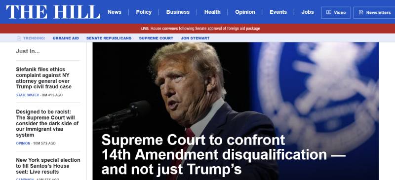
Ever walk up Capitol Hill? Yeah, neither have I – but The Hill’s website gives you that power-walking-politico feel without breaking a sweat. It’s serious business here; a typography choice that’s as sharp as a senator’s suit, and a grid layout that lays out the political landscape, inviting you to jump right in.
Every story has its place in this digital congress. They pop out with custom graphics that could make any statistician blush. The Hill’s got content delivery down to a science with their content management system; it’s a seamless stream of the nation’s pulse. What’s the cherry on top? An accessible standard compliance that ensures everyone’s got a front-row seat to democracy.
Bloomberg
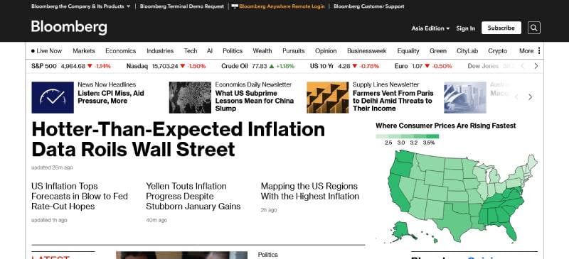
Oh, Bloomberg, you titan of finance news. Your website’s got that Wall Street swagger, a responsive layout with all the bells and whistles of a stock ticker galore. It’s like walking into a virtual trading floor – sleek, professional, and means business.
The user interface alone could make a newbie feel like a seasoned trader. And folks, the speed at which this site updates? It’s like watching live trading, complete with data visualization tools that dance with each market shift. They don’t just dish out the fiscal news; they serve it up on a data-driven silver platter, making sure you’re tuned in to the global economy with just a swipe and a tap on your phone – smooth as a billionaire’s handshake.
The Intercept
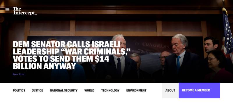
The Intercept? Now that’s a website slinging stories with a side of grit. It’s a deep-dive into investigative journalism that’s not afraid to get its hands dirty. Its design? Bold. Its message? Bolder. With a monochromatic color scheme that screams noir thriller, reading through this site is like flipping through a detective’s notebook.
Fact-finding is the game, and The Intercept plays it with a user experience that hones in on the search for truth. Cluttered design is a no-show here; instead, it’s all about content that packs a punch, loading at the speed of a whistleblower’s tip. Here, the social media widgets do the heavy lifting, making sure these powerhouse articles are just a click away from sparking debates and shares across the digital universe.
The Times
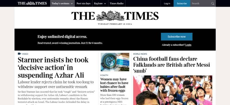
I’ll cut to the chase: The Times isn’t just any ol’ news rack. It’s got that heritage print vibe, spruced up for the digital age with a typography choice that nods to its history while winking at the modern reader. The navigation menu? Oh, it’s like having tea with the queen – classy, organized, and downright sophisticated.
Interactive media elements grace its pages, because hey, it’s not the 18th century – we’re telling stories in 4K now. The Times does this cool thing where it marries old-world charm with front-end development that’s ahead of its time.
The Next Web
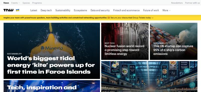
Get this: The Next Web is like that cool tech guru friend who knows gadgets better than their own birthday. Their design is a Silicon Valley dream – high-tech, user-friendly, and it screams innovation.
No coding degree needed, either. They got engagement metrics and interactive media elements, making reading about the latest tech trend as easy as streaming your favorite tune. It’s got that start-up buzz, with articles that’ll unlock your inner geek. And, oh boy, the SEO-optimized design means you’ll find what you’re after before you can say “quantum computing.”
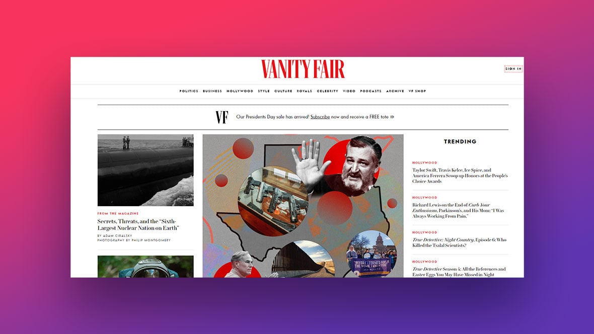
Vanity Fair
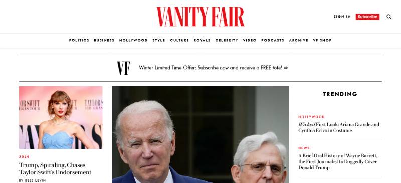
Vanity Fair is where design struts down the runway, darling. It’s like a VIP pass to the world of glitz, glamour, and the arts. Their high-resolution imagery and elegant typography are as fancy as a Met Gala gown.
This is the digital storytelling hot-spot, laying out the red carpet for you to sashay through Hollywood scoops and high society tales. And that social media widget? It’s your backstage pass, bringing the VIP buzz to your social circle with just a tap, all wrapped up in a grid layout as curated as a museum exhibit.
BBC
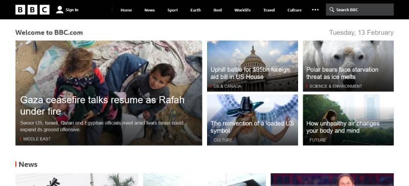
Cheerio! Here’s the BBC, offering you a platter of global news with that oh-so-British poise. This site’s got class – typography sharp as the Queen’s English, and a layout that’s like having a high tea with information.
Their navigation menu delivers everything from Auntie Beeb’s famous broadcasting right to the palm of your hand. And mate, it’s all accessible – doesn’t matter if you’re from London or Lahore; the BBC’s making sure you’re in the global loop. The user interface is as polished as a Beefeater’s boots. Just a click and you’re off on a world tour of news, culture, and tea-time-worthy stories.
Washington Post
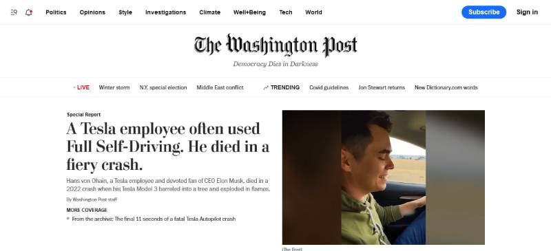
The Washington Post? Now here’s a digital broadsheet that’s the talk of the town. These folks weave a design that hooks you headline after headline with Pulitzer-winning flair. It’s like they’ve got the typography choices down to an art form – conveying trust and authority as only The Post can.
They’ve mastered the elegant dance of SEO-optimized design with a user experience that keeps you scrolling through the corridors of power. Whether it’s breaking scoops or deep dives, it’s wrapped in a responsive layout that adapts faster than politicians change stance. And the multimedia integration? It’s like a front-row seat to history in the making, straight on your screen.
Forbes
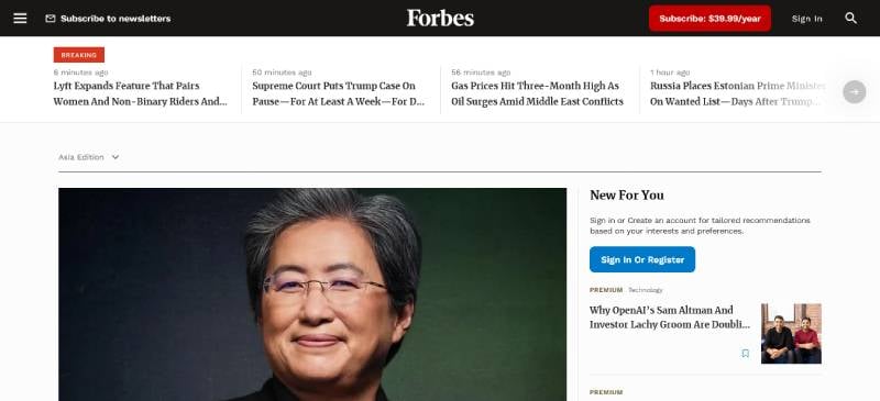
Forbes, folks, is where money talks – and its website? It’s a crisp, tailored suit in the world of corporate buzz. The design talks shop with a clean layout, bold font choices, and a user experience that means business.
I dig that their site’s serving up insider info with analytics tracking, giving you the skinny on who’s up, who’s down, and who’s making bank. It’s a smooth ride through the echelons of profit and power. Forbes’ take on web content accessibility guidelines shows they’re not just about dollars – they want every Tom, Dick, and Harriet reading along, no fuss.
Huffpost
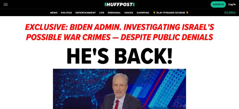
Alright, let’s chat Huffpost. This news hub? It paints outside the lines – it’s bold, unapologetic, and it’s got a color scheme that pops louder than bubblegum. It’s crafting a user experience that makes scrolling through news as comfy as your fav sweatpants.
Huffpost’s got front-end development that’s buddy-buddy with every device – it’s all about quick bites of news on the fly. Plus, they’re savvy with SEO entities, so tapping in for a quick read is easy-peasy. This site doesn’t just report the news; it jumps out of the screen, takes your hand, and says, “Let’s dive in together!”
NYT
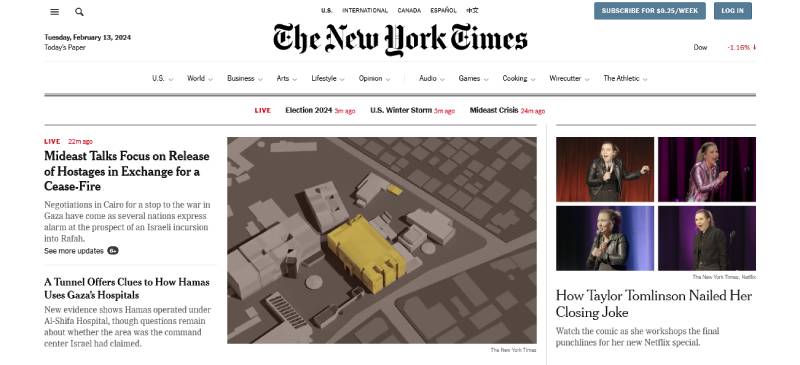
The NYT is not just a newspaper; it’s an institution, and its website design? Pure class with a glass of Chardonnay. Expect a typography choice that’s as timeless as New York City skyline views. There’s an unwavering commitment to high-grade journalism, artfully presented in a digital format.
Every pixel on the NYT’s site is handpicked to deliver a user experience smoother than a ride in a yellow cab. And their content management system makes navigating the vast ocean of articles easier than finding your favorite bagel spot. If journalism were a symphony, NYT’s SEO-optimized design is the maestro conductor, making sure each story hits the right note on your feed.
NBC News
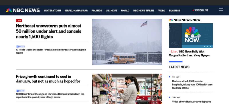
NBC News swings in with a design that’s as crisp as a live broadcast. With a layout that lays out the day’s happenings, you’re always in sync with the world’s heartbeat. Typography isn’t just print; here, it’s like a newscaster’s voice, trustworthy and authoritative.
Wrapped in a responsive design, the site ensures your journey through current events is hitch-free, regardless of the device. And hat tip to their use of social media widgets; it makes sharing that heartfelt story or groundbreaking report as reflexive as applauding a killer SNL punchline.
A.P. News
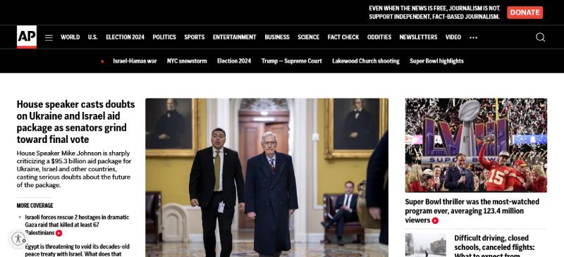
A.P. News is straight-up news with no frills. Here’s a design that’s as dependable as morning coffee. Their color scheme is subtle, letting the content be the siren that lures you in, and the content is king.
Their user: experience: interface? It’s the real deal, providing unbiased reports to the masses. The site’s navigation menu is like a compass pointing you towards the headlines of the hour. And even with the nonstop inflow of news, their tech makes sure you won’t hit a snag when you’re in need of your info fix.
Los Angeles Times
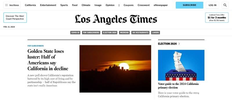
Ah, the Los Angeles Times, a site that’s got that SoCal cool with a dash of Hollywood drama. The layout sashays smoothly across your screen, now that’s what you’d call web development with style. It’s got a content delivery network that’s all turbocharged, bringing the City of Angels’ stories without any Hollywood delays.
The interactive media elements are like a palm tree-lined tour of diverse narratives, showcasing the melting pot that is LA. Reading the LA Times online? It’s like sunbathing on Malibu beach, with every headline soaking in the warmth of in-depth journalism.
Time
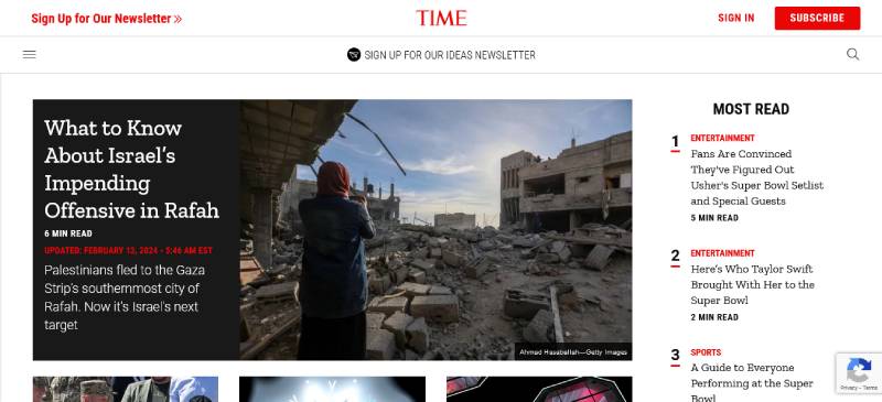
Time magazine’s online portal? It’s timeless. The design takes a leaf from its print legacy, sprucing it with digital flair. Imagine HD imagery and video content as striking as their iconic covers, all tailored within a responsive layout.
Beyond the trail-blazing visuals, there’s a navigation menu that ushers you into a realm of stories that shape our world. With Time, you’re traveling through articles at the speed of light, thanks to a grid layout that guides you with ease, despite the weighty content.
Fox News
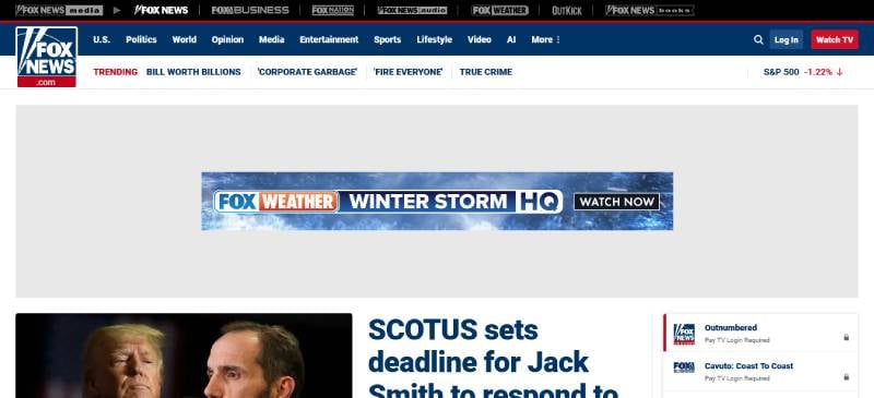
Got a minute for Fox News? Because here’s a site that doesn’t dabble in maybes – it’s conviction with a capital ‘C’. The design lays it out with bold font choices and an American palette that’s got patriotism written all over it.
Fox News flaunts an SEO-optimized design that ensures you won’t miss a beat in the political drumline. You land on the site and bam – top stories, breaking news, all the sound bites right there in a user-friendly interface that’s as straightforward as it gets.
FAQ On News Website Design Examples
What elements are crucial for a news website design?
Let’s dive straight in. A news website needs to be user-friendly and responsive, adapting smoothly to various devices. Navigation should be intuitive, guiding readers through the sea of information with ease.
Remember, visual hierarchy is key—so leverage typography and layout to highlight important content. Content should load at lightning speed, and don’t forget accessibility standards to reach a wider audience.
How does color impact news website design?
Color is the silent storyteller. It sets the tone of your news platform, invoking emotions and guiding user behavior. Stick with a palette that aligns with your brand and enhances readability. Contrasts are your ally—think black text on a white background for that crisp, clear edge.
What role does typography play in news website layouts?
Typography in a news website is more than just fonts—it’s about legibility and setting the right pace for readers. Choose typefaces that balance personality with clarity.
Headlines ought to be punchy and body text easily digestible. Consistency is vital across the platform to maintain a professional look and feel.
Why is mobile responsiveness essential in news website design?
Here’s the scoop: more people access news on mobile than ever before. A mobile-friendly news site ensures content looks sharp on tiny screens, with touch-friendly interfaces and fast loading times.
It’s not just about aesthetics; it’s about being accessible anytime, anywhere, on any device.
What makes a news website’s user interface effective?
An effective UI boils down to simplicity and intuition. Think minimal clutter, clear CTAs, and structured menus.
Every element, from the breaking news ticker to the comment section, should ease the user journey, not complicate it. Users should feel in control, with information readily available at their fingertips.
How does page speed optimization benefit a news website?
Ever clicked away from a site that took ages to load? Ensure your readers never feel that. Faster pages mean happier visitors and potentially more of them sticking around. This can lead to higher engagement rates, better SEO rankings, and an overall boost in credibility.
Are multimedia elements necessary in news website design?
Absolutely! In an era of visual culture, integrating multimedia—like videos and images—within your news content can captivate and engage readers more so than text alone. It’s about striking a balance: enough multimedia to enrich the story, not overwhelm it.
How important is accessibility in online news platforms?
Massively important. Everyone deserves equal access to information. Complying with accessibility standards not only broadens your reach but also reflects on your brand’s inclusivity.
Screen reader compatibility, alternative text for images, and captioning for videos—it all counts towards an accessible site.
Can SEO influence the design of a news website?
You bet it can. Ever heard of SEO-friendly design elements? These are built to appeal not just to readers but also to search engines crawling your site. From headlines to HTML5 markup, the way a news site is designed can significantly impact its visibility online.
What’s the trend in news website designs for the upcoming year?
Trends point towards minimalism and personalization. Readers want clean, user-centric designs that prioritize content and offer a tailored experience.
Anticipate more AI and machine learning integration to craft those personal touches. Watch for virtual reality features to gain traction, making stories more immersive.
Conclusion
So, we’ve ventured through a gallery of news website design examples, each a blueprint of innovation and savvy design ingenuity. You’ve witnessed how a harmonious fusion of typography, visual hierarchy, and responsive layouts create more than just a website—they craft an experience.
Let’s not forget the takeaways, etched in pixel-perfect precision:
- User-centric interfaces always come out on top.
- Mobile responsiveness isn’t just a feature; it’s a necessity.
- Accessibility broadens horizons, smashing barriers.
- The silent pulse of page speed optimization keeps readers engaged.
Whether it’s the subtle lures of color schemes or the smart integration of SEO strategies, the culmination of these elements doesn’t just sing—it soars. Now it’s your turn. Harness these insights. Mold them. And watch as your next news website project takes flight, becoming an example others will bookmark for inspiration.
If you liked this article about news website design, you should check out these articles also:
- Websites with Video Background That Integrate It Properly
- Amazing homepage slider examples from modern websites
- The Best Designed Parallax Scrolling Websites (108 Examples)


