
Imagine painting a masterpiece, but your canvas stretches from a pocket-sized screen to a billboard. CSS frameworks are the brushes and colors in the world of web design that make such versatile art possible.
In the ever-evolving landscape of the internet, these frameworks are non-negotiable tools for crafting websites that are not just attractive but smartly responsive and highly functional.
Dive into the depths of front-end development, where every pixel matters and every second of loading time counts. This article will unlock the secret chests of CSS frameworks—from Bootstrap’s might to Tailwind CSS’s finesse.
You’ll wade through the grid systems that keep layouts crisp, the UI toolkits that make designs come alive, and the preprocessors that fine-tune the aesthetics to the last semicolon.
By the final punctuation mark, expect to have grasped the transformative power of the right framework.
We’ll dissect how SASS ties into the picture, explore responsive web design’s cornerstones, and unveil the simplicity behind Flexbox. It’s a journey through the spectrum of web creativity, tailored for curious minds set on mastering the web’s canvas.
The Best CSS Frameworks
| Framework | Preprocessor | Components | Customization |
|---|---|---|---|
| Bootstrap | SASS | Extensive | High |
| Tailwind CSS | – | Minimal | Very High |
| Foundation | SASS | Extensive | High |
| Bulma | – | Moderate | Moderate |
| Skeleton | – | Minimal | Low |
| Daisy UI | – | Extensive | High |
| Semantic UI | LESS | Extensive | High |
| Materialize | SASS | Moderate | Moderate |
| UIkit | LESS, SASS | Moderate | Moderate |
| Ant Design | LESS | Extensive | High |
| Primer | SASS | Extensive | Moderate |
| Tachyons | – | None | Low |
| Pure CSS | – | Minimal | Low |
| Material Design Lite | – | Moderate | Moderate |
| Spectre.css | – | Moderate | Moderate |
| Milligram | SASS | Minimal | Low |
| Water.css | – | None | None |
| Vanilla | – | Moderate | Low |
Bootstrap
Kickstart your project with Bootstrap, the one-stop-shop for web design. It’s a comprehensive toolkit for folks looking to build responsive and mobile-first websites confidently. It comes loaded with ready-to-use components—from navigation bars to modals—all customizable to fit your design needs.
Best Features:
- Responsive grid system
- Pre-styled components
- Customizable via SASS
- Extensive documentation and community support
What we like about it: Bootstrap’s strongest suit is its vast array of UI components that can be mixed and matched, drastically reducing development time.
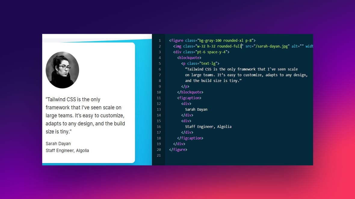
Tailwind CSS
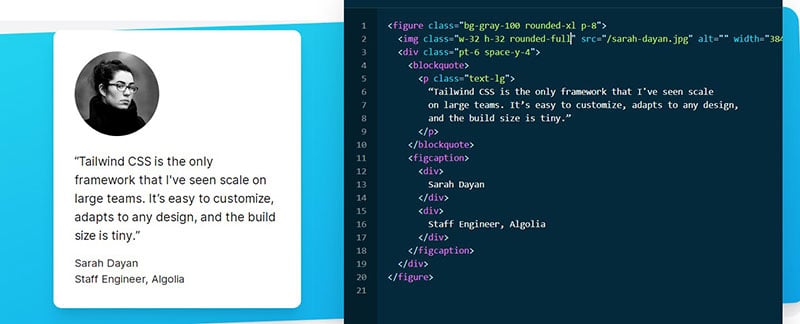
Tailwind CSS is for the creative souls who love to tinker until perfection is achieved. It’s a utility-first framework, which means you style elements by stringing together pre-defined classes directly in your HTML.
Best Features:
- Utility-first approach
- Highly customizable
- Responsive design-friendly
- Growing community
What we like about it: With Tailwind CSS, you get the ultimate control over your layout without leaving your HTML, providing a seamless design workflow.
Foundation

Foundation is all about building beautiful, professional websites that look and feel fantastic across any device. With a mobile-first approach, it gives you a powerful grid, versatile navigation tools, and a bunch of other HTML, CSS, and JavaScript components.
Best Features:
- Mobile-first philosophy
- Advanced grid system
- Accessibility features
- A set of HTML templates
What we like about it: Foundation shines with its flexibility and smooth responsive features that cater to mobile devices superbly.
Bulma
Say hello to Bulma, your new CSS friend that champions simplicity with its purely CSS-based framework. It offers a clean syntax and is built with Flexbox for a sleek layout design, all without a single line of JavaScript.
Best Features:
- Flexbox-based
- Modern, clean design
- Easy-to-learn syntax
- Modular and lightweight
What we like about it: Bulma’s modern approach with Flexbox makes for a straight-up intuitive experience designing beautiful interfaces without the script bloat.
Skeleton
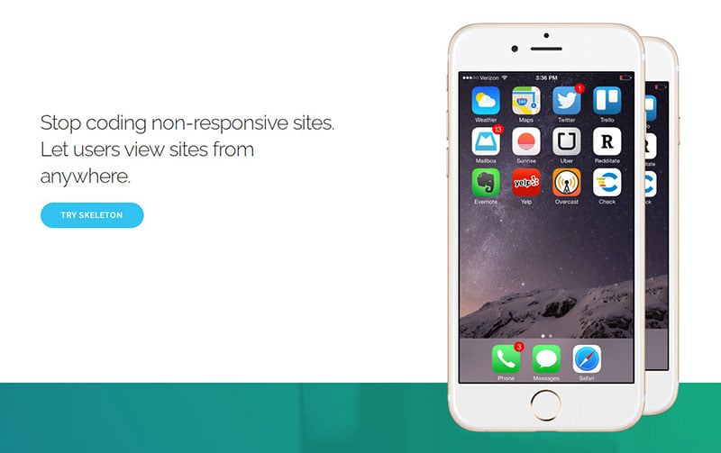
Skeleton is the minimalist’s dream, especially when you’re all for a lightweight structure to throw a small site or a quick prototype. It might not have bells and whistles, but this bare-bones framework packs enough punch to create mobile-friendly designs with ease.
Best Features:
- Ultra-lightweight
- Responsive boilerplate
- Simple to use
- Quick to start
What we like about it: The beauty of Skeleton lies in its simplicity, being extremely lightweight yet effectively meeting responsive design needs for simpler projects.
Daisy UI
Daisy UI takes your Tailwind CSS game to another level with its beautifully crafted UI components. It’s plug-and-play with Tailwind, adding a new dimension of aesthetic components that are ready to use and easy to customize.
Best Features:
- Integrates with Tailwind CSS
- Themeable components
- Rich set of elements
- Regular updates
What we like about it: Daisy UI’s superpower is its adaptability with Tailwind, giving you a creative edge with pre-made themes that are a breeze to tailor.
Semantic UI
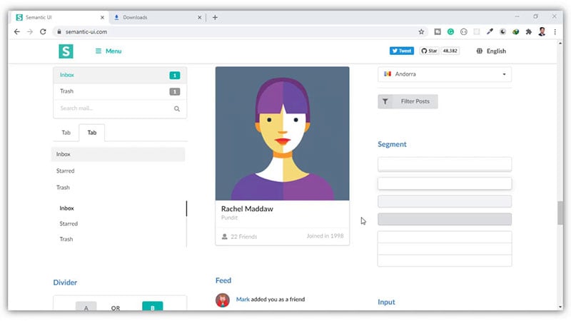
Semantic UI is about embracing meaning in your design, focusing on human-friendly HTML. It’s loaded with thoughtful components that align logically with their function. If you’re all about intuitive design, here’s your framework.
Best Features:
- Intuitive and expressive
- Theming capabilities
- Rich component library
- Integrated build tools
What we like about it: The framework’s readability stands out, making it easy for someone else to pick up your code and understand the layout at a glance.
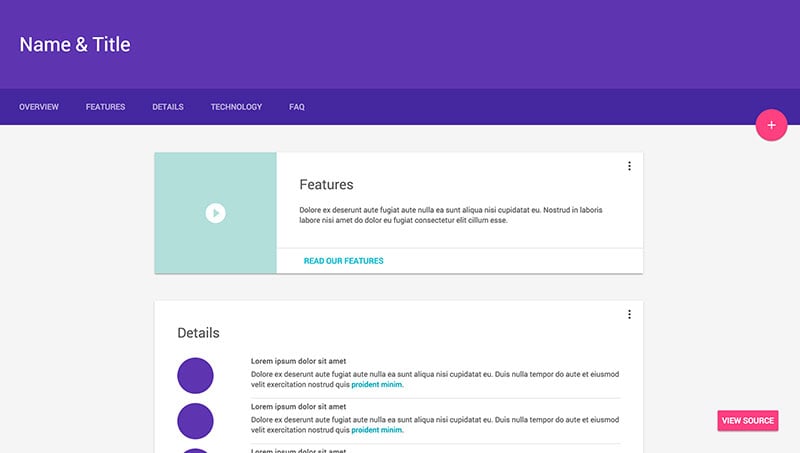
Materialize
Materialize whisks you into a world where design aligns with Google’s Material Design principles. If you’re after that modern, clean-cut look and a touch of elevation and depth in your UI, this is the framework to embrace.
Best Features:
- Material Design Standards
- Responsive design out-of-the-box
- Pre-built components
- Robust animation features
What we like about it: Materialize’s adherence to Material Design principles makes creating designs with depth and motion feel almost effortless.
UIkit

UIkit is where lightweight meets modular. It’s a comprehensive collection of small, responsive components that can be easily layered and combined for complex UIs. Plus, with LESS and SASS integration, customization is a walk in the park.
Best Features:
- Modular component system
- Customizable with LESS and SASS
- Lightweight and nimble
- Great animations
What we like about it: The modular nature of UIkit allows for piecing together a tailored UI without any excess baggage.
Ant Design
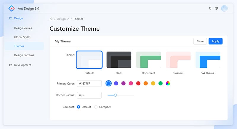
Dive into Ant Design for an enterprise-level framework that speaks the design language of high-grade applications. It’s informed by Chinese aesthetic and cultural sensibilities, making it ideal for projects seeking that edge.
Best Features:
- Enterprise-grade tools
- Extensive list of components
- Internationalization support
- Design-led philosophy
What we like about it: Ant Design stands out for its broad component coverage and extensive support for localization and internationalization, making it a go-to for global projects.
Primer
Primer comes straight from the corridors of GitHub, built to cater to the needs of complex web applications. It’s a CSS framework that takes into account web components, utility classes, and responsive design for a seamless developer experience.
Best Features:
- Developed by GitHub
- Component-based design
- Utility classes for spacing, color, and typography
- Robust documentation
What we like about it: Primer’s strong suit lies in its emphasis on a systematic approach to design with detailed guidelines and strong support from GitHub’s ecosystem.
Tachyons
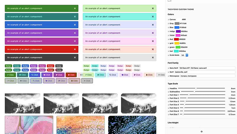
If lean, mean, and clean is your motto, Tachyons has you covered. This CSS toolkit offers functional styling that doesn’t weigh down your pages, making it perfect for performance-focused projects.
Best Features:
- Functional CSS
- Responsive mobile-first design
- Small file size for performance
- Clear documentation
What we like about it: Tachyons is all about speed, serving a design strategy that’s incredibly fast-loading and perfectly optimized for different devices.
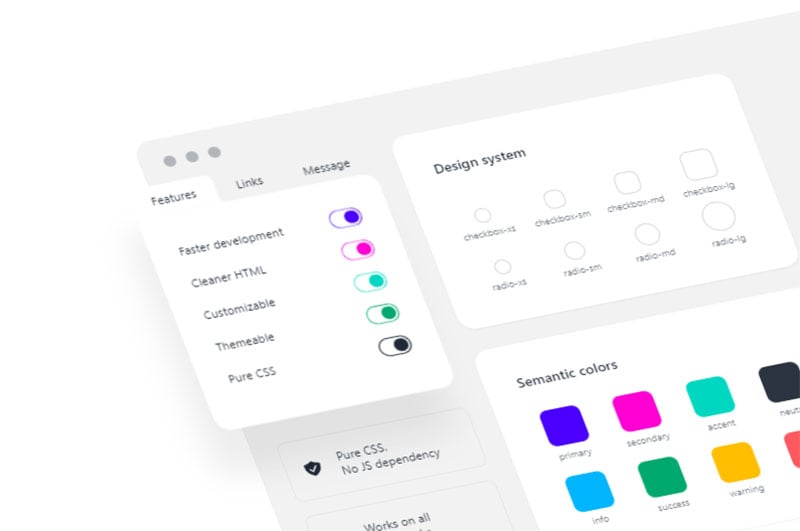
Pure (Pure CSS)
Pure CSS lives up to its name by offering pure simplicity. It’s a set of small, responsive CSS modules developed by Yahoo that can be utilized in any web project, focusing on being as minimal as it can be.
Best Features:
- Minimalist design
- Extremely lightweight
- Mobile-friendly
- Modular approach to CSS
What we like about it: Pure CSS mesmerizes with its modularity and feather-light footprint, proving that sometimes less is genuinely more.
Material Design Lite
For those who desire Google’s Material Design visuals but need something lighter than Materialize, MDL steps in. This framework enables classy designs and material aesthetics without heavy JavaScript dependencies.
Best Features:
- Lightweight Material Design
- Fewer dependencies
- Versatile color palette
- Easy to deploy
What we like about it: Material Design Lite’s major draw is its simplicity paired with the elegance of Material Design—it’s as lite as you can get without compromising style.
Spectre.css
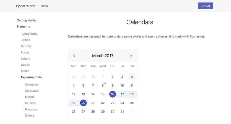
Step into Spectre.css, where modern features meet a lean approach. It’s a light framework but robust enough to create compelling UIs with its clean elements, responsive layout utilities, and beautiful typography.
Best Features:
- Light and responsive design
- Elegantly crafted elements
- Flexbox-based layout
- Extensive customization
What we like about it: What strikes most about Spectre.css is its balance—nimble yet sufficiently equipped to handle a variety of design challenges with poise.
Milligram

Milligram is for those moments when you crave speed and simplicity but don’t want to compromise on a sophisticated outcome. With its minimalist approach, you’ll find just the essentials here, making quick work of responsive designs.
Best Features:
- Minimal footprint
- SASS-based styling
- Modern grid system
- Typography focused
What we like about it: Milligram takes the cake with its no-nonsense approach, offering a fast, efficient, and typography-based framework for the straight shooters.
Water.css
For the times when you just need a drop of style, Water.css flows right in. It’s a classless framework meant for small projects or markdown files, instantly beautifying your content without you having to write a single class.
Best Features:
- Classless design
- Instant beautiful defaults
- Dark and light themes
- Zero-setup
What we like about it: The highlight of Water.css is its drop-and-go nature, effortlessly styling content beautifully with zero effort on part of the designer.
Vanilla
Vanilla is where robust meets reliability. It’s a base you can count on for creating clear, scalable, and appealing designs. Not too flashy but definitely not bland, making it a superb choice for straightforward projects.
Best Features:
- Clear, consistent design
- Built-in grid and spacing system
- Accessibility-minded
- Well-suited for scalability
What we like about it: What’s to love about Vanilla is its focus on clarity and consistency, ensuring your designs scale gracefully as your projects grow.
FAQ on these CSS Frameworks
Why Should I Use a CSS Framework?
It’s like having a Swiss Army knife for your web design projects. A CSS framework gives you a solid foundation, with pre-designed grids, UI components, and handy JavaScript integration. They save time, ensure consistency, and are fantastic for team collaboration.
What’s the Difference Between Bootstrap and Tailwind CSS?
Think of Bootstrap as the all-in-one kit—comes with predefined components, ready for use. Tailwind CSS, on the other hand, offers a “build-it-your-way” approach with utility classes. It’s about preference; Bootstrap for ease and Tailwind for granularity.
How Do CSS Frameworks Impact Responsive Design?
They’re a godsend! CSS frameworks come packed with a responsive grid system and media queries out of the box. They simplify creating fluid layouts that adjust smoothly across devices, from mobile phones to desktops.
Can I Customize CSS Frameworks?
Absolutely! While they offer out-of-the-box styles, tweaking is part of the game. You can override the default styles, harness preprocessors such as SASS or LESS, and tailor the framework to fit your brand’s unique aesthetic.
Are There Lightweight CSS Frameworks for Simple Projects?
For sure. You don’t always need the full arsenal. Lightweight options like Skeleton or Milligram offer the bare bones necessary to get the job done without weighing down your project.
How Do I Choose the Right CSS Framework for My Project?
Let’s break it down. Consider the size and complexity of your project, community support, documentation quality, and learning curve. Dive into the features—does the framework align with your design ethics, like mobile-first or atomic design principles?
What Are the Best Practices for Using CSS Frameworks?
Start by understanding the framework’s core concepts, like its grid system and UI components. Use its built-in classes effectively and avoid unnecessary overrides. Import only what you need to keep things light, and don’t shy away from using preprocessors for better organization and maintainability.
How Can CSS Frameworks Work Alongside Preprocessors Like SASS?
Frameworks and preprocessors, they’re peas in a pod. Many frameworks support SASS right off the bat. You can benefit from variables, mixins, and nesting, which make your CSS cleaner and more malleable. It boosts theming versatility and simplifies updates across the board.
What Are the SEO Benefits of Using a CSS Framework?
Think structure and speed. Search engines love well-organized content. CSS frameworks encourage semantic HTML with a consistent structure, making content easier to crawl. Plus, a well-implemented framework can improve page load speed, and we know search engines are all about that speed.
How Does a CSS Framework Affect Website Accessibility?
They can be a helping hand or a stumbling block—it’s all in how you use them. Many frameworks come with built-in accessibility features, but always add the necessary ARIA roles and ensure keyboard navigation is intact. Accessibility should be at the heart of your web design—framework or not.
Conclusion on these Frameworks
And just like that, we’ve reached the final curtain. CSS frameworks—they’re game changers, aren’t they? With a few scrolls and clicks, we navigated the grid systems that architect our digital spaces, the responsive designs that adapt like chameleons to screens, and the UI toolkits that make the virtual world a stunner.
- You saw the charm of Bootstrap, the utility belt that is Tailwind CSS, and the sleek minimalism of Skeleton.
- We dipped our toes in SASS’s more profound seas, wading through variables and mixins that make coding feel like proper 21st-century craftsmanship.
- Wrapped our brains around responsive web design, because who doesn’t want their creations looking sharp on any device?
Remember, these tools are just the beginning. Like any craft, the real magic happens when creativity, logic, and technology blend—a trifecta you now hold. Use them well, explore constantly, and make the web a richer, more inclusive canvas.
If you liked this article on CSS frameworks, you should check out this one with tips for creating a website design questionnaire.
We also wrote about other useful topics, like using a web design contract, the coolest fonts, and dummy text generator tools.


