
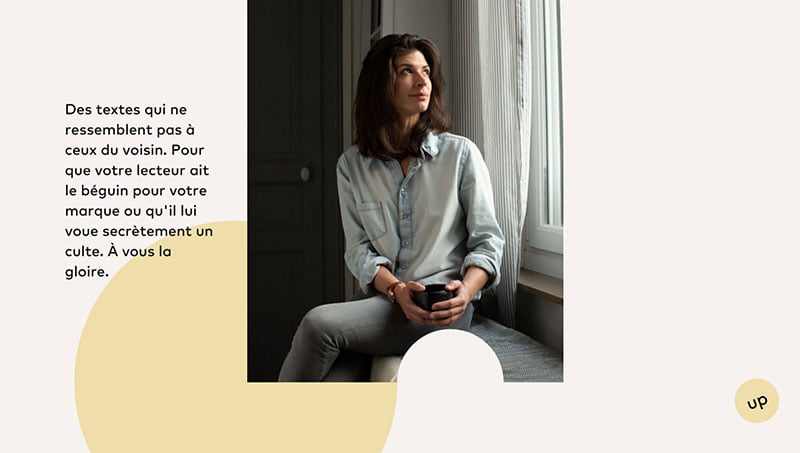
It is the details that differentiate a professionally built website from one that looks amateurish. Using the coolest fonts and paying attention to detail are factors you can easily adjust on your website, with no adverse impact on your site that could cost you time and resources.
A premium website needs to have not only excellent images and colors but also the fonts and typography need to be considered, both of which will appeal to your audience and assist you to build your brand.
For the vital role it plays in building brand perception, deciding your website’s font must be very important in your design process. Yet, finding the best fonts that engage your audience can be a chore. This article created by our team behind Slider Revolution will find the coolest fonts that will captivate the attention of the visitors to your site.
The Coolest Fonts to use to make your website interesting
LeverEdge
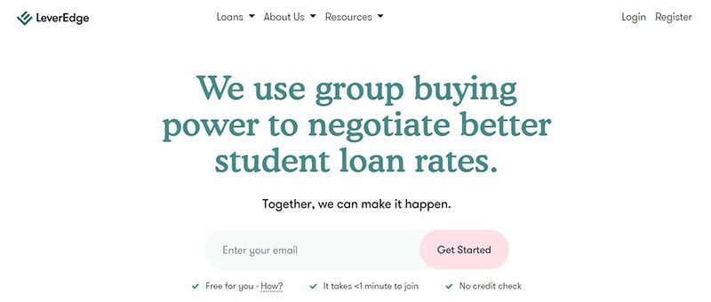
LeverEdge uses GT Walsheim Pro and Cooper.
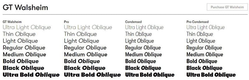
The typeface inspired by Otto Baumberger’s lettering is beneficial, including supporting the Cyrillic languages. GT Walsheim Pro gets its inspiration from the 1930s Swiss designer’s style.
Cooper is one of those mysterious typefaces. It originates from a complex riddle with hidden letterforms, whilst GT Walsheim is more precise.
Even though its letterform is secret, Cooper’s design will add to your collection of cool fonts.
Bruskowski
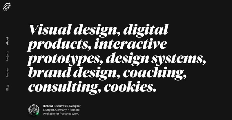
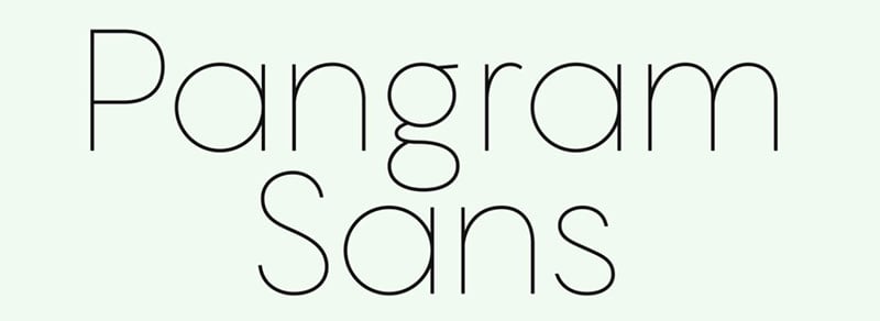
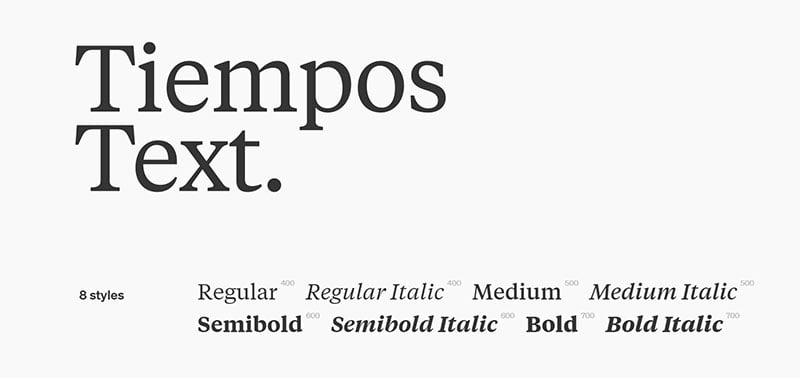
Bruskowski uses Pangram and Tiempos.
The spread of Pangram’s font weight starts from Extralight to a strong Black, obtaining inspiration from some great geometric typefaces.
The Tiempos Collection has built a hardworking reputation for itself. This editorial typography has over 2800 interesting fonts of meticulously imprinted crafted glyphs.

Bruskowski is one of those cool typefaces that will take your design to a different level.
Subvisual
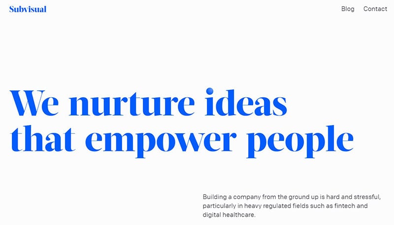
Subvisual uses Colfax and Acta Display.
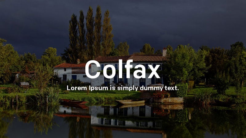
Colfax has four workhorse weights, evolving from a refined oval sans serif font. It also has two extreme display styles, and easily combines with several typefaces and can stand independently in any web design with no form of support required.
Acta Display first appeared in La Tercera – a Chilean newspaper in the year 2010. Coming from the fresh and clean Acta family, Subvisual is befitting for a newspaper setting.
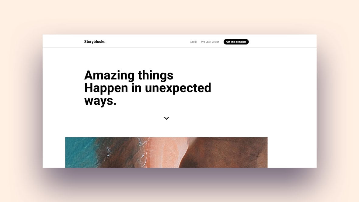
Storyblocks template
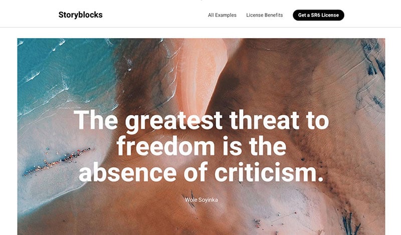
This Storyblocks template uses Heebo.
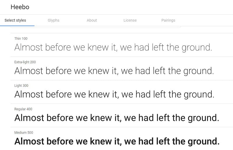
Heebo belongs to the Latin and Hebrew typeface family, and extends Roboto, Christian Robertson’s Latin to Hebrew. Meir Sadan mastered the font files of this cool font, while Oded Ezer attributed the Hebrew.
Reed
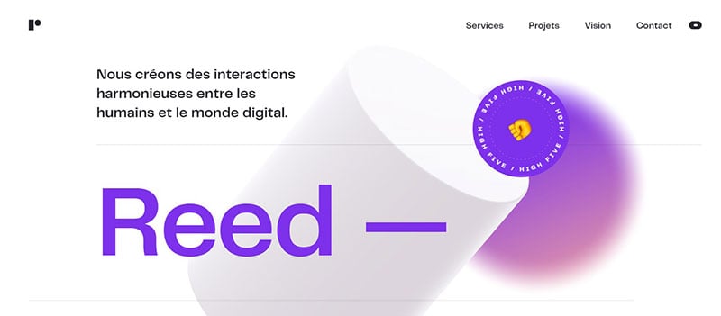
Reed uses Telegraf.
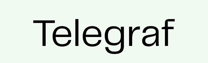
Telegraf is a combination of several grotesque forms with rigid angles. Its counter becomes more rectangular with an increase in weight. The large sizes provide added impact, while smaller sizes enable on-screen viewing.
A11.studio
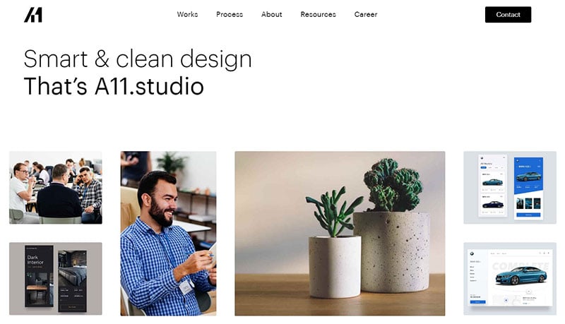
A11.studio uses Graphik.
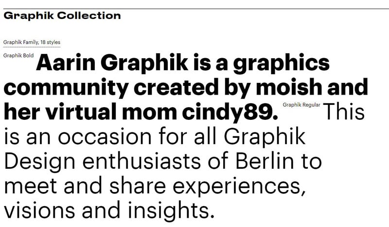
Graphik was released in 2009 and since then has become a classic, aiming to maximize communication flexibility. It has a rational grid consisting of nine weights inside eight different widths. .
Pixelismo
Pixelismo uses Roboto Mono and Heebo.
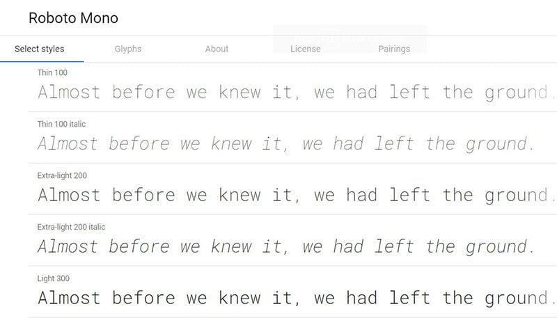
The vertical metrics of Heebo differ from the original Roboto family because of the Hebrew design of its primary font family. Rather than being hand-hinted like Roboto, the Pixelismo family is auto-hinted, resulting in Roboto’s improved rendering quality on old Windows machines.
Roboto Mono belongs to the monospaced Roboto family.
Bruno Cirilo
Bruno Cirilo uses BrownStd and Noe
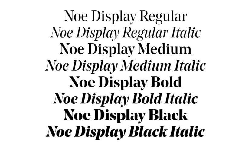
The Noe Display has a serif display type consisting of strong contrast in fine details, including thicks and thins, vertical stress axis, as well as elegant curves that are all in rational mode.
Turbulent
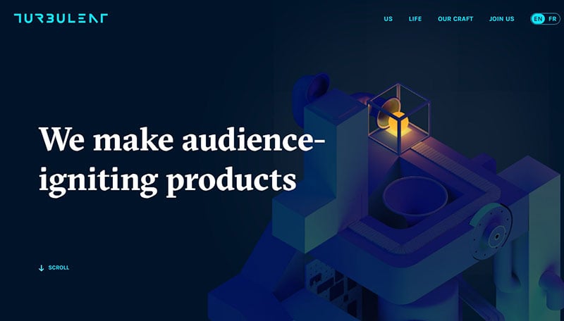
Turbulent uses Karla and GT Sectra.
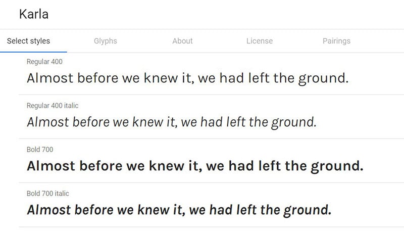
Karla is a grotesque typeface belonging to the San Serif family and offers support to all languages using Tamil and Latin scripts. The Latin script font family consists of Italic and Roman styles in Bold and Regular weights.
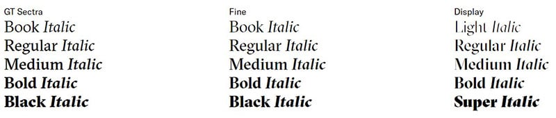
GT Sectra is a contemporary typeface of the Serif family and combines broad nib pen’s calligraphy with the sharp cutting edge of a scalpel.
Cyber particle hero template
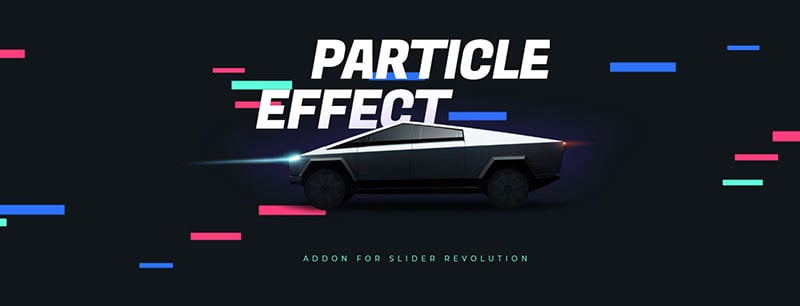
This cyber particle hero template uses Fugaz One.
Fugaz One is a sans serif font that leaves its formal beginnings as a result of its characteristics, with gestural characteristics and geometric features. Fugaz One combines with italic inclination to form a dynamically interesting font.
Kelly Phan
Kelly Phan uses Anderson Grotesk
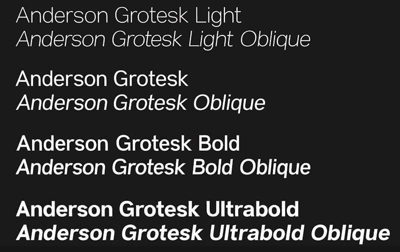
Anderson Grotesk is Stephen French’s creation; a Neo-Grotesk hand-rendered typeface.
Viral Positivity
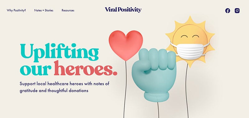
Viral Positivity uses Futura PT and Recoleta.
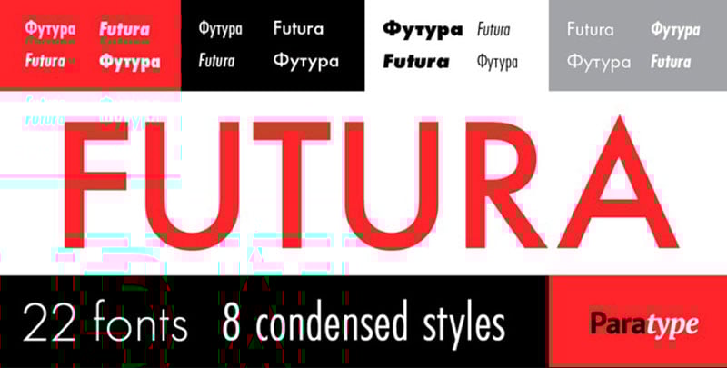
Futura PT bases its san serif face on geometrical shapes, representing the aesthetic Bauhaus school that existed between the 1920s and 1930s. Futura PT uses several weights and widths and is now a popular choice for display and text setting.
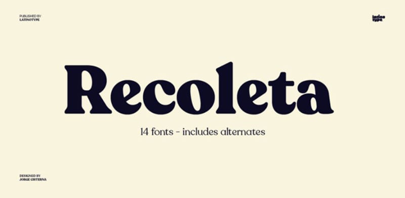
Recoleta is a composition of different recipes. Its compositions stem from several typefaces from the 1970s mixed in a single fresh, familiar design including the gentle and soft shapes found in Windsor’s angled strokes, the fluid, and Cooper.
Mélanie Hubert-Crozet
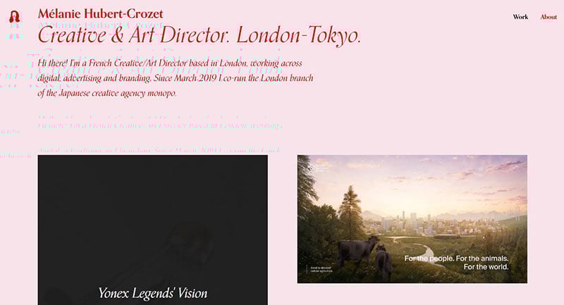
Orpheus Pro belongs to Melanie Hubert-Crozet.
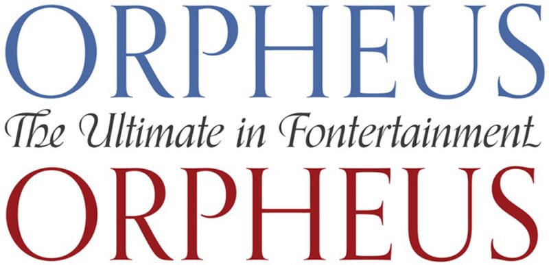
The Orpheus Pro is a simple, cool looking font, which started as Euphorion and Tiemann Orpheus’ straightforward revival. Orpheus gives a snazzy line and is appealing to the eyes.
Fernando Puente
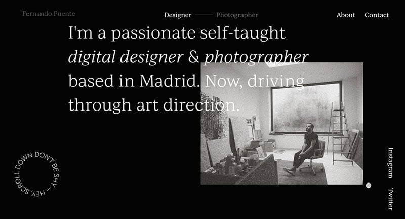
Fernando Puento uses Ivi Journal.
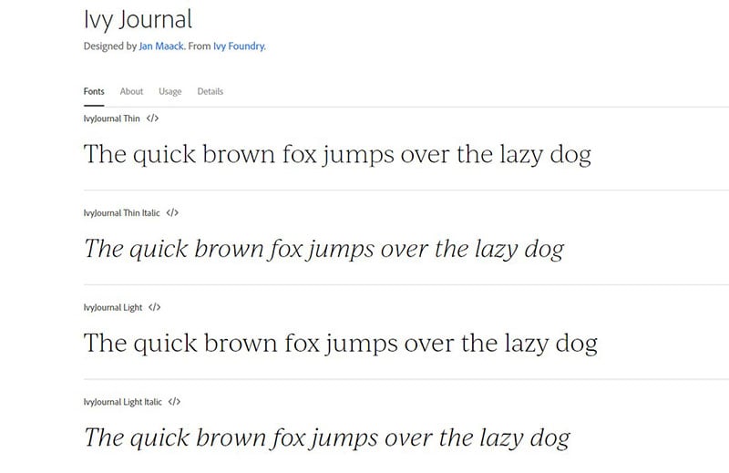
Designed by Jan Maack, Ivi Journal is from Ivy Foundry.
Travel blog template
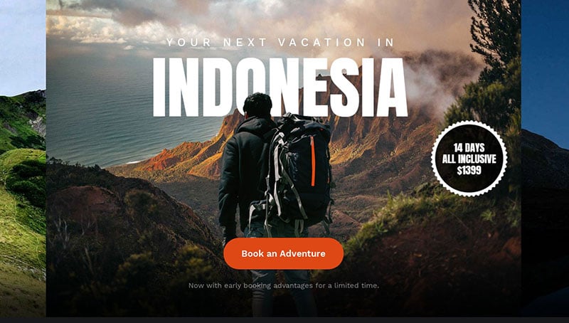
This travel blog template uses Anton.
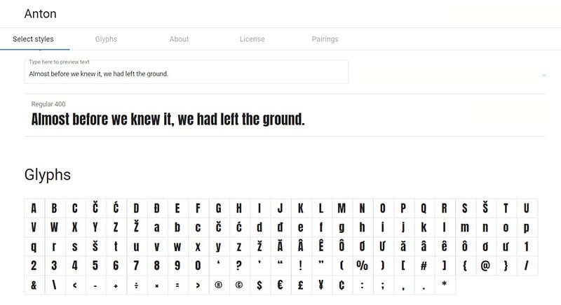
Anton is the reworking of the san serif typefaces of many traditional advertisements. Its letterforms underwent digitization and a reshaping to serve as a Webfont, with an opening of counters and stems optimization for bold display on new web browsers.
Jessica Hägg
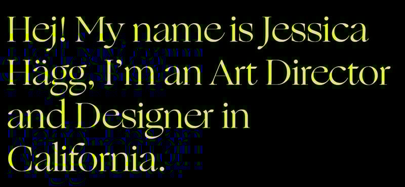
Jessica Hagg uses Sporting Grotesque and Ogg
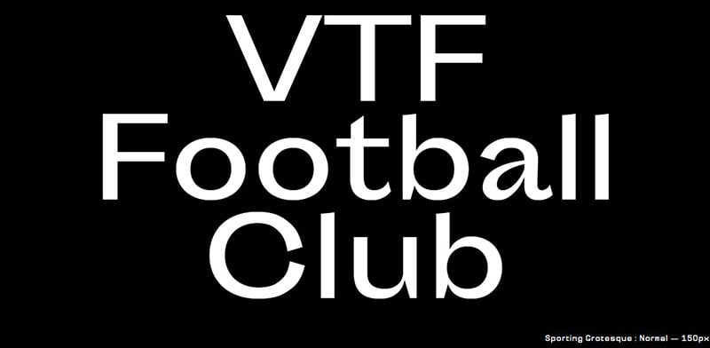
Sporting Grotesque is an original creation of Lucas Le Bihan.
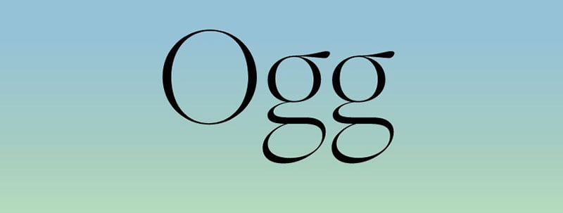
Ogg by Oscar Ogg captures the unique blend of typography and calligraphy from his era, when hand-carved brushes, pen nibs, and white-out, were popular.
Matt Downey
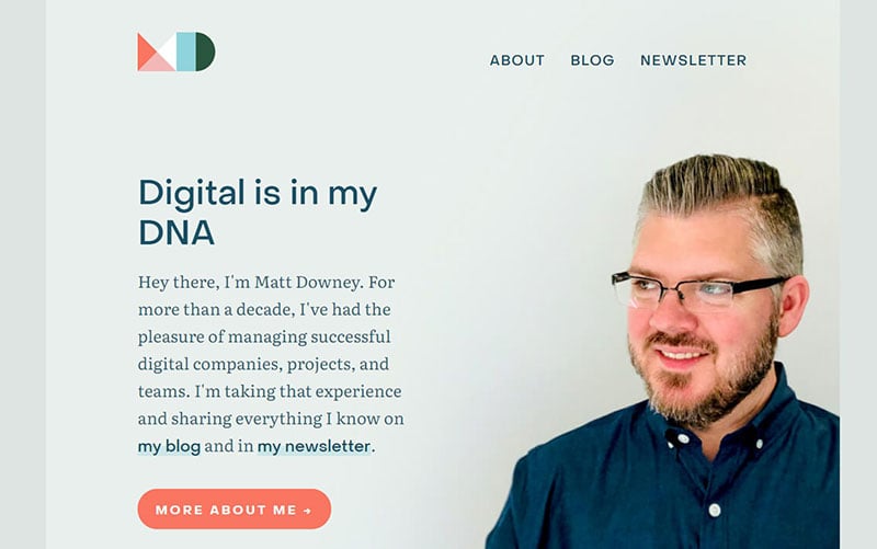
Matt Downey uses Object Sans and Literata
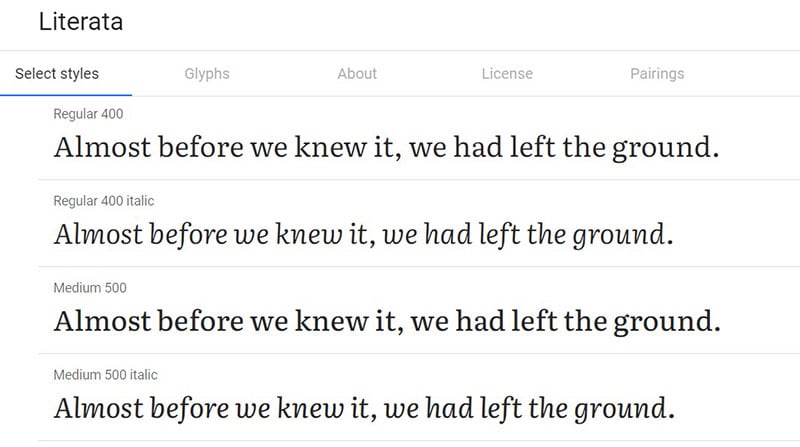
Literata belongs to the contemporary family of serif made for long-form reading such as an ebook. Literata received its commission in 2014 by Google Play Books. It became widely available with variable font-weight in January 2019.
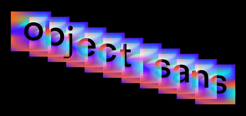
Object Sans combines the best Swiss geometric and neo-grotesk fonts. This contemporary family is a multifunctional workhorse, best for on-screen and printed contexts.
Lorenzo Girardi
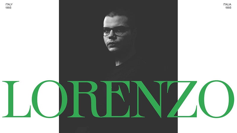
Lorenzo Girardi uses Apfel Grotezk and Sprat.
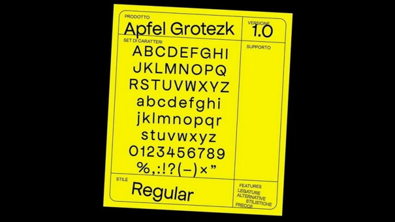
Apfel Grotezk font has a hybrid typeface, blending natural handwriting imperfections with the neatness of uniformly weighted san-serifs.
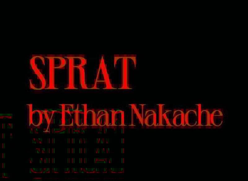
The powerful Sprat font family makes strong statements as well as powerful logos. The conventional serifs are also useful. It has four weights such as bold, semi bold, medium, and regular.
Landing page template
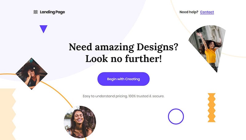
This landing page template uses Lora.
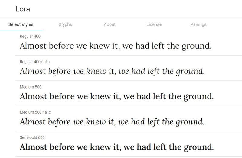
Lora is a contemporary serif with calligraphy roots, with moderate contrast that suits body text well.
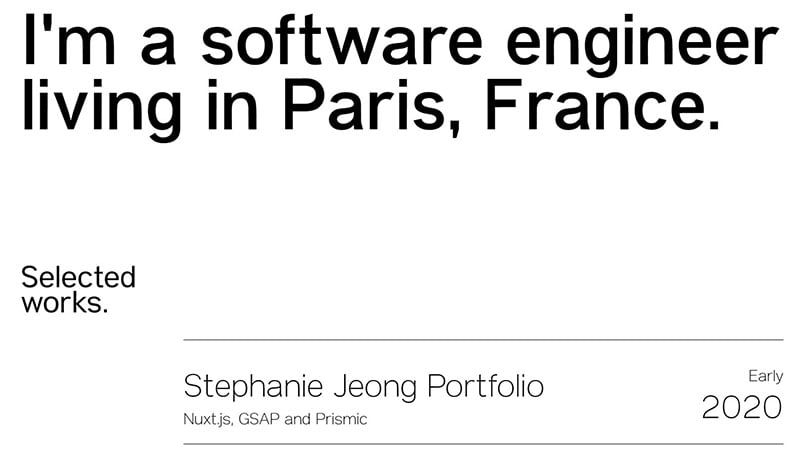
Steph Jeong
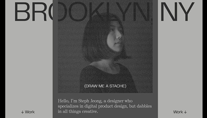
Steph Jeong uses Self Modern and Telegraf
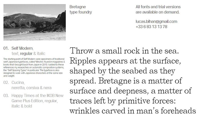
Self Modern starts with the cool typefaces of the Japanese serif, Mincho, which began in a 2015 Japanese magazine, and has since grown in its appeal.
Telegraf combines mid-century grotesk forms with rigid angles. The counters of Telegraf become increasingly rectangular with an increase in weight, aids small sizes on-screen viewing, and increases impact in large sizes.
Jesse Zoutewelle
Jesse Zoutewelle uses Fuji and Giselle.
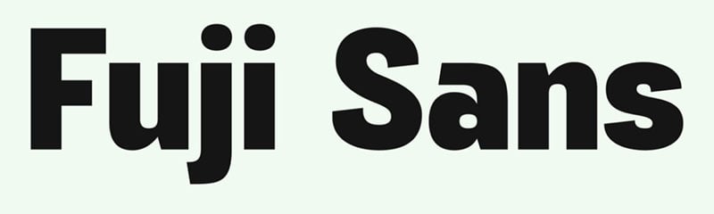
Fuji Sans is a bold typeface of sans-serif, slightly condensed to fit perfectly with brands and bold designs.
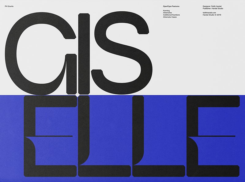
The Giselle font is an excellent font for music, design, film, and logo. It is also great for TV, publishing (books, magazines), games, corporate identity, and cinema.
Gardenberg
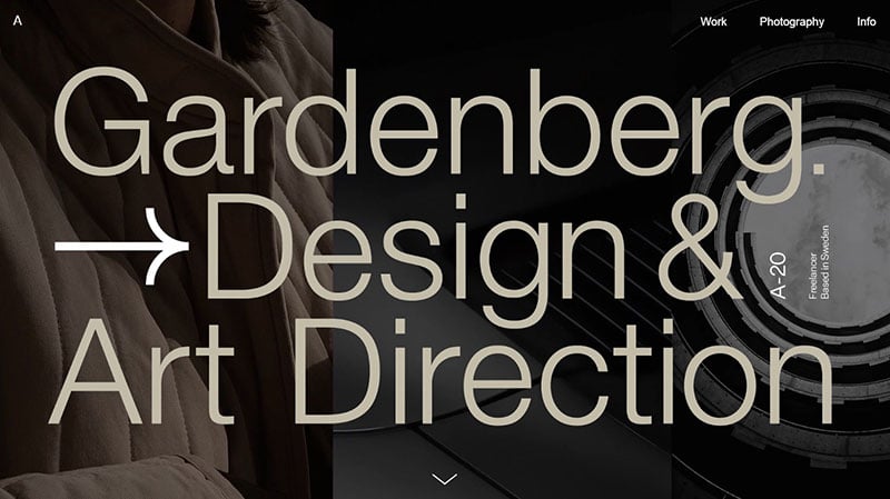
Gardenberg uses Gothic A1 and Arial.
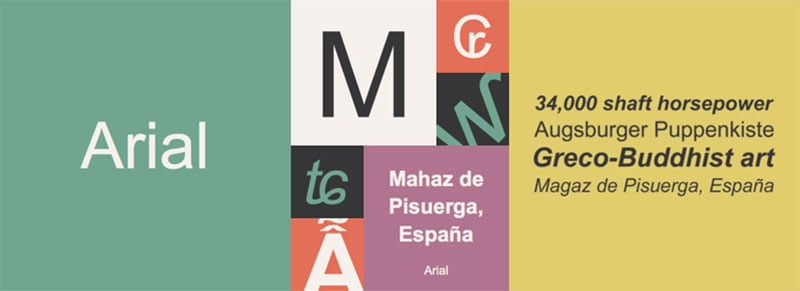
In the past 30 years, one of the most commonly used typefaces is Arial®. It was the creation of Patricia Saunders and Robin Nicholas in 1982 for an early IBM printer, perfect for textual content.
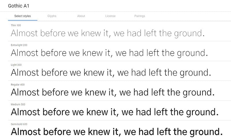
The Korean and Latin Gothic A1 sans-serif font is versatile with multiple weights and optimized spatial distribution.
Art Gallery Slider
This art gallery slider uses Poppins.
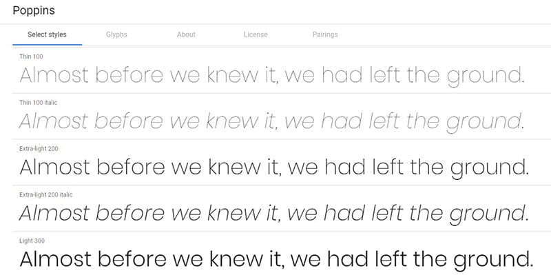
Poppins is a from the long tradition of Geometric sans serif font that also supports the Latin and Devanagari writing systems. It’s just one of those ssans serif fonts that you need to have.
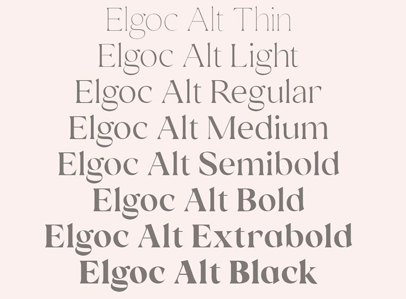
Thomas Bosc
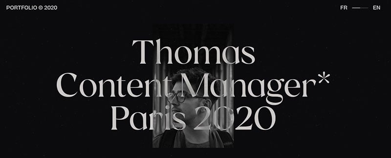
Thomas Bosc uses Elgoc Alt and Beatrice.
Beatrice was designed in Ti Morawa, an Indonesian sub-urban village found in North Sumatra and is new to the typeface family. This family explores contrasting methodologies, merging several canon expansionist systems, including sans serif Grotesk’s contrast behavior and inverted contrasts.
Rachel Yhe
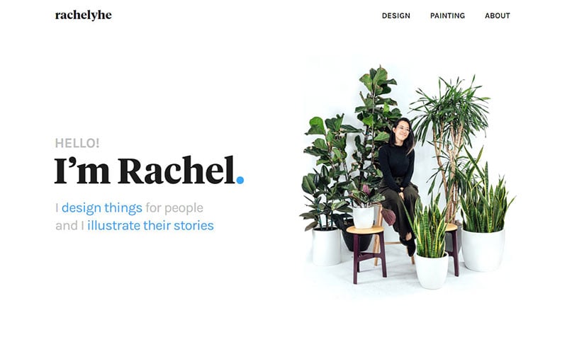
Rachel Yhe uses Karla and Tiempos.
The grotesque Karla supports languages using Tamil and Latin scripts. The Latin script has bold and regular weights with Italic and Roman styles.
The Tiempos collection belongs to the modern serif family, with over 2800 crafted glyphs for editorial typography.
Mackenzie Child
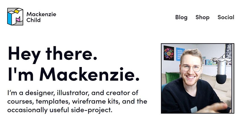
Mackenzie Child uses Sofia Pro.
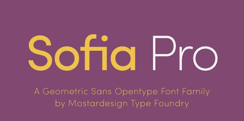
Olivier Gourvat is the Sofia Pro designer under Mostardesign. Sofia Pro has 16 different cool fonts and options for the family package.
Gweno
Gweno uses Oaks and Vulf Sans
Oaks displays a really cool typeface with a straightforward attitude and character, inspired by the signwriting structure used in the latter part of the 1800s.
Vulf Sans has 5 weights in Roman and Italics.
Construction company template
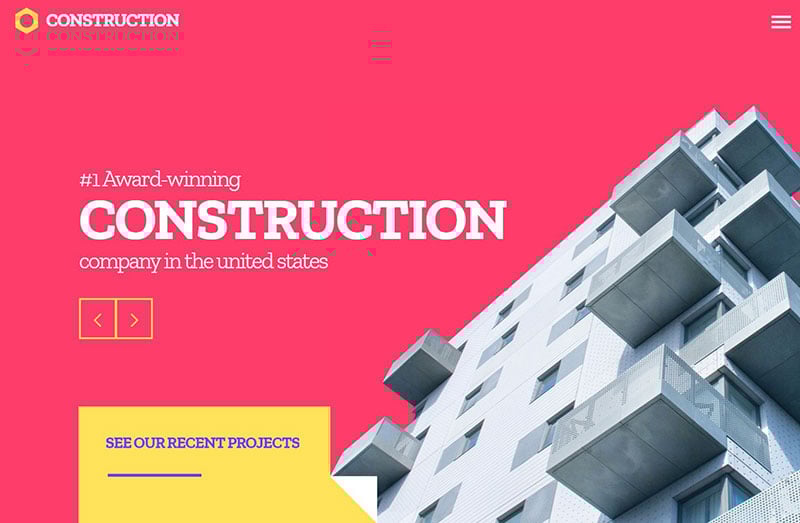
This construction company template uses Zilla Slab.
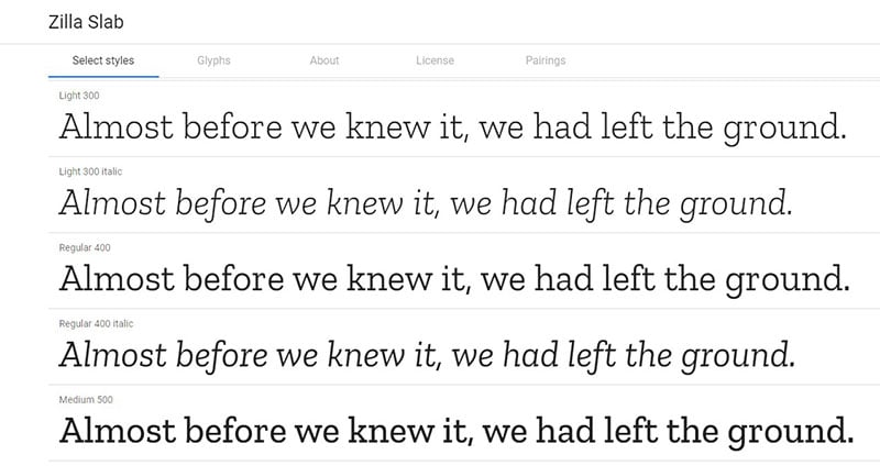
Zilla Slab is a Mozilla typeface used for wordmark and headlines, featured throughout their designs. The text has a sophisticated industrial look, constructed with true italics and smooth curves.
Quentin Hocde
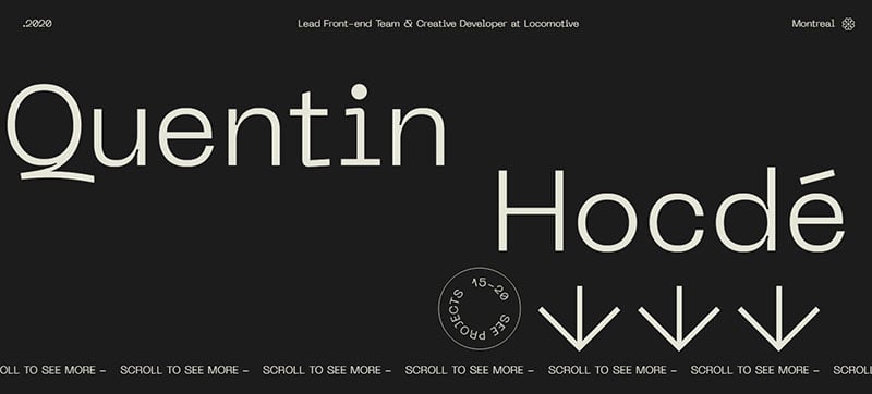
Quentin Hocde’s is one of the professionally built websites in this article and uses Neue Machina.
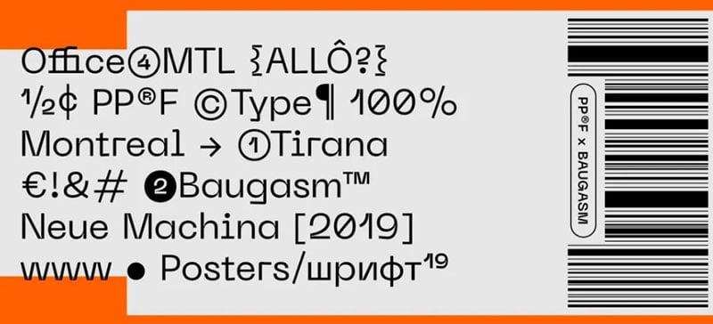
The Neue Machina is meticulously crafted with a powerful typeface,boasting monospace and deep ink traps in heavier weights.
Sanne Wiibenga
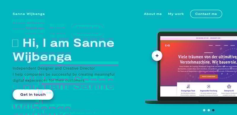
Sanne Wiibenga uses Moderat.
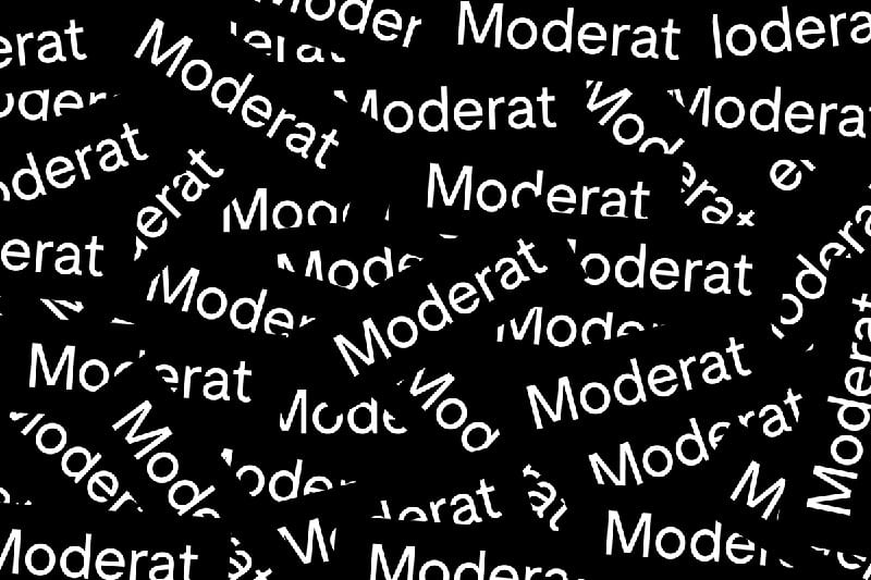
Moderat combines some edgy accents and geometric shapes to produce a really cool sans serif typeface.
Julie Muckensturm
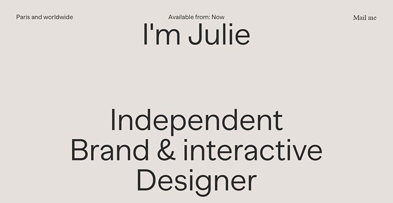
Julie Muckensturm’s web design uses Banana Grotesk.
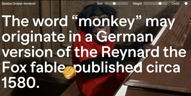
Published in 2018, Banana Grotesk is a really good font of sans-serif typeface.
Start Agency template
The Start Agency template uses Work Sans.
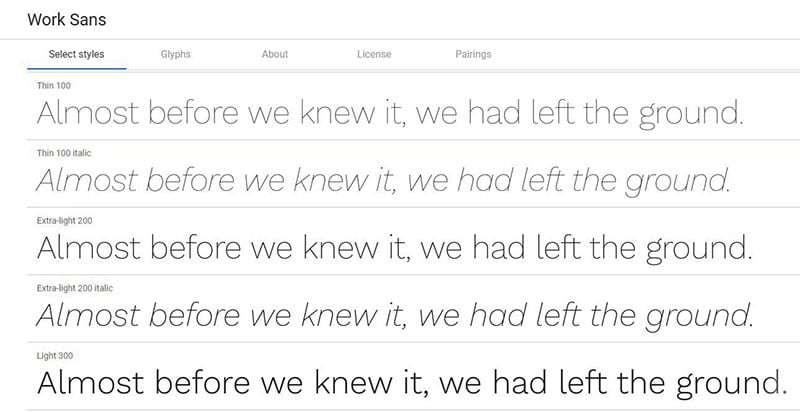
The Work Sans typeface family has some roots in early Grotesques. The regular weights optimize on-screen text at medium-sizes and are really useful in print design.
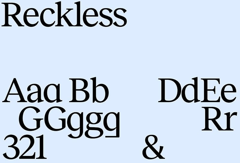
Henrik and Sofia
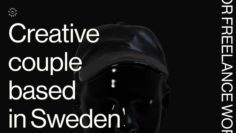
The Hendrik and Sofia web design uses Reckless and Neue Haas Grotesk.
This is a design of Max Miedinger and Christian Schwartz. Neue Haas Grotesk contains 22 styles and several family package options.
The serif text family font of Reckless has a renaissance look.
Matt Dayton
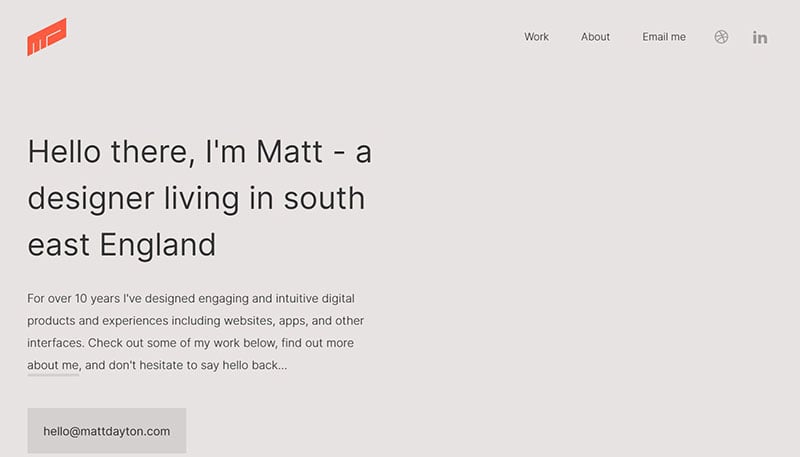
Matt Dayton’s web design uses Inter.
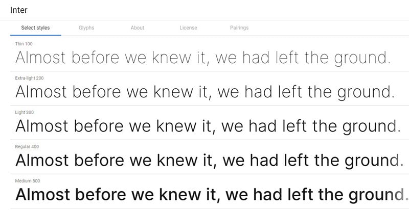
The variable Inter font belongs to a carefully crafted font family aimed for computer screens, featuring a tall x-height that aids readability.
Niccolo Miranda
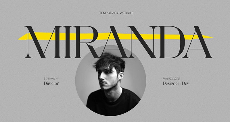
Niccolo Miranda’s website uses Saol.
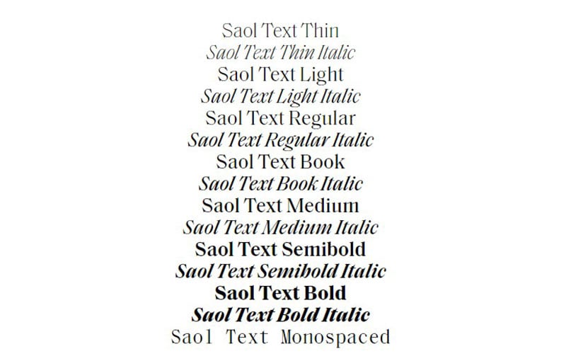
Saol gives modern conveniences such as, broad language support, several weight ranges, and opulent italic caps.
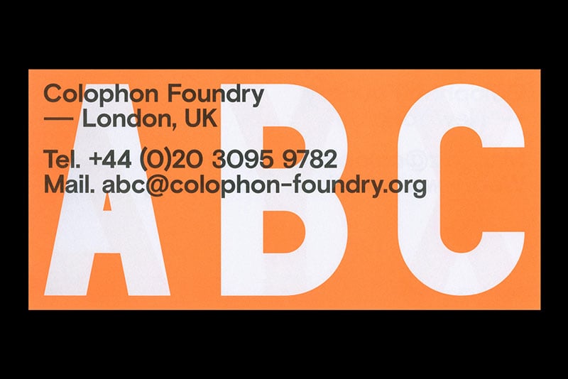
This is Grey
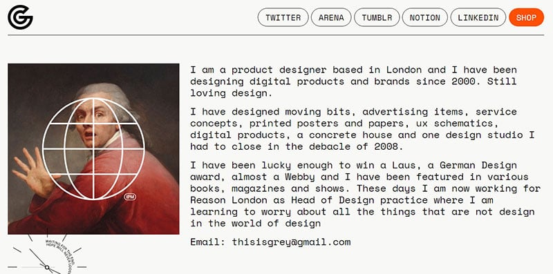
This is Grey uses Space Mono.
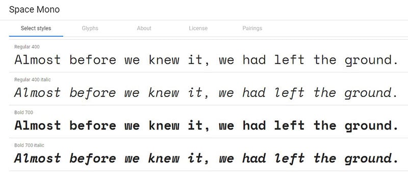
The Space Mono is Colophon Foundry’s design for Google. Its fixed-width type of family enables English and Western European typesetting.
Jesper Dahlqvist
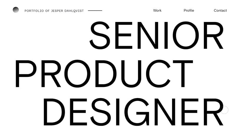
Jesper Dahlgvist uses Basis Grotesque.
Basis Grotesque from Colophon Foundry features four monospaced weights as well as five weights in regular and italic.
Victor Work
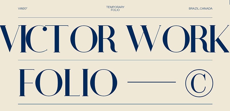
Victor Work uses both Athene and Mabry
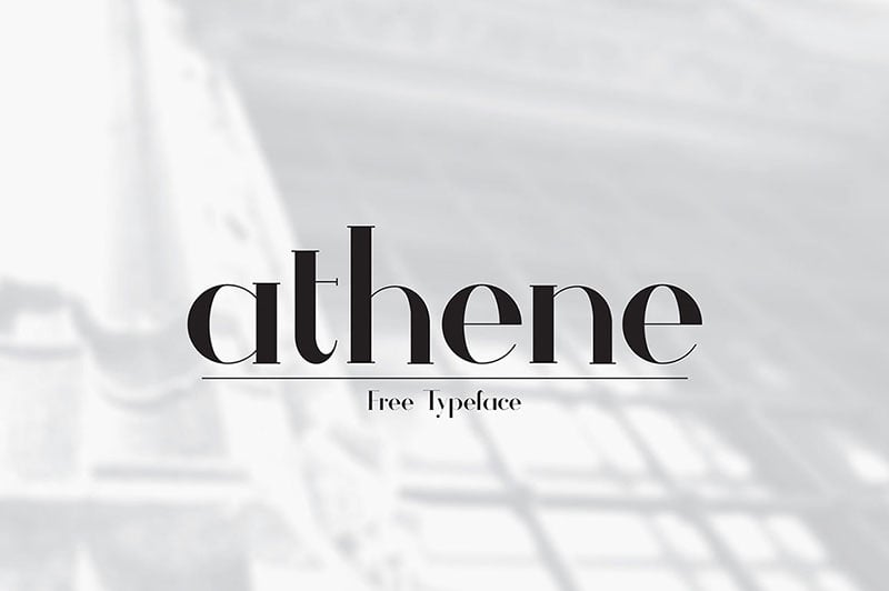
The serif typeface Athene comes with a modern geometric touch. It looks best as a Display. This free serif is an amazing custom font by Matt Ellis.
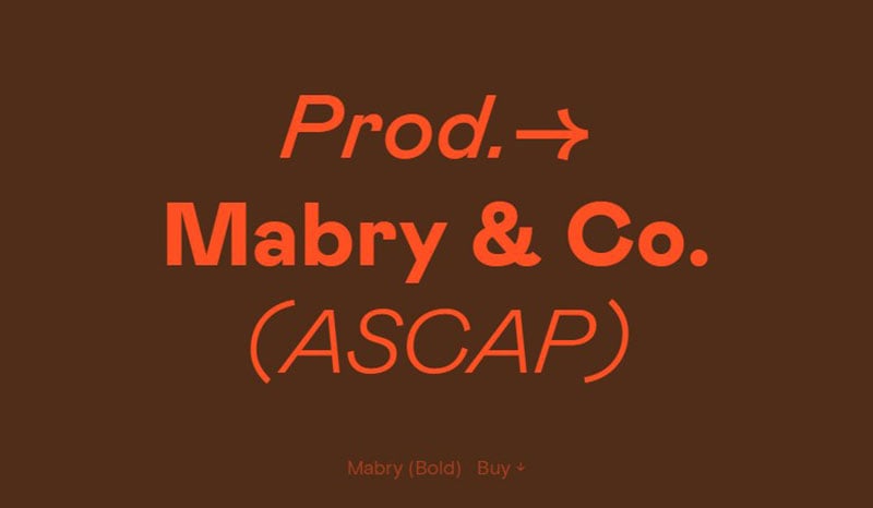
Mabry presents various characteristics: rigorous and gestural, historic, and contemporary, as well as coarse and refined, subjective, and objective. It is also a Multan royal contemporary, precise and cultivated.
Vic Bell
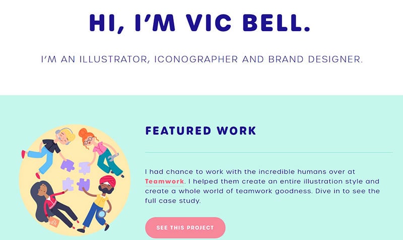
Vic Bell uses Urbane Rounded.
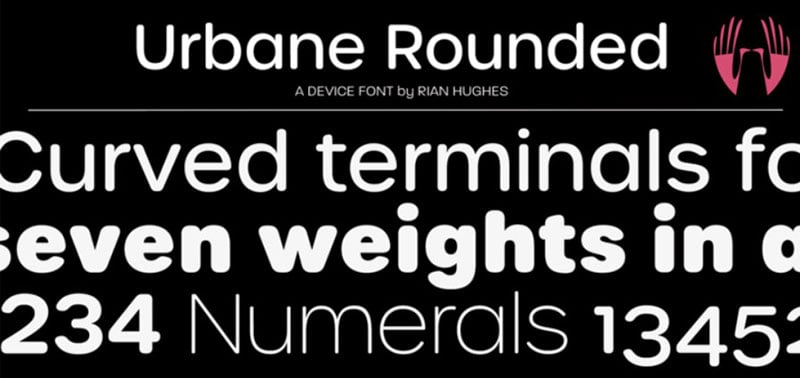
Urbane Rounded is an uncomplicated version of Urbane, only with curves. It is an all-purpose versatile member of the sans serif family consisting of italics and six weights.
Davide Baratta
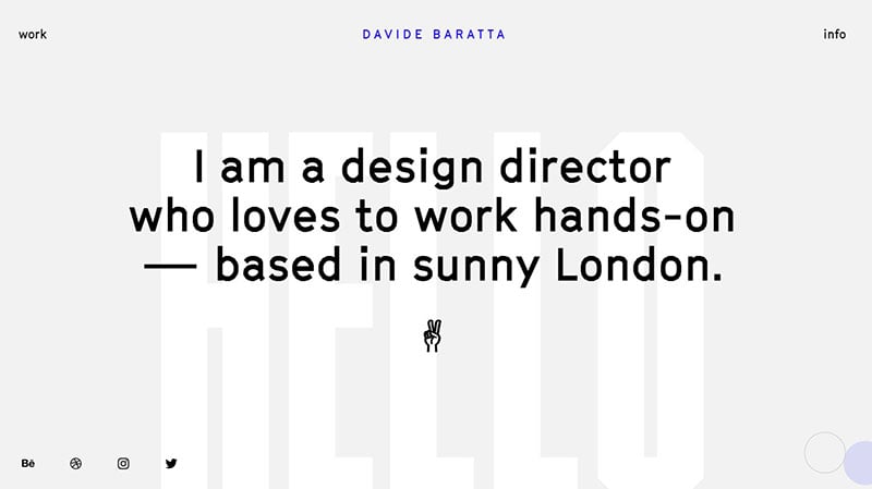
Davede Baratta makes use of GT Cinetype.
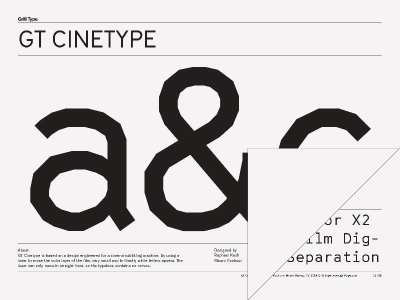
GT Cinetypeis based on the design used for a subtitling cinema machine. It works using a laser to remove the film’s color layer, so only very small sharp white letters appear. It is an extremely interesting font.
Jonnie Hallman
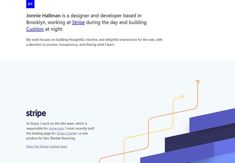
The Jonnie Hallman typeface uses Segoe UI.
The Segoe typeface or font family is famously used by Microsoft.
Andrei Robu
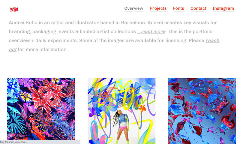
Andrei Robu has Chivo.
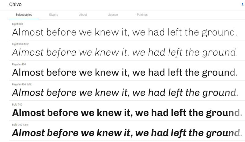
Chivo (Goat) is a sans serif typeface family with a modern Omnibus-Type grotesque nature. Chivo Black’s bold outlook makes it one of the coolest fonts for headlines and highlights.
Martin Laxenaire
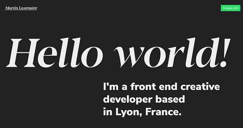
The Martin Laxenaire uses Nunito Sans.
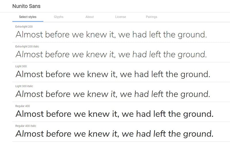
Nunito is a sans serif typeface with great balance. Vernon Adams is responsible for the production of this round terminal typeface, which also supports Display typography.
Robin Rotman
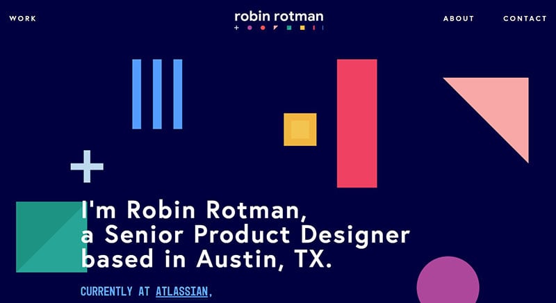
Robin Rotman uses Europa.
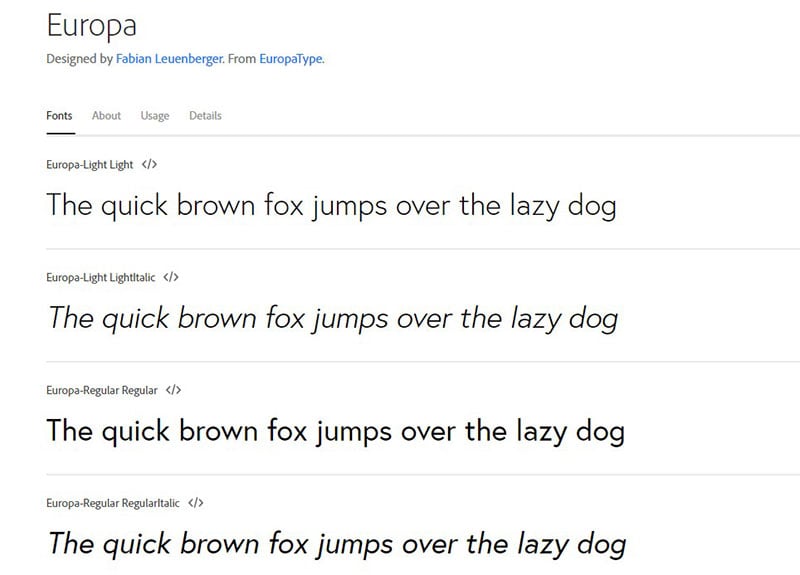
This geometric sans-serif typeface is made by the Swiss designer Fabian Leuenberger. Europa sold in 2011 through Europa type. Its unusual design is due to its geometric and humanist influences.
Javier
Javier uses Helvetica
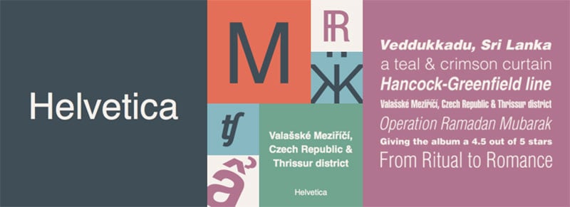
Helvetica is yet another neo-grotesque typeface. Akzidenz-Grotesque and other Swiss and German designs inspired the production of Helvetica. These two were famous designs from the 19th century, and its modern counterpart is great for websites.
Melanie Da Veid
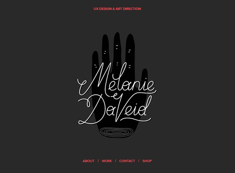
Melanie Da Veid uses Proxima Nova.
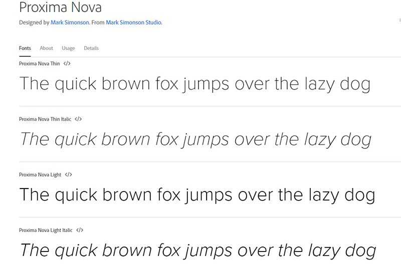
Proxima Nova closes the gap between typefaces including Akzidenz Grotesque and Futura, combining geometric looks and modern proportions.
Donica Ida
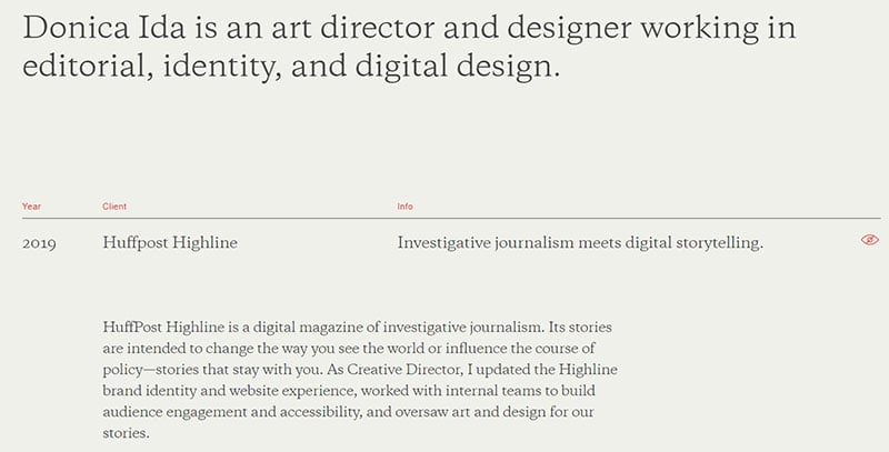
Donica Ida uses Copernicus.
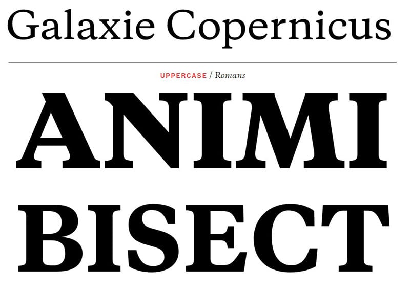
Copernicus is a provisory serif typeface. It was initially designed in 2009 and influenced by Monotype Plantin’s metal versions, and now rebranded for the twenty-first century.
White Elephant
White Elephant uses Mark Pro and Windsor BT.
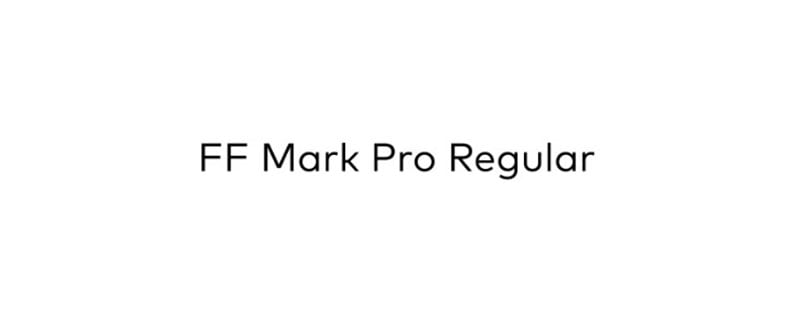
The producers of the Mark Pro San font are the German designers Christoph Koeberlin, Hannes Von Döhren, and the Font Type Department.
Windsor BT is a font from the Windsor family influenced by Roman weight and style.
Zef
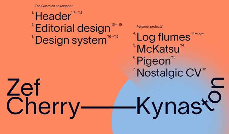
Zef utilizes Lausanne.
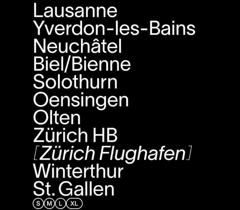
Lausanne is an elegant sans-serif font with an aesthetic feel. It has small but legible sizes and several details in large sizes.
Jess+ Design
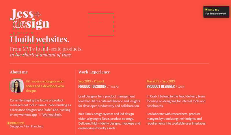
Jess+ Design uses Quattrocento Sans.
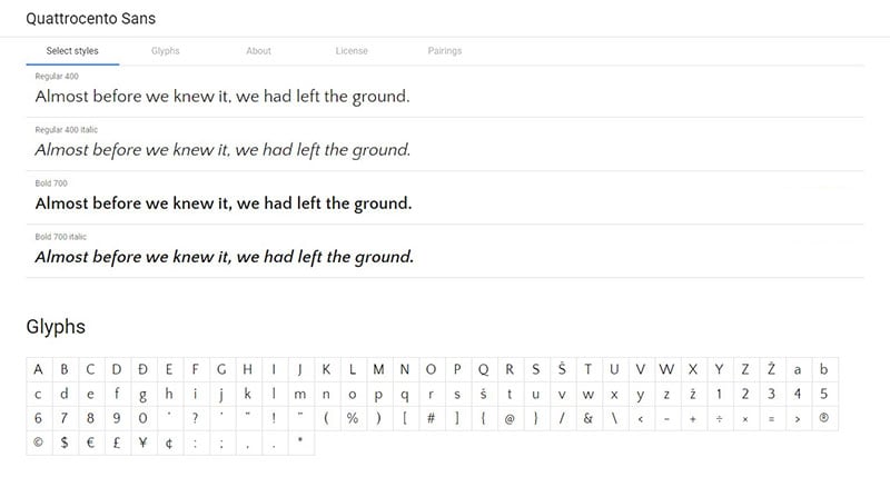
Quattrocento Sans is a refined, cool, and classic typeface family. Its open letter form makes it legible in small text bodies. It is readable without being intrusive. This typeface is the most suitable sans-serif partner for Quattrocento.
Marco
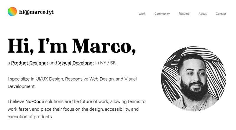
Marco makes use of the Calibre and Dr. Raymond’s fonts.
Dr. Raymond is perfect for titles and headers requiring sharp edges and prominent serifs, with outstanding and strong outlines. This typeface best works at large scale. Its prominent nature is slightly different from its Marco counterpart, Calibre.
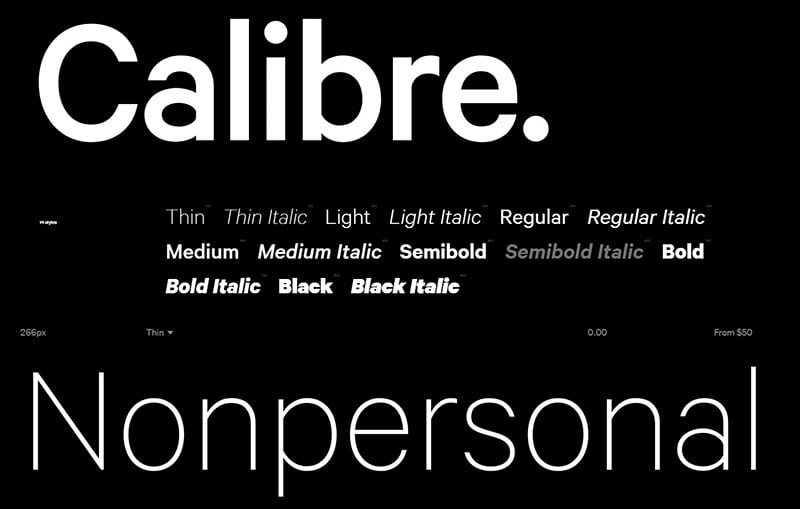
Calibre’s typeface, unlike other signage lettering, is clear and graceful. Letterings on the street signs of West Berlin inspired the creation of the neo-grotesque sans serif Calibre.
Snow Particle Scene Hero Template
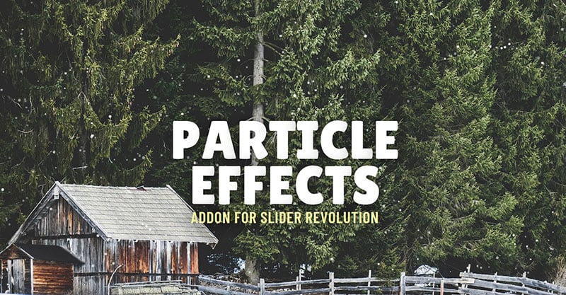
This hero template uses Lilita One.
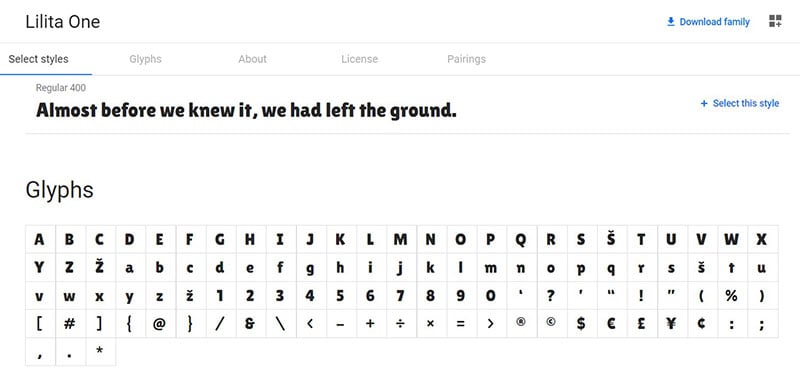
The display typeface, Lilita One, is best for short texts and headline, due to its fat appearance. Yet, it gives a soft look and personal feel wherever it’s used, due to its new captivating details and a slightly compact structure.
Union Haus
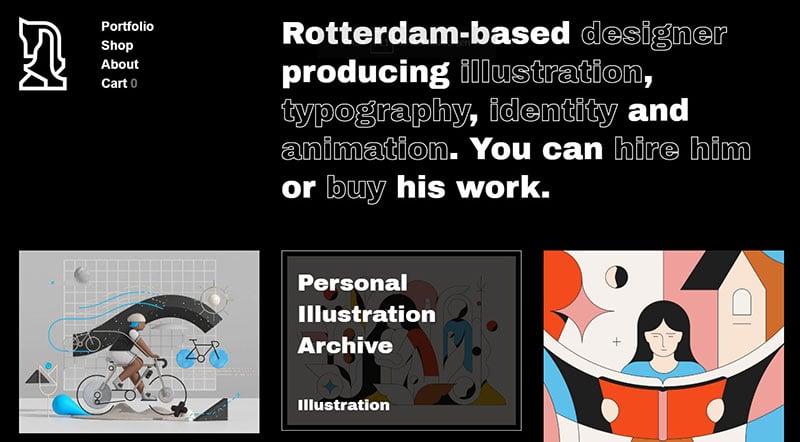
The Union Haus typography uses Archivo Black.
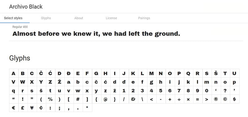
Archivo Black will work either on digital platforms or prints, available for high topography performance.
Nidia Dias
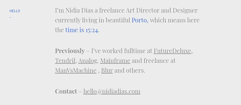
This font has both Roboto and Playfair Display at play.
Playfair is a provisory design. Being a Display, its font size is large, and is therefore compatible with Georgia for the text body in both style and function.
Roboto is a dual-natured typeface. Its structure is mechanical and the letterform is highly geometric, however the features of the font have open curves.
Gilabert Design
Gilabert Design uses Apercu Regular Pro and Feijoa Display.
Apercu seeks to blend the realist classics, Franklin Gothic, Gill Sans, Neuzeit, and Johnston. Its form portrays the synopsis of its origin.
The principle of a straight line being a deadline inspires Feijoa’s design, thus the typography features letterforms with warm curves. The individual letters have their distinct forms but together they form a unique design.
Julia Zass
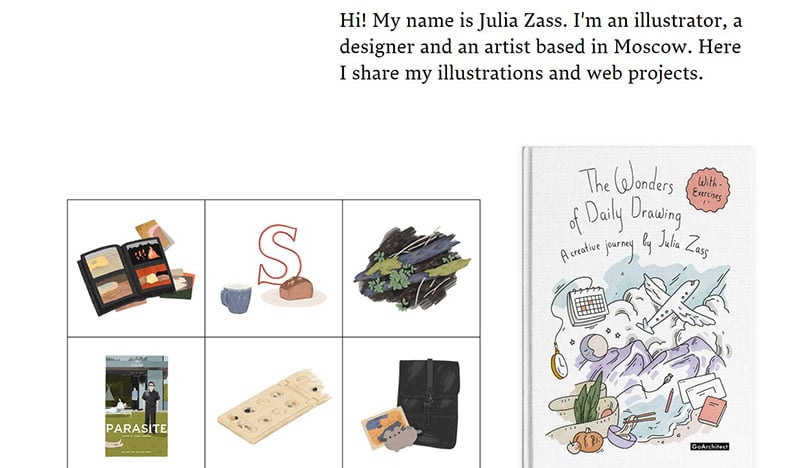
Julia Zass uses Lava.
Lava was originally used for magazines, and so brings strength and versatility to the fore. This typeface is one of the coolest fonts because it can maintain its style amidst chunks of text. There is no reason to fear that your relatively lengthy text will scare visitors away. Lava takes care of this with ease.
Hicks
Hicks uses TT Norms Pro.
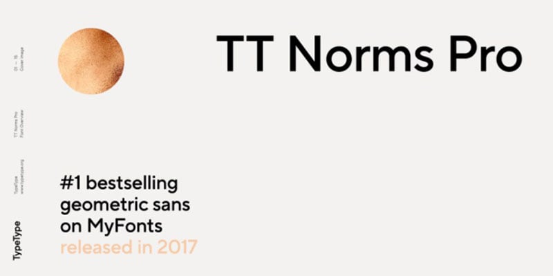
The main version of TT Norms Pro is neutral and subtle, and when using the stylistic alternates the outlook is more humanistic. This typeface comes with several variations and styles, including two variable fonts, with ligatures and stylistic alternates, small capitals and broad support of OpenType. The font has eleven weights matched with their eleven corresponding italics.
Bobby Giangeruso
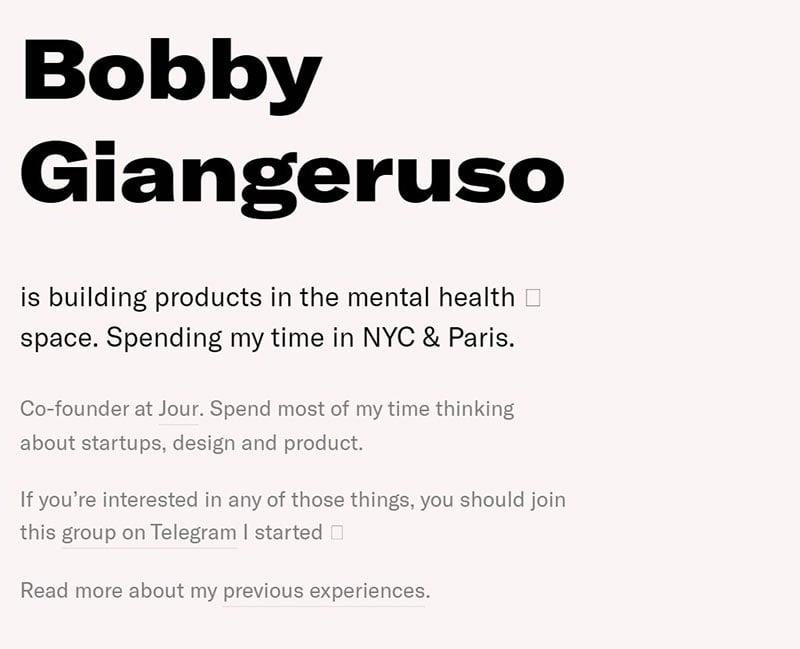
Bobby Giangeruso uses GT America.
This font builds a bridge between the European Grotesque and American Gothic typeface genres, in a seamless blend. The interesting font combines the design features of both traditional styles, thus uniting them with a contemporary finish.
FAQs about the coolest fonts
1. What are the coolest fonts to use for a professional presentation?
Making a professional presentation requires careful consideration of the font you use to ensure that your message is understandable and simple to read. Calibri, Helvetica, and Arial are some of the hippest fonts for a polished presentation. These typefaces are perfect for corporate presentations since they are straightforward and contemporary while still being quite readable.
2. What are some of the best fonts to use for a stylish and trendy website design?
There are many cool fonts that might help you create a contemporary and current look for your website if you’re designing one. The best typefaces to utilize are Lato, Raleway, and Montserrat. These typefaces are stylish and contemporary, making them a wonderful option for any website design that aspires to elegance and sophistication.
3. Which fonts are best for a modern logo design?
The fonts used in contemporary logo designs must be stylish and recognizable. For contemporary logo designs, Proxima Nova, Futura, and Bebas Neue are some of the nicest typefaces to choose. With their distinctive styles, these fonts can help your brand stand out from the crowd and leave a lasting impact on your target audience.
4. What are the most popular cool fonts for social media graphics?
Fonts that are attractive and easy to read are needed for social media visuals. Impact, Open Sans, and Gotham are a few of the most well-liked hip fonts for social media images. These fonts are very readable and might encourage your followers to view and share your social media postings.
5. What are some creative fonts to use for a resume or CV design?
When creating a resume or CV, you should pick a font that is both artistic and appropriate. Garamond, Baskerville, and Georgia are a few of the best fonts for this kind of design. These typefaces have a timeless, refined look that can make your CV stand out from the competition.
6. Which fonts are recommended for a futuristic or sci-fi design theme?
There are various fascinating fonts that can help you create the correct appearance and feel if you’re planning a project with a futuristic or sci-fi theme. For this kind of design, fonts like Orbitron, SF Pro Display, and Univers are several that are suggested. These typefaces’ contemporary and forward-looking aesthetics can make your design stand out and have an effect.
7. What are the coolest handwritten fonts for personal projects?
Any design project can benefit from the creative and unique addition of handwritten fonts. The best handwritten fonts for individual projects include Alex Brush, Grand Hotel, and Sacramento. The distinctive and artistic style of these typefaces can make your design stand out and feel more genuine.
8. Which cool fonts are best for a fashion brand logo?
You should use a font that is both fashionable and distinctive when creating the logo for a fashion company. Bodoni, Didot, and Playfair Display are some of the hippest fonts for fashion business logos. These typefaces offer a timeless, refined look that can help your brand leave an enduring impact on your target market.
9. What are some cool fonts to use for a tattoo design?
Cool and readable typefaces are essential for tattoo designs. The best typefaces for tattoo designs include Helvetica, Times New Roman, and Old English. The traditional and timeless nature of these fonts might help your tattoo design endure the test of time.
10. What are some popular cool fonts for wedding invitations or other formal events?
Elegant and polished fonts are required for wedding invitations and other formal events. The most well-liked cool fonts for this kind of design include Trajan Pro, Bickham Script, and Edwardian Script. These typefaces’ timeless and conventional appearance can add a sense of formality and sophistication to your design.
Ending thoughts on the coolest fonts you can use on your website
There are numerous popular fonts available so there’s no need to choose the defaults. Well-chosen styles and fonts will never overshadow the content of your text. However, your fonts can either hold your reader’s interest or dampen it.
Fonts can convey messages to your viewers of creativity, stability, sophistication, or elegance, depending on the brand identity you wish to build. You have plenty of options, such as those highlighted in this article, so you are sure to find one that suits your style.
If you liked this article with the coolest fonts, you should check out this one with tips for creating a website design questionnaire.
We also wrote about other useful topics, like using a web design contract, CSS frameworks, responsive image sliders, responsive product carousels, and dummy text generator tools.


