
Ever stumble upon a product page so slick it made your credit card twitch in excitement? That’s the power of genius product page design. A symphony of UX, visuals, and responsive design quietly convinces you that ‘Add to Cart’ is the next logical step in your life.
Here’s the thing: A product page isn’t just a digital shelf space. It’s the ultimate pitch. We’re talking high-quality product images, snappy product descriptions, and a CTA that’s basically a magnet for your mouse.
Like a secret sauce, it blends UX/UI design and visual hierarchy to create an e-commerce art piece.
By diving deep into riveting product page design examples, you’re about to unlock a trove of conversion gold. You’ll see firsthand the sweet dance of product galleries, user experience, and conversion rate optimization.
Product Page Design Examples
Sneaker WooCommerce Slider
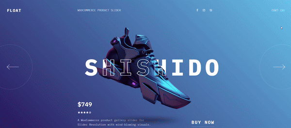
This WooCommerce product gallery slider is available in two versions: a static version, as showcased in the preview, and a dynamic WooCommerce version that automatically populates with your selected products.
Extravaganza Ecommerce Product Carousel
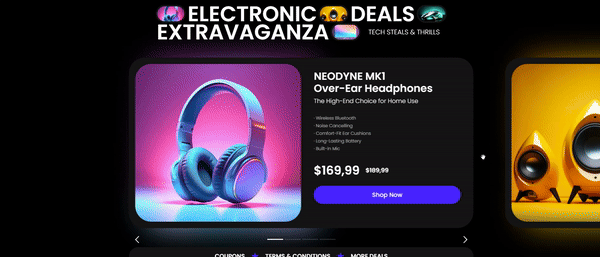
Elevate your online store with the Extravaganza Ecommerce Product Carousel. Designed for modern retail websites, it highlights products magnificently, set against a dark, stylish backdrop. Available in both a WooCommerce and a static version, it’s versatile enough to integrate with any WordPress website.
Bellroy
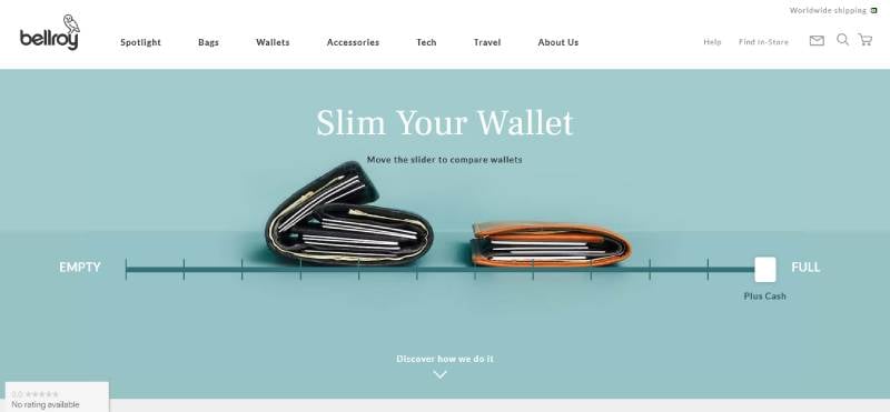
Imagine slipping your hand into your pocket and feeling that sleek minimalism. Bellroy crafts that reality with premium wallets that are a masterpiece of design and function. Picture lux leather that just gets better with age. Now, stuff it with cards and bills — still slim, still slide-in easy. It’s the pocket revolution you didn’t know you needed. With an eco-conscious heart, their wallets are a nod to both style and sustainability.
Kettle & Fire

Close your eyes. Take a sip. Boom, you’re wrapped in a warm hug in a bowl. That’s Kettle & Fire’s whisper in the world of bone broths. Sourced from grass-fed bovines and organic ingredients, these broths are like a health potion that your taste buds actually thank you for. Beyond just a meal, it’s fuel for life’s adventures, boosting your well-being from the inside out.
Square
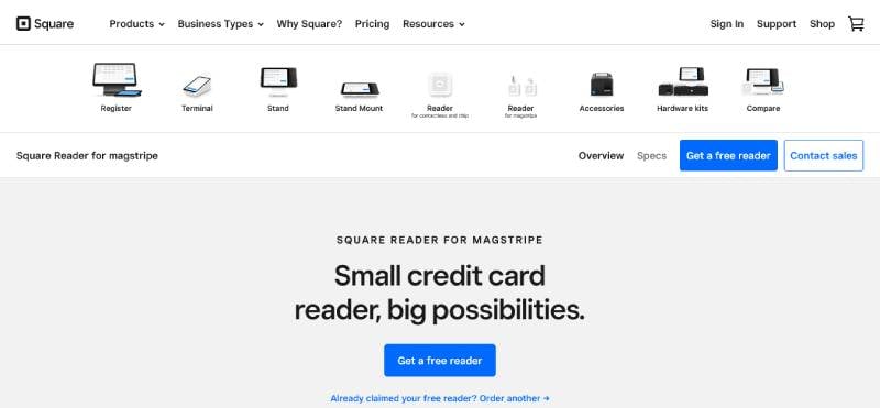
Never let the lack of a bulky register kill your sale vibes again. Square’s here to turn your phone into a money-making hotspot. That tiny gadget in your pocket? It’s your new business BFF. Easy to use, and no strings attached — just simple, secure transactions anywhere, anytime. It’s the 21st-century way to sell—effortless, efficient, on-the-go.
Studio Neat
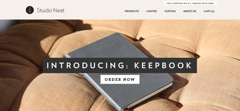
Studio Neat manifests that less-is-more life. Think of their goods as the silent Bob to your talkative Jay, quietly making life’s daily dances a little lighter. Elegantly understated, their gear is the stuff of dream design: solving real-world puzzles without causing a scene. Choose Studio Neat if you’re about elevating your everyday, minus the unnecessary flair.
Outdoor Voices
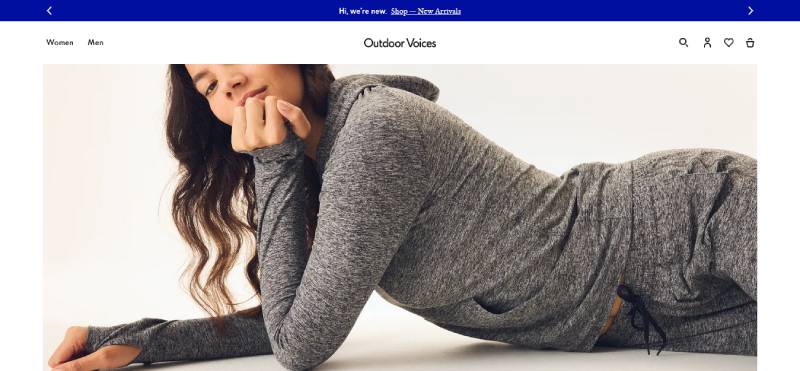
Outdoor Voices calls on you to just move and feel fabulous while doing it. Your body’s your temple, and their activewear dresses it up like the deity it is. Designed to ride along your curves and cheer on your strides, it’s about looking as good as you feel, wherever you move. This isn’t just gear; it’s motivation stitched into fabric—wear it and be part of the movement.
Pourri
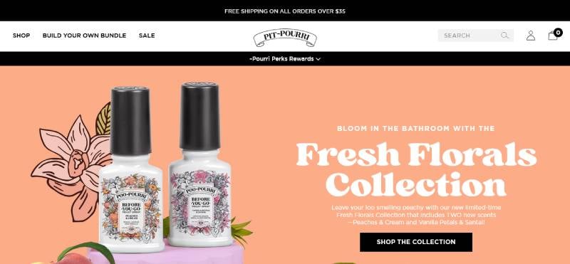
Splash a dash of Pourri, and bam — your space is a meadow of freshness. Those gym shoes? Now a breath of fresh air. Your bathroom? A no-funk zone. It’s that little aromatic companion turning nose-scrunch zones into perfumed paradises. Beyond masking, it’s about transforming — your room, your mood, your world.
Manitobah
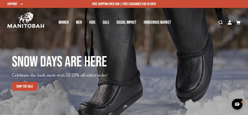
Behold Manitobah, where footwear is more than just protection from the cold. It’s a tribute to heritage, a canvas of artistry painted with age-old traditions. Stride in mukluks that wrap your soles in stories and style. Manitobah isn’t just boots; it’s respectful reverie for your feet, a march in warm comfort, steeped in culture.
Wistia

Wistia takes your videos and puts them to work—think of it like your brand’s visual wingman. Not just a hosting gig, it’s a full-blown video marketing arsenal. Production, editing, analytics — it’s all here, waiting to sling your digital presence into the stratosphere. Turn playbacks into paybacks with Wistia, your video’s secret sauce.
Rocky Mountain Soap
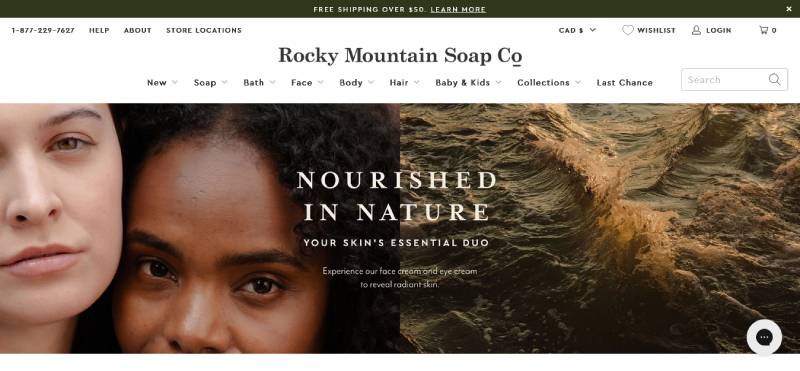
Take a trip back to nature with Rocky Mountain Soap — where every lather is a step into a meadow, unspoiled and pure. Your skin gets nothing but love from the finest all-natural ingredients, each product a handcrafted token of their unwavering commitment to keeping you toxin-free.
Allbirds
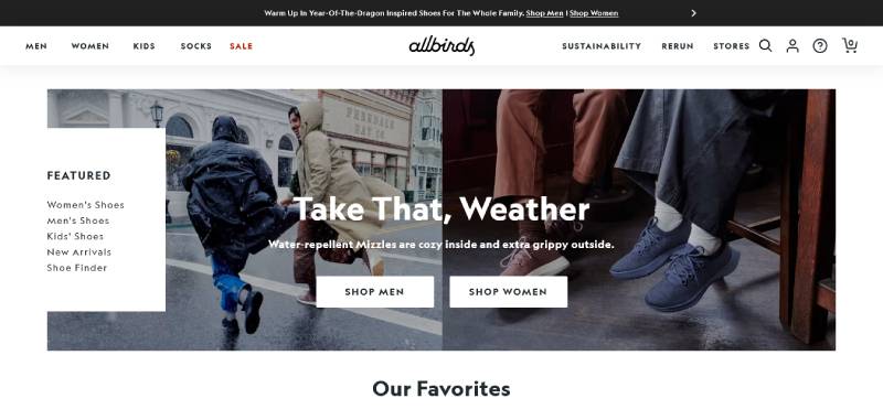
Sink your feet into Allbirds and you’re not just wearing shoes; you’re making a stand for the planet. Imagine eco-friendly comfort, whipped up with materials like Merino wool and tree fiber. Cool, right? It’s more than just footwear; it’s a sustainable stride into the future, one eco-step at a time.
Leesa
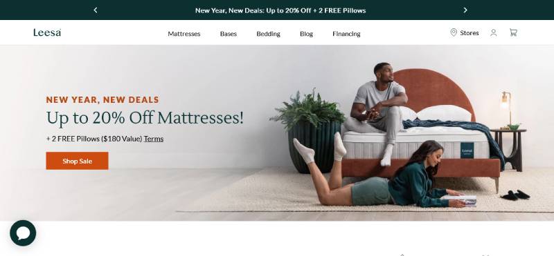
Leesa’s more than a mattress; it’s a commitment to sanctuary sleep. Crafted for the coziest shut-eye, their mattresses are just the right blend of support and fluffiness. Plus, you’re gifting sleep to someone in need with your purchase. Dream in Leesa, and dream of a better world — they’ve got you, and others, covered.
Perfect Keto
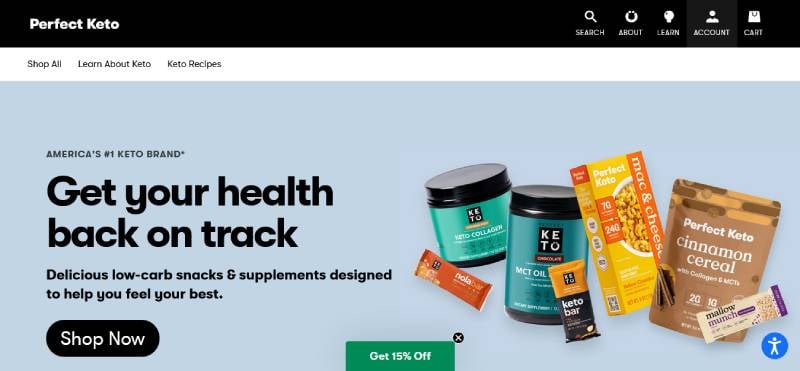
Perfect Keto: your low-carb crusade’s new BFF. With treats that keep both your macros and your taste buds on point, it’s like having your keto cake and eating it too. Beyond shedding pounds, it’s about boosting your energy and mental clarity, making the keto life not just delicious but downright doable.
Fitbit
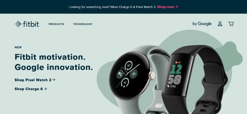
With the new Charge 6 on your wrist, Fitbit is not just tracking; it’s like your health’s personal cheerleader. It’s about knowing your heart, your sleeps, your steps — your everything health. It’s the fitness sidekick that nudges you towards a happier, healthier life with every little vibration.
Away
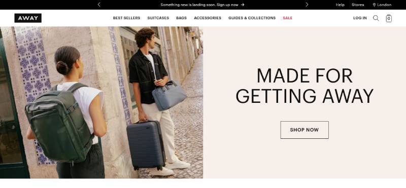
Away is your ticket to breezy traveling. Glide through terminals with their stylishly pragmatic suitcases. Built for those bitten by the wanderlust bug, it’s carry-on that says “I get you, and I’ll keep up.” Travel is an art, and Away’s your travel curator, ensuring your belongings are as world-ready as you are.
Orangina
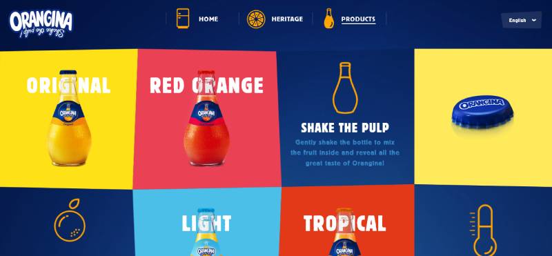
Orangina is that bubbly buddy that brings the zest back into life. With every sip, it’s like a fruit-filled fiesta in your mouth — real citrus, lightly carbonated, striking the perfect sweet-n-tangy balance. It shakes up the ordinary and adds a sparkling twist to everyday hydration.
Master & Dynamic
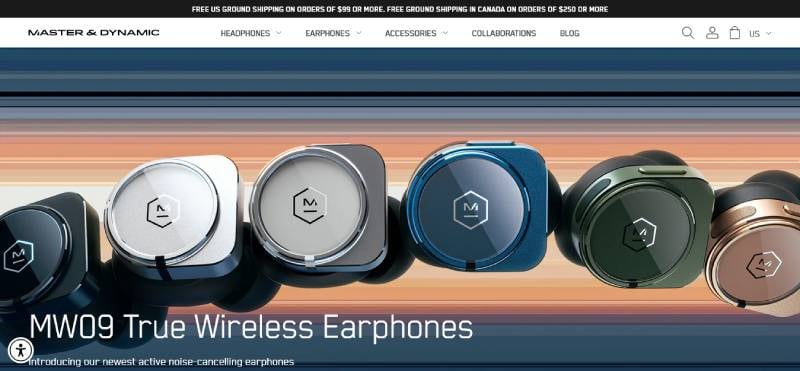
Master & Dynamic takes sound seriously, wrapping it in lux materials and delivering it in pure, unadulterated waves. It’s the audio artisan’s dream, marrying form with function, and elevating everyday listening to an opulent acoustic encounter. Choose them to transform your tunes into treasured moments.
Glossier
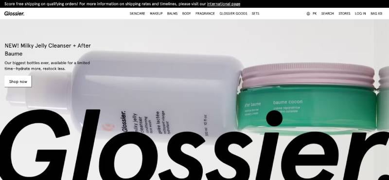
Glossier is your beauty wing-woman, cheering on your natural glory with skincare that plays gentle and makeup that just gets your vibe. It’s a brand that stands with your unique glow, offering products that promise no cover-ups, just enhancements. Wear Glossier, and wear your authentic self with pride
Vinomofo
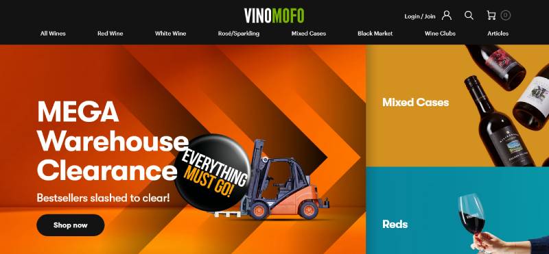
Raise a glass to Vinomofo, where the wine world is your oyster. Here’s a place that uncorks the crème de la crème of vineyards straight into your living room. Celebrate the craft, explore the taste — it’s viniculture vibes without the snobbery. Just pure passion poured with every bottle.
Jackbox Games

Jackbox Games is the life of the party you’ve always wanted to throw. Crazy fun, yep, it’s all here in this box of digital party packs. Connect with pals or fam, in the same room or across cyberspace, and let the good times roll. It’s not gaming; it’s guffawing, bonding, and simply living the moment to the max.
FAQ on Product Page Design
What’s the secret to a high-converting product page design?
Trust me, the crux lies in user experience and visual hierarchy. Nail a design that guides the eye from the hero image to CTA. Make sure everything from product descriptions to customer reviews is top-notch. Simplicity mixed with clear pathways to purchase – that’s your ticket.
How do I make my product images stand out?
Let’s talk image optimization. Crisp, high-res photos are a must. But go the extra mile. Use lifestyle shots that tell a story. Get those angles that flaunt your product’s best features. Quality lighting, multiple views, zoom-in functionality — yeah, these are the game-changers.
Are videos important on product pages?
Absolutely! Product video demos can skyrocket engagement. Show your product in action, highlight its benefits. It’s the next best thing to a customer actually touching the product. Plus, videos keep visitors glued to your page longer. Remember, more time spent on the page, the higher the chance they’ll hit ‘buy’.
What role does page loading speed play?
Huge! The longer a page takes to load, the more likely visitors will bounce. Speed is king in the e-commerce jungle. If your responsive design isn’t snappy, you’re losing bucks every second. So, optimize those images, streamline your code, and watch your hosting like a hawk.
How can I effectively display product variations?
Given the choice, people love to compare. Make it a breeze with a slick product filters system. Provide options to switch between colors, sizes, and materials with a single click. Showcase variations beautifully and logically. Easy peasy decision-making for your customers means more sales for you.
What’s the best way to feature customer reviews?
Reviews are like gold dust. Make them shine. Integrate them prominently on the page, design it so they’re easy to scan. Star ratings? Get them near the product title. Written feedback? Highlight the best testimonials. Nothing sells like peer approval. And yeah, trust signals are through the roof with this one.
Should pricing be displayed prominently?
Spot on! Price display should never be a scavenger hunt. It’s gotta be right there, clear as day, no guesswork involved. Alongside, show any deals or discounts. This transparency builds trust. And trust? That’s the currency of online sales.
How important is the Add to Cart button?
It’s your MVP. Positioning, color, size – these are crucial. Call to action should be the most striking element on the page. Make it pop, make it tempting, make it impossible to ignore. When your visitor is ready to buy, there should be no searching for the next step.
Can you give some tips on mobile-friendly product page design?
In the mobile realm, it’s all about thumb-friendly design. Streamlined navigation, big, bold buttons, and swift checkout processes. Less is more on the small screen; prioritize content. And remember, if they can’t easily buy it on their phone, you’ve lost the game.
What’s the best way to integrate social proof on product pages?
Social proof is your secret sauce. Got influencer endorsements or social media raves? Flaunt ’em. Align this content with user interface components like your gallery or reviews. Seeing that others love your product creates an irresistible bandwagon effect. It’s the subtle nudge towards ‘yes, I need this in my life’.
Conclusion
So, we’ve been deep-diving into some killer product page design examples, haven’t we? Kinda like a tour through an art gallery of e-commerce. We’ve witnessed the power of sleek visual hierarchy, the kind that guides your eyes like a pro.
- Seeing those high-res product images – pretty sweet, right?
- It’s like every pixel is screaming, “Hey, look at me!”
- And don’t get me started on those responsive designs; they’re like magic on any screen.
We dove into those nifty tricks, from A/B testing for that golden CTA placement to sprinkling customer reviews just where they need to be. You’ve got to admit, it’s been a ride!
Wrapping up, remember the gold we’ve uncovered here. Let it be the wind guiding your sails as you venture into crafting your very own masterpiece. The goal? Make ’em stop, stare, and add that product to their cart. And who knows? Your very own page might just be the next great example some bright-eyed designer studies.
If you liked this article about product page design, you should check out these articles also:
- Responsive Slider Examples For Modern Websites
- Stunning Parallax Slider Examples for Websites
- Websites with Video Background That Integrate It Properly


