
Imagine this. You’re cruising online, click a button, and bam—a splash of color, a smooth slide, a delightful bounce. Suddenly, you’re not just browsing; you’re experiencing. That’s the magic of CSS button hover effects. A touch of code igniting life into a web page.
Here’s the deal: web design isn’t just about looks; it’s how it feels. And when it comes to grabbing attention, those hover animations and interactive buttons mark the spot. They’re the hidden gems that can transform a routine click into a memorable snapshot. That’s why I’m diving deep into the realm of CSS hover effects—showcasing examples that’ll make your digital creations stand out with your brand.
You’ll coast through snippets that’ll up your UI game, transitions that sing with simplicity, and effects that make every interaction a joyride. Ready to hijack the mundane with code? Let’s light up those buttons with style to make your web pages unscrollable from.
CSS Button Hover Effects
Button hover effect on Startup Website Template
Button Fun
These CSS buttons come with a cool aura effect of text and colors when you hover over them. It will make your designs livelier and appeal to those who visit your website.
Hidden Door Twitter Button
Using this button, users can interact with your website through its extra engaging elements. You’ll see the likeness to a Twitter icon. When you hover your mouse over it, a structure that looks like a hidden door will appear while it holds an action button.
Cool Beans Button 60fps
Utilizing this button is pretty simple. You can choose whether or not to use transforms and opacity for animations. You can let your browsers know the next animation by using ‘will change: transform.’
CSS3 Button Hover Effects with FontAwesome
This button is FontAwesome-related with unique design options. This CSS3 has various CSS hover effects that reveal an arrow instead of text. It accommodates an arrow on the button known as the textual shift.
Custom Icon CSS Button Hover
This button’s hover effect is 3D-animated, CSS-based, and HTM-based. You can use the buttons in your call-to-action section to make it more appealing and move people to purchase your product or service. It’s possible to edit the text section inside the button.
Animated Button With Rainbow Hover
When you hover over this animated button, it presents the rainbow hue color effect. This effect is possible through CSS and HTML coding. It appeals to more people while enjoying a smooth interaction with your website. You can choose from different shades and color palette animations.
Flip Button
Sass Button Border Hover Effect Mixin
As you hover on the CSS button, the drawing effect will appear.
Collection of Button Hover Effects
This button comes with several CSS buttons hover effects your visitors can enjoy, including color shifts, fills, and outline effects.
CSS-Mask Button Hover Animation
This hover effect is ideal for triggering the frame’s button, which is the developer’s goal for creating this sprite animation.
CSS Fizzy Button
CSS Button Hover Effect with Unique Features
Clear Transparent Button
An excellent feature of this button’s hover effect is its customizable transparent button with borders. That means you can add texts according to their purpose. When you click or hover over to the button, the text’s color and transparency will turn into different colors on an opaque level.
Auto Width CSS Button Flip
This is an animated button. You can customize its front and back texts. For example, you have the word “Fashion’’ as the front text, but the text will change into “Trendy” when you hover over this button.
Button Hover Effects With Box-Shadow
This is an ideal primary box-shadow type button..
Iconic Button FX
Each icon of this button has its own signature effect once clicked or hovered over. Although you can’t use all the available icons on your website, you can clone them through custom animation styles. Whichever icon font you choose for the text, they will fit accordingly. Using this Iconic Button FX is a great way to customize your website.
Stretchable Button Hover Effect
The stretch-out or expansion effect appears once you hover over this button. You can choose from the two animated lines up and down to your button’s text section.
Pure CSS Button Loader | Bootstrap 4 | SCSS
100 Days CSS Button N 045
When you click the or hover your mouse over the button, the button’s outline color intensifies while it chases its borders.
Stripped Buttons
On hover, you’ll see the animated diagonal single border in this button.
Thin Buttons
Mana Button
This button is simple and straightforward. The developer used only 80 lines of CSS and a few dozen HTML lines. When you hover over the button, it creates a background fill to animate a custom liquid shape.
Gooey Button
This CSS-based hover effect button comes with SVG filters.
CSS Button with Hover Effect
If you are looking for simple CSS button hover effects, this button provides an effective and subtle design. It develops a disappearing aura once hovered over.
Icon Buttons
More CSS Button Hover Effect with Customizable Designs
Pure CSS Click Effect
This is an easy-to-clone button. You can transfer the effects to anything. The effects act more like tabbing or selecting page elements. Upon clicking the snippet target icons, they eventually light up.
Animation with Cubic Bezier
Once you place the mouse section over the button, the text changes color. You can customize the text and button colors based on your preferences. Although this button is simple, it will add more fun and a twist to your page.
Simple CSS Button Hover Effects
This button comes with a color shift effect while splitting into an X-shape when hovered over. The text also spreads out together with the button’s effect. It improves your site’s design and layout and makes your page livelier.
Border Button
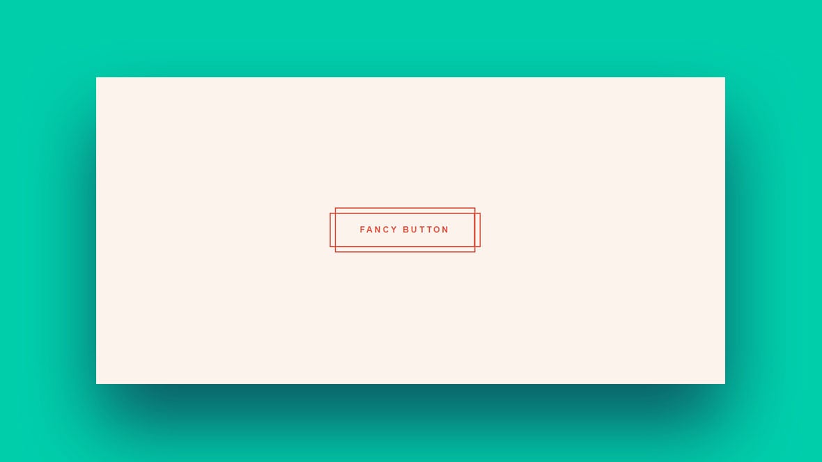
This button’s fancy hover effect makes it fun to use.
Pure CSS Button Hover effect
CSS + SVG Button Animation
Despite being a single animated button, its effect is eye-catching and superb. The effect you’ll see is a button filled with colors from sides to the middle, while the outline has a contrasting color.
Hover Buttons
Hover Button used to CSS mix-blend-mode property.
Background Change
The button comes with a single solid color, while the border has a different style and color. The effect is that the button’s background color changes into another to match its border.
Infinite Pagination
This is a recommended CSS button hover effect for your AJAX-powered pages. You don’t have to reload the entire page. By using this Infinite Pagination, the visitors can view the complete animation while new contents are loading. The disadvantage of this button is that it only has limited practical value.
Simple CSS Buttons Animation
The design of this button is more on slide-in color from various directions. It also fills the button from the center out. If you are searching for a simple CSS button hover effect, this is an excellent choice.
Hover Glow Effect
Stylized Buttons
This button comes with direction hover effects.
CSS Icons on Hover
This one is purely CSS-based. When you apply this button to your page, your page will have hidden icons. They will only appear once you place the cursor on the button section.
CSS3 Buttons
The effect of this button is a drop shadow and cool transition effect. When you click on the button, it seems like it lifts off the screen to show the texts or icons.
Ghost Button Animation
Nikola Popovic created this button animation based on a Dribbble shot.
More Animated CSS Buttons
These CSS buttons with hover effects that are simple and easy to use. You don’t need to learn advanced coding to make your buttons more appealing. This one will do all the work for you.
Glow Effect CSS Button
This button comes with an attractive glow effect. Put the cursor at the top of the button, the 3D effect will appear with the rainbow hue glow.
Buttons + Svg Trianglify
This button is straightforward to use. It has colorful SVG images with a simple design. Moreover, it has a smooth transition since it is CSS and Javascript-based. The transition effects will appear when hovered over.
CSS Tooltip Hovers
If you need default tooltips, you can use the built-in option in your browser. You can also have your own by using a plugin or the cloning pens like CSS Tooltip Hovers. When you hover the text in the HTML <dfn> tag, the fade effect will appear with a tooltip’s resemblance.
Three Simple CSS Button Hover Effects
These three CSS buttons hover effects have a cool transition to improve your site’s appearance.
“Click Me” Button
In this button, the CSS hover/click effect will appear.
Photo Hover Effects
This one is a simple hover effect that is ideal for the page’s images. It only relies on the simple thumbnail gallery. The image’s title, description, and a “read more” button will then show up upon hovering on the photo.
Button Hover Effects
When you apply this hover effect to your page, you can customize your buttons according to your needs and preferences. For example, you can apply different effects with box-shadow on each button. Apart from the box-shadow, you can use the border-radius and letter-spacing for a balanced effect and animation on your website.
Animated Buttons
This button comes with a rainbow hover effect.
Stylish Animated CSS Buttons for Bloggers
This one is an ideal choice for bloggers. You can choose from different hover effects. These could be a swiping color across a button from left to right, right to left, or top to bottom. They highlight the button’s outline for a better design.
Nav Hovers
Since this button relies on CSS, it comes with unique hover effects on each hyperlink. You can choose various navigation hover events for this pen.
CSS Button Hover Effects
You’ll see with this button the common effects are the shadow, pulse, angle background, and neon.
Bubble Coloring Button
This CSS-based button has a bubble coloring effect.
CSS Submit Button Hover Effects
Animate the “:before” and “:after” pseudo-elements to have compelling CSS submit button hover effects.
FAQs about CSS button hover effects
How do I create a basic CSS button hover effect?
Let’s start with the basics. You know, CSS – our styling wizard. Wrap your button in HTML. Next, sprinkle your CSS with a .button:hover selector. Add a dash of color change or border refinement. Voilà! Your button, once plain, now responds to a cursor dance with a visual whisper.
Can I implement animations on button hover using only CSS?
Absolutely. Think of CSS as your choreographer. To pull this off, use keyframes to plot the dance steps, and the animation property kicks it into gear on hover. You want a button that pirouettes on point? Just ask CSS to take the lead.
Why aren’t my CSS button hover effects working in all browsers?
Ah, cross-browser fun. CSS shepherds your web sheep differently depending on the browser. Be sure you’re not missing any vendor prefixes, like -webkit-. Also, double-check if you’re using cutting-edge CSS that older browsers might just snub. Sync with the caniuse.com rhythm to stay in tune.
How can I change the hover effect’s transition speed?
Oh, tempo matters. Inside your CSS, find transition-duration. It’s the DJ that controls the beat of your hover effect’s transition. Faster. Slower. It’s your call, so set that duration to hit the sweet spot between too sluggish and hyperdrive.
Is it possible to have different hover effects for mobile users?
Here’s the twist. Mobile screens don’t hover; they tap. But, you can craft a savvy user interface with @media queries. Tailor your CSS for touch by adapting the styles. It won’t be a hover, but it can be a tap effect that still turns heads.
Can CSS button hover effects improve user engagement?
It’s more than just bling. Hover effects are like a wink across the room. It signals interaction, entices clicks, and adds zing to the user interface. Do it right and watch your engagement ring in harmony.
What are some cool CSS button hover effects I can use to make my website stand out?
Wanna be unforgettable? Fuse CSS transitions with keyframes, and experiment with gradients, shadows, and transformations. Juggle these aspects to unleash a button that not just wows with hover effects but also embeds your site in every visitor’s memory bank.
How can I apply a gradient color change on hover?
Gradient game, anyone? Define your silky gradient inside the hover state using background-image. This could be linear or radial – your style, your rules. Remember, gradients flow; so ease them out with a transition for that flawless morph.
What’s the best practice for creating accessible CSS button hover effects?
Inclusivity is key, my friend. Ensure your effects don’t rely on color alone. Mix it up with visible shifts. Think underlines or size changes, paired up with :focus states too. This way, everyone enjoys the show, color vision, and all.
How do I test and ensure my CSS hover effects work on various devices?
Embrace the gorgeous mess that is device diversity. The tools? Your arsenal is browser dev tools and emulators. Tinker with settings, twist every which way through screen sizes. A/B tests ensure your CSS effects resonate across the vibrant tech spectrum we live and breathe.
Conclusion
So, we’ve been talking CSS button hover effects and man, isn’t it something how a sprinkle of code can turn a static page into a lively party? Now you’ve seen the rhythmic dance, the subtle glows, cheeky slide-ins, transformative shadows – all these concoctions brewed from pure CSS magic.
These effects, they’re not just pretty faces; they’re the secret handshake between your site and its guests, whispering, “Psst, interact with me!”
Armed with these tricks, the cursor becomes a wand, every hover a spell cast on your button, transforming the mundane into the extraordinary. But remember, my friends, wield this power with care. Keep it accessible, user-friendly, and always stylish.
Go on then, take these nuggets of wisdom, give your UI that extra oomph, and watch as every pixel plays its part in a grander user story. Here’s to making the web not just a visual feast but a tactile delight.
If you liked this article about CSS button hover effects, you should check out this article about CSS text animation.
There are also similar articles discussing CSS menus, CSS tables, CSS hover effects, and CSS checkboxes.
And let’s not forget about articles on CSS forms, CSS tabs, CSS search boxes, and CSS slideshow.


Thank you very much for sharing these classic hover effects. I will definitely use one of these on my website.
Hello, is great the variety of effects that we can add to our web pages. But, it would be perfect if you could find a guide for beginners on how to integrate these codes into our “sliders”. regards
Hey,
thanks for the feedback! I will forward this idea to our writers!
Cheers, Dirk @ Slider Revolution
Wonderful information. Thank you
I think something like this could enhance the overall appeal for your website and support boosting the CTR as well. I am looking forward to try this on “Check Price” buttons on my site. Thanks again for sharing these.
amazing work I am really satisfied by your content literally remarkable work best i loved your work
Wonderful information. Thank you
IT’s very use full effects , nice