
With increasing demand for more convenient ways to eat healthy, a lot of companies are getting in on the meal kit delivery game these days. With so many to choose from, though, it can be hard for customers to figure out which service is best for them.
Many times the greatest differentiator between these food companies is what’s on the current menu. Rather than force prospective customers to dig through your website to find the digital menu or to see pictures of the newest specials or items, make it the highlight of the home page.
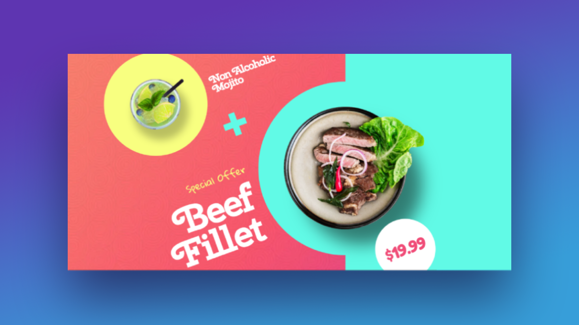
In this tutorial, we’re going to show you how to create a digital menu teaser that stands out from the rest using the Restaurant Menu Slider template. While your home page can still talk up the benefits of fast and convenient meal prep, the delicious imagery in your home page slider will let customers’ stomachs do some of the decision-making for them.
Table of Contents:
- Step 1: Create your food photos
- Step 2: Resize and reposition the food shadow layers
- Step 3: Update the slide backgrounds
- Step 4: Update the background circle colors
- Step 5: Customize the text layers
How to design a digital menu teaser for your food services company
The Restaurant Menu Slider template can be used for anyone working in the food space — food trucks, cafes, food bloggers, etc.:
Regardless of what kind of website you’re designing, you can still follow along with this tutorial. We’ll show you how to preserve the layout and transition effects while customizing the rest:
If you’re new to Slider Revolution, take a look over these docs before you start the tutorial:
Step 1: Create your food photos and upload them to Slider Revolution
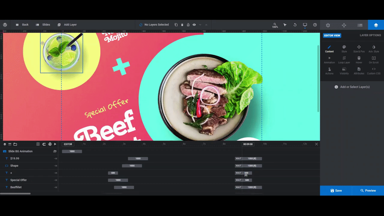
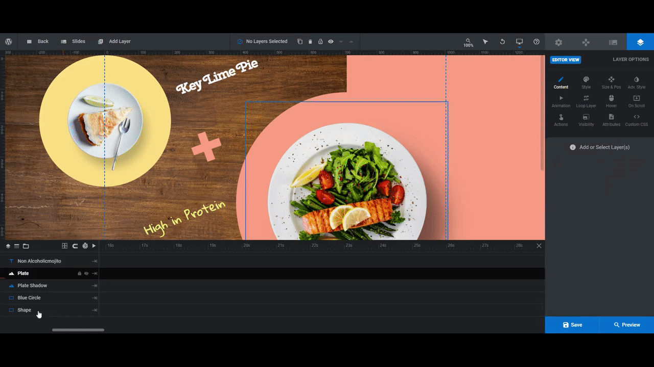
In the original template, there is a layer called Plate that shows a plated photo of the main dish. There is also a layer called Drink that shows the drink that goes with the food.
You don’t need to stick with that pairing. For instance, you could add two different meal kit dishes to the fields and turn the slider into a general showcase of what customers can make. Another option is to replace one of the layers with an illustration that represents the food category (like a cow for a meat dish, a fish for a pescatarian option, etc.).
If you go this route, just make sure to remove the + (plus-sign) layer so that there’s no suggestion that the two layers and images go together.
For our meal prep service, we’re going to replace the Drink layer with photos of desserts.
As for creating your food/drink photos, here are some tips:
Tip 1: Take or find photos that look head-on at the plated dish, glass, etc.
Tip 2: For the Plate layer, size your image as close to 600px x 600px as possible if it’s square. If it’s rectangular, you can size it upwards of 1200px x 1200px.
For the Drink layer, size your image as close to 300px x 300px as possible.
Give your images a little breathing room around the margins, too.
Tip 3: If you can see the backdrop in your photo, use a tool like Canva’s BG Remover to strip it out.
Tip 4: Download your image, making sure to enable the transparent background setting. This way, all of the background noise — whether it be an image or white space — will be removed.
You can now replace the existing food and drink images with your new ones.
To do this, select the layer you want to replace in the canvas or timeline editor. Go to “Layer Options” and “Content”. Upload your replacement image to the Media Library:
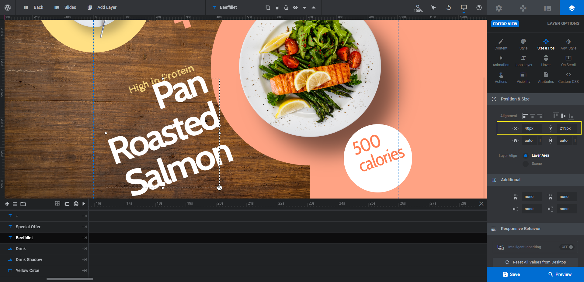
Note: If you feel as though any of the items is too small or large for the given space, go to “Size & Pos” to adjust the width or height value:
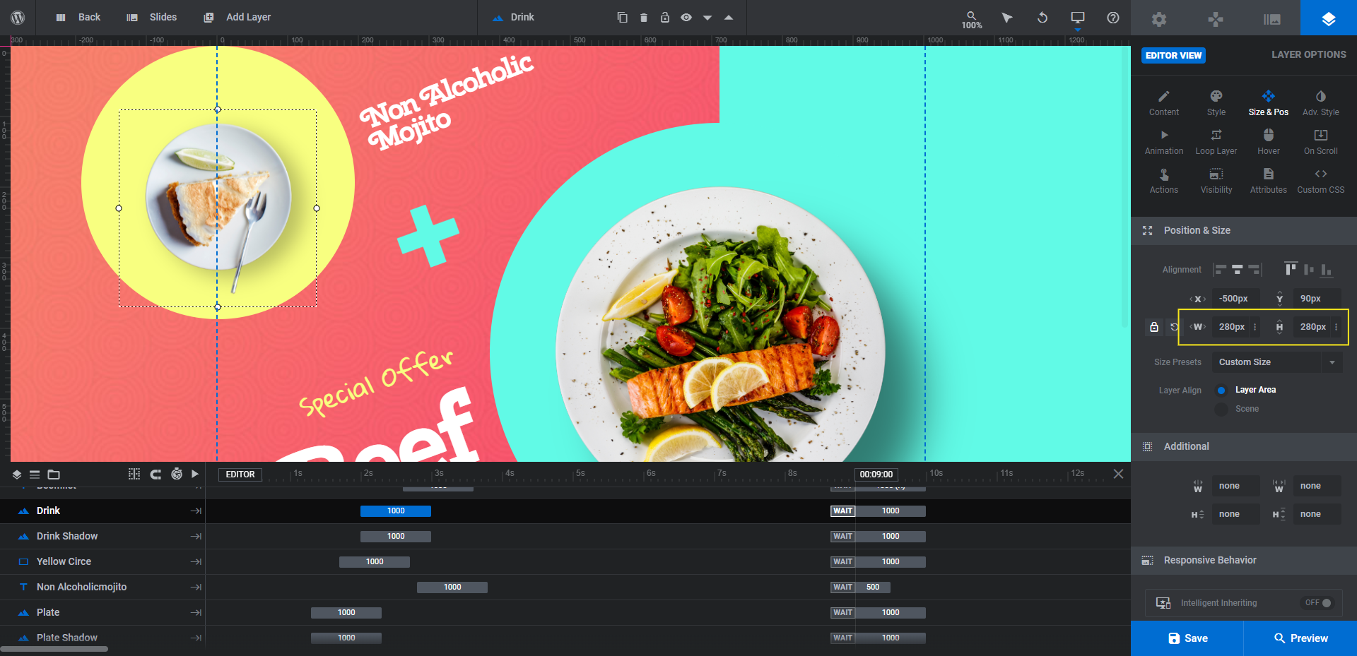
You may also need to tweak the X or Y placement if the new image isn’t properly centered.
When you’re done replacing the images in one slide, save your changes before moving onto the next. Repeat this process until all six Plate and Drink layers have been replaced.
Learn more:
Step 2: Resize and reposition the food shadow layers
In order to give your slides the feel that your plates or glasses are moving along a tabletop or another flat surface, there needs to be a shadow behind them. The template already has the shadow image in place for the six food/drink layers.
If you made any changes to the size or position of the Plate or Drink layers, then adjust the Plate Shadow and Drink Shadow layers accordingly in this step.
It’s the same process as resizing and repositioning the photos. Select the shadow layer you want to modify and go to “Layer Options” and “Size and Pos”.
For the Drink Shadow:
Make the shadow layer 15px (width and height) larger than the main photo. Also, make the X and Y values offset by 20px — the shadow should sit down and to the right of each image.
For the Plate Shadow:
Make the shadow layer 15px (width and height) larger than the main photo. Also, make the X and Y values offset by 60px.
Before you wrap up this step, do a responsive check using the variant dropdown in the toolbar:
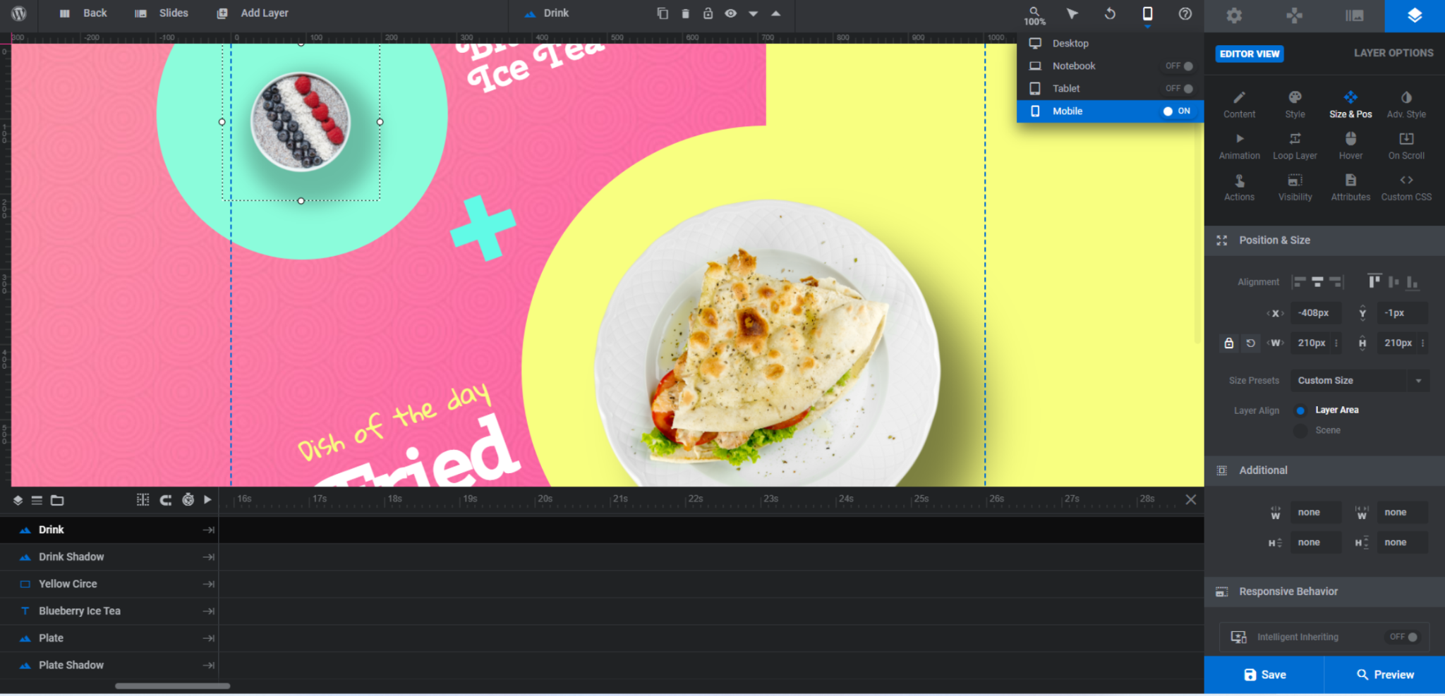
Changes to the original image or shadow dimensions can sometimes lead to misalignment issues on smaller screens. This tool will enable you to detect and repair those issues so that visitors won’t encounter them.
Learn more:
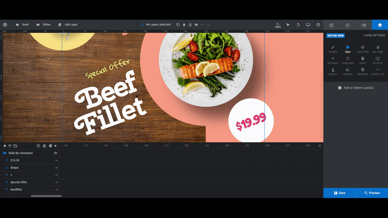
Step 3: Update the slide backgrounds
When you look at each slide, it looks as though there are two backgrounds — the texturized one beneath the Drink Layer and the solid one beneath the Plate Layer.
In order to create this effect, there are three elements that need editing.
The first you’ll find by going to “Slide Options” and “Background”. Source is where you’ll upload your new background texture:

You’ll have to do this for all three slides.
Note: You don’t need to use a textured image to create your background. If you’d prefer to use a solid or gradient color, click the down-arrow next to Image and select the corresponding background type.
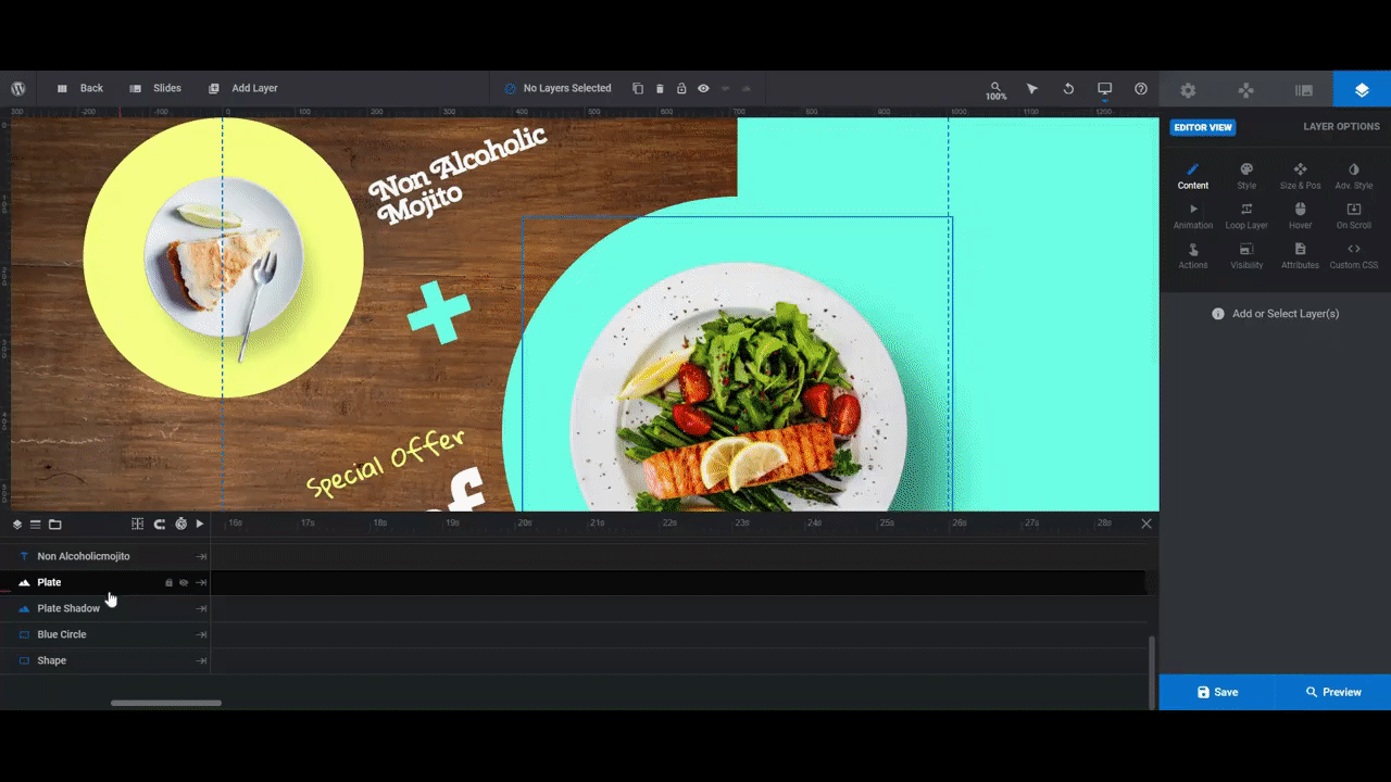
For our background, we’ve replaced the digital texture with a realistic wood grain as we want to give our healthy meal kits a dose of class. Because of this design choice, we’ll be using softer colors in the rest of our design.
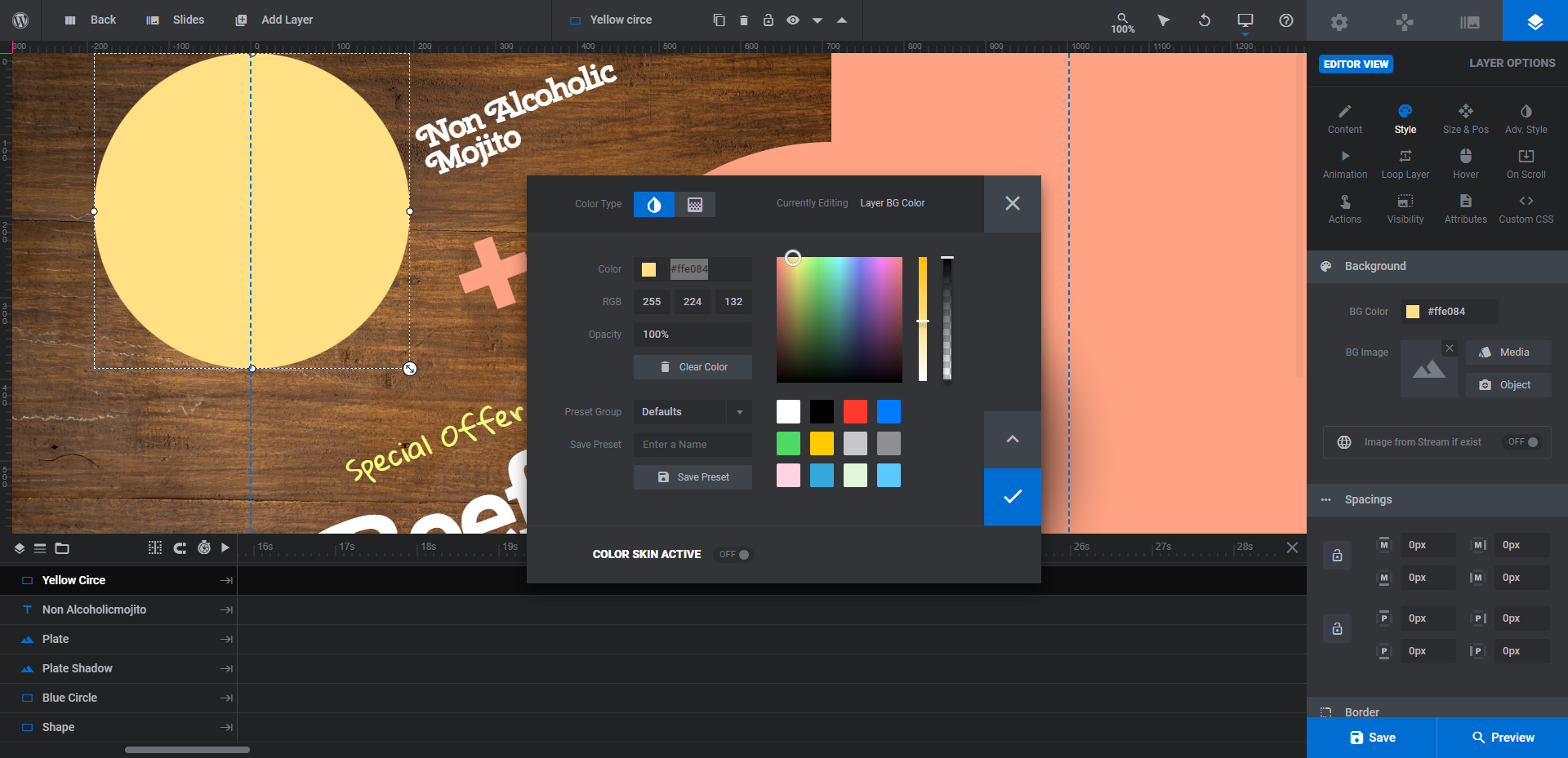
To update the other half of the background color, locate a layer called Shape. There are two of them in each slide, so be sure you pick the one that highlights the large rectangular shape in the canvas (not the circle behind the price).
To edit the color, go to “Layer Options” and “Style”. You can swap out the BG Color there:
Pro tip: To save time, update the colors of the Blue Circle layer’s background color and the + layer’s text color now since they use the same color as the Shape layer.
Repeat this process for the other two slides. Save your changes as you complete each batch of updates.
Learn more:
Step 4: Update the background circle colors
There are two circular shapes remaining:
- Yellow Circle sits behind the Drink layer.
- Shape (the other one) sits behind the $19.99 layer.
Edit these two layers the same way you did the Blue Circle layer. Select them in the canvas or timeline editor. Then go to “Layer Options” and “Style” to edit the background color:
After you finish each slide, save your changes.
Step 5: Customize the text layers
There are four text layers in each slide:
- Name of the plated dish
- Tagline
- Name of the drink
- Price
You can keep all four layers or remove the ones you don’t need. We’ll be keeping them, but making some slight alterations to the content within each.
To start, let’s update what each text layer says. To do this, select the layer either in the canvas or the timeline editor. Then go to “Layer Options” and “Content” to add your own text:
Note: If you want to force any of the words down to the next line, add the cursor where you want the break to go and then type in <br />. You can also hit the return-arrow key above the text field.
Next, you’ll want to add custom styling to the text layers. You’ll be able to customize the following settings under “Style”:
- Font
- Color
- Weight
- Size
- Spacing
The last thing to do is adjust the position of the text layers. This will be useful if you’re using a different font and the weight and spacing of it varies a lot from the original.
To make modifications, go to “Size & Pos”. You won’t be able to adjust the size of text layers here, only the position:
Use a combination of position (under “Size & Pos”), text weight/size (under “Style”), as well as the text <br /> (under “Content”) to make your text layers fit exactly as you’d like them to in the canvas.
Before saving your changes, check the responsive variants to ensure that your text changes work on smaller screens.
Learn more:
Create a drool-worthy image slider that puts your menu’s best dishes front and center
Humans are visual creatures. While you can certainly sell them on a meal kit service that’s fast, affordable, and convenient, they’re not going to make up their minds until they actually see the food for themselves.
With the Restaurant Menu Slider template, you’ll be able to create a digital menu preview of your most current or popular meals. With your customers’ stomachs excited at the prospect of what they’ll be eating, their brains will be able to focus on the other benefits of becoming a subscriber.


