
Checking to Ensure Modified Content is Still Responsive
What is responsiveness, how do you check if you have it, and what do you do if you don't?
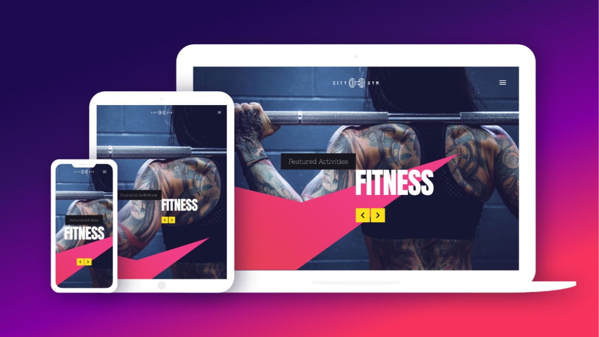
Table of Contents
- What Does “Responsive” Mean?
- Responsiveness in Template-Based Modules
- A Foundation in Responsive Design
- Checking Responsiveness in Edited Templates (Video Tutorial)
What Does “Responsive” Mean?
The word “responsive”, in the world of website creation, means ensuring your content is able to respond to any device type its viewed on, providing an equally good experience to all viewers.
This typically means having multiple layout versions made to fit nicely on various screen sizes, ensuring images can be seen clearly, checking that text is legible & readable, and so on.
Responsiveness in Template-Based Modules
Slider Revolution [?]
Slider Revolution is a website content creation tool with a focus on captivating animation and stunning visual effects.
It began its life as a plugin for creating slideshows, but has evolved into a fully fledged piece of design software. has several built-in tools and settings to help you make your modules [?]
A module in Slider Revolution acts as a container for slides, which in turn act as containers for layers. Modules are created and edited with the module editor.
A "module" is a single, self contained piece of content. You can think of this as being similar to the way a post or page in regular WordPress is a self contained piece of content.
A module can represent any kind of content Slider Revolution is capable of creating, such as a slider, carousel, hero unit, navigation menu, posts display and so on.
Multiple modules can be combined to form rich content such as complete sites and landing pages. responsive, and the vast majority of Slider Revolution templates [?]
A "Template" is a premade module. It has pre-configured layers already in place.
It is designed to be ready for use, either as is or after being modified in the module editor.
Slider Revolution comes with several templates you can use, or alternatively you can create your own templates, thereby allowing you to easily reuse modules you have produced. are created with responsive layouts already is place. So when you start with a template as a base, the vast majority of the requirements for responsiveness will have already been met.
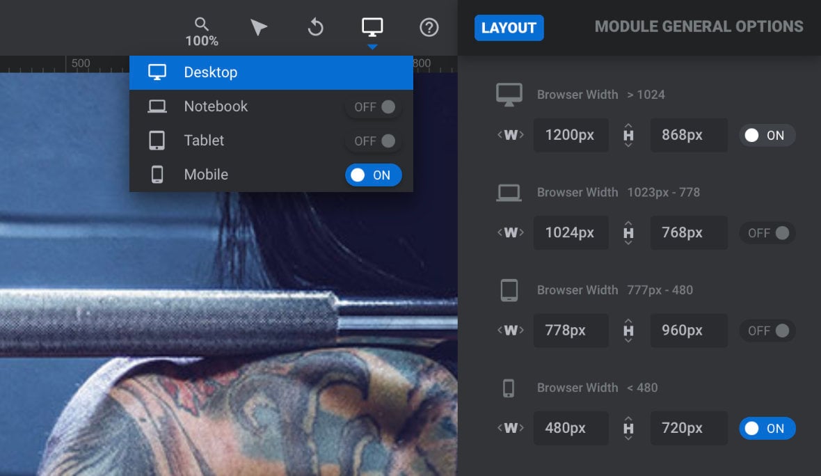
However, after you make customizations to template-based modules, the size and position of layers [?]
Layers are containers for visual, audio or layout items and are added to slides. For example, text, button, image, audio, video, group and row are all types of layers.
Layers are added to slides via the module editor. may end up slightly different, altering the way the module looks at different screen sizes. For this reason, after modifying pre-made content you may find it’s necessary to tweak a few things to make sure your layouts remain fully responsive.
To help you in doing so, in this section of the manual we’ll show you how to check through your customized modules, identify any issues with responsiveness, and solve any problems you find.
A Foundation in Responsive Design
Through learning how to check for responsiveness in template-based modules, you’ll get a solid foundation in the core principles of what responsiveness is, and how to work with it in Slider Revolution.
This foundation will later help you to design responsive content of your own. Given setting up all the responsive behavior yourself can be a somewhat in depth process, we won’t be stepping through it just yet. Rather, we’ll tackle it in full in the upcoming “Modules from Scratch” section of the manual.
Checking Responsiveness in Edited Templates (Video Tutorial)
Everything covered in this section of the manual can also be learned by watching the ‘Checking Responsiveness in Edited Templates’ tutorial video below:
If you watched the above video in full you can skip the remainder of this section of the manual and proceed to the next section of the manual to learn about making modules from scratch.
Or, continue reading to learn more about responsiveness in Slider Revolution.
Up Next: Previewing & Editing Different Screen Sizes
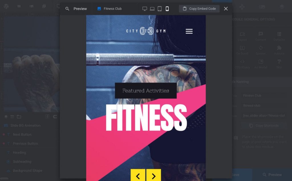
For now, on the next page of the manual we’ll get the ball rolling by learning about the four layout size variants available in Slider Revolution, and how you can preview & edit them as part of ensuring your modules are optimally responsive.