

Ever swiped through a website feature and thought, “This is smooth, this is sick?” That’s some good carousel UX right there, folks. We’re not just talking about those click-to-the-next arrows or even those automated slides that cycle like they’ve got somewhere to be. Nah, we’re going deep—into the nitty-gritty of what makes or breaks your carousel user experience.
So, why should you listen up? Simple. I’ve been creating these interactive bad boys for years, and let me tell you, it’s not as easy as just slapping some images together. You’ve gotta consider mobile responsiveness, accessibility, and even whether or not your mom can navigate it. Trust me, there’s more to this than meets the eye.
This article is your roadmap to that jaw-dropping carousel UX. We’ll dish out some real talk about common mistakes you’ve gotta steer clear of, and dish out the inside scoop on modern best practices.
The Carousel Controversy
Common criticisms and issues
Accessibility concerns
Alright, let’s get real about this whole carousel UX thing. Ever thought about how folks with disabilities interact with your stunning carousel? The truth is, many carousels are kinda terrible when it comes to accessibility. Screen readers can struggle with them, and keyboard navigation? Forget about it.
Make sure your carousel is navigable by keyboard shortcuts and legible for screen readers. If not, you’re excluding a significant part of your audience, which is not just bad form but also could lead to compliance issues.
Low click-through rates
You’ve got this sleek carousel, front and center. But guess what? Sometimes people just scroll right past it. I mean, who clicks on these things, right? So, the click-through rate can be depressingly low. That’s like throwing your efforts and cool ideas into the void.
Carousels often get neglected because they can overwhelm or confuse the user. There’s too much going on, and before you know it, whoosh, the slide changes.
Disruptive auto-advancing
Okay, this one drives me nuts. You’re halfway through reading something interesting on a slide, and bam! The carousel moves on. Seriously? Auto-advancing is like that friend who doesn’t let you finish your sentence. Super annoying and poor carousel UX for sure.
The continued use of carousels
Image galleries and news items
Now, despite all the hate, carousels are not all bad. I mean, they still look snazzy for image galleries and news items. Done right, they can add a layer of interactivity that makes content pop.
When it comes to showing off a portfolio or the latest headlines, they can actually be super useful. But again, it all boils down to how well you’ve thought through your carousel UX.
Landing pages and corporate websites
Many landing pages and corporate sites still swear by carousels. Why? Because when done right, they can be eye-catching and convey multiple messages successfully.
However, this isn’t an excuse to cram as much as you can into one space.
Onboarding, testimonials, and product highlights
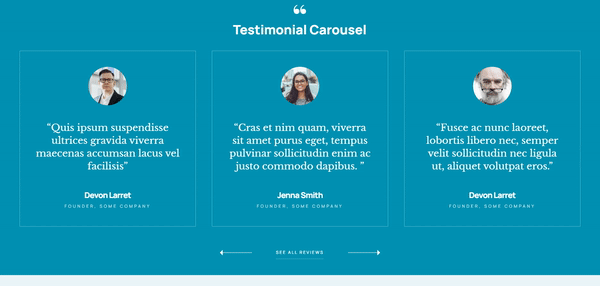
I’ve seen some really neat uses of carousels for things like onboarding sequences, displaying client testimonials, or highlighting key features of a product.
In these cases, carousels can serve a real purpose. They guide new users, build credibility, or showcase the stuff that matters most.
Understanding Carousel Interaction
User behavior with carousels
Size matters. No, seriously, it does. A massive carousel that takes up the entire screen? Way too much. But make it too small, and it will transmit the proper message.
And let’s not forget content. You could have the perfect size, but if what’s on there is just fluff? Then it’s like putting ketchup on ice cream. Gross and confusing. Relevant content is key for good carousel UX.
Benefits and drawbacks of carousels
Multiple content pieces in prime real estate
Okay, one big win for carousels is they let you pack in a bunch of different stuff in one spot.
Like, you wanna show off your portfolio, some testimonials, and a couple of blog highlights? Boom! Carousel to the rescue.
But wait. Here’s the flip side.
Often overlooked, potential misrepresentation
Because you’re packing in so much, sometimes people just, ya know, forget to look.
It’s like when you’re at a buffet and pass by the salad because, hello, there’s pizza! So, there’s a risk your content could go unnoticed.
Designing Effective Carousels
Essential carousel components
Container element
Okay, so the stage for our little carousel drama is the container. This bad boy holds everything.
And when I say everything, I mean all the things: images, text, buttons, you name it. For this, just think of a good, clean box where your content can shine.
Items within the carousel

These are your VIPs—Very Important Pixels. What’s going in there? Photos? Snippets of text? A meme or two?
Just make sure each item is a showstopper or at least worthy of your user’s eyeballs. We’re talking about the essence of carousel UX here.
Descriptive text
A picture’s worth a thousand words, but sometimes those words are like, “What the heck am I looking at?” A lil’ bit of text can clear things right up.
So don’t skip the captions. Let people know what they’re seeing.
Navigation buttons
The unsung heroes, really. We’re talking ‘Next’ and ‘Previous’ buttons. Make these puppies stand out but not scream in your face.
Nobody likes a loudmouth button, am I right?
Play/pause buttons
If you’re living life on the edge and opting for auto-scroll, then for the love of good carousel UX, give folks a way to pause.
It’s kinda like when Netflix asks if you’re still watching. Yes, Netflix, I am. And yes, users, you can pause.
Context-dependent carousel components
Indicators
Little dots, little numbers, or maybe little nothing? You can A/B test to see which one users like most. The thing to know here is that they are useful. They’re like breadcrumbs, but for your eyes. They give a sense of how much content is up for grabs.
Captions
Sometimes an image is just an image, but other times it’s a freaking mystery. Like, what’s this abstract blob of color supposed to mean? Captions, my friends. They explain the unexplainable.
Call to action
If your carousel is more than eye candy—if it’s asking folks to do something—then a call to action is your wingman. Could be as simple as “Learn More” or as demanding as “Buy Now!” Either way, make it pop.
Pagination
Think of this as the table of contents for your carousel. It lets users jump to the slide they care about, without having to click through every. single. one.
Carousel usability enhancements
Scrolling direction and user expectations

Look, if you drive on the right side of the road, you’d freak if someone told you to drive on the left all of a sudden, right?
Same goes for carousels. Stick to what folks expect. Generally, people are cool with left-to-right scrolling. It’s the bread and butter of carousel UX.
Replacing progress dots with labels
Okay, those tiny dots under a carousel? Cute but not always useful. Imagine, like, watching a movie without knowing the title. Weird, huh?
Let’s swap those generic dots for actual labels. Give people a reason to care about the next slide, not just a hint that it exists.
Using a horizontal slider for progress indication
Alright, stepping up the game here. A slider’s like the VIP section in the carousel world. It’s not just saying, “Hey, there’s more!”
It’s saying, “Here’s exactly how much more, pal.” It’s a touch of class that can elevate your whole carousel UX.
Indicating the current position in the carousel
This is basically the “You Are Here” sign in a mall. You need it. Otherwise, it’s like scrolling through Netflix without knowing which season you’re on. Disorienting and low-key frustrating.
Carousel design considerations
Importance of the first slide

First impressions count, right? The first slide is your frontman, your opening act, your icebreaker. It’s got to grab attention like a firework show on a quiet night.
Because, let’s be real, if slide one doesn’t hook ’em, slides two, three, and four don’t stand a chance. Carousel UX, people. It’s not rocket science, but it kinda is.
Repeating important information outside the carousel
Say you’ve got some super important stuff. Like, life-changingly important. Don’t lock it up in a rotating cell, no way. Splash that info somewhere permanent, where users don’t have to play hide-and-seek to find it.
Like maybe in a sidebar or a header, just somewhere it can shine 24/7.
Carousel Best Practices
Avoiding common pitfalls
Ensuring accessibility for all users
Alright, let’s get this straight—your carousel is for everyone. Imagine if your favorite coffee shop suddenly put their menu on the top shelf where you couldn’t see it. Not cool, right? Make your buttons big enough to tap, and include alternative text for those images.
If you’re not thinking about accessibility, you’re basically skipping out on a whole chunk of people who could be loving your stuff. And that’s just leaving money and goodwill on the table. Carousel UX is about everyone.
Avoiding auto-advancing carousels
You wouldn’t keep flipping someone’s book pages while they’re still reading. So, why let your carousel slide change before someone’s even done looking?
Auto-advance is like that friend who spills the end of the movie just as you’re getting into it. Let folks soak it in at their own pace. Trust me, your user engagement will thank you. Carousel UX for the win.
Ensuring content discovery in carousels
Ever had a mystery box of chocolates? Fun for a second, but you kinda wanna know what you’re getting into, right?
Make it obvious what your carousel is serving up. Whether it’s feature updates or top-selling products, be clear. Mystery is for novels, not carousel UX.
Modern carousel effectiveness
Importance of the first slide
I know I’ve said it before, but man, this is key. Your first slide is your show-stopper, your big entrance.
If your first slide is like, “Yeah, okay,” you’ve already lost the crowd. Make it a “Woah, tell me more!” kind of deal. Your entire carousel UX vibe starts here.
Repeating important information outside the carousel
If your carousel was a music playlist, think of this as your hit single. If something’s super critical, don’t let it disappear when the slide changes.
Put it up somewhere permanent, like a wallflower at a party that everyone needs to notice.
Conversion rates and carousels
Analyzing successful carousel approaches
Hey, don’t just throw stuff at the wall and see what sticks. Look at the big players.
What are they doing? Their carousel UX is probably tight for a reason. So analyze, adapt, and get that click-through rate soaring like an eagle or, you know, something equally majestic.
The importance of user research
Ah, the classic “talk to your audience” move. Like, actually ask people what they think of your carousel. You can guess all day, but real-life feedback is where it’s at.
UX best practices for carousels
Designing for easy functionality

A carousel should be as easy to use as scrolling through your social media feed. Intuitive, clean, no fuss. Like a well-organized sock drawer.
Giving users control
Okay, imagine you’re a DJ for a sec. Would you like someone else messing with your decks? Nah. Same with carousels. Give people the control to navigate how they want. Play, pause, skip—whatever.
Informing users about the number of slides
This is basically saying, “Yo, we got three floors of awesome, and you’re on floor one.” Simple, but helpful.
Using clear labels
The days of “Click Here” are long gone. Tell people exactly what clicking will do. It’s like the difference between a mystery door and a door that says, “This way to the rooftop party.”
Ensuring responsiveness
Ever tried reading a broadsheet newspaper on a crowded train? Awkward, right? Your carousel should fit on any screen like it was made for it. Because, well, it should be.
Carousel UX is more than just some slides. It’s an experience. Like a chef with a tasting menu, every element, every moment counts. And when you nail it, you’ve got something that’s not just visually cool but super effective in getting people to click, look, and maybe even buy.
Carousel UX is kinda like your online handshake—make it strong, make it slick, and make it something people remember.
FAQ On Carousel UX
Why do people use carousels in web design?
Carousels, when done right, can be a visually appealing way to showcase multiple pieces of content in a confined space. They’re especially popular on landing pages where there’s a need to highlight several features or products without overwhelming the visitor.
But remember, while they can be flashy and eye-catching, they need to be user-friendly. If not, they might just become a decorative element that users scroll past.
Are carousels effective for user engagement?
Ah, the age-old debate! Some studies suggest that carousels can suffer from low engagement, especially if users don’t realize there’s more content to see.
However, when designed with clear indicators and interactive elements, they can indeed engage users. It’s all about striking a balance between aesthetics and usability. If users can’t navigate it easily, they’ll likely skip it.
How can I make my carousel more accessible?
Accessibility is crucial. To make your carousel user-friendly for everyone, ensure it has keyboard navigation, pause/play buttons, and ARIA roles. Alt text for images is a must, and don’t forget about contrast ratios for text.
Remember, an accessible carousel isn’t just for those with disabilities; it improves the experience for all users.
Do carousels work well on mobile devices?
Mobile design is a different beast. Carousels can work, but they need to be optimized. Think about touch gestures like swiping. Also, ensure the carousel’s content scales well and remains legible on smaller screens.
And, given the limited space, maybe consider if a carousel is the best choice or if there’s a more mobile-friendly design pattern you could use.
Should my carousel auto-rotate?
Auto-rotating can be a double-edged sword. While it can draw attention, it can also annoy users if it moves too quickly or disrupts their reading. If you do choose to auto-rotate, always provide controls for users to pause and navigate manually.
And never let it move so fast that users can’t comfortably read or view the content.
How many items should I include in my carousel?
Less is often more. Overloading your carousel can overwhelm users. A good rule of thumb? Stick to 5 or fewer items.
This ensures users can engage with each piece of content without feeling rushed or bombarded. Quality over quantity, always.
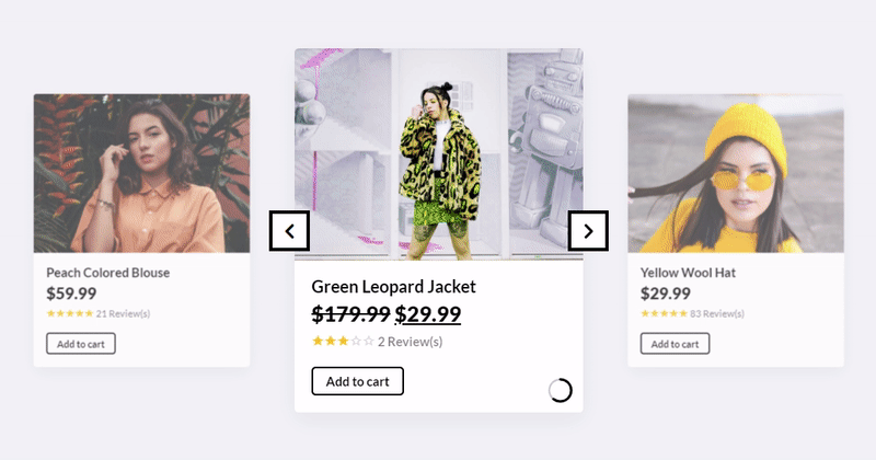
What kind of content works best in a carousel?
Visual content shines in carousels. Think high-quality images, graphics, or short videos.
How can I encourage users to interact with my carousel?
Clear indicators are key. Arrows, dots, or even thumbnails can hint at more content. Also, consider adding interactive elements like hover effects or subtle animations.
But, always ensure these don’t detract from the carousel’s main content. The goal is to entice, not distract.
Conclusion On Carousel UX
So, there you have it, the ultimate cheat sheet for nailing that carousel UX. Seriously, who knew a couple of rotating slides could get so complex, right?
- First up, you’ve gotta make sure it’s accessible for everyone.
- Then, work on those slick designs and attention-grabbing features.
- And don’t even get me started on mobile optimization—it’s a must.
Bottom line, there’s no room for half-measures here. You’ve either gotta go all in or maybe consider alternative designs. Trust me, no one’s ever raved about a mediocre carousel.
If you liked this article about carousel UX, you should check out this article about mobile carousels.
There are also similar articles discussing Owl Carousel, product carousels, websites with carousels, and testimonial carousels.
And let’s not forget about articles on carousel sliders, Bootstrap carousels, ecommerce sliders, and parallax sliders.


I am surprised that Slider Revolution carousel doesn’t scale properly (or at all) for mobile devices, given WordPress goes to the trouble to make every size image that could possibly be used when they are uploaded. I have read a few articles now and it seems this basic functionality is not built into the SR code, instead it is apparently a job for the end user, with no clue how to go about making that happen. Whilst I appreciate that this article, yet again, makes clear this functionality isn’t built in, so that is how it is, maybe the fine line between beer and coffee should be crossed and get it on to the critical dev list, where it rightly belongs :)? Thank you.