
Ever swiped left or right on your phone and watched images glide smoothly? That’s a mobile carousel for ya! It’s not just a fancy tech term. It’s the magic behind those sliding images on websites and apps.
Now, why should you care about it? Well, if you’re diving into the world of web design or just curious, understanding mobile carousels is crucial. They’re the unsung heroes of user experience. They make browsing photos, products, or any content a breeze on mobile devices.
By the end of this read, you’ll:
- Grasp the essence of mobile carousels.
- Discover their role in enhancing user experience.
- Uncover the secrets to designing an effective carousel.
Understanding the Basics
What is a Mobile Carousel?
Hey there! Let’s talk about what a mobile carousel really is. In layman’s terms, it’s like a revolving stage for content on your mobile screen. Imagine you’ve got a tiny theatre in your hand, and the stage turns to display different acts — pictures, text, videos, you name it.
Definition
A mobile carousel is essentially a design element that rotates content in a loop. It’s interactive, dynamic, and definitely adds some flair to your app or website.
Core Components
You got your slides, which are the content pieces you’re showcasing. Then, there’s usually a navigation element, like dots or arrows, that tells the user how many slides there are.
Types of Mobile Carousels

So, you’ve got an idea of what a mobile carousel is, but did you know there are different types you can use?
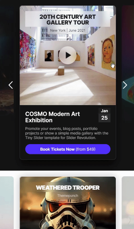
Image Carousels
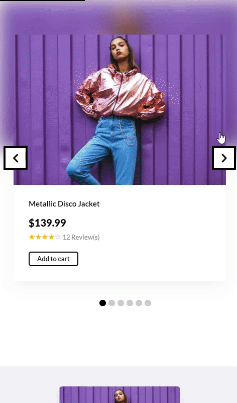
Here’s a juicy one. Ever been to an online store and seen those rotating images of a product from different angles? That’s an image carousel. Super handy for giving folks a fuller picture (pun totally intended) of what you’re selling or showcasing.
Text Carousels
Text carousels are more like your daily news reel but interactive. Imagine you’ve got essential tidbits, announcements, or even Twitter testimonials about your brand. You can shuffle these into a text carousel so users can swipe through ’em. It’s a great way to condense a lot of info into a small space without overwhelming anyone.
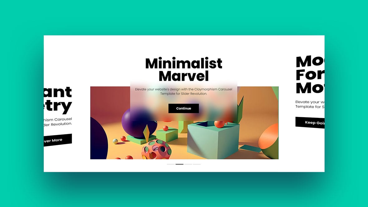
Mixed Content Carousels
Alright, for the grand finale: the mixed content carousel. It’s like the Swiss army knife of mobile carousels. You can really go to town with how you use it. Say you’re showcasing a new product, you could have an image, some snappy text, and a quick tutorial video all in one rotating set.
Carousel Anatomy
Let’s dissect this beast for a sec. Beyond the slides and navigators, you have:
- Controls: These could be swipe gestures, autoplay settings, or manual next/prev buttons.
- Animation: Yeah, that’s the cool transition effects between slides, like a fade-in or slide-over.
- Loop Settings: Ever notice how some carousels just keep going in a loop while others come to a dead-end? That’s your loop settings at work.
Design Principles
Visual Consistency
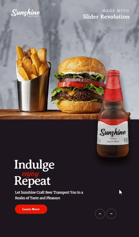
Visual consistency—sounds kinda highbrow, but it’s super simple. Imagine you walk into a room and everything just flows. The colors, the vibe, the feels. That’s what we aim for in a mobile carousel.
Color Schemes
So, color schemes. Think of them as the playlist for a party. You don’t want sad break-up songs in a happy-go-lucky BBQ, right? Same goes for your carousel. Keep the colors in sync with the mood of your content.
Typography
Fonts, my friends, are the unsung heroes of design. A good font in your mobile carousel is like the bass player in a band. You might not always notice it, but you’d miss it if it were gone. So choose wisely. Make sure the text is easy to read and fits with the overall vibe.
User Interactivity

Boom! Now, let’s talk about the part everyone loves: messing around with stuff. Your mobile carousel needs to be more than just a pretty face; it’s gotta interact with peeps too.
Swipe Actions
Okay, so you know how you swipe right on, um, some apps? Same thing here. Make it a breeze to slide from one bit of content to the next. It’s all about that thumb-flick action.
Tap Actions
But hey, maybe you’re old-school and like to tap. That’s cool, too. Just make sure those buttons or dots or whatever are big enough to hit without zooming in like you’re trying to read the fine print on a contract.
Responsiveness

We live in a multi-screen world, y’all. Your mobile carousel has gotta look good whether you’re on a phone, tablet, or anything else you can swipe on.
Screen Size Adaptability
Imagine your carousel is like a chameleon. It’s got to adapt to its environment. Big screen, small screen, it doesn’t matter. Your content should still be visible and not look like it got caught in a funhouse mirror.
Loading Times
Ah, the dreaded spinning wheel of doom. Nobody likes waiting. Optimize those images, shrink those videos, and for the love of all things snappy, make sure your mobile carousel loads like it’s on a sugar rush.
Extra Tips: Subtle Add-ons
- Shadows and Layers: A subtle drop shadow or layering elements can give your carousel depth. Kinda like putting eyeliner on. Subtle, but it makes the eyes—err, slides—pop.
- Feedback: Tiny animations that give a sense of response when interacting. Think of it as the carousel winking back at you when you swipe.
Best Practices
Content Prioritization
Alright, so you got the basics and the design principles locked in. Now, let’s talk about actually setting up your mobile carousel so it’s not just eye candy but also gets the job done.
Most Important First
You know how when you start a playlist, you wanna kick things off with a banger? Same goes for your carousel. That first slide should be a showstopper. Something so good people can’t help but swipe to see what’s next.
Least Important Last
On the flip side, don’t dump your leftover content at the end. But if you gotta prioritize, keep the less crucial stuff for the last slides. It’s like saving the veggies on your plate for last, except people will actually want to get to it.
Navigation Indicators
Alright, next up: telling people where they’re at. No one likes to be lost, whether it’s in a city or in a mobile carousel.
Dots
Dots are like breadcrumbs. Small but noticeable, they give folks a quick look into how many slides there are. And like, if they’re on slide two out of five or what.
Arrows
Now, arrows are like your GPS. They’re more direct, telling you exactly where to go next. Left to go back, right to go forward. No guesswork, just tap and go.
Accessibility
Accessibility isn’t just a buzzword; it’s a must-have.
Alt Text for Images
This one’s huge. Adding alt text to the images in your mobile carousel is like having subtitles in a movie. It lets those who can’t ‘see’ the image know what’s going on.
Voice-over Capabilities
Next level? Adding voice-over capabilities. It’s like an audiobook for your mobile carousel. So, if someone can’t read the text or see the images, they can still get all the info.
The Extra Mile: Spicing It Up
- Interactive Elements: Ever think about adding quizzes or polls in between your slides? Makes your carousel interactive like a video game.
- Limited Time Offers: Create a sense of urgency. It’s like those flash sales that happen outta nowhere.
- Progress Bars: They give people a sense of how long each slide will last. Sorta like the timer on a microwave.
Common Mistakes and How to Avoid Them
Overloading Content
So, picture this. You’re at an all-you-can-eat buffet, but your plate’s so stacked you can’t even see over it. Yeah, that’s what we call content overload in the mobile carousel world.
Limit Number of Slides
It’s tempting to chuck everything you’ve got into your carousel, but easy there, tiger. No one wants to swipe through a novel. Keep it short, snappy, and to the point.
Simplify Text
When it comes to text, less is more. You’re not writing an essay; you’re shooting off a quick message. Short. Sweet. Done.
Ignoring Mobile Optimization
Not gonna lie, this one’s a biggie. You’ve got this sleek mobile carousel, but it only looks good on a desktop? Nah, fam, that ain’t it.
Image Compression
Big, heavy files are like dragging a suitcase up a flight of stairs. It’s exhausting just thinking about it. Keep your files lightweight so that carousel spins like it’s got wheels.
Touch-friendly Design
This is a mobile carousel, not a microscopic carousel. Buttons, links, or anything you gotta touch should be big enough for a human finger, not a pencil tip.
Neglecting Analytics
What’s the point of doing something if you can’t tell if it’s working or not, right?
Tracking User Engagement
Are people swiping through? Are they tapping on links? Analytics is like having a backstage pass to your audience’s behavior. You can see what’s hitting the right note and what’s falling flat.
A/B Testing
Ever make two different smoothie recipes to see which one tastes better? That’s A/B testing, but for your mobile carousel. Try out different images, text, or even whole layouts to see what gets people clicking.
The Oopsie Daisy: Common Overlooked Details
- Updating Content: The world keeps spinning, and so should your mobile carousel. Keep it fresh and up-to-date.
- Looping vs Non-looping: To loop or not to loop? If you’ve got a killer last slide, maybe give people a moment to let it sink in before it loops back to the start.
- CTAs (Call To Actions): Don’t assume people know what to do. Sometimes you gotta spell it out with a ‘Buy Now’ or ‘Learn More’ button.
FAQ On Mobile Carousels
What’s a mobile carousel anyway?
A mobile carousel is like a digital conveyor belt for images or content on your mobile screen. Think of it as a revolving showcase, letting users swipe through multiple items without needing to scroll endlessly.
Why are they so popular in web design?
Mobile carousels are a hit because they save space and offer a dynamic user experience. They allow designers to present multiple pieces of content in a compact and interactive manner, making sites look cleaner and more engaging.
How do I add one to my website?
It’s simpler than you might think. There are many tools and plugins available, like Slider Revolution, that allow even the least tech-savvy among us to integrate a carousel. Platforms like WordPress have plugins, and coding languages like HTML and JavaScript offer scripts for the more tech-inclined.
Can they slow down my site?
If not optimized, yes. Large image files or too many items can impact load times. It’s crucial to compress images and ensure the carousel script is efficient to maintain site speed.
Is it mobile-responsive?
Most modern mobile carousels are designed to be responsive. This means they’ll adjust and look great regardless of the device’s screen size. However, always test on different devices to be sure.
How can I make my carousel more user-friendly?
Keep it simple. Limit the number of items, use clear navigation indicators, and ensure it’s swipe-friendly. Also, consider adding captions or short descriptions to give context to each slide.
What about accessibility?
Accessibility is crucial. Ensure your carousel has keyboard navigation options and is compatible with screen readers. Alt text for images and clear contrast ratios are also essential for visually impaired users.
Can I add videos or other media?
Absolutely! While images are standard, many carousels support videos, text slides, and even embedded widgets. It’s a versatile tool, but remember to keep user experience in mind.
Conclusion On Mobile Carousels
We’ve seen how these carousels aren’t just about sliding pictures. They’re about creating that smooth, user-friendly experience on our mobile screens.
It’s not just about the techy bits. It’s about the feel, the flow, and the finesse.
If you liked this article about mobile carousels, you should check out this article about carousel UX.
There are also similar articles discussing Owl Carousel, product carousels, websites with carousels, and testimonial carousels.
And let’s not forget about articles on carousel sliders, Bootstrap carousels, ecommerce sliders, and parallax sliders.


