
A website footer can be an instrumental tool if it is well designed. Website footers are often overlooked and underappreciated.
Many people design their website footer at the last minute. This means that little thought goes into its design.
However, website footers are like a secret weapon. When properly utilized they can be of great benefit to a website.
They can encourage visitors to navigate to other sections of a website. They can also persuade visitors to make contact or signup for a newsletter.
Designing a website footer presents many challenges. There needs to be a careful consideration of the purpose of the footer and of which elements to include.
What will visitors see when they scroll to the bottom of your website? This article discusses the best practices for designing a website footer. It also provides examples of well-designed footers.
What is a Website Footer?
What exactly is a website footer and what is its purpose? A website footer is a section of content that appears at the very bottom of a webpage.
It is the opposite of a header. Headers appear at the top of a webpage.
The footer appears on every page of the website. So if it is well designed it creates a positive effect on the appearance of the whole website.
A website footer is usually the last thing a visitor sees. This is especially true for visitors who scroll down the webpage quickly.
So the website footer is the last opportunity to grab and hold a visitor’s attention. But it is not the main selling point.
Footers can provide supplementary information and summarize the main points of the content. They can prevent someone from leaving the website and never returning.
A website footer enhances a website in three main ways.
First, it provides key points that you want visitors to see again. Second, it offers guidance for visitors to find something they could not before. Third, it allows visitors to take action without scrolling back through the website.
To design an attractive and useful website footer, designers need to understand what is most appealing to their visitors.
Why are Website Footers Important?
Each website will have a different footer design depending on its purpose.
Footers can be bold and obvious to catch a visitor’s attention. Or they can be sleek and subtle to provide additional information.
The important thing is to design the footer with your specific business goals and audience in mind. There are many reasons why taking the time to design a footer will benefit the website.
There are four main reasons why a footer is important.
Footers can help to:
- Retain visitors longer
- Encourage visitors to return to the website
- Make the website and company memorable
- Acquire more leads
Here is how footers accomplish those desired effects:
They Highlight Important Aspects
Although footers seem insignificant, they will have viewers. For example, people who quickly scroll down to the end of webpages will see the footer.
A footer can emphasize the content of the webpage and encourage visitors to stay longer.
They Win Leads
Depending on the structure of the footer, they can win leads. They do this by providing more information and by asking for subscriptions.
Many websites use the footer to display an attractive Call To Action. This may be an invitation for visitors to sign up for a newsletter with their email address.
They Provide Useful Information
Footers are also useful when all the information does not fit on a single webpage.
The footer may contain external links, a list of partners or sponsors, or any other important information. And it is reasonable to include legal documentation, like the terms of use, in the footer.
They Guide Visitors
Well-designed footers serve to summarize the content of the website. This is helpful for when a visitor’s attention is dwindling. Or if someone is in a hurry, they can scroll straight to the footer to find the information they are looking for.
The footer is also useful when a visitor cannot find the information they want on the main page. If the footer is visible and organized they will be able to find exactly what they need.
The footer is an opportunity to arrange the website’s content in a succinct manner. This can guide visitors, enabling them to navigate through it.
They Catch the Attention of Visitors
The footer can make the website memorable or catch the attention of visitors about to leave. It can do this through a creative and entertaining design.
A designer may include striking images, cool animations, or amusing parallax effects. These elements add a creative touch and serve to delight visitors.
Best Design Practices For Website Footers
What are the best design practices for website footers used by successful websites?
The footer is viewable on every page of the website. This means that it should only contain the most relevant information.
It should not overwhelm visitors or be overcrowded. Include information that will help to achieve the business goals.
Three of the most essential elements of a footer are the Copyright, Privacy Policy, and Terms of Use. These necessary aspects are for the legal protection of the website and its content.
And there are other elements that it is sensible to include in the footer. Here is a list of elements that are often found in the footer according to best design practices:
Copyright
If a footer is going to have only one element it would be the copyright symbol and the year. It doesn’t provide a lot of legal protection but it does protect against plagiarism. Including it in the footer assures that it displays on every page of the website.
Privacy Policy
This is the second most common element to include in a website footer. Usually, it is a link that directs visitors to a page explaining how their information is used and stored.
For most websites, the privacy policy explains how they track visitors. It also outlines how they use and store form submissions and email subscriptions.
Terms of Use
The terms of use explain what the visitor agrees to by using the website. It states that continuous use of the site means they agree with the terms.
Some websites, depending on their purpose, add a disclaimer to the footer.
Contact Information
Contact information is a common element of website footers. Visitors appreciate it when there is a straightforward way to contact a company.
Contact information includes email addresses, phone numbers, physical addresses, and contact forms.
Email address: Email is still a popular way to get in touch. But an email address is a magnet for spam. So it is wise to use a designated email account.
Phone number: Another common method of contact is to display a phone number in the footer. Companies can include a CTA that dials the number directly.
Physical address: Including a physical address earns the trust of visitors. This form of contact indicates that you are a real entity.
Contact page or contact form: Another popular method of contact is to link to a contact page or a contact form.
A contact form has fields that allow visitors to enter their name, email, and comments. It provides a way to immediately get in touch with the company.
Contact forms are better than email links because:
- Form submission is trackable in analytics
- A visitor may be on a device that is not signed in to their email
- Forms send visitors to Thank You pages which makes them happy and encourages further action
- The forms send auto-response emails providing more opportunities to display CTAs
- Forms save submissions in a database
- Forms connect to marketing automation and other systems
Sitemap
A sitemap is a file that provides information about the pages, files, and videos on the website. Some websites include a link in the footer that connects to the HTML version of the sitemap. Visitors rarely click on these links.
Search engines read the sitemap to understand and discover the pages of a website. This enables them to intelligently crawl the site.
Brand and Personality
It is beneficial to display your brand and personality in the footer. It makes your website more trustworthy and increases the chances of success.
Images or logos reinforce the brand. Add a mini gallery of images or animations to leave a lasting impression on visitors.
A creative footer design is helpful for visitors with short attention spans or for those who scroll through websites fast.
CTA

Call To Action buttons are one of the most important aspects of marketing in today’s age. Visitors should never have to wonder how to take action.
Putting a CTA in the footer assures that it will be on every page of the website. Adding a CTA to the footer also allows visitors to take action without scrolling back up the page.
The CTA can encourage visitors to buy a product, contact the company, or sign up for a newsletter.
SEO
Footers can also include SEO or search engine optimization. Adding keywords in the footer helps a website fare better in a search engine.
But a word of caution: Google has penalized websites for putting too many keywords in the footer. One or two main keywords are enough to promote your website.
Navigation
Designing the footer to be bigger than usual is a new trend called “fat footer”. This allows companies to include more features in the footer, like navigational options.
A good footer design practice is to arrange the web site’s content into categories. Under the categories, provide links to information that did not fit on the homepage.
This allows visitors to navigate swiftly through the website and find the information they need.
Map of Physical Address
An essential part of SEO is adding a company physical address. Providing a map and directions to the location is even more beneficial.
This practice lets Google know and display the location of your business. And visitors will be able to find your physical location with ease.
Social Media Icons and Widgets
Social media icons and widgets are seldom put in the header.
Visitors would go to the social media platform and not return to the website. For this reason, it is better to put them in the footer.
This design practice encourages visitors to interact with a brand on social media. But it also focuses on retaining visitors.
Some companies use social media widgets instead of icons. Widgets are bigger than icons. They attract more attention and emphasize a brand’s social networking presence.
Email Signup
A fourth of all websites have an email signup option in the footer. This gives visitors the opportunity to subscribe to a website or signup for updates.
Placing this option in the footer allows visitors to find and access it with ease. This is especially so as people are now used to finding it there.
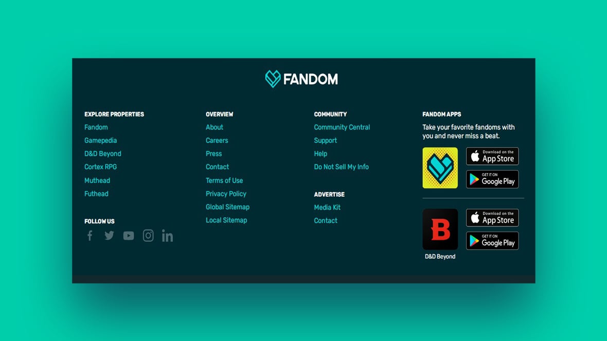
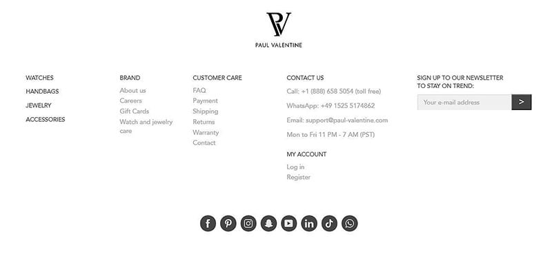
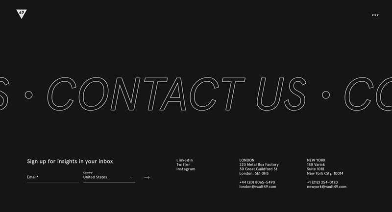
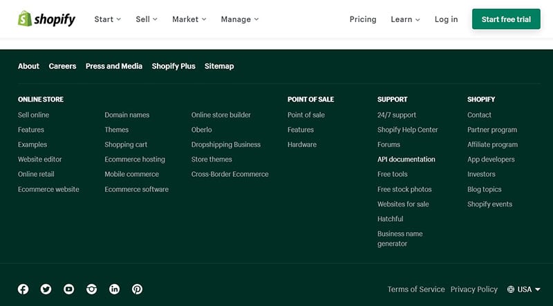
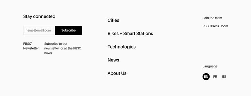
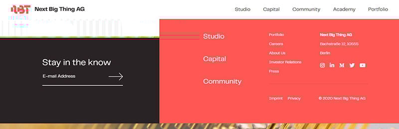
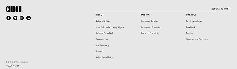
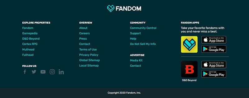
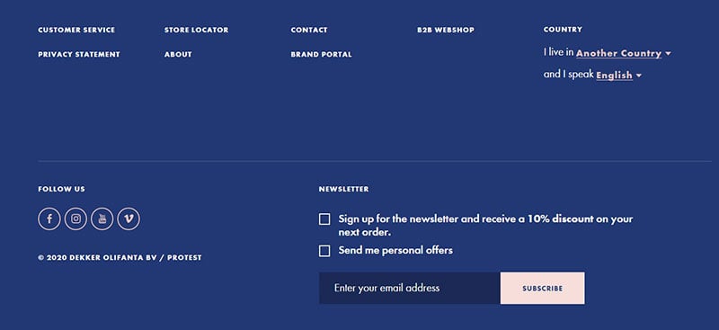
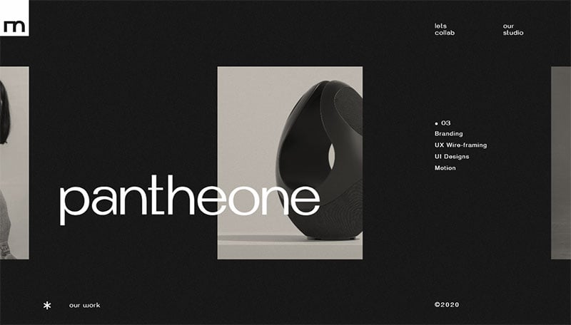
Website Footer Design Examples
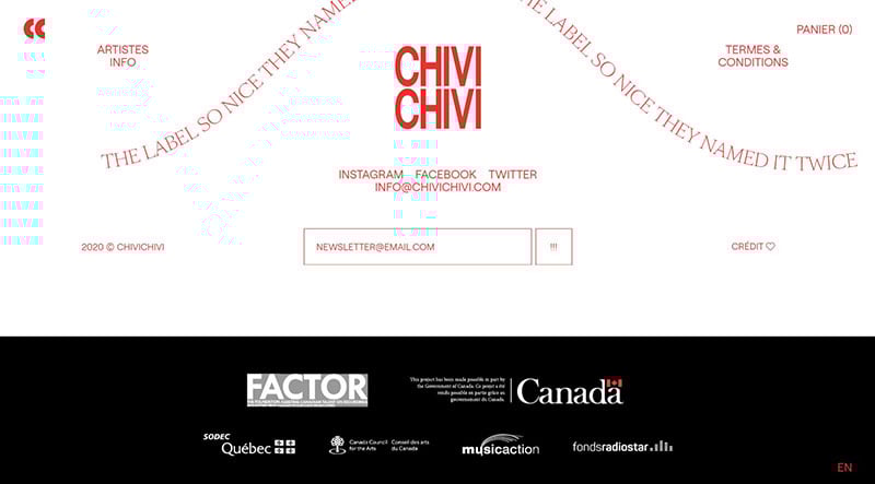
Griflan Design Inc.
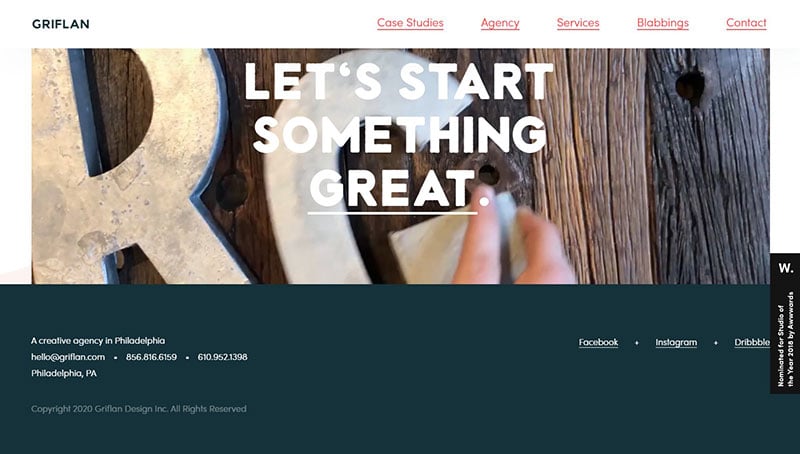
The website footer of Griflan Design Inc. is very simple. It contains company location, copyright information, and social media buttons.
A unique part of the design is that a large animated image accompanies the footer. When a visitor clicks on the image a contact form appears.
Cash By Cash App
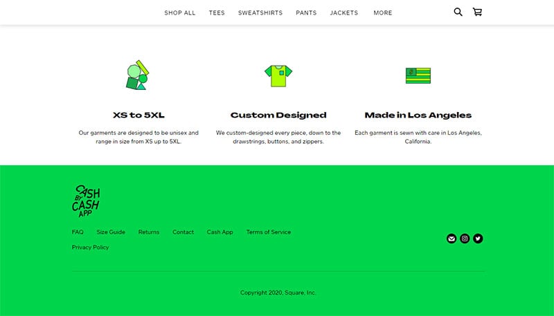
This is the website for an apparel line. The footer is simple but guides visitors to useful information.
For example, links in the footer direct visitors to the FAQ, the return policy, and a size guide.
Homebase
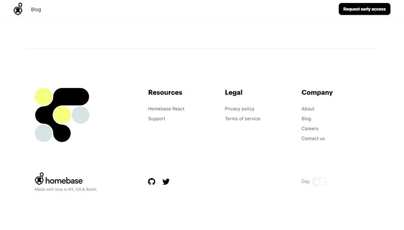
The website footer for Homebase is well organized. It is organized into three sections so that visitors can easily find information.
A unique feature offered in the footer is the ability to change the website from day mode to night mode.
Taxonomy of Design
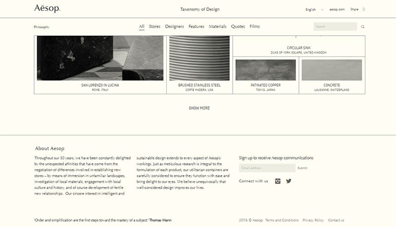
The designers of this website were creative with its footer. It displays the story of the company.
It includes a CTA inviting visitors to enter their email for further communications. And social media icons direct visitors to the company’s social media pages.
Valaire
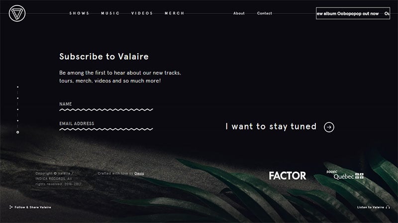
It is hard to scroll through this website quickly with the various parallax effects. But if any visitor was not convinced to buy or subscribe, the footer gives them one last opportunity.
It presents an invitation to subscribe and a CTA to follow them on Instagram.
Mill3
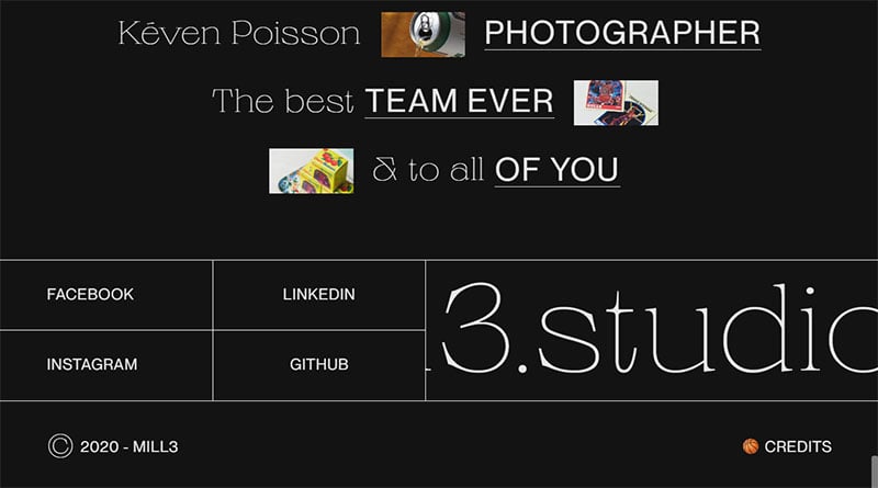
This website displays a CTA based website footer.
It thanks the contributors to the site. It then invites visitors to click on one of four CTA’s directing them to social media pages or other websites.
Simon Liesinger
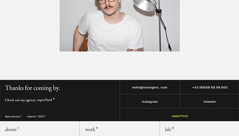
This website has two footers.
One footer provides options to explore the website. It stays at the bottom of the screen as the visitor scrolls up and down.
The other footer thanks visitors and provides links to other platforms.
Lunettes Noires
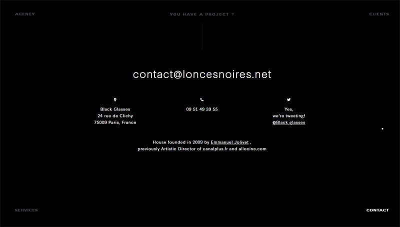
This agency has a clean footer that matches the style of the website. It is simple, uncluttered, and appealing.
It contains an address, a phone number, and a link to Twitter.
The Invisible Collection
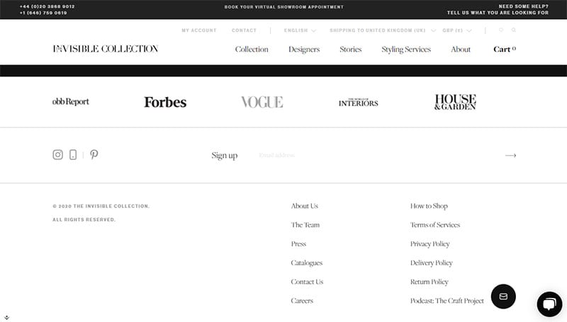
The Invisible Collection shows a classic footer design.
It gives visitors one last chance to sign up with their email. It also displays links to additional information that visitors would want to know.
Black Pizza
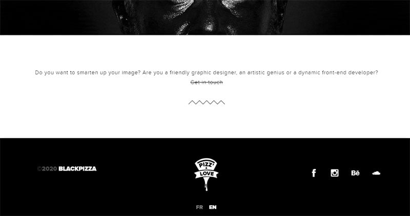
Black Pizza has a footer that stands out because of the black color. It contains a minimal amount of information.
This footer design displays the copyright, logo, and social media icons. It is a good example of a minimalistic design.
LoveSeen
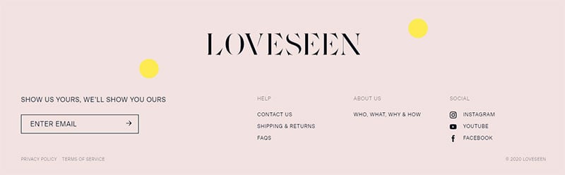
This website displays the classic category footer design. But the bouncing dot animation adds entertainment and keeps visitors from leaving.
Tomorrow.one
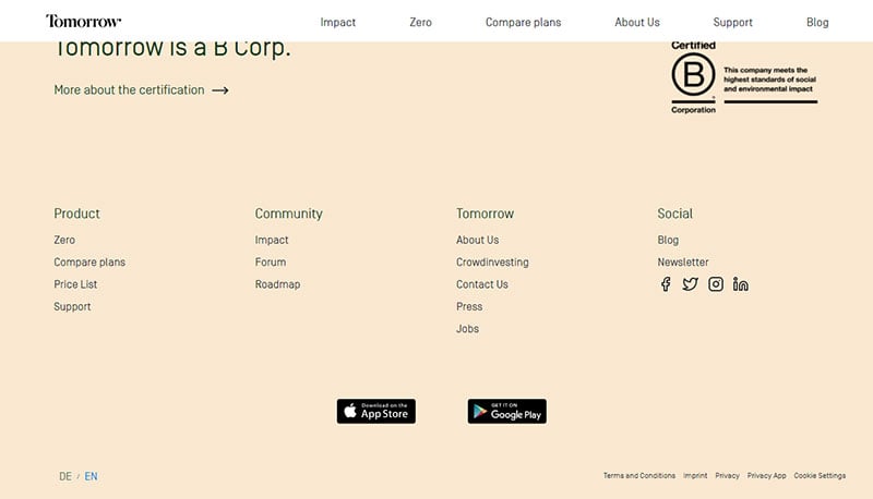
Tomorrow.one is a mobile banking app. It uses a classic footer layout with organized categories.
It makes use of the footer to provide information about their B Corp certification.
Tux
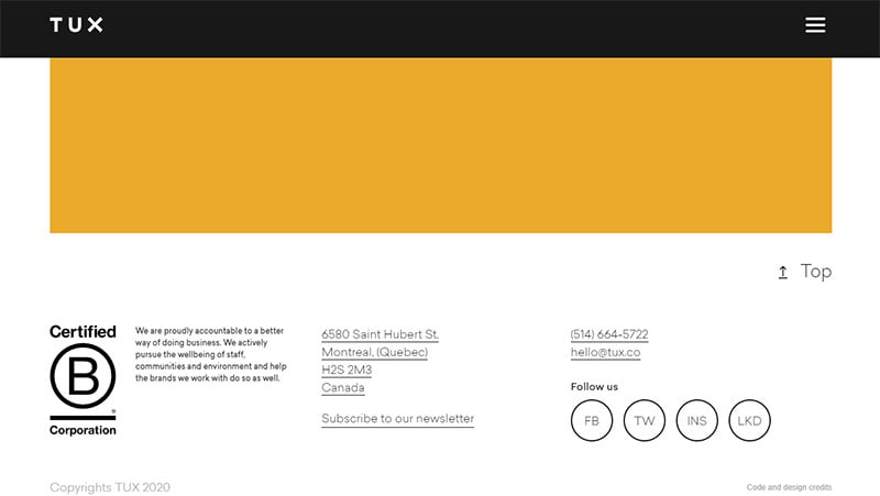
The footer on this website is the only thing that does not jump out at visitors. It contains a lot of information in a small space.
A useful feature is a back to top button.
Spline
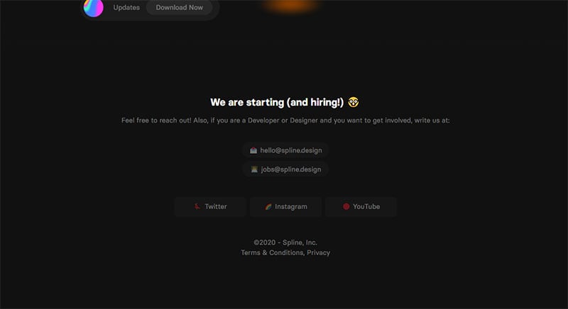
Spline uses its footer to reach out to those wanting a job. They provide contact information and social media buttons.
Mesh Times
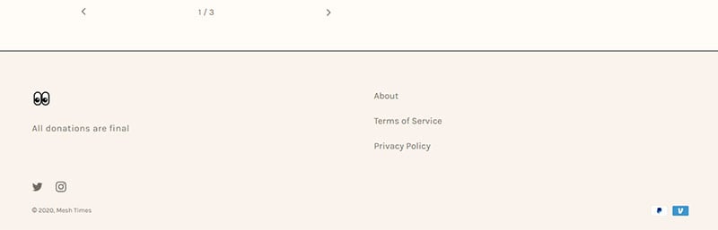
Mesh Times keeps its footer minimalistic. It makes wise use of whitespace to maintain an organized appearance.
Three links direct visitors to additional information.
Mellow Studio
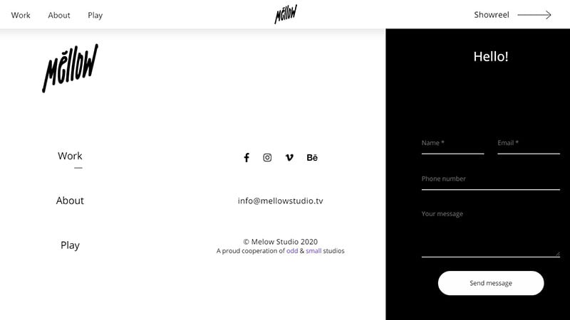
This website implemented the design of a fat footer.
It includes a contact form right in the footer. It also displays social media buttons, extra links, and contact information.
Harry Vincent
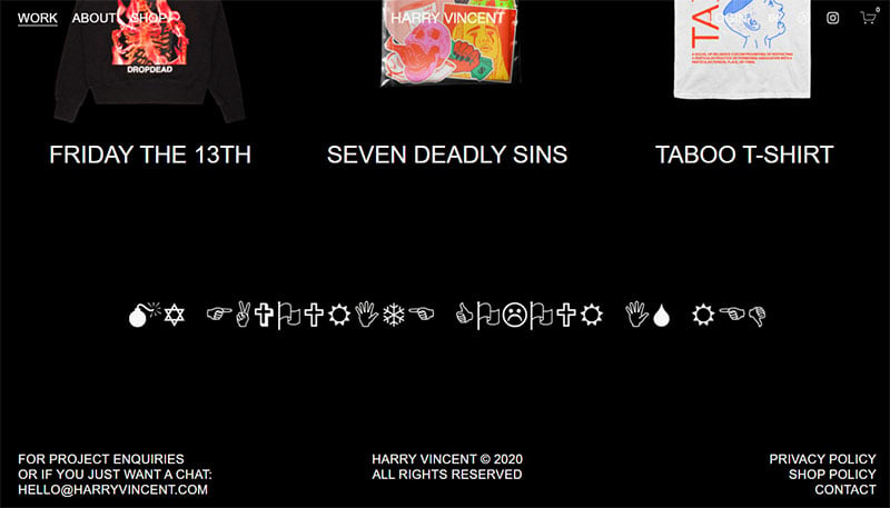
This website has a thin footer. It is separated into three sections.
One section provides contact information. The middle section displays the copyright. And the third section includes additional links.
Fanfare
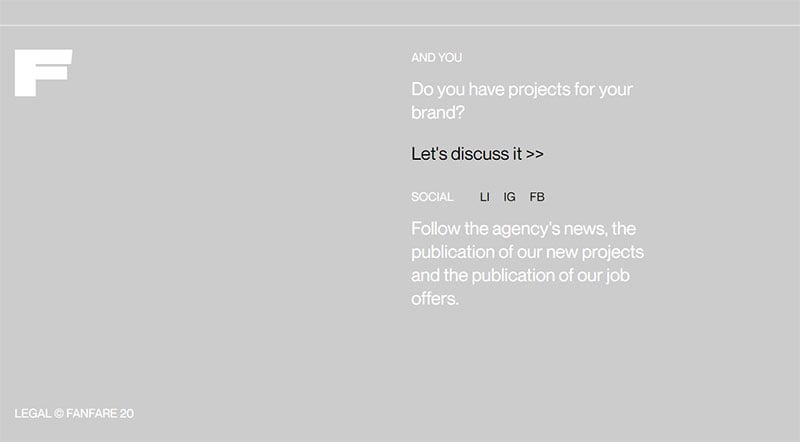
Fanfare has a fat footer design. It encourages visitors to contact them.
Social media buttons direct visitors to the company’s social media pages.
Awwwards
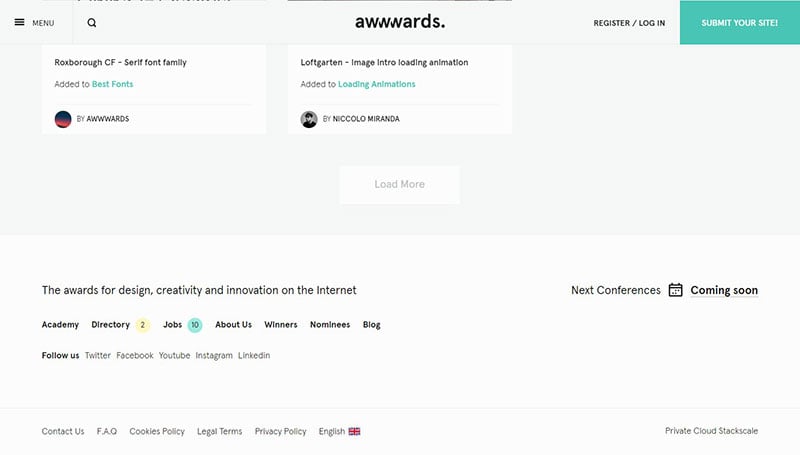
Awwwards provides much additional information through their footer. It differentiates itself from the crowd by displaying information on the left-hand side versus the common right-hand side footer layout.
Tapbots
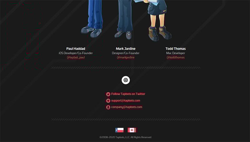
Tapbots shows that footers can be entertaining. This website displays an eye-catching animation.
And it includes links to contact or follow them on Twitter.
Collecta
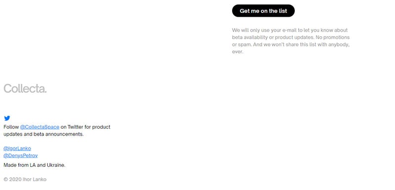
Collecta designed their footer to be in the left-hand corner instead of spanning across the width of the webpage. It displays the website’s copyright and links to Twitter accounts.
PANOPTICA
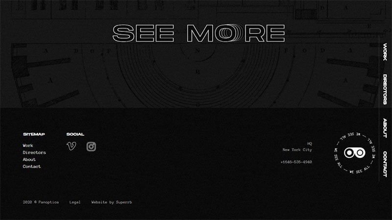
The footer of PANOPTICA maintains the dark mode style of the webpage. Its most unique feature is the clickable animation on the right side.
Tropics Paris
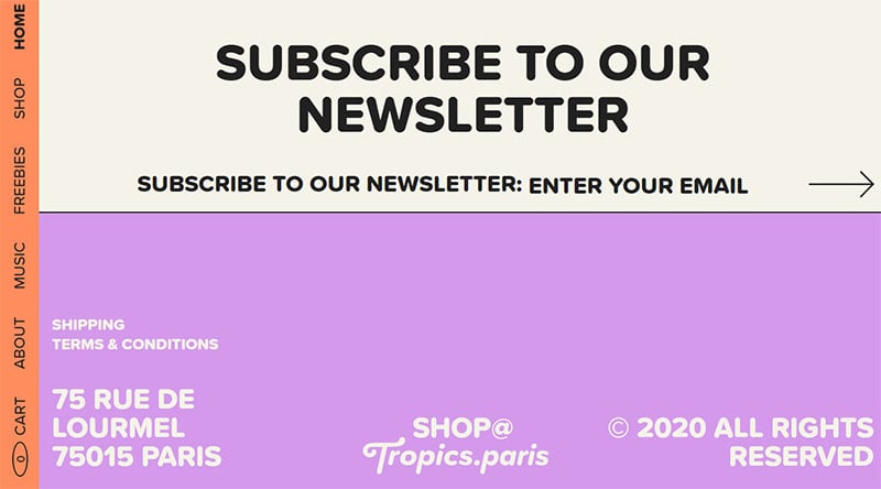
This website uses a fat footer. Large lettering and social media widgets invite email subscriptions and social media followings.
A pop of color attracts attention to the bottom part of the footer. It provides extra information like terms and conditions.
Welcome
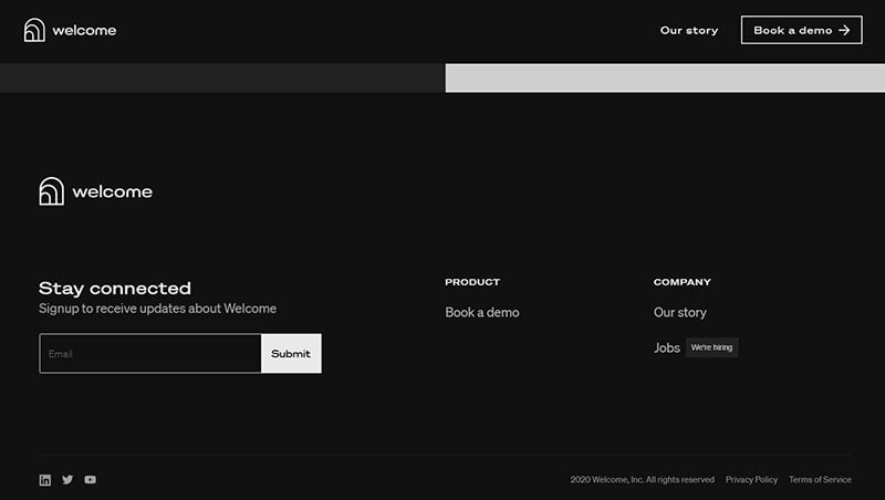
Welcome is another good example of a minimalistic design. The footer invites visitors to subscribe and displays three links for more information.
Le Singe
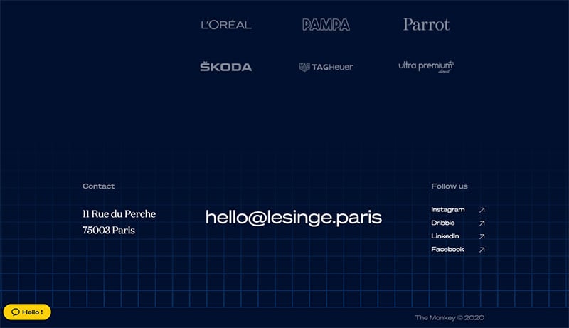
Le Singe also has a clean design. An email address in large font attracts the attention of visitors.
Social media buttons and an address take the side stage.
Pangram Pangram
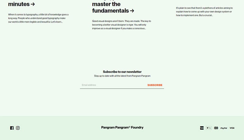
This website has a thin footer.
It is made up of social media and payment icons. The brand name doubles as a back to top button.
Bello
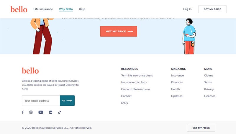
Bello displays a classic footer design. It allows visitors to subscribe, and it displays horizontal lists of extra information.
Studio Malvah
The footer of this website is almost as big as the website itself. It contains horizontal lists of how to get in touch and how to follow on social media platforms.
Bluestag
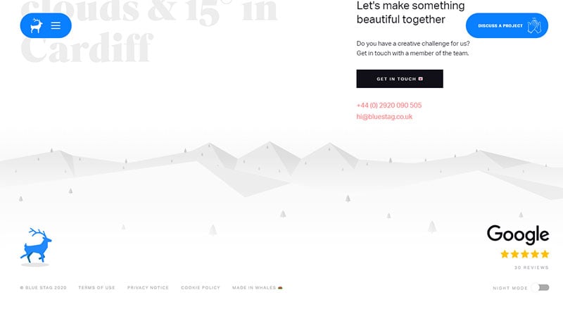
Animations define this website’s footer. Grey mountains and a blue stag bring delight and entertainment to the visitor.
The added links are subtly placed below the blue stag.
Site Inspire
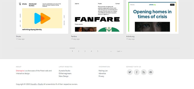
This simple but functional footer is a good design to imitate. It organizes the information into categories and is not overcrowded.
Stylenovels
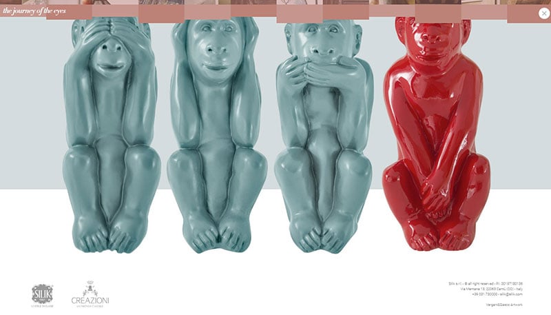
This website’s footer creates an unexpected surprise. Scrolling down reveals a picture of the four wise monkeys and plays the sound of a monkey chattering.
It is a good example of using images to retain visitors.
BB Agency
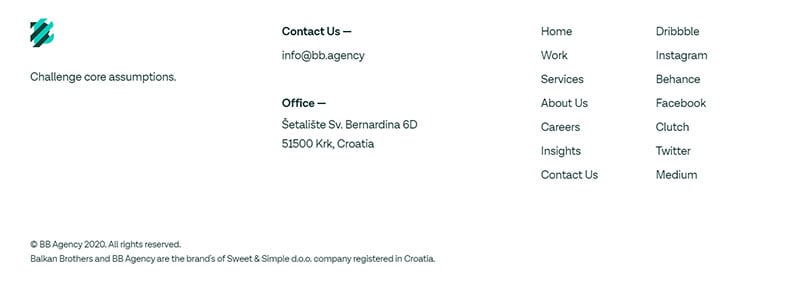
For their footer, BB Agency use the classic format of links to additional information. But they also apply one of the best design practices for a footer which is including a CTA.
Joinery
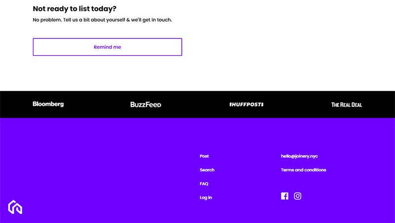
Joinery uses bold colors to make their footer stand out. The content includes social media buttons and contact details.
Hi, skin

The designers of Hi, skin use this footer to tie the color scheme of their website together. They also use it to provide supplementary information.
KEENTU
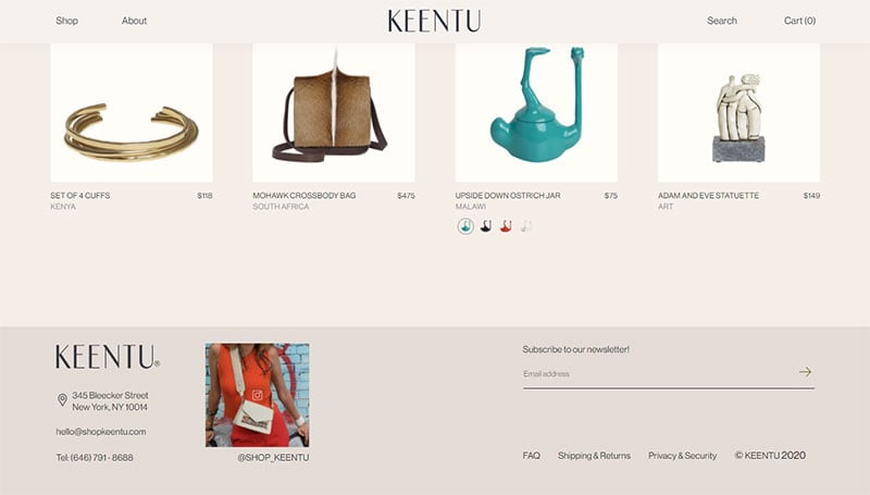
The footer of KEENTU is appealing because of its simple design. It invites visitors to subscribe and includes a striking image.
Remrise
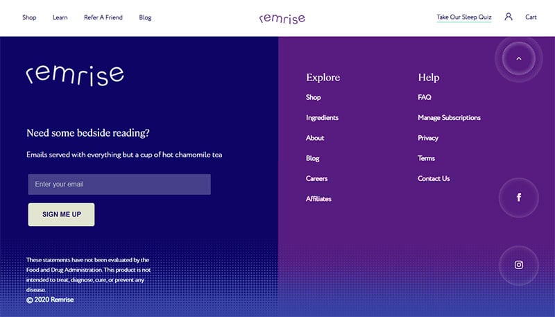
Remise displays a fat footer design.
It allows visitors to subscribe to the newsletter. It also provides links for visitors to explore other aspects of the site.
Loftgarten
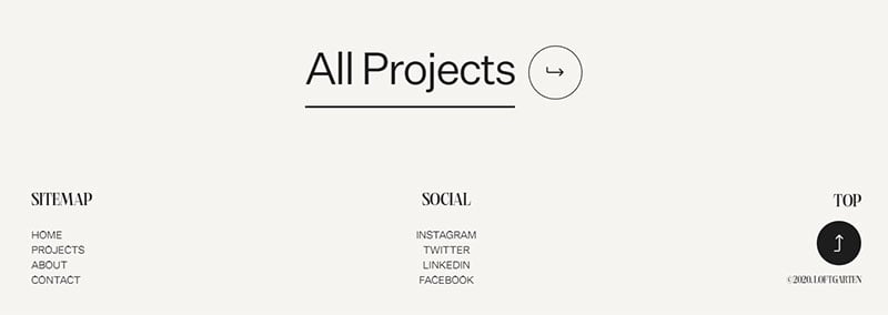
This website has a CTA based footer. The CTA guides visitors to all the projects displayed on the site.
The footer includes links, social media buttons, and a back to top button.
Orbitmedia
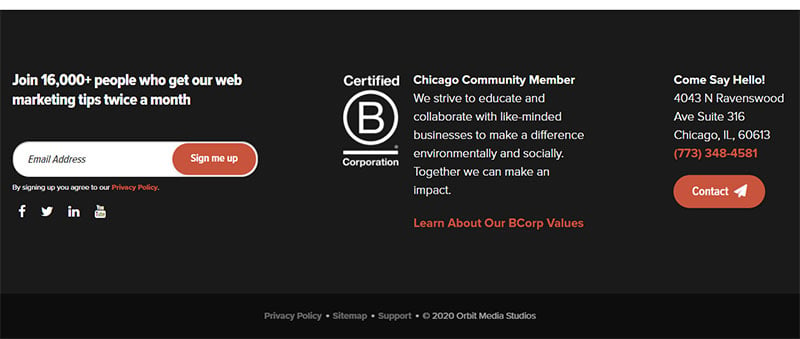
This footer is CTA-focused. Three CTA’s invite visitors to subscribe, learn more, or make contact.
Guerlain
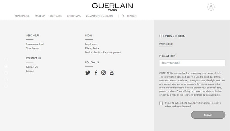
The fat footer for Guerlain maintains an organized, functional, and appealing layout. It directs visitor’s attention to what they want to know and invites them to subscribe.
BUCK
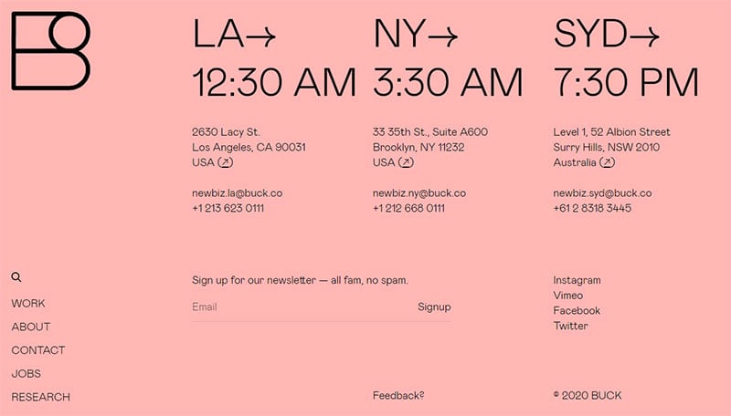
This website’s footer attracts attention with its bold color and typography. It takes displaying the address of their company to the next level. With offices in different time zones, BUCK’s footer shows the local time for each office.
Oscar
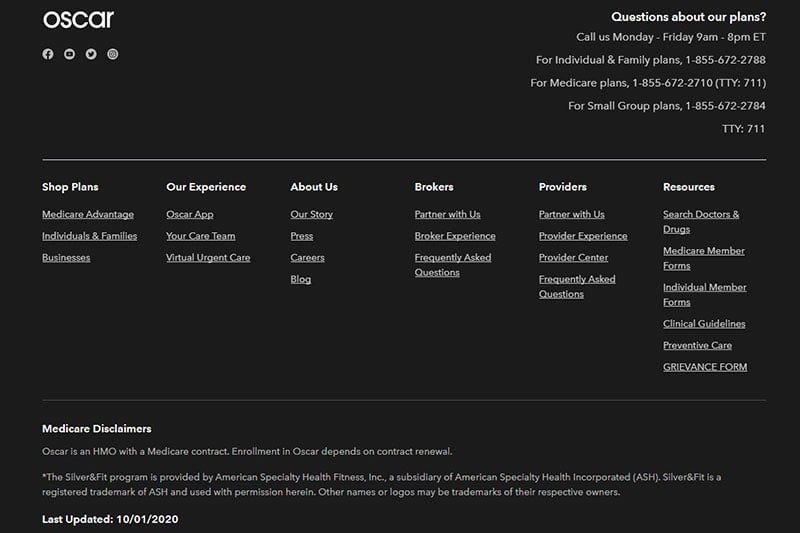
Oscar’s footer fits a lot of information in a small space. It includes contact details, disclaimers, resources, and more.
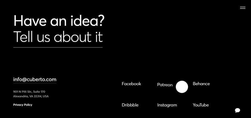
Arlind Aliu

This website is another example of using strong typography in the footer. It invites visitors to contact the developer.
Secondary details appear in small letters at the bottom of the page.
OISX
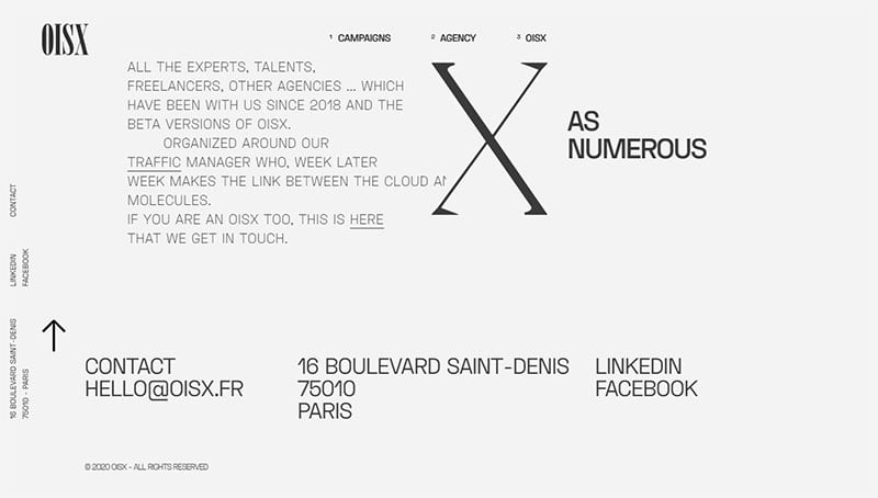
OISX is an excellent example of a simple footer design. It includes three elements that stand out due to the big and legible font.
New York Times
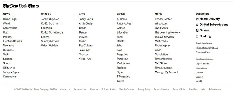
The New York Times is content-heavy, yet the footer is well organized. This provides a great example of how to concisely organize a lot of information in the footer.
Hive Streaming
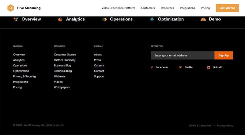
Hive Streaming uses bright colors and animations to make their footer stand out. It includes information organized into categories, email signup, and social media icons.
CRSA
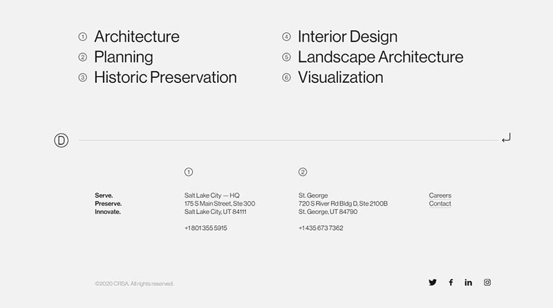
The CRSA website displays an architectural design theme. The theme carries through to the footer.
It has a simple design that is appealing and uncluttered.
Foundation
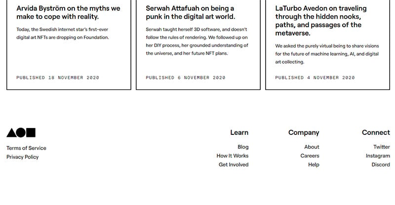
Foundation displays the classic footer layout that organizes information into categories. It does so in a thin footer area and with a lot of spacing for visual appeal.
radicle
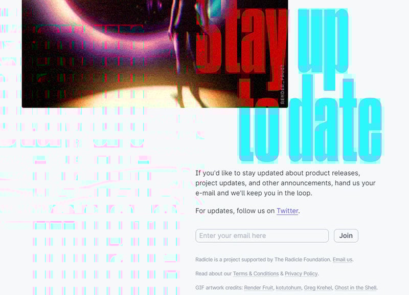
Radicle displays a footer like no other. It contains a timeline of how the company is progressing.
It also contains striking images and bright colors. The CTA at the bottom invites visitors to join their online community.
Lucky Folks
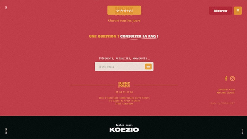
Lucky Folks has a CTA based footer.
It enables visitors to reserve a table at their restaurant. They can also enter their email for more information.
Squadeasy
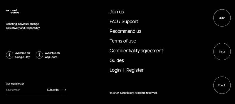
This website makes wise use of whitespace. Information is comfortably spaced, and buttons allow visitors to download the platform.
Victionary.com
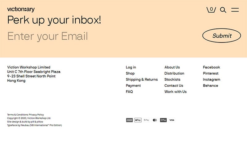
Highlighted in a hue of pink, this footer uses a large font to invite visitors to enter their email. Below that, it provides additional details about the website.
Random-ize
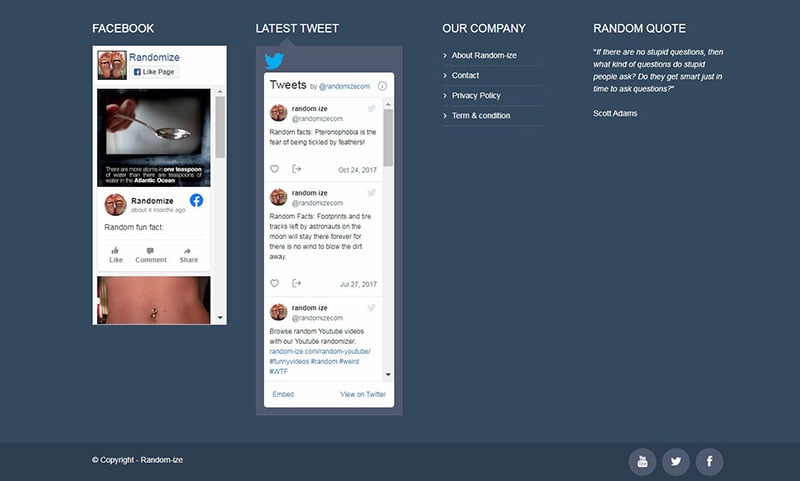
Random-ize claims to be the most random website on the web. Fittingly the footer of this website is random, spanning the entire length of a screen.
It displays Facebook and Twitter posts emphasizing the randomness of the website.
Genuse
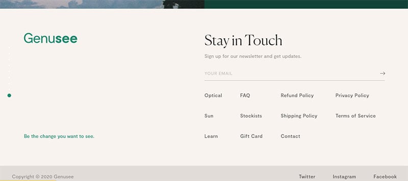
Genuse’s footer has a blank space on the left side. But the right side is well organized with subscription options and other information.
Nodes
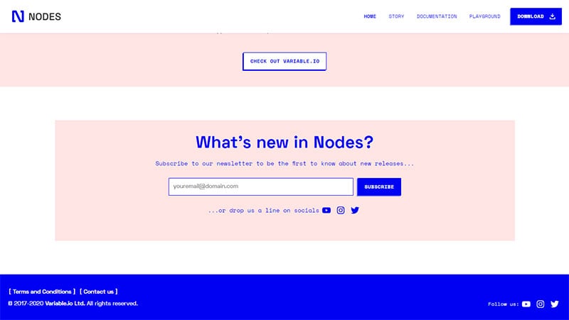
Nodes is an excellent example of a simple footer. It invites visitors to subscribe to the newsletter, with social media buttons below.
Blue highlights the bottom part of the footer. This section displays links to make contact or read the terms of the site.
Runway
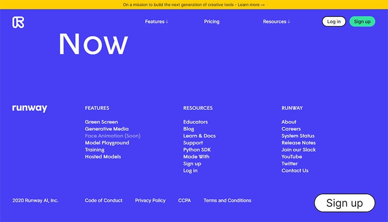
Runway displays a fat footer with a bright color. The outstanding feature is the large “sign up” button on the bottom right-hand side.
BUMP
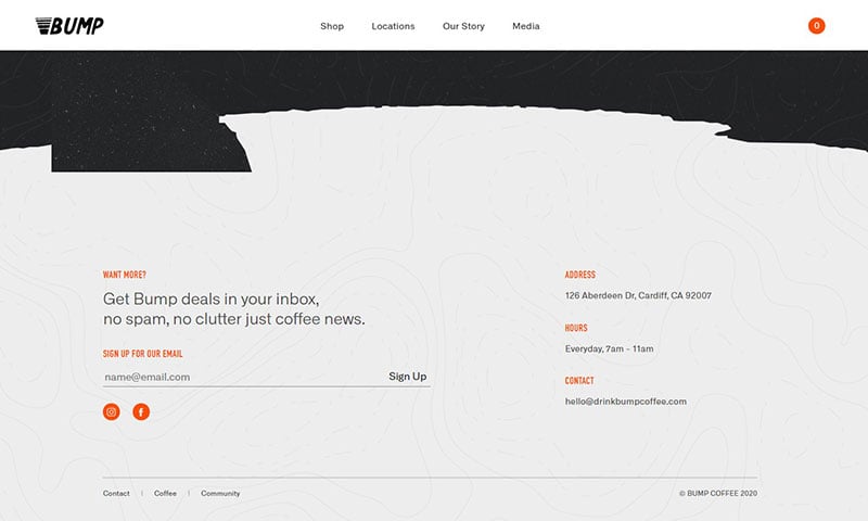
This website’s footer displays four elements. They are a place to sign up with an email, the address, working hours, and contact information.
It is well organized and uses an accent color to highlight important words.
Lifehacker
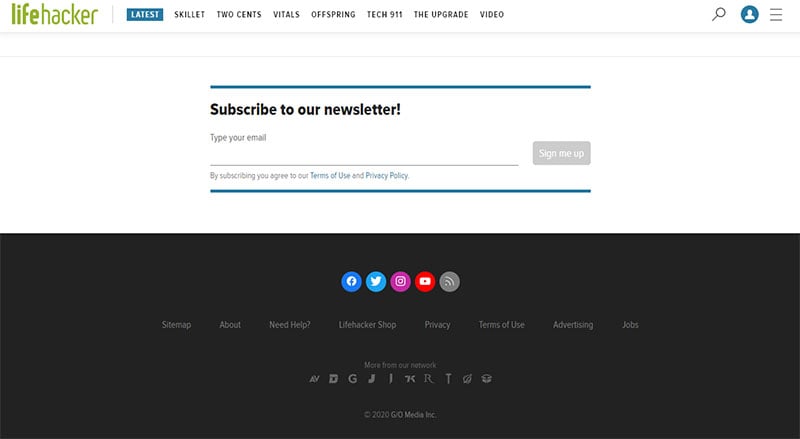
This site covers a wide range of content but the footer maintains a simple layout. It emphasizes subscribing and displays social media icons.
thi.ng
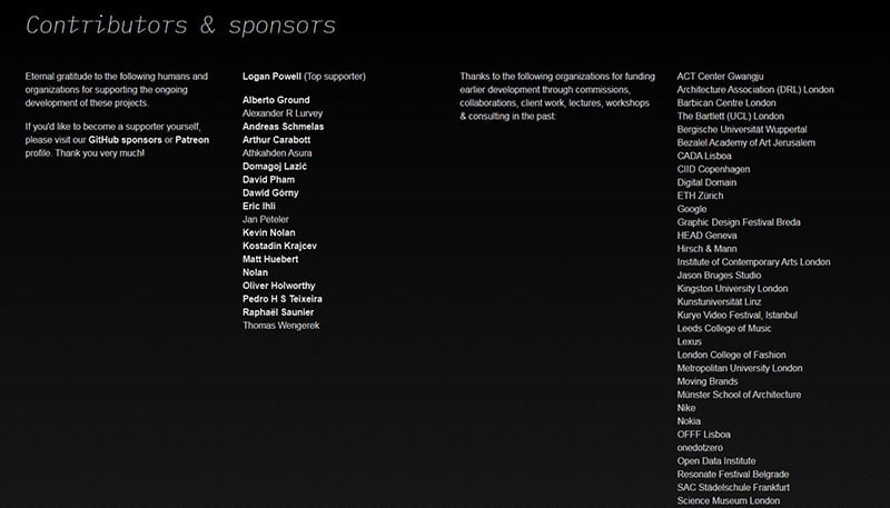
This website expresses gratitude to contributors and sponsors. Links appear as icons instead of words.
Sandy Gray
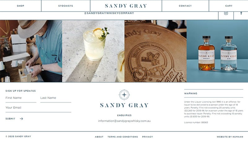
Sandy Gray’s website footer contains three elements. It invites visitors to sign up for updates and it displays the logo.
The third element is an important warning for those under the drinking age.
Beau
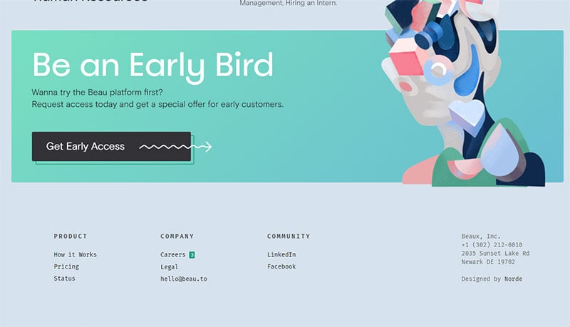
The website of Beau includes a footer with an interesting animation and a large CTA. Additional information is organized under categories for easy access.
Furrion
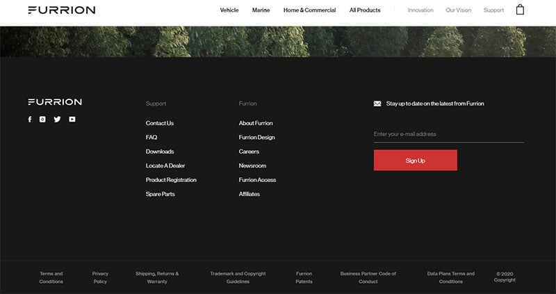
Furrion uses white text in the footer to contrast the dark color of the website. A red CTA draws the attention of visitors beckoning them to sign up with their email.
FAQs about website footer design
1. What elements should be included in a website footer?
The area that shows at the bottom of a website page is called the footer, and it often contains crucial information that visitors may need to access. Contact information, links to social media, copyright information, a site map, and links to key pages are some of the aspects that are frequently included in website footers.
2. How should the footer design complement the overall website design?
By employing the same color scheme, typography, and layout as the rest of the website, the footer design should harmonize with the overall design of the website. For the users, this will produce a seamless and appealing visual experience. Additionally, the footer design should be useful, simple to use, and enhance the overall user experience.
3. Should the footer be a fixed or sticky element?
Whether the footer is a fixed or sticky element depends on the goal and layout of the website. A sticky footer can offer rapid access to crucial information without requiring the visitor to scroll back to the bottom of the page if the website has a lot of content that necessitates scrolling. However, it might be preferable to permanently fix the footer to the bottom of the page if it contains important information.
4. How many columns should be used in the footer layout?
The website’s content and design will determine how many columns are used in the footer layout. The inclusion of crucial details like contact details, links to social media, and copyright information is possible with a three-column layout, which is a popular option. However, a four or five-column layout might be better suited if the website has a lot of content or is primarily focused on e-commerce.
5. What is the ideal font size for the footer text?
The footer text should be easily readable and in a font size that is readable. For footer text, a font size of 12–14 pixels is usually chosen to make sure it is readable without being too small.
6. Is it necessary to include social media icons in the footer?
Although it is not required, including social media icons in the footer can help users who want to connect with the website on social media platforms. Additionally, it can support the website’s online presence and user engagement.
7. Should the footer be scrollable or fit within the visible screen area?
The website’s layout and content will determine whether the footer scrolls or fits within the viewable screen space. A scrollable footer can give users rapid access to crucial information if the website has a lot of content without them having to scroll all the way back up the page. However, it might be preferable to have it fit within the visible screen area if the footer contains crucial information.
8. How can the footer be used to improve website navigation?
By adding links to vital pages like About Us, Contact Us, FAQs, and Site Map in the footer, you may enhance website navigation. To make it simpler for users to locate certain content on the website, it can also have a search box. It should be simple to use and offer rapid access to crucial information in the footer.
9. What is the importance of including copyright information in the footer?
Because it informs visitors that the website’s content is protected and cannot be copied without permission, copyright information should be included in the footer. Additionally, it demonstrates the website’s professionalism and attention to detail. It can also aid in avoiding legal problems brought on by copyright infringement.
10. How can the footer be used to enhance website credibility and trustworthiness?
By incorporating information like the privacy statement, terms and conditions, and security certificates in the footer, a website’s credibility and trustworthiness can be improved.
To give social proof and foster user trust, it may also contain client endorsements. In general, the footer should be created to give visitors the knowledge they require to feel comfortable using the website and transacting business with the website owner.
The website’s footer might convince visitors that it is a reputable, expert, and reliable resource. Increased user engagement, brand loyalty, and overall website success can result from including components that convey credibility and trustworthiness.
Ending thoughts on website footer design practices
There is no universal footer that fits every website. It is up to the developers to design a footer that suits the website.
But there are website footer design practices that lead to success. Creating a website footer involves analyzing various aspects of the website.
Think about the content available on the site and the way it’s organized. Think too about the target audience and the information that they will be looking for.
Then decide what information is most relevant and how you can arrange it succinctly. Do not overcrowd the footer.
Use it as a tool to attract attention, entertain, and provide vital information.
This article discussed the best website footer design practices and examples. May they help you design a successful, useful, and appealing website footer.
If you liked this article about website footers, you should check out this article about minimalist websites.
There are also similar articles discussing parallax scrolling, website color schemes, cleanest website designs, and website animation.
And let’s not forget about articles on coming soon page design, modern website design, one page website, and creative websites.


Hello,
I am now a new admin of the old site belonging to horse riding club. I can see Revolution Slider v. 4.6.3 and Essential Grid v 2.0 are installed here. Were these plugins free in these versions or should I look for the licence key in the archive of my club 6 years backward?
I don’t know how to check their compatibility with WP 5.6 and PHP 7+
I see these plugins are not in the WordPress repository now so they don’t have any free version actually, but I don’t know how to check if my club have purchased a licence 6 year ago or not. Could you help us with this, please?
Hi!
6 years ago we did not sell on our own but only via CodeCanyon/Envato.
So in order to get information about a purchase this old, you need to contact:
https://help.market.envato.com/hc/en-us/articles/202821620-Contact-Us
Cheers, Dirk @ Slider Revolution