

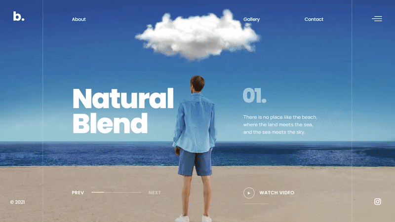
Ever stumbled upon a website that instantly dialed up your curiosity? That’s often the wizardry of well-constructed website sliders examples—each one telling its own seductive little narrative, right there on the screen.
Imagine this: You’re navigating a universe where every slide is a portal to another dimension of ideas, products, or storytelling. That’s what I’m unpacking today. Not just any run-of-the-mill examples, but a finely tuned collection that shows just how diverse and impactful sliders can be when they’re part of the digital fabric.
You’ll get the insider look into UX best practices married with eye-pleasing aesthetics. This journey showcases hero sliders that champion a brand’s mission, responsive designs that play nice with any device and animation effects that add that extra pizzazz to a user’s journey.
By the article’s end, you’ll be brimming with inspiration, armed with insights on crafting your own engaging sliders—or elevating existing ones to superhero status. Here’s to slides that don’t just display content but revolutionize how it’s experienced.
Website Sliders – What Are They and Why Are They Useful
“Slider” is a short word for a slideshow on a website. It may display as a rotating carousel showing static images or products.
Web designers can integrate a slider into any kind of website. They are popular with companies that want to showcase specific content or portfolios.
A slider can help search through content fast, or narrow down options.
The main components of a slider include:
- Container – a box that holds everything in shape
- Slide – that’s where the content is
- Navigation – a tool for guiding through the slides
- Pagination – additional navigation
Sliders also have many transition effects. They eliminate abrupt shifts between pieces of content.
Contemporary slides contain added dynamic effects, interactive features, and pioneering tricks.
Why use sliders on your website? Here are some legitimate reasons:
- Create the impression of a “hero area”.
- Prop up the overall impact of the website’s design or user experience.
- Engage users early by highlighting specific content.
- Appeal to users by displaying multiple images.
- Display more than one additional or popular offer.
- Focus users’ attention on the key message above the fold.
- Display text snippets in a tasteful way.
- Enhance content with added information within the reading flow.
- Create a promotional landing page.
- Create a powerful storytelling experience covering plenty of information.
- Put multiple CTAs on one display.
- Add text to images without using Photoshop.
- Showcase your portfolio.
The Most Impressive Website Sliders
Motion Blur Portfolio Showcase
This impressive slider display includes a stylish motion blur transition and an optional video popup. It comes equipped with a logo and menu, making it perfect for presenting your creative concepts. You can use this amazing slider in your WordPress theme once you install our WordPress slider plugin.
VR Arles Festival

Cinematic Wildlife Slider
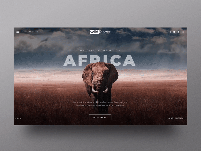
You can effortlessly produce cinematic presentations with this slider, which is based on photography and includes a convenient YouTube video popup. As you might have expected, it’s included in our WordPress slider plugin.
Yannis Yannakopoulos Portfolio

The slideshow gives the artist a good foundation to show off. It includes fancy tricks and elaborate solutions.
Mouse-based interactivity gives it a cool look. The navigation is very handy and puts the user in control.
Real Estate Showcase Slider

Present your client’s real estate listings in a professional and compelling manner with this neat and polished presentation. Our WordPress slider plugin helps you make your image slider several times better than if you’d be using other slider plugins.
StudioChevojon
Delicious full-width slider
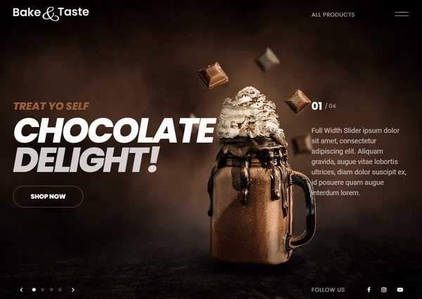
We have something delicious in store for you – a responsive full-width slider that would look simply mouth-watering on your web pages! It’s incredibly versatile and comes with a wide range of use cases, as well as a plethora of smart UI navigation options. It’s available with the Slider Revolution slider plugin.
Bold Cycles Ltd.

This slider is like the name of the company – bold.
It features a tilted angle, bold images, large sans-serif font, big bullet controls, and a striking call to action. The animation zooms in and out stimulating visitors’ inclination to click the links.
Cloudforce

This is a smart and well-executed vertical slider. It creates a compact yet excellent microsite.
It presents the story behind the brand in a dapper way. Each slide depicts the company.
One of the slides even includes a carousel. The slider creates an engaging and captivating user experience.
Coffee Shop Split Screen Slider
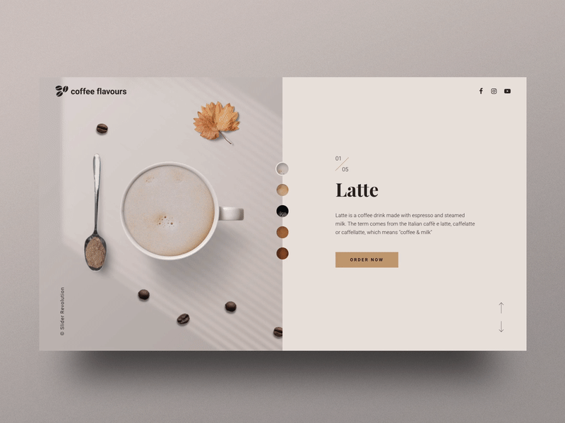
The sleek design and interactive elements of this slider solution will make it a striking addition to your coffee shop. This cafe template is highly customizable, making it an excellent choice for highlighting any type of product you wish to showcase.
antoni

Personal portfolio of Kelly Milligan
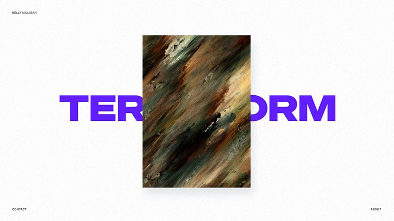
This slider uses a capsule approach to attract users’ attention. There is no overwhelming, full-screen drama.
The hero area consists of only a small rectangle in the middle of the page. The transition effects are exceptional and mouse interactions make the page a pleasure to explore.
Food Delivery Hero
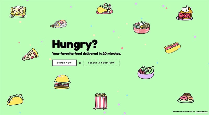
This hero template is truly captivating, featuring a dynamic color-changing background, lively illustrations with a particle effect, and seamless mouse-over effects.
O&3
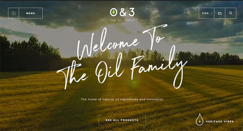
O&3 decided to put a slider advertising their products, not at the top of the page but lower down. You can scroll through the images to see each one.
The slider includes context clues, such as the “View” text inviting visitors to click on the image. There are other navigational prompts too.
Belyi Ostrov

Backyard Burgers
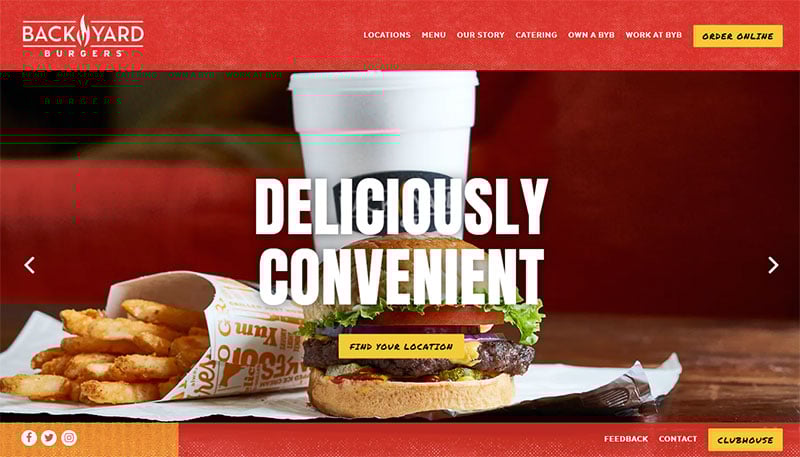
Back Yard Burgers uses a simple slider. It helps visitors search through and choose their perfect pick from the menu.
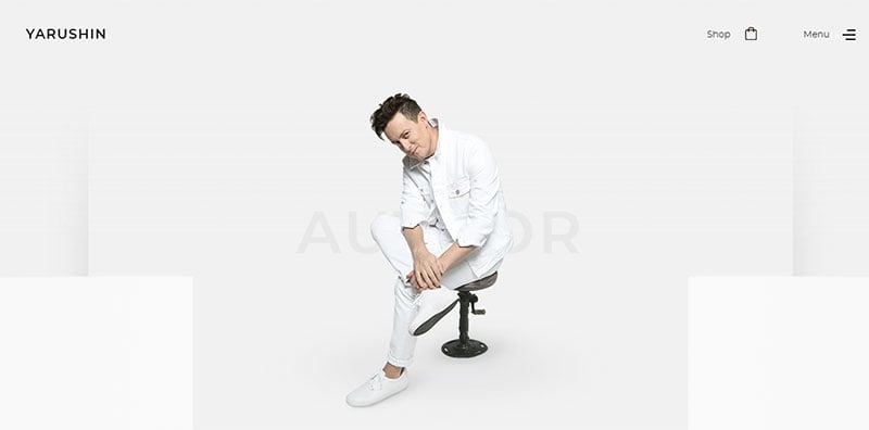
Yarushin
Universal Orlando
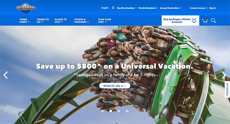
This slider’s goal is to tempt and persuade viewers to visit their amusement park. The CTAs are inviting but it is the gorgeous photos that do the trick.
van Cutsem
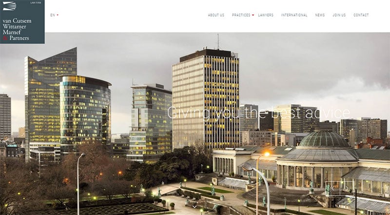
Each slide in this animation zooms out and moves out of frame making room for the next one to move into frame and zoom in. The timer bar at the bottom indicates when the panels will switch.
The slider’s purpose is, not to promote the product but to introduce the company and invite you to find out more.
Unpigeon

Saville’s Dove Cotes
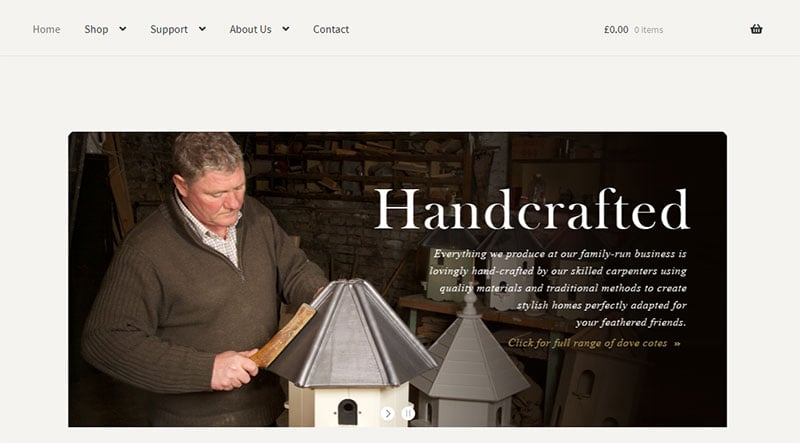
A serif font and pleasant photos showcase the quality and craftsmanship of the company’s dovecotes. The slides also show their broad knowledge of doves.
This gives viewers confidence in both the product and the company.
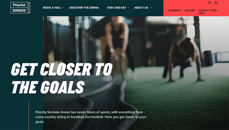
Prioritet SERNEKE
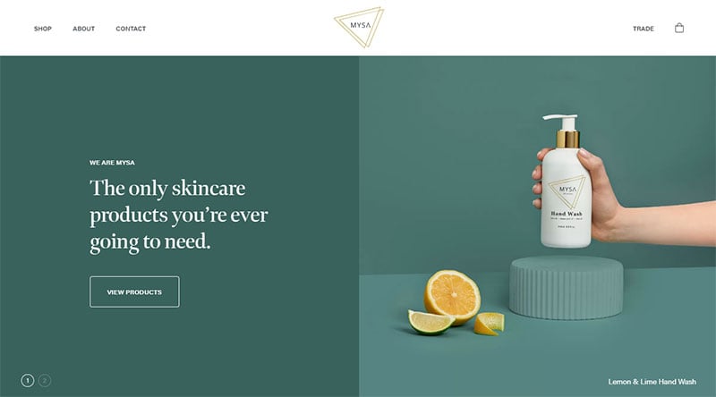
MYSA
Smithsonian Freer Sackler Gallery
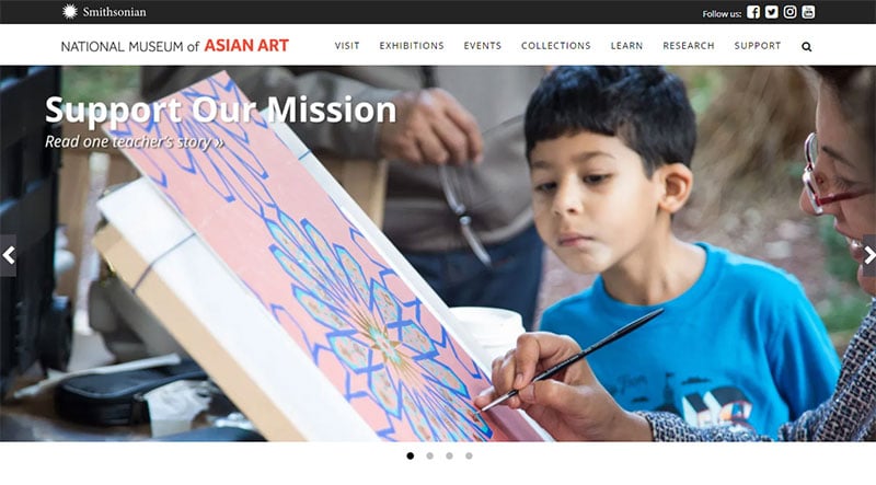
This website employs a simple navigational slider to introduce the main website pages. The slider is clean and simple, using white space to draw visitors’ attention to the images.
75 Portraits de Securite Sociale

Au Lit Fine Linens

This home and decoration website uses photos in gray and beige tones to create a warm atmosphere. It gives the impression of actually walking into a cozy home.
It uses a full-screen, auto-rotating carousel to showcase various products.
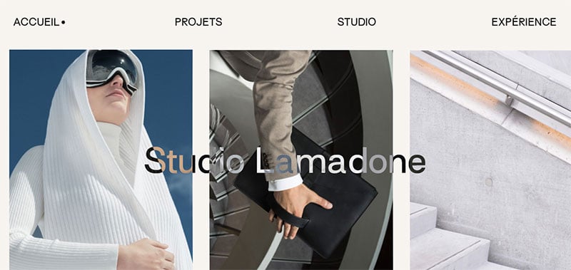
Studio Lamadone
Mercedes Benz
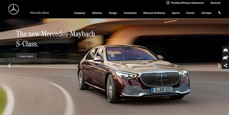
A simple photo slider with subtle animation. It creates a story-telling experience that reaches viewers’ hearts.
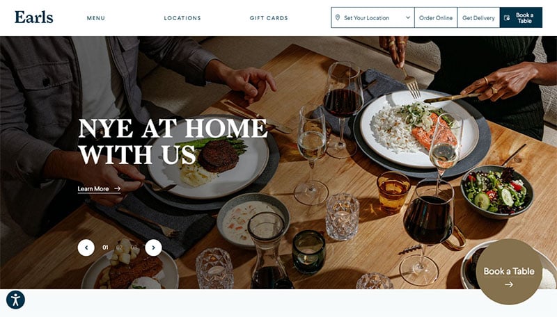
Earls Kitchen
Claudia Moreira Salles
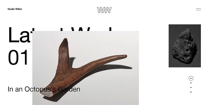
Studio Willen
ETQ Amsterdam
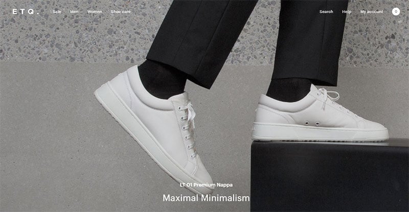
A remarkably well-made slider. Have a look and get inspired.
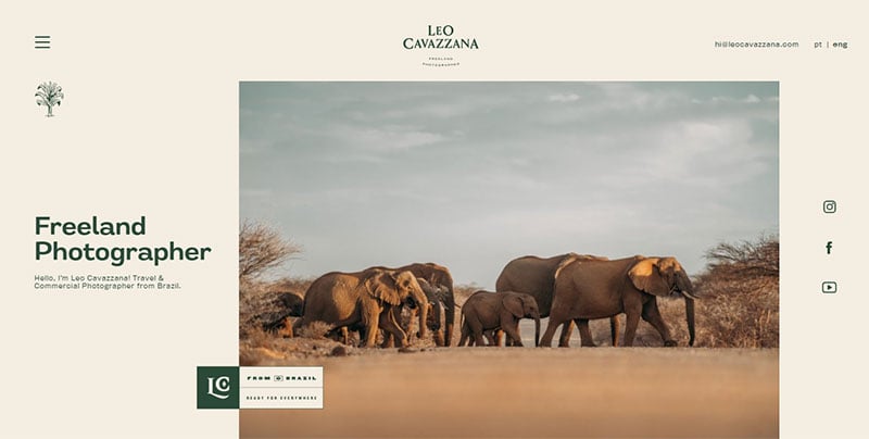
Leo Cavazzana
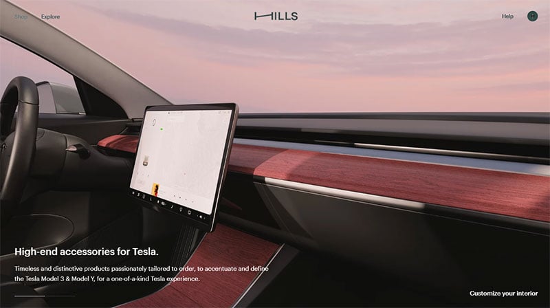
Hills
Hello Lucky

Arts should be showcased in full size. Pictures accompanied by bold, uppercase font and colors from the same range work well.
Viewers can get inspiration from this fantastic slider design.
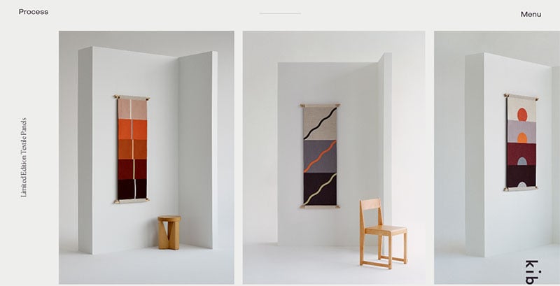
Kibun
Lamborghini
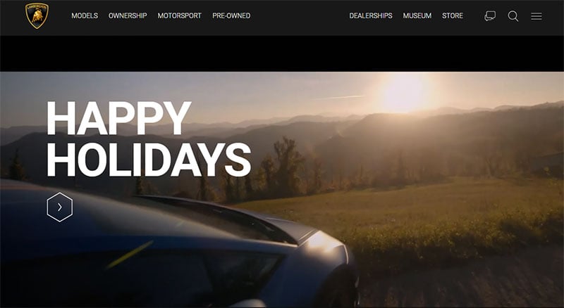
The slider is as gorgeous as the cars. It consists of auto-playing high-resolution photos of luxurious sports car models.
Ettitude

Aaron Blaise’s website
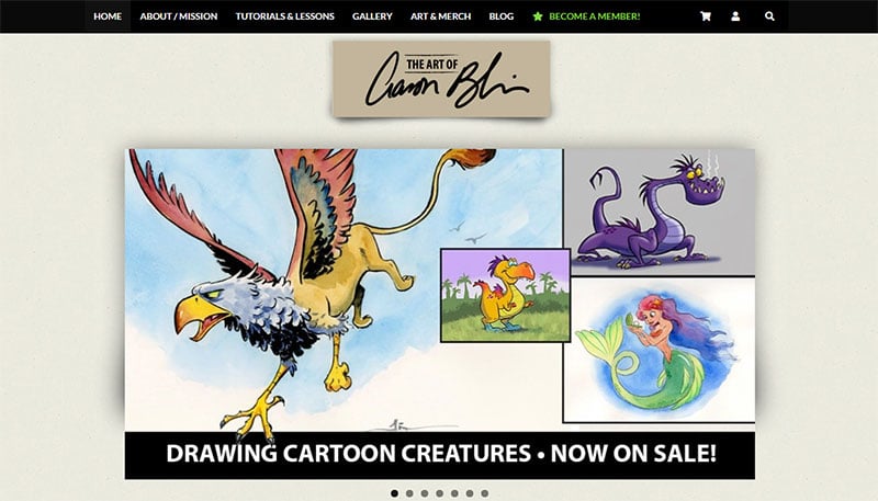
Aaron Blaise worked at Disney for twenty years and showcases his skills in this portfolio slider. The artist uses this website to sell his art videos.
Worth & Worth

Sony Music
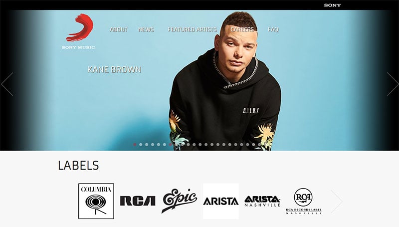
Sony Music is famous for using this kind of content. The slider website design is fresh and creative.
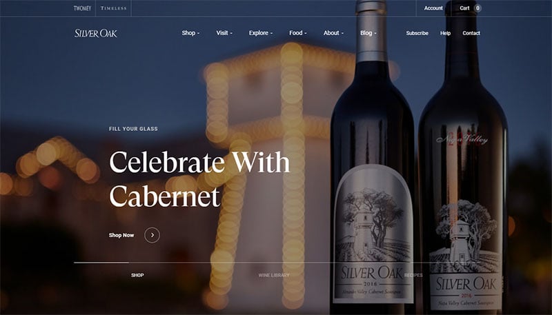
Silver Oak
De Hooch

De Hooch lets the images do the talking. The carousel, though not full-screen, creates a large and eye-catching centerpiece.
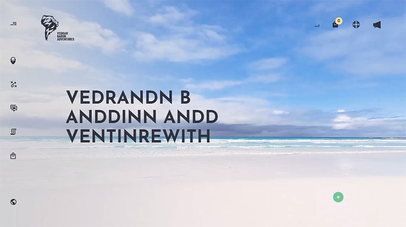
Vedran Badun Adventures
AMAIO
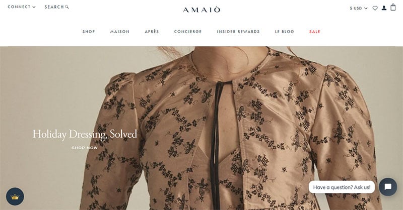
AMAIO utilizes a full-page slider. The photographs are impressive thanks to the reduction of all other elements.
Materasso Hotels

Yozenn
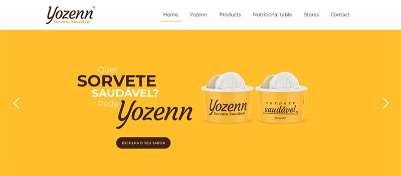
This full-screen header slider does not auto-rotate and is purely decorative.
MITA Eyewear

Omega
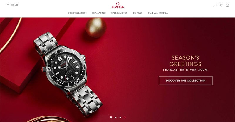
Omega’s slider is a great example of how to use a simple and tasteful photography slider to tell a story. A subtle yet powerful animation effect on each slide catches the attention and gets you involved.
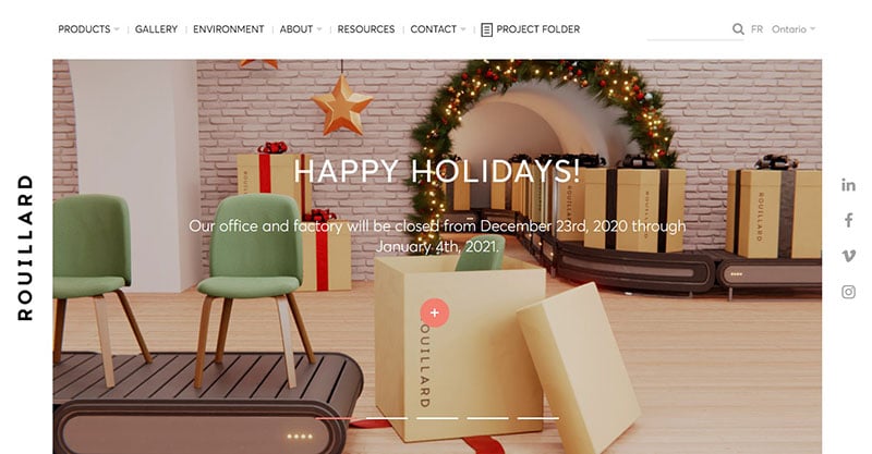
Rouillard
Flexie

Rally Interactive
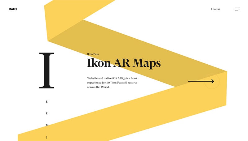
A very impressive and unique full-screen homepage slideshow.
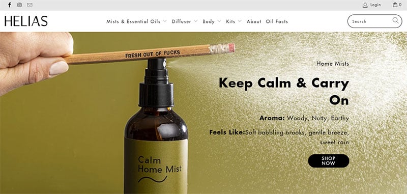
HELIAS
Pure Cycles
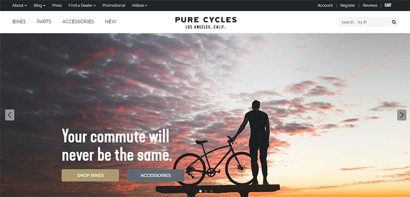
Pure Cycles uses both dots and arrows. The arrows give the visitors forward and back navigation. The dot navigation at the bottom prevents them from getting lost in the slides.
Native Union
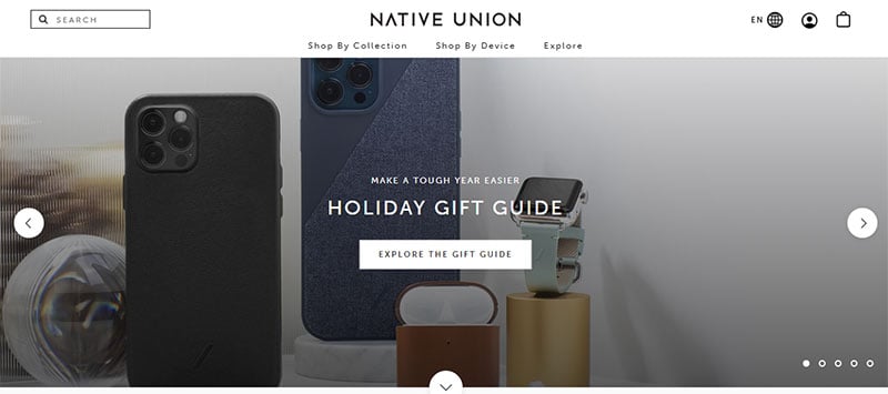
Hi-tech devices make powerful lifestyle statements. Therefore, technology and style need to blend.
Native Union’s slider combines aesthetics and practicality. This allows visitors to focus on the details.
Liars and Lovers

The Soviet Taxi

An eye-catching and unique slider. It contains springy animation, a cool hover effect, subtle static, impressive art and photography styles, and joyful background music. You can’t help but look at each slide.
uBear

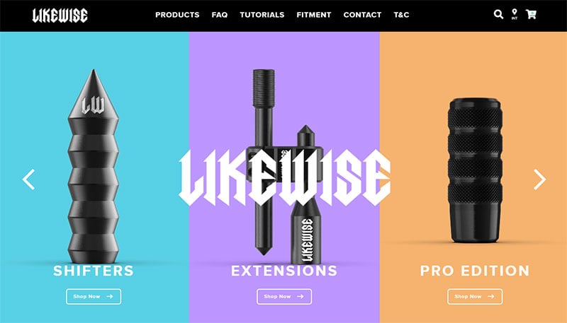
Likewise
Mikiya Kobayashi
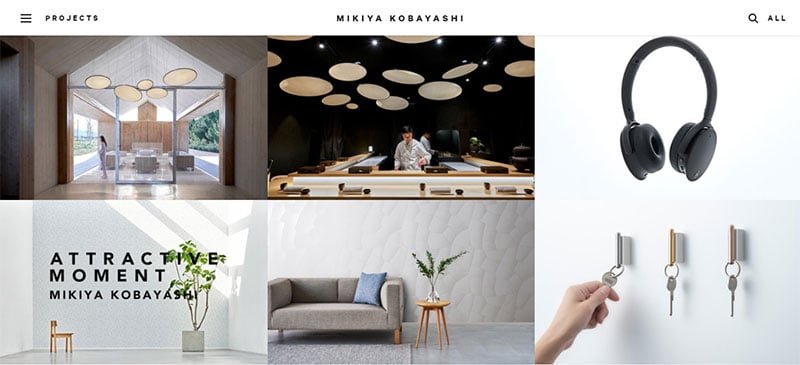
It’s pure pleasure to scroll through this website. The photo sliders employ a gentle, slow-motion animation effect to maximize the impact.
TALIA

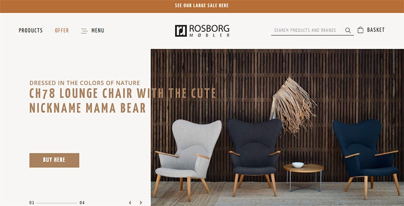
ROSBORG
The NoMad Hotel
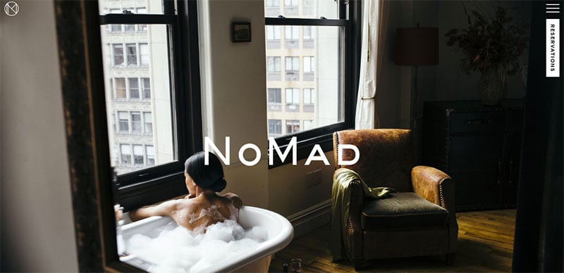
A fullscreen slideshow consisting of photos that showcase the highlights of the hotel.
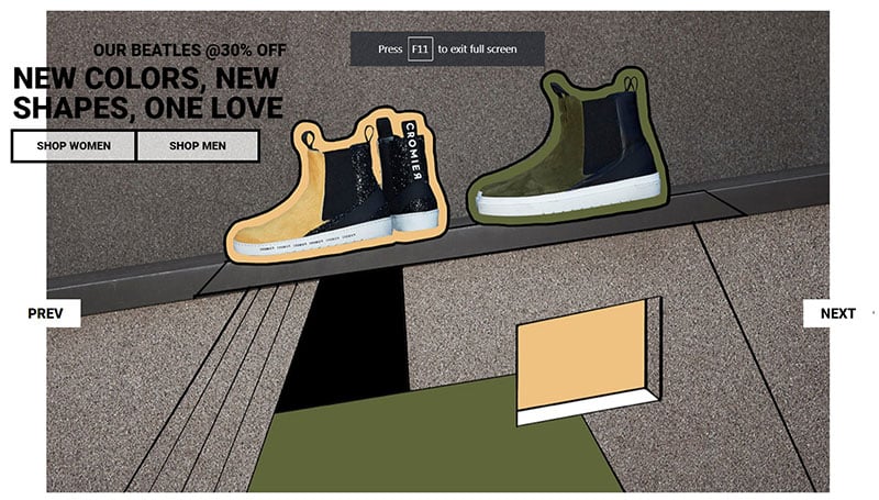
Cromier
Rhizom Studio

Louvre
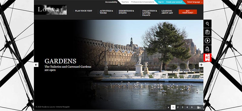
The slider reflects the museum itself – historic and elegant. Whitespace, a serif font, and a fade to black effect in the images create a simple yet dramatic impression.
An added feature is the Play/Pause button in the lower right-hand corner.
kotohayokozawa

Hamerville Media
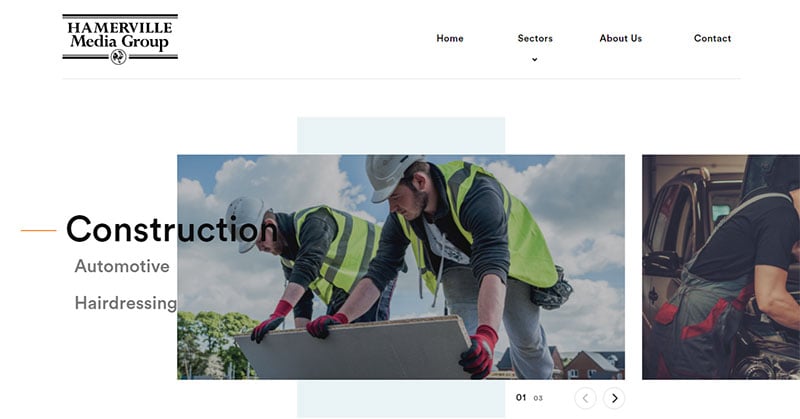
This slider is simple and consistent. The background stays the same when the slides move. Each image zooms in when visitors hover their mouse over it.
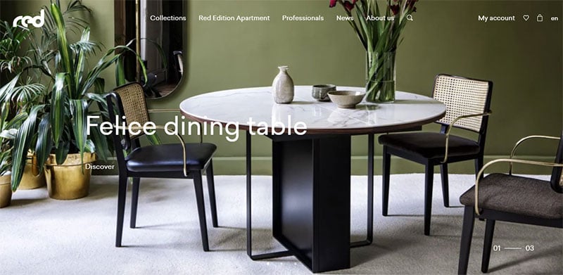
Red Edition
Round Studio

Round Studio is a branding agency that takes pride in handling various projects.
It uses photo sliders to tell the story of each project, show off their work, and engage potential clients. It also encourages employees to take pride in their work.
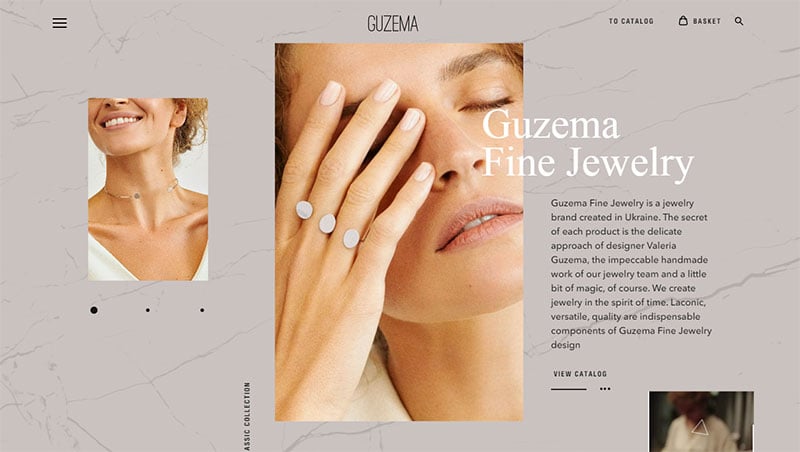
Guzema
Jax Vineyards

This website design includes a transparent menu and a slideshow on the main web page.
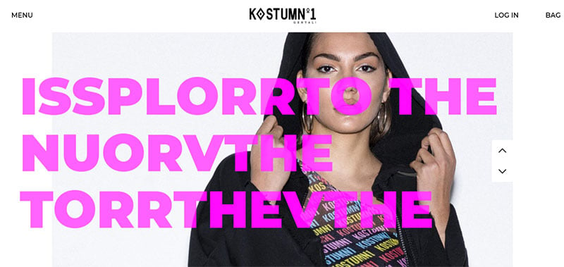
Kostum No1
umdasch
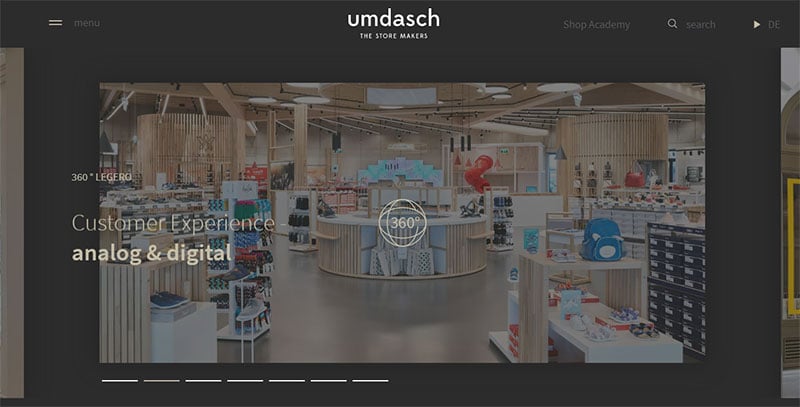
This is a contemporary image slider. It uses bars instead of bullets, has a dark background, and employs a few other modern details.
By clicking the video or any of the 360° panels the site will pop into a lightbox. This allows visitors to view the video or navigate a 3D space in a near full-screen mode.
UC San Diego

This is a great example of an image slider used by an educational institution. It provides a lot of information without sacrificing a nice design.
Revelry
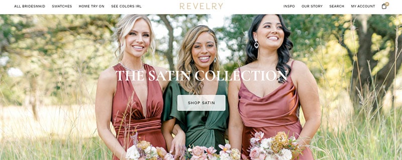
Fashion websites aim to make consumers feel inspired and happy. This amazing image slider does that.
Smithsonian Institute
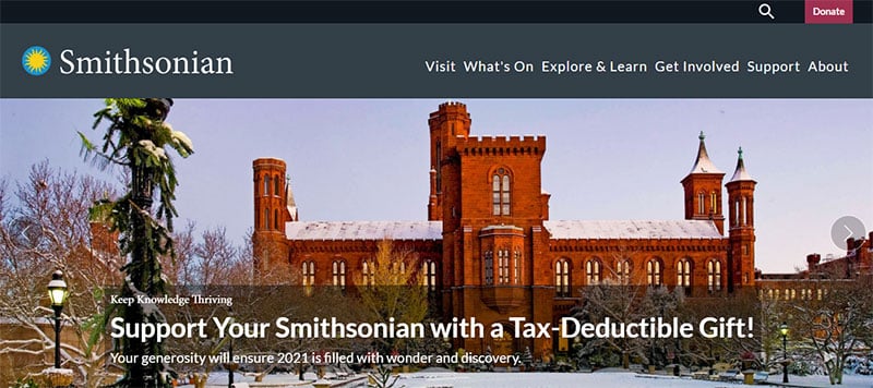
This slider employs prominent arrows making it easy to navigate back and forward. This is helpful as there is a lot of information to read on each slide and visitors may need to scroll back to catch it all.
Skal

This slider draws inspiration from the traditional carousels of horizontal sliders.
The content slider showcases info in small portions but also employs contemporary solutions. It’s a blend of the old-school vibe and visually pleasing modern tricks.
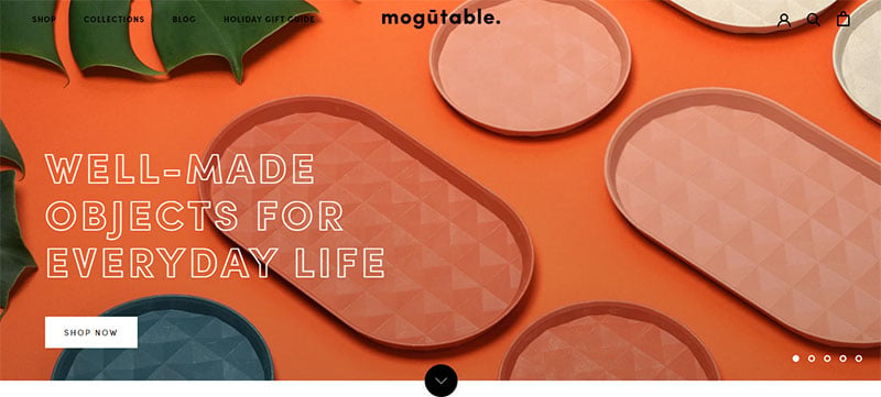
Mogutable
FAQs about website sliders
Are website sliders bad for SEO?
Sliders themselves are not the enemy of SEO, but how they’re used can make waves. They can slow down your page load time, and that’s not good news for search rankings. Keep your sliders optimized—compressed images, minimal text, and avoid overstuffing with keywords. Balance aesthetics with performance.
How do I make my slider responsive?
Now, responsiveness is non-negotiable. For a slider to play well with devices of all sizes, use percent-based sizing or CSS media queries. Ensure your slider plugin or script adjusts images and text dynamically. It’s all about that seamless user experience, regardless of where it’s viewed.
Can sliders improve user engagement?
For sure, if they’re not overcooked. A well-crafted slider with engaging images and relevant calls to action can captivate visitors. Remember the three-second rule—grab attention fast, deliver value, and no information overload. Your slider should be a visual appetizer, not the whole buffet.
What’s the best number of slides to use?
Ah, the golden question! Aim for a magic 3 to 5. Enough to showcase diversity without making users feel like they’re watching a never-ending movie. Quality trumps quantity. Each slide must be a heavyweight in its own right—solid message, stellar visuals.
Do auto-play sliders annoy website visitors?
Sometimes, they’re like uninvited guests at a dinner party—awkward. Auto-play can be disruptive, but if timed with finesse (think 5-7 seconds per slide), they can be a smooth operator. Give users control, though. Navigation arrows and pause options are essential manners.
Is it difficult to add a slider to my website?
Not with the right tools at your fingertips. Lots of CMS platforms have plugins that make adding a slider as easy as pie. Even if you’re hand-coding, you’ll find a plethora of scripts and tutorials. The real trick is in the customization—make it your own.
Should sliders be on every page of a website?
Let’s not overdo it. Sliders are perfect for introductions on home pages, perhaps highlighting products or services. But on every page? That’s like wearing a suit to the gym—unnecessary, and it might be uncomfortable. Keep it relevant and contextual.
How do I ensure my slider is accessible to everyone?
Accessibility is key. Use alt text for images, clear navigation controls, and ensure keyboard navigability. Avoid only using color to convey information. Remember, if you’re excluding people, you’re not only losing potential users but also knocking your karma points. Accessibility should be baked into your design.
What content should go in my slider?
You’re aiming for a mixtape of your best hits. Highlight unique selling points, compelling messages, and delicious visuals. Keep it fresh, keep it relevant. Remember, this is prime real estate—only showcase what genuinely matters to your audience.
How often should I update the content in my slider?
Keep it seasonal, keep it fresh. If you’ve got a new product, a hot sale, or a story to tell, that’s when you hit update. Don’t let it gather dust, but don’t change it just for the sake of it. It’s about relevance and riding the wave of what’s current.
Conclusion
So, we’ve just surfed through a gallery of website sliders examples that’d make any digital connoisseur’s heart race a bit faster. You’ve seen the slick transitions, the ones that make you go, “Woah, did it just do that?” And the responsive designs? They ensure nobody’s left out, no matter the screen size.
Check it, you’re now equipped with a treasure trove of concepts. Use them as a springboard for your own web ventures. Those call-to-action buttons positioned just right? They’re your silent barkers, drawing folks in. And never underestimate the power of a well-placed carousel or the simplicity of a fade effect.
This isn’t the end—it’s the starting line. Take these inspirations, twist ’em, blend ’em, make ’em unapologetically yours. Because the best sliders? They’re the ones that haven’t been seen yet. Your next project could be the one setting screens—and imaginations—on fire.
If you enjoyed reading this article about website sliders, you should check out this article on how to add a slider in WordPress.
We also wrote about similar topics like using a video slider, a homepage slider (see the pattern here?). But also about the Ken Burns effect that we use in some of our slider templates, as well as WordPress themes with sliders included, the best WordPress slider plugin, WordPress video background, the particle effect, and slider animation examples.


