

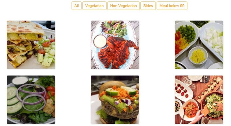
Ever find yourself admiring sleek, stunning web galleries? Those vibrant showcases that just scream professional? Here’s a secret: they’re often spun up with Bootstrap gallery templates. Supercharged with a mix of art and science, these templates are not your average cookie-cutter solutions.
Diving into the digital realms of responsive web design, Bootstrap templates are like the Swiss Army knife for snapping user interface design up several notches. Think of Bootstrap galleries as a canvas where functionality meets beauty – without sweating over complex codes.
In this article, brace yourself to uncover the blueprint of crafting dynamic visual stories effortlessly. We’ll navigate through the nuts and bolts of harnessing the mighty power of Bootstrap’s grid system, snazzy lightboxes, and beyond. Wading through the glory of CSS3 and HTML5, you’ll discover how to exhibit style and substance on any front-end framework.
By the end, expect to wield the know-how of populating Bootstrap photo albums with your own bursts of creativity. Ready to transform your site into the talk of the town? Let’s embark on this journey, pixel by pixel.
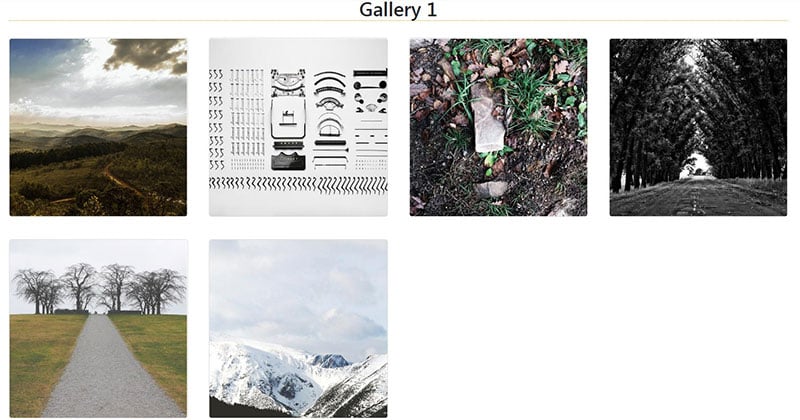
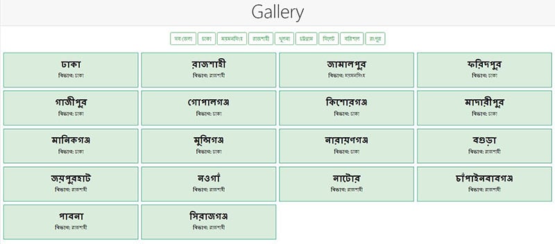
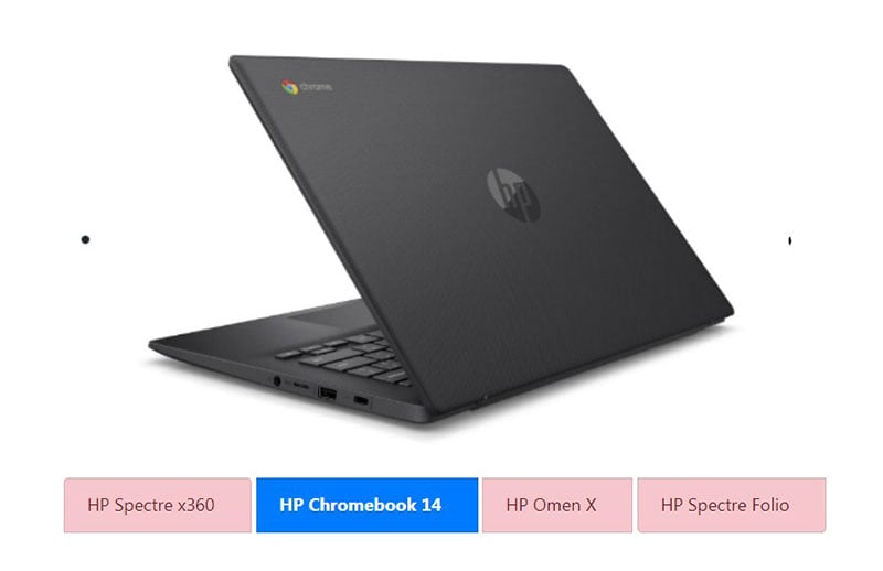
The Best Bootstrap Gallery Templates
Gallery template from Slider Revolution
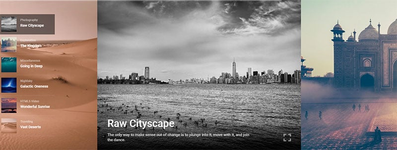
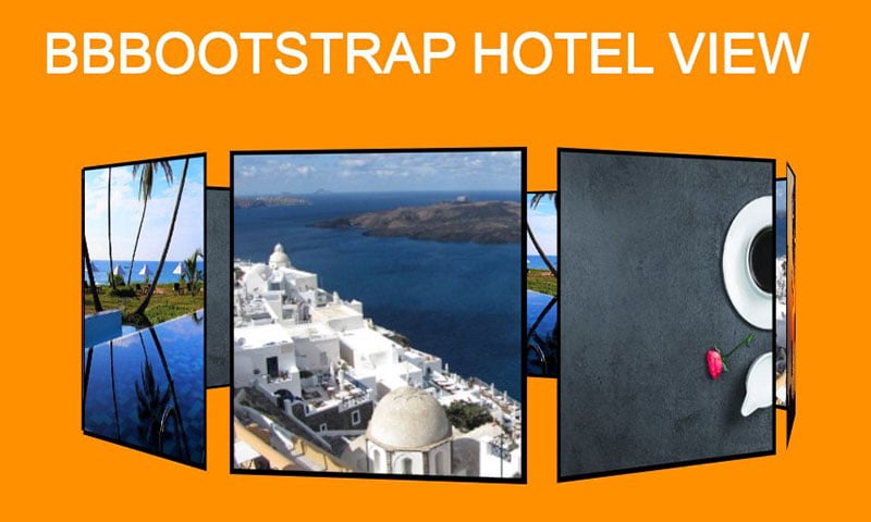
3D Gallery
- Snippet by RanaZubair
- Made With: HTML, CSS
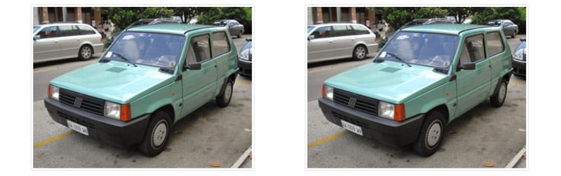
3D Scrolling Image Gallery
- Snippet by ankit1991
- Made With: HTML, CSS, JS
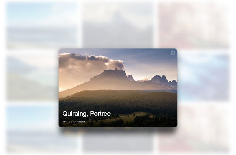
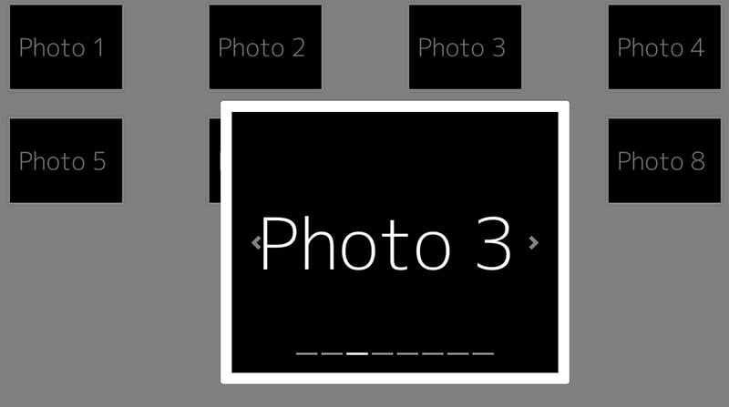
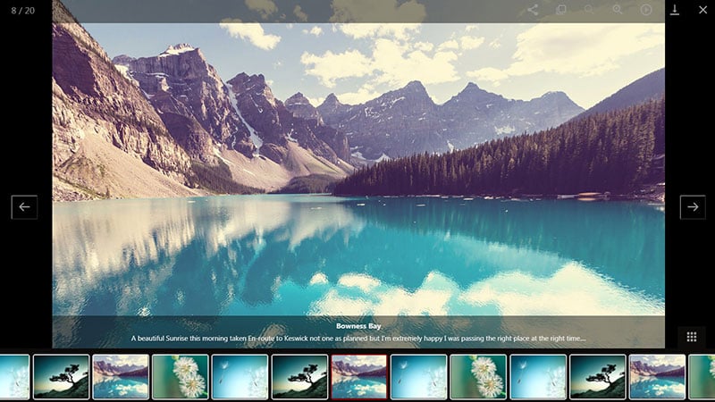
Arrow key navigation thumbnail gallery modal view
- Snippet by NMonst4
- Made With: HTML, CSS, JS
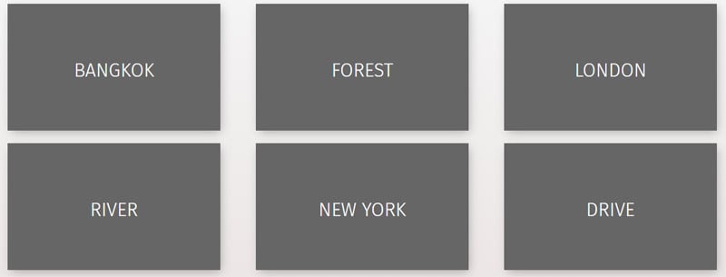
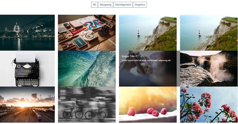
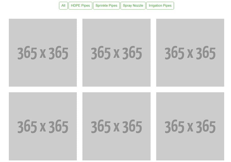
Bootstrap 3 portfolio gallery with filtering category
- Snippet by BBBootstrap Team
- Made With: HTML, CSS, JS
Bootstrap 4.1.1(CSS 3D Gallery Slider)

- Snippet by ebubekirbastama
- Made With: HTML, CSS, JS
Bootstrap-4-beta gallery + modals lightbox
- Snippet by Webdragong3
- Made With: HTML, CSS, JS
Bootstrap 4 Gallery Filtering
- Snippet by ashifulcse
- Made With: HTML, CSS, JS
Bootstrap 4 Image slider gallery with animation
- Snippet by BBBootstrap Team
- Made With: HTML, CSS, JS
Bootstrap 4 Multiple image slider
- Snippet by BBBootstrap
- Team Made With: HTML, CSS, JS
Bootstrap Image Gallery Template
- Snippet by evarevirus
- Made With: HTML, CSS
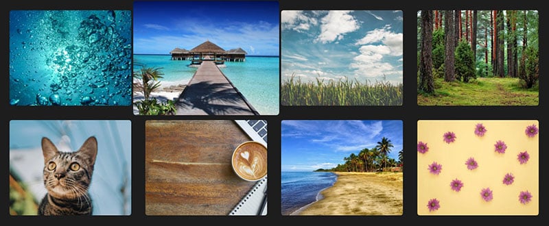
Bootstrap photo gallery
- Snippet by Ondrej
- Made With: HTML, CSS
Bootstrap Thumbnail Gallery

- Snippet by Start Bootstrap
- Made With: HTML, CSS
Bootstrap Zoom Gallery
- Snippet by BharathKurapati
- Made With: HTML, CSS, JS
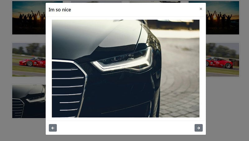
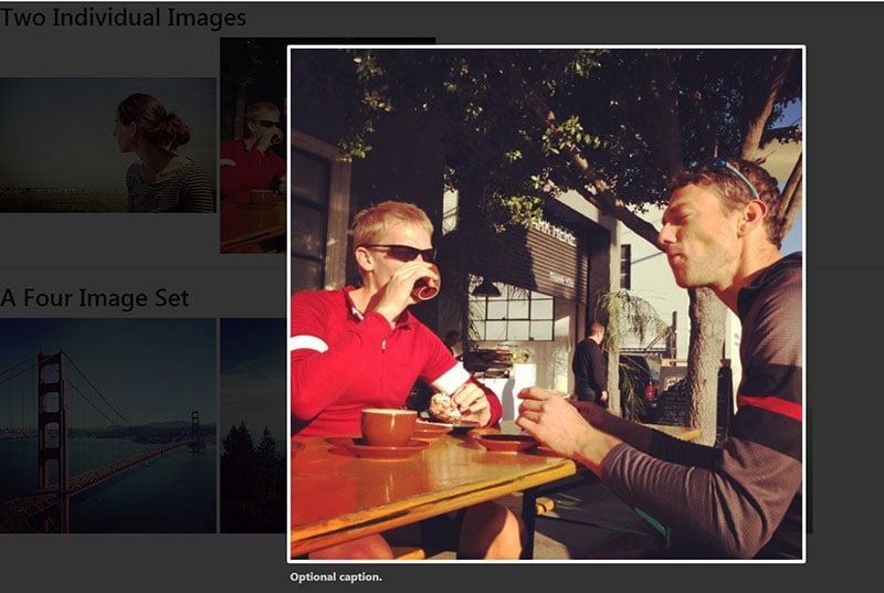
Easy image gallery in a modal
- Snippet by Donny5300
- Made With: HTML, JS
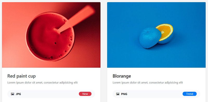
gallery + text
- Snippet by evarevirus
- Made With: HTML
gallery filters
- Snippet by evarevirus
- Made With: HTML, CSS, JS
Gallery

- Snippet by evarevirus
- Made With: HTML
Gallery
- Snippet by evarevirus
- Made With: HTML, CSS, JS
gallery – vK

- Snippet by vivekbisht109
- Made With: HTML, CSS, JS
gallery – Vk
- Snippet by vivekbisht109
- Made With: HTML, CSS, JS
Hexagon Grid Gallery
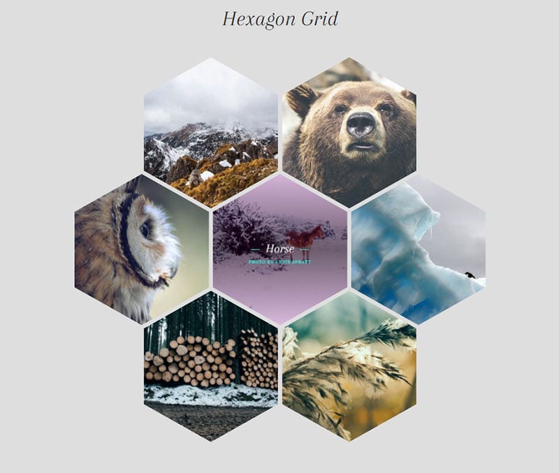
- Snippet by evarevirus
- Made With: HTML, CSS
Hover card effect + gallery image + ravi
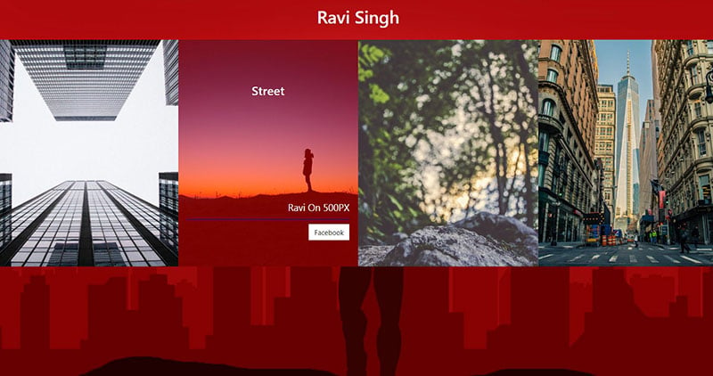
- Snippet by ravi7284007
- Made With: HTML, CSS
Image Gallery + hover effect + only css + ravi
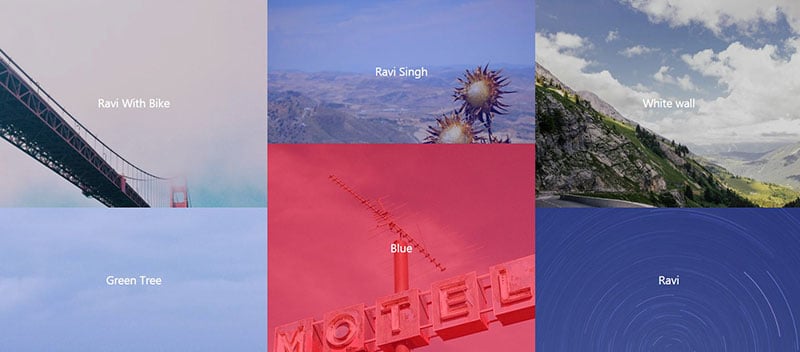
- Snippet by ravi7284007
- Made With: HTML, CSS
Image Gallery using bootstrap 4
- Snippet by dipendra
- Made With: HTML, CSS, JS
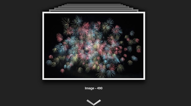
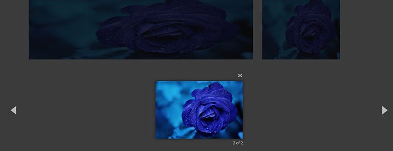
Lightbox Gallery by Bootstrap 4
- Snippet by Monoxa
- Made With: HTML
lightbox gallery
- Snippet by mdburhani52
- Made With: HTML, CSS, JS
Lightbox image gallery (Manish Yadav)
- Snippet by Manish Yadav
- Made With: HTML, CSS, JS
LightGallery using jQuery
- Snippet by Siddharth Panchal
- Made With: HTML, CSS, JS
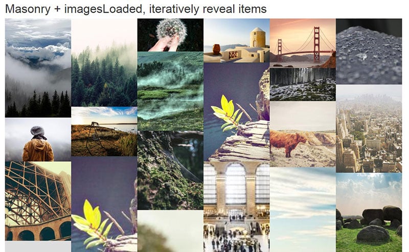
mesonry image gallery
- Snippet by admanekishor
- Made With: HTML, CSS
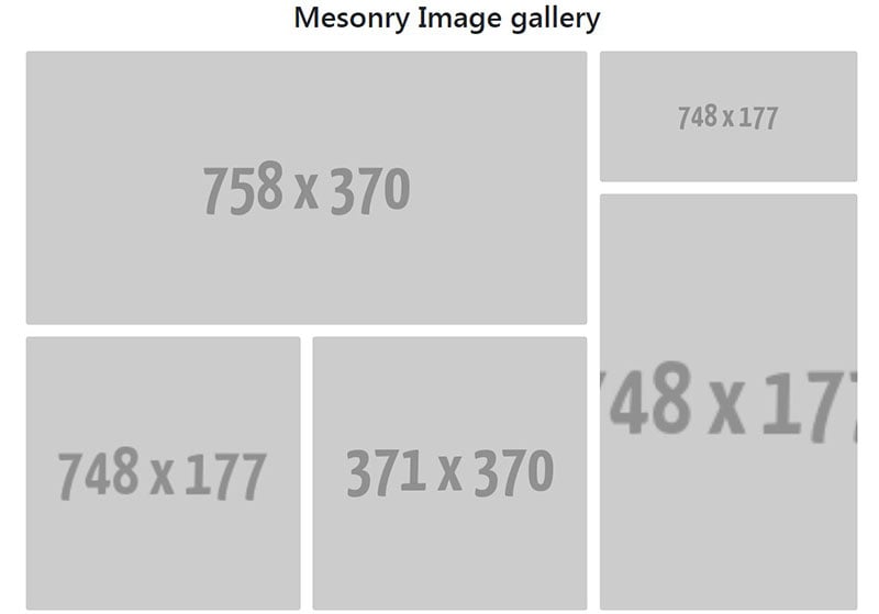
Masonry Image Gallery
- Snippet by Sagar Joshi
- Made With: HTML, CSS, JS
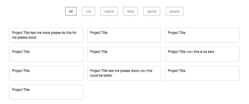
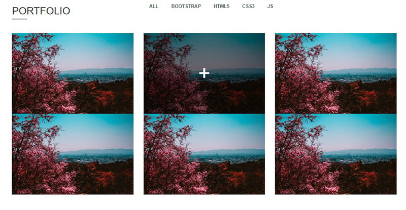
Portfolio Gallery Filtering using bootstrap 4.1
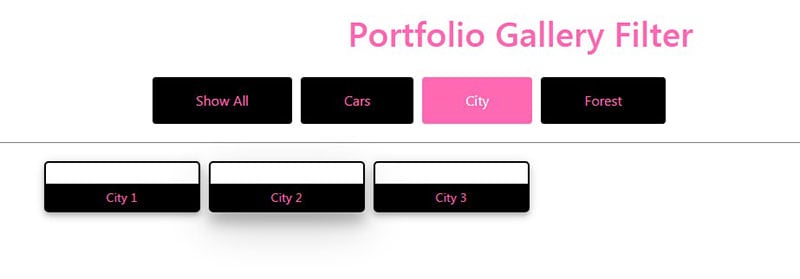
- Snippet by Winson222
- Made With: HTML, CSS, JS
Portfolio Gallery with filtering category
- Snippet by meetshah
- Made With: HTML, CSS, JS
Portfolio Image Gallery With Modal
- Snippet by tareqahmed
- Made With: HTML, CSS, JS
Pure css Responsive Masonry Gallery
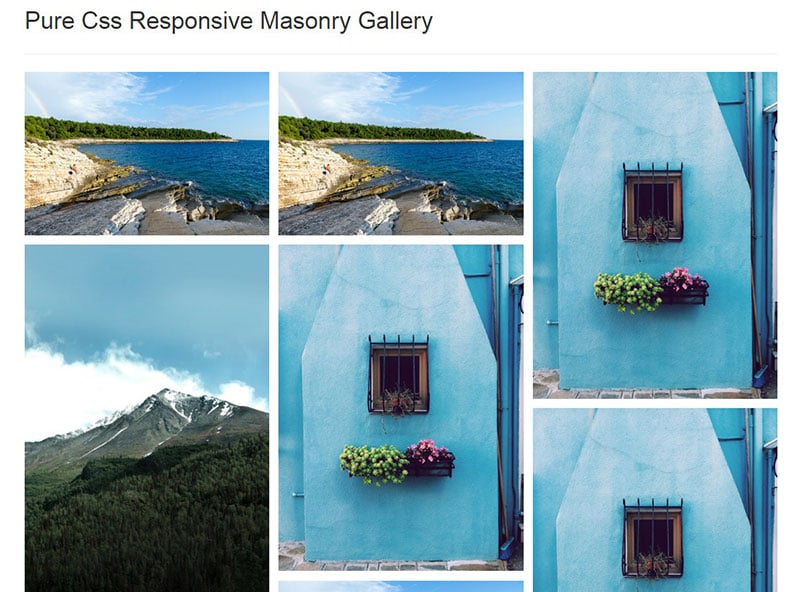
- Snippet by Shuvendu Dhenki
- Made With: HTML, CSS
Responsive Lightbox Gallery With Popup on click with Description
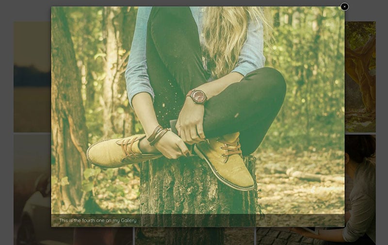
- Snippet by nabeelkondotty
- Made With: HTML, CSS
Simple Responsive Image Gallery

- Snippet by ishwarkatwe
- Made With: HTMl, CSS
FAQs about Bootstrap galleries
How do I get started with Bootstrap gallery templates?
You dive right in! Start by snagging a Bootstrap framework from the web. Make sure it sings in harmony with the latest version of Bootstrap. Remember, Bootstrap’s grid system is your playground—lay out your images within it, then style with CSS to make it truly yours.
Are Bootstrap gallery templates responsive?
Absolutely. Born in the era of mobile-first design, these templates flex like acrobats. They’ll shimmy perfectly across devices, big or small. Plus, their responsiveness ensures your gallery looks fab on desktops and phones alike. It’s that CSS magic working with HTML5—presto!
Can I customize Bootstrap gallery templates easily?
Oh, customization is a breeze. Bootstrap’s classes are like Lego blocks. Mix, match, tweak to your heart’s content. Whether it’s colors, fonts, or animations, you can tailor each piece. Sprinkle in some HTML or CSS finesse, and make that gallery echo your unique flair.
What about SEO with Bootstrap gallery templates; are they optimized?
Smart question! SEO-wise, Bootstrap’s clean code is a good pal. Add semantic markup, toss in those alt tags on images, keep things accessible—Google will give you a nod. Plus, a fast, mobile-friendly gallery means better user experience, and that’s SEO gold.
How can I add a lightbox to my Bootstrap gallery?
Great pick—lightbox adds that professional touch. Most templates come with a built-in option, or you can hitch a third-party plugin. Link it up with a bit of JavaScript, and voila, you get that sleek overlay effect. It’s like drizzling caramel on a sundae—just better.
Do all Bootstrap templates support the latest web technologies?
Keep pace, stay relevant—that’s the Bootstrap way. Most templates evolve as web tech advances—think harnessing the powers of CSS3 and the latest JavaScript libraries. But, always check for updates; ensure the template doesn’t lag behind like last season’s fashion.
Can I use Bootstrap gallery templates on commercial projects?
Sure can! Bootstrap struts on the open-source runway. Just respect the licensing—if it says free for commercial use, you’re golden. However, keep an eye for premium picks, some might cost a penny but deliver a bang for your buck.
Is there a way to make Bootstrap galleries more interactive?
Indeed! Bootstrap doesn’t just sit pretty; it intermingles with jQuery or vanilla JavaScript for that extra oomph. Pop in some hover effects, clickable events, or dynamic image loading techniques. Turn that gallery from static to interactive, making it engage and dazzle.
What’s the most effective way to handle image sizing in galleries?
Consistency is key. Use the same ratios, ensure images don’t clash file-size-wise. Bootstrap’s responsive classes set the stage, your images dance to the tune. A good rule of thumb: optimize for web, reduce file size without losing that crisp look. Keep load times short, too!
How important is accessibility in Bootstrap gallery templates?
Don’t even get me started—it’s huge! Accessible design not only reaches wider, but it’s simply the right thing to do. Use ARIA roles, keyboard navigation support, proper contrast ratios. This lifts your gallery from good to exemplary, making it a seamless experience for all.
Ending thoughts
And that’s the wrap on our deep-dive into the world of Bootstrap gallery templates. These are the digital canvases where your images pop, tell stories, and captivate audiences—with not one iota of sweat on the code front.
- No one needs to get tangled in a web of complex design maneuvers here.
- Let’s remember, Bootstrap is all about bringing that wow factor into play, making sure that every gallery you craft resonates with style, across every screen out there.
You’re now equipped to pick a template that’s just the right fit and infuse it with your unique touch. From slick carousels to minimalist thumbnail grids, your creations are going to shimmer on any device. Think about those smooth CSS photo galleries and how they’ll elevate your content.
So, here you go, poised to conjure up a visual experience that’s not just another gallery but a powerhouse of interaction and beauty. Let the creativity flow and the pixels align—your next gallery is set to be a masterpiece.
If you liked this article about Bootstrap galleries, you should check out this article about Bootstrap sidebars.
There are also similar articles discussing Bootstrap profiles, Bootstrap carousels, Bootstrap timelines, and Bootstrap search boxes.
And let’s not forget about articles on Bootstrap menus, Bootstrap footers, Bootstrap testimonial sliders, and Bootstrap login forms.


