

So much of the user experience on a website is passive. By actively engaging users with your design, you can make them feel more a part of your story and your product.
In this tutorial, we’re going to show you how to add a before-and-after image slider to your hero section. We’ll use the Image Comparison Slider template to do this, only we’re not going to be depicting a before-and-after scene. We’re going to use it to give our customers different options to choose from.
Table of Contents:
- Step 1: Delete the 3 slides you don’t need
- Step 2: Delete all of the global layers
- Step 3: Set the before and after background imagery
- Step 4: Update the Before & After slide settings
- Step 5: Edit the slide’s text
- Step 6: Add a call to action
How to create a highly engaging before-and-after image slider
One UI feature that is almost guaranteed to get your content more engagement is a before-and-after image slider. There are so many different use cases for this feature, too. The Image Comparison Slider template demonstrates just a small handful of them:
In this tutorial, we’re going to create a slider for our sister restaurants. This could either be the hero section on the home page of the restaurant group site or it could serve as an entry landing page. Either way, visitors have two clear options to choose from:
If this is your first time using Slider Revolution, read through these quick-start guides before you begin:
Step 1: Delete the 3 slides you don’t need
You only need one before-and-after image to create an engaging experience for visitors. Take a look through the four images contained in this slider and pick a style — e.g. image layers, font type, text placement, etc. — that is closest to the one you want to create.
Then go to “Slides” in the top toolbar and delete the other three slides. Hover over them one at a time and click the trash can icon to delete:
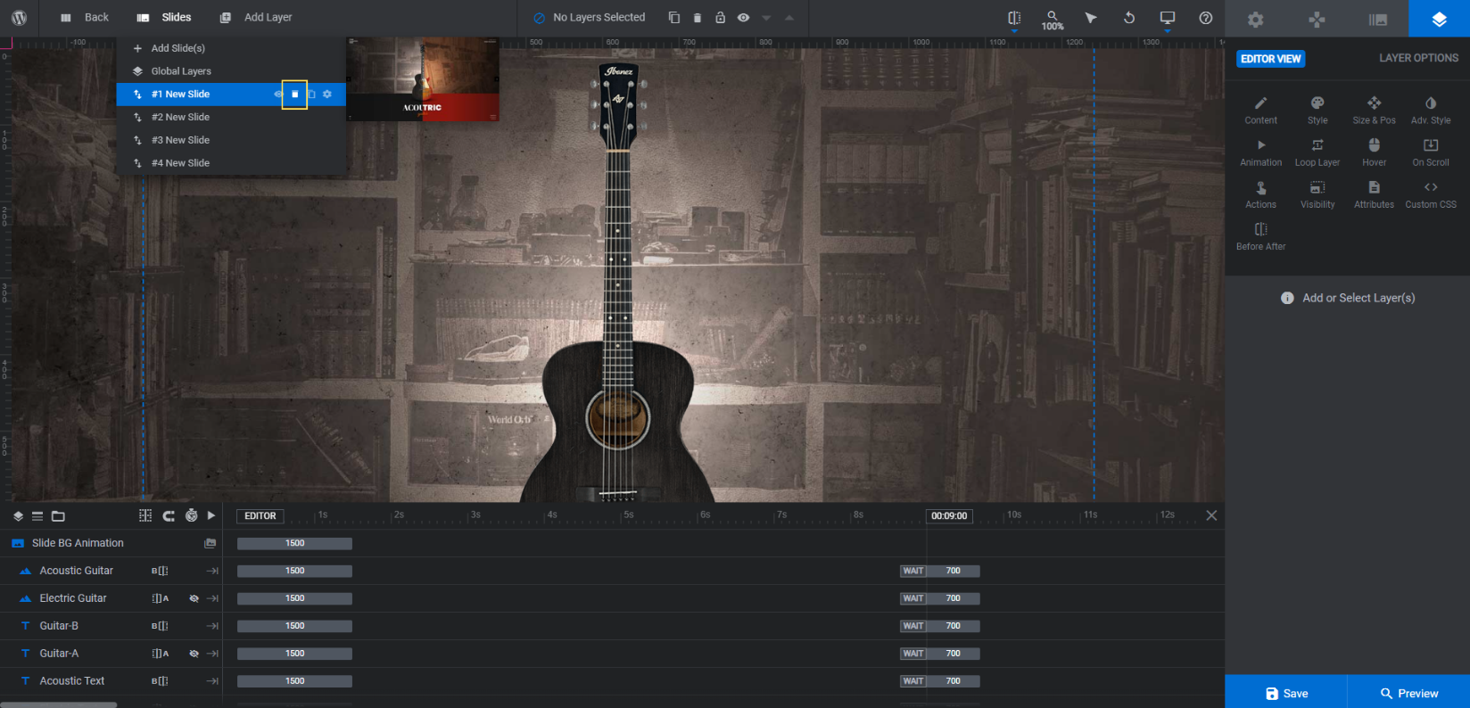
For our example, we’re going to keep Slide #4.
Learn more:
Step 2: Delete the global layers
Keep the “Slides” dropdown open and click on “Global Layers”:
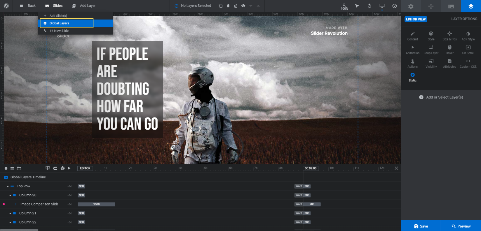
These layers appear on top of the slider. As visitors click through different slides, these layers remain where they are. Global layers are useful when you want to add a header to your design or to include elements like custom navigation arrows or social media icons.
Because this slider will serve as our hero image, we don’t need any of those layers. To delete them, hold down the Ctrl or command button on your keyboard. Then select the following layers in the timeline at the bottom:
- Top Row
- Bottom Row
Hit Backspace or delete to remove the rows and all the text elements contained within them.
This will leave two layers remaining: Left Gradient Overlay and Right Gradient Overlay. These layers add darker edges around the left and right sides of the slider.
Keep them here until you add your custom before-and-after images. If you feel like they add too much darkness to them, you can always come back here to delete them.
Learn more:
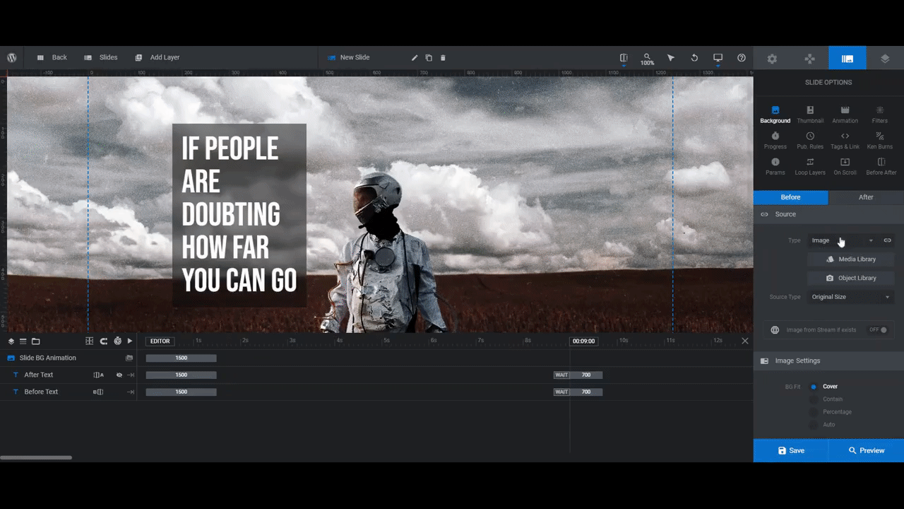
Step 3: Set the before and after background imagery
Return to your slide and open up “Slide Options”. With the Before & After AddOn activated, this is going to look a little different than it usually does.
Before uploading a new background image to the slide, make sure you have the right tab selected at the top.
- The Before tab is where you’ll set the image that appears on the left side of the slider. It will sit atop the After image.
- The After tab is where you’ll set the image that appears on the right side of the slider. It will sit beneath the Before image.
While you’re here, consider changing the slide’s intro transition effect. You’ll find this under “Animation”. Currently, a Motion Blurred Horizontal effect is applied.
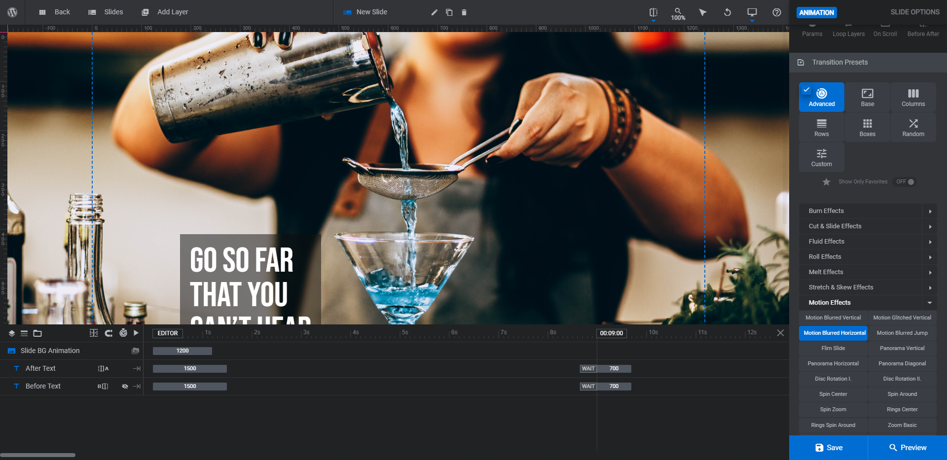
To preview the other transition presets, hover over their names and you’ll see a preview in the canvas. Once you’ve found the one you like, click on it. You can leave it as is or use the settings down below to customize it further.
Pro tip: Because of the directionality built into the slider design, try to find a “Horizontal” effect. That way, it won’t create such a chaotic feel to the motion.
Learn more:
Step 4: Update the Before & After slide settings
Under “Slide Options”, go to the “Before After” tab to make adjustments to the before-and-after image slider settings. You can do things like:
- Change where the image divide starts if you don’t want it in the center (at 50%).
- Set the slider to vertical instead of horizontal.
- Adjust the slider’s animation settings.
- Add a teaser so that the arrows more explicitly draw visitors’ attention to them.
- Apply a transition effect.
You won’t be able to see the changes in the canvas on the left. Go to “Preview” to confirm that the changes to the image slider are good to go.
Learn more:
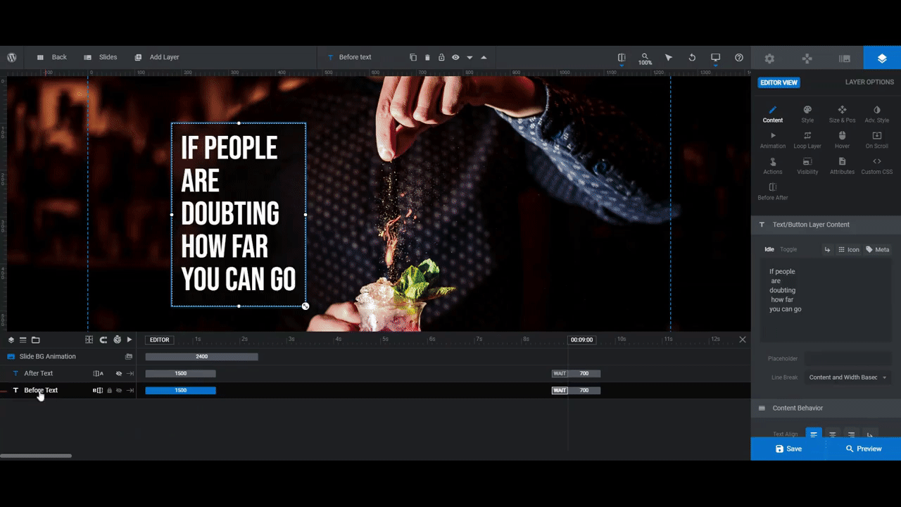
Step 5: Edit the slide’s text
There are just two text layers in Slide #4: After Text and Before Text. To edit what the text says in each and how it looks, select the layers in the timeline editor or from the canvas.
From “Layer Options”, you can edit the text under “Content” and change the font and its appearance under “Style”:
One other thing you can do is move the text around. You can make this change under “Size & Pos”:
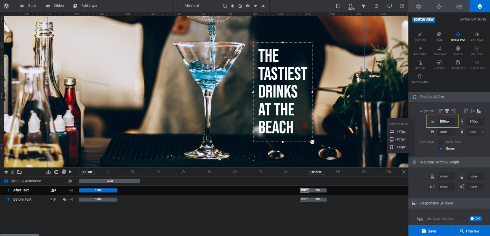
Note: If your slider cuts the image in half, you might not want to move your text layers. The way this particular image is designed, the “After” text remains hidden until someone moves the slider. However, if you’re going to do as we’ve done with the slider set to 90%, you can move your text to another part of the screen if you’d prefer.
One last thing:
Style changes shouldn’t have an impact on the way your text layers fit on smaller screens. Changing the size or position, however, probably will. So it’s a good idea to do a responsive check before you move on:
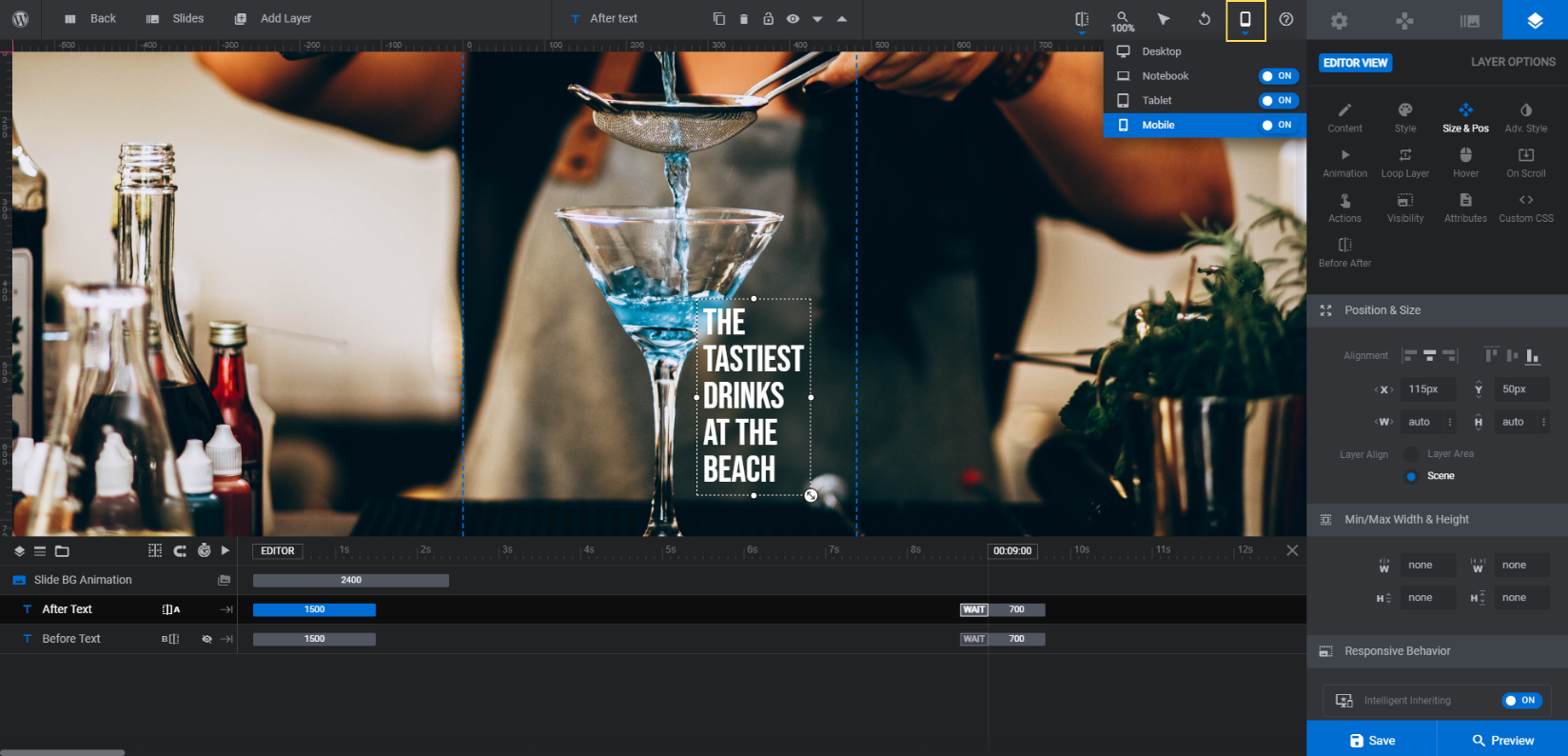
Tweak the position of your text layers under each of the responsive variants that need it. Then save your changes.
Learn more:
Step 6: Add a call to action
The last thing we’re going to do is add call-to-action (CTA) buttons to the Before and After images. The other slides in the template had them, but this one doesn’t, so we’re going to create our own.
To do this, go to “Add Layer” in the toolbar and select “Button”. This will add the default button design to the canvas:
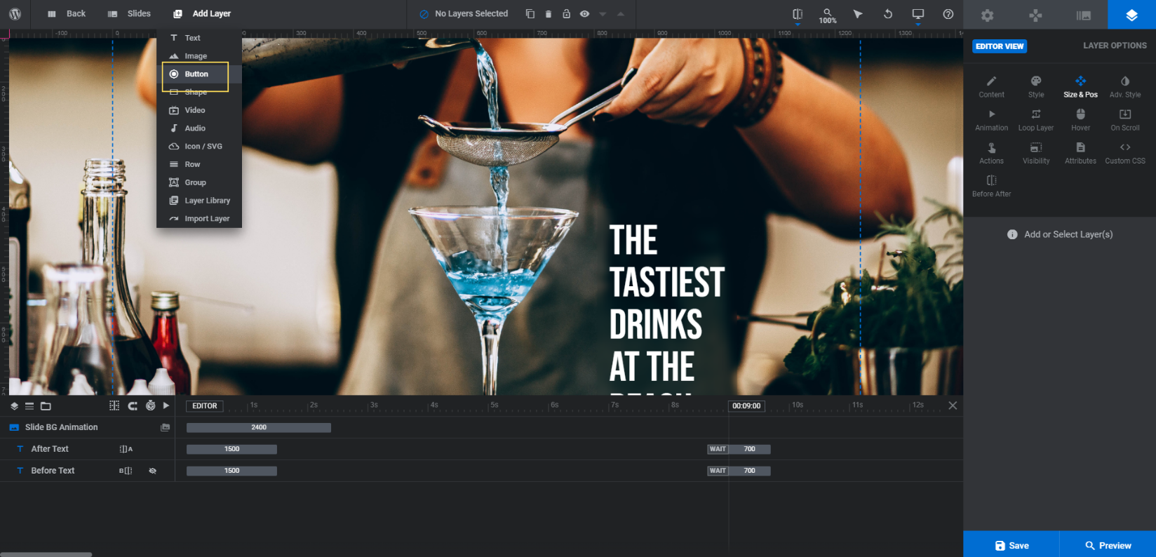
It will also open a template sidebar on the right. Peruse the designs and choose one that looks closest to the type of button you want to add.
Then use “Layer Options” to customize it. Start by going to “Before After” to choose which of the images to pair the button with. Then use the other settings to customize the rest:
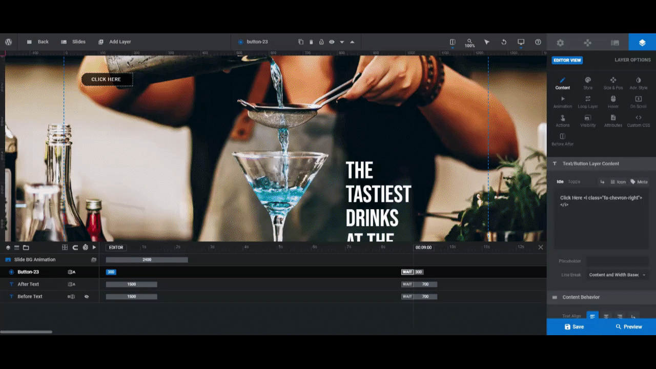
Use “Content” to change the button text and “Style” to change the font, button and text color, and shape.
You can drag-and-drop the button to where you want it to go in the canvas. Then use “Size & Pos” to refine its position.
Use “Animation” to set an animation that matches the text’s sliding animation. First, Click on IN/Anim From and configure the following:
- Under “Layer”, set the X value to left.
- Go to “Slide Direction Based Mirroring” and enable it for the X axis.
Click on IN/Anim To and configure the following:
- Duration: 1500
- Start: 0
- Easing: power2.inOut
At the bottom, set a “Layer Back-Drop Filter” with a 5px transparency.
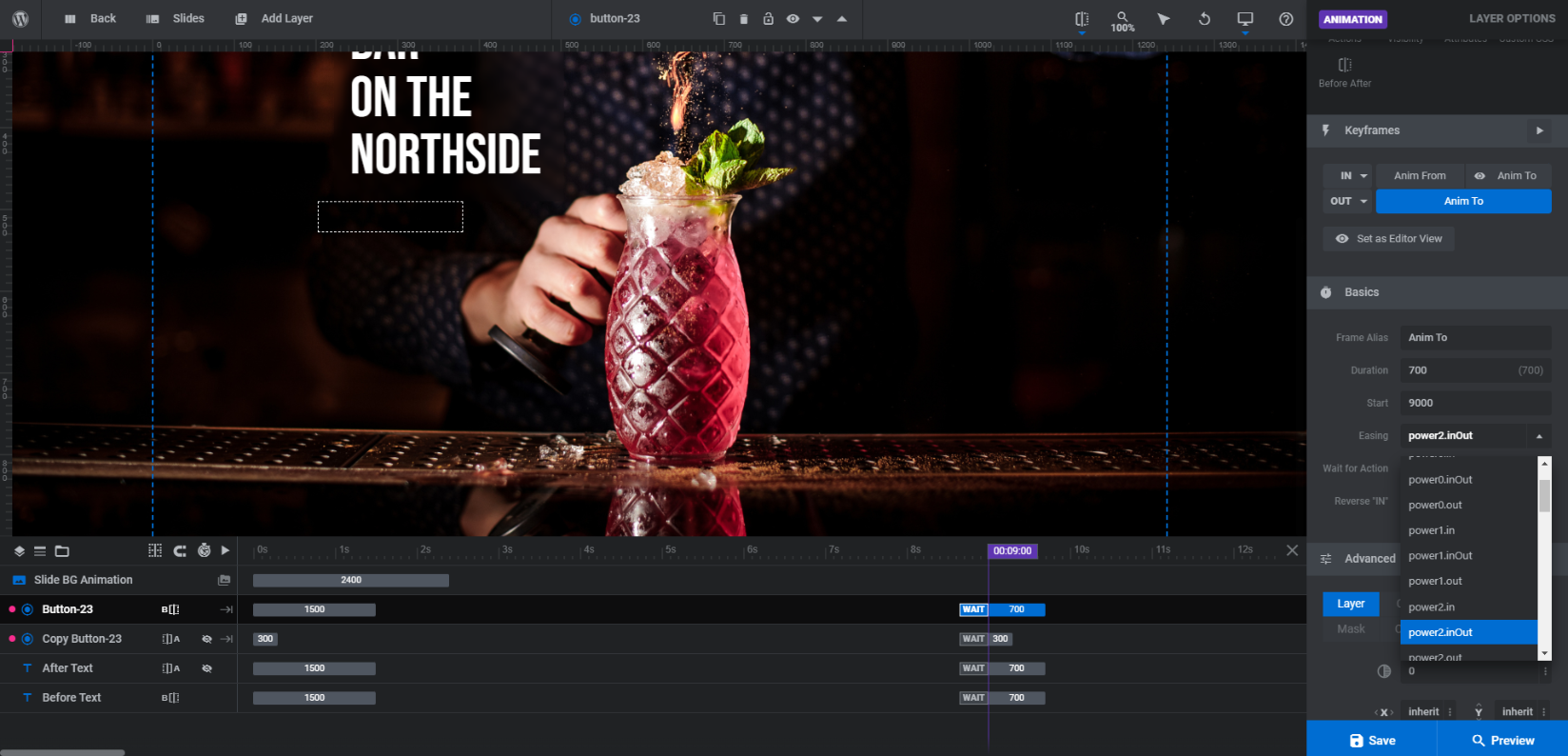
Then switch to OUT/Anim To and configure the following:
- Duration: 700
- Start: 9000
- Easing: power2.inOut
Also, under “Layer”, set the X value to right. And enable “Slide Direction Based Mirroring” on the X axis.
Last but not least, use “Hover” to alter the button’s appearance upon hover and “Actions” to direct visitors to another section or page.
Right-click on your new button and click “Duplicate” from the dropdown. Set this one to the other “Before After” image. Then go through the “Layer Options” settings to make custom tweaks if needed.
Because these are brand new layers in the slider, you’ll have to do another round of responsive edits, focusing on the size and position of each button.
Learn more:
- Adding and Configuring Button Layers
- Editing Links in Template Modules
- The Fundamentals of Animation
Give your visitors a reason to engage with an image comparison slider
While a before-and-after image slider is commonly used to depict just that — progressive image stills — there are so many other ways to put this engaging feature to use. The Image Comparison Slider template makes it easy to do, too. Just upload your side-by-side imagery, customize the text, and then make tweaks to how the slider operates.


