
Adjusting for Responsiveness
Learn how to identify and resolve responsiveness issues in your customized, template-based modules.
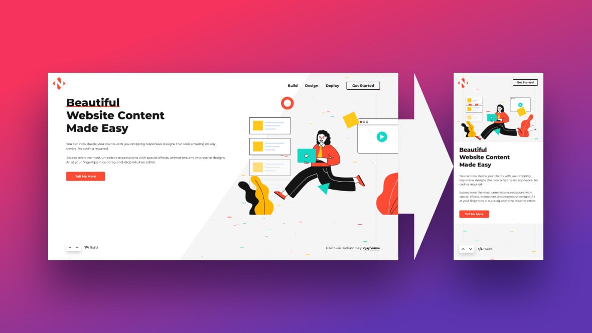
Table of Contents
- Introduction
- Checking Responsiveness in Edited Templates (Video Tutorial)
- General Tips
- Common Issues, and How to Apply Their Solutions
- 4 Step Cheat Sheet
- Coming Up Next: Modules from Scratch
Introduction
On the previous page of the manual we talked about how you can preview all four of your module’s [?]
A module in Slider Revolution acts as a container for slides, which in turn act as containers for layers. Modules are created and edited with the module editor.
A "module" is a single, self contained piece of content. You can think of this as being similar to the way a post or page in regular WordPress is a self contained piece of content.
A module can represent any kind of content Slider Revolution is capable of creating, such as a slider, carousel, hero unit, navigation menu, posts display and so on.
Multiple modules can be combined to form rich content such as complete sites and landing pages. size variants, so you can check for issues with their layouts. But exactly what should you be looking for, and how do you make adjustments if you find a problem?
In this guide we’ll go over the specifics of what to check your modules for in regards to responsiveness, and how to use the module editor [?]
The "Module Editor" is the tool used to create & modify modules.
Through this visual, drag & drop, no-code interface you can add various types of layers, animation and special FX to your modules, as well as managing slides and configuring options. to resolve any issues you find.
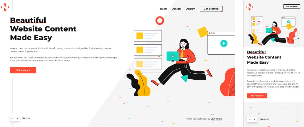
Note: This guide is intended to help you with the task of ensuring responsiveness in template-based [?]
A "Template" is a premade module. It has pre-configured layers already in place.
It is designed to be ready for use, either as is or after being modified in the module editor.
Slider Revolution comes with several templates you can use, or alternatively you can create your own templates, thereby allowing you to easily reuse modules you have produced. modules, where the bulk of the responsive functionality is already in place.
However, you will also learn some of the fundamentals of handling responsiveness in Slider Revolution [?]
Slider Revolution is a website content creation tool with a focus on captivating animation and stunning visual effects.
It began its life as a plugin for creating slideshows, but has evolved into a fully fledged piece of design software., and we will build on that foundation later, in the manual section on making modules from scratch. For that reason we recommend you read this guide whether you are currently using templates or creating your own custom designs.
Checking Responsiveness in Edited Templates (Video Tutorial)
Everything covered in this section of the manual can also be learned by watching the ‘Checking Responsiveness in Edited Templates’ tutorial video below:
If you watched the above video in full you can skip the remainder of this section of the manual and proceed to the next section of the manual to learn about making modules from scratch.
Or, continue reading to learn more about how to fix common responsiveness issues in Slider Revolution.
General Tips
Before we get onto finding and fixing specific responsiveness issues, let’s cover some general tips that will help you throughout the entire process.
Find Issues Through Scrubbing
The best way to find potential responsiveness issues is to slowly scrub the playhead forwards and backwards through your animations on the timeline [?]
The timeline is the section of the module editor dedicated to animation and controlling the stacking order of layers.
From this part of the editor animations can be added, adjusted and previewed. Additionally, layers can be selected from the timeline, and can be dragged and dropped up and down on the timeline to modify which appear in front and which behind.
It can be equally compared to both a timeline in a typical video editing application, and a layers panel in a typical graphic design application, paying attention to each layer’s size and movement on the canvas [?]
The canvas is the point and click design space in the module editor. It forms the largest area of the module editor.
In this area layers can be selected, moved and resized. Animations can also be previewed..
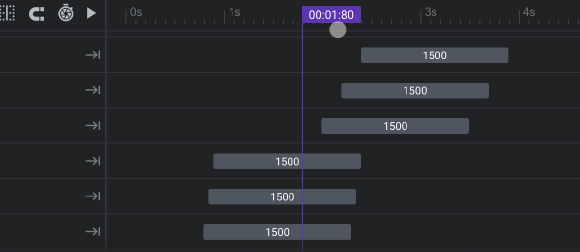
While you should also use the real time animation playback on the canvas and in the popup preview, these functions will be most helpful for testing modifications you make after finding problems. It will be easier to first spot those problems through scrubbing, rather than realtime playback.
This is because through scrubbing you can easily control the exact speed of playback, as well as stopping or reversing playback at will, giving you plenty of time to examine things as closely as you like.
Adjust Larger Layouts First
After you finish customizing your initial “default” layout at desktop size, always start the responsive checking and adjusting process on the laptop size layout first, followed by the tablet size layout, then the phone size layout.
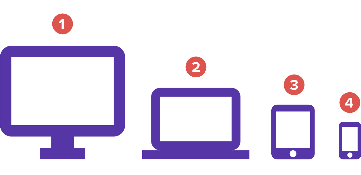
The reason for this is that by default each size variant inherits layout settings from the size above it. For example, the tablet layout will inherit settings from the laptop layout unless it is specifically given settings of its own.
So in some cases you may find when you make adjustments to larger layouts, they are inherited by smaller layouts, and that turns out to be all you need to get them in shape as well.
Common Issues, and How to Apply Their Solutions
Let’s step through some of the most common ways that a module’s layouts might run into issues at smaller screen sizes, and how you can solve these issues if you spot them.
Note: These issues are listed in the order we recommend you check for then solve as required. You can think of this as a “to do” list for ensuring responsive modules.
Issue: Layer Sizes Seeming Too Large
If the edges of a layer [?]
Layers are containers for visual, audio or layout items and are added to slides. For example, text, button, image, audio, video, group and row are all types of layers.
Layers are added to slides via the module editor. are clipped at any point, or if it seems to crowd other layers, it’s probably too large.
Solution: How to Adjust Layer Sizes
To adjust a layer’s size, click and drag any of the grab handles on its container rectangle.
This resizing method works equally well for most layer types. Images and videos will have their height and width altered, while most text will have its font size changed.
Alternatively, select the layer then go to its Size & Pos sub-section and edit the width and height fields directly in the Position & Size panel. Or, in the case of a text layer, go to its Style sub-section and edit its font size directly in the Font & Icon panel.
Issue: Over-Crowding
After making size adjustments, you may find there is too much crowding on the canvas, causing things to appear too busy or cramped.
Solution: How to Fix Over-Crowding
Your first option is to move layers around to see if rearranging them can alleviate any feeling of cramping in the available space.
If this doesn’t do the job you may need to hide some of the less important layers on a per-layout basis, for example, hiding a layer only on tablet and phone sizes.
To do so, select the layer you want to hide and go to its Visibility sub-section under the Layer Options tab. In the Visibility panel you will see icons and toggle switches for each of the four layout variants.
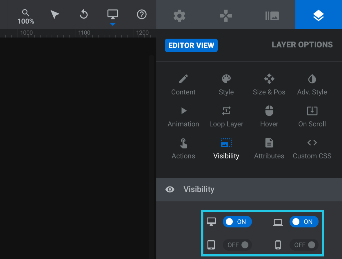
For any layout size on which you wish to hide the selected layer, toggle the corresponding switch to OFF.
Issue: Layers Moving Out of Bounds During Animation
If you have made modifications to animated layers, such as replacing images, replacing text, or altering sizes, you may find that those layers now unexpectedly move partially out of bounds during their animation on smaller size variants.
Solution: How to Adjust Animation Positioning
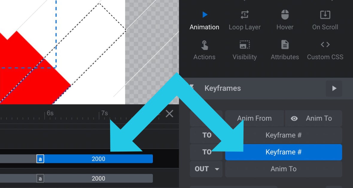
Generally speaking you will want to adjust for one animation keyframe at a time, i.e. the keyframe(s) at which the layer is moving out of bounds.
What you don’t want to do is click and drag the layer on the canvas, because that will move the whole animation and all its keyframes at once. You also don’t want to modify the position values in the Size & Pos sub-section because that will have the same effect.
Instead, select the keyframe in question by either clicking the corresponding animation strip on the timeline, or in the Keyframes panel under the Animation sub-section.
Then directly modify the X and Y settings under the Animation sub-section, Advanced panel.
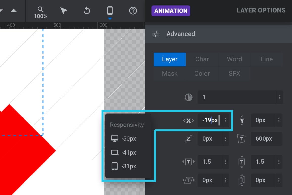
The X field represents horizontal position – increase the value to move right, and decrease it to move left. The Y field represents vertical position – increase the value to move down, and decrease it to move up.
Note: When you click in a field that relates to responsive layout you will see a little readout of the settings being used by each of the other three sizes.
4 Step Cheat Sheet
All the above can be boiled down to a 4 step cheat sheet to guide you through ensuring your customized, template-based modules are properly responsive.
Complete this process first on your laptop size variant, then tablet size, then phone size.
1) Shrink layers that are too large, and are being clipped or causing crowding
2) If the layout has crowding after layer sizes have been optimized, try adjusting layer positions
3) If there is still crowding, consider hiding layers
4) Adjust any animation keyframes that unexpectedly move the layer out of bounds
This process might not cover every single possible opportunity to optimize responsiveness, but it will reliably catch and solve the most common problems.
Intermediate Editing, Complete!
That brings our manual section on “Intermediate Editing” to a close. You should now be well equipped to leverage the large library of ready made content that comes bundled with Slider Revolution.
Of course, nothing quite compares to the creative freedom of designing your own modules completely from the ground up.
And that’s exactly what you’ll learn to do in the next major section of the manual, “Modules from Scratch”.