

One of the advantages that boutique shops have over larger retailers is that they can devote more time and space to promoting more of their products on their websites. One effective way to do this is with a horizontal-scrolling carousel. Another way is with a vertical-scrolling gallery.
In this tutorial, we’ll be using the Woodworking Website Template to create a 3D product carousel / gallery combo with a built-in spotlight effect to increase the wow-factor.
Table of Contents:
How to create your own engaging 3D product carousel
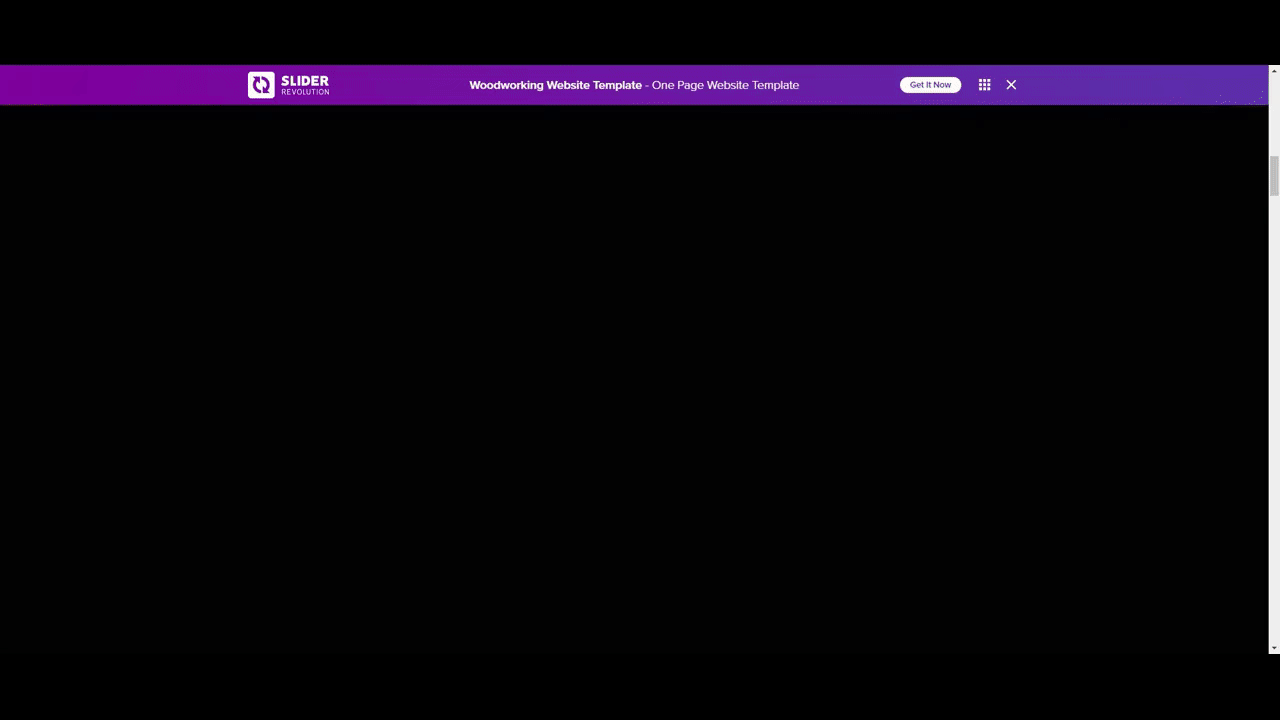
The Woodworking Website template is a one-page website designed to show off the craftsmanship of a woodworker. It has a 3D product carousel and pop-out gallery:
This template can be used to create another one-page website or you can pick it apart and use the various sections within it for your own purposes. In the following example, we’ll use the carousel and gallery sections to show off our arts and crafts kits:
If this is your first time using the Slider Revolution editor, start here:
Note: In this tutorial, we’re going to use the website template to build out our gallery. You’ll find it under New Module from Template. Hover over the template and click the blue Install Template Package button that appears.
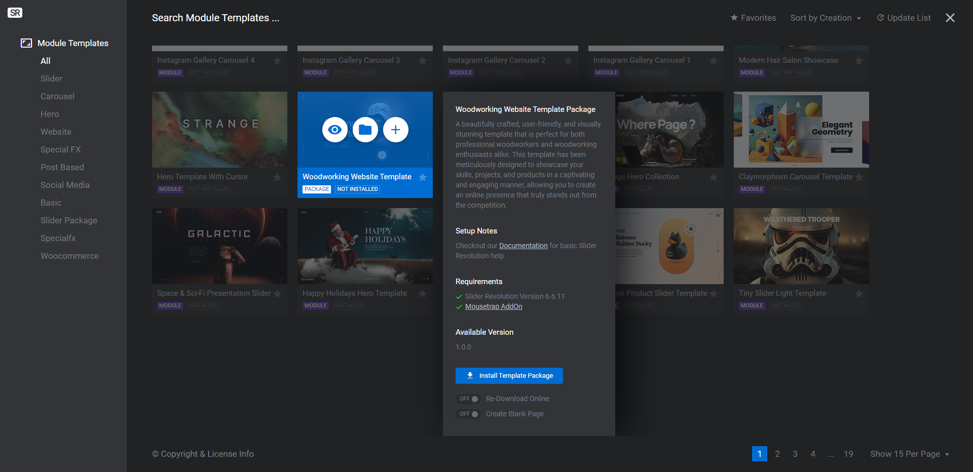
The package has 11 modules in it. If you’re only interested in building a 3D product carousel instead of creating an entire home page or website from the template, you can delete the extra modules:
- Footer
- Events
- Testimonials
- About
- Hero
To delete modules, hover over each and click the down-arrow to open more options. Click the Delete option that appears.
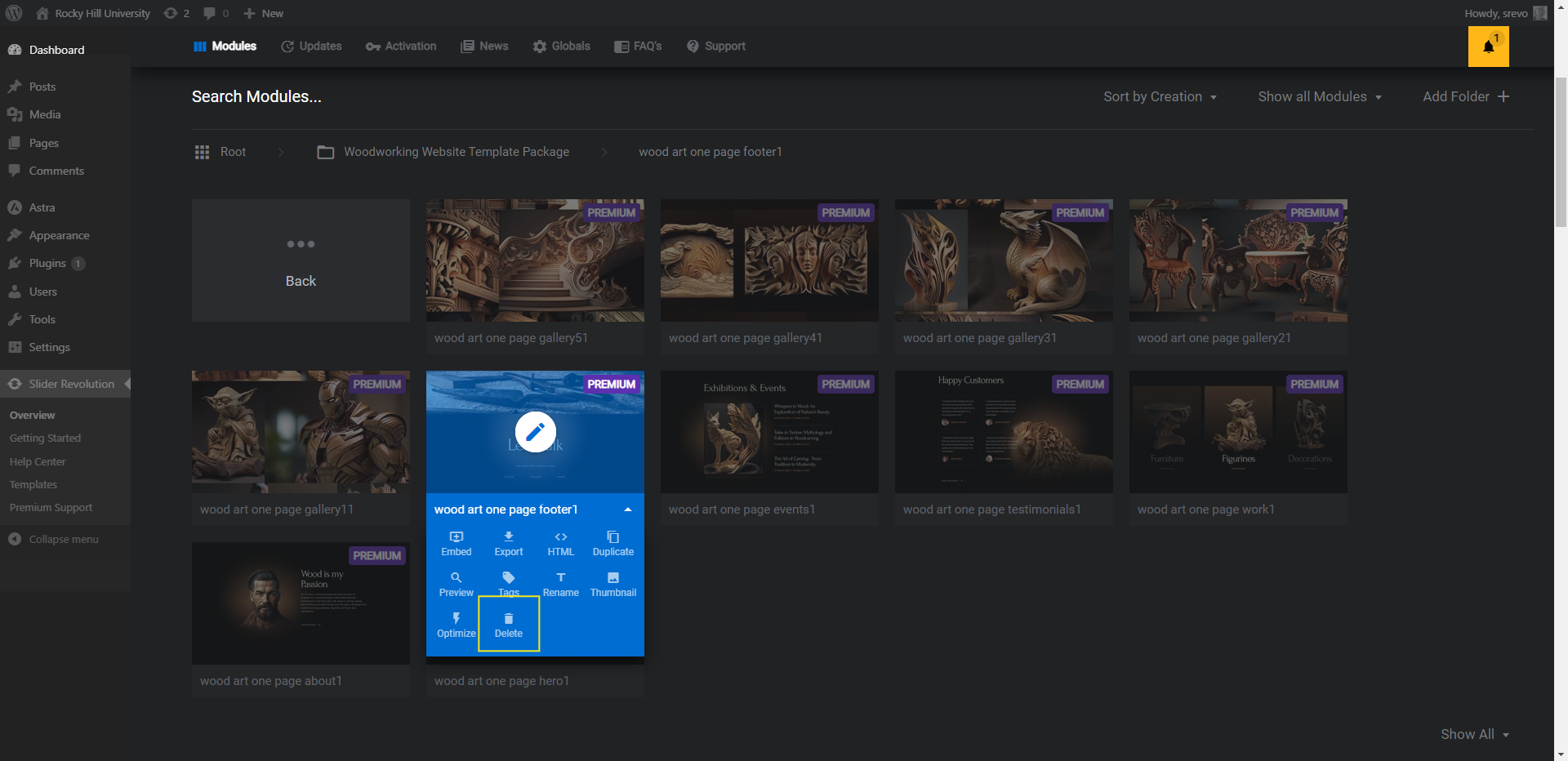
When you’re done, the Work and Gallery modules are the only ones that should remain.
The Work module is the carousel that appears on the home page (or wherever you want to put it on your site). The Gallery modules form the scrollable pop-up gallery of images that appear when someone clicks the View Gallery button under each product category in the carousel.
How to customize the Work carousel
We’ll need to edit this template in two sections. Let’s start with the Work module.
Step 1: Edit the background color
The background we’re editing in this step is the color of the page behind your carousel. If you’re designing a dark themed web page, you can keep the color black.
To change the module/section background color to something else, go to “Module Options” and “Layout”. Then scroll down to the “Module Background” section.
Click the color block next to BG Color. You can either choose a color from the presets in the bottom-right or add a custom HEX code at the top.
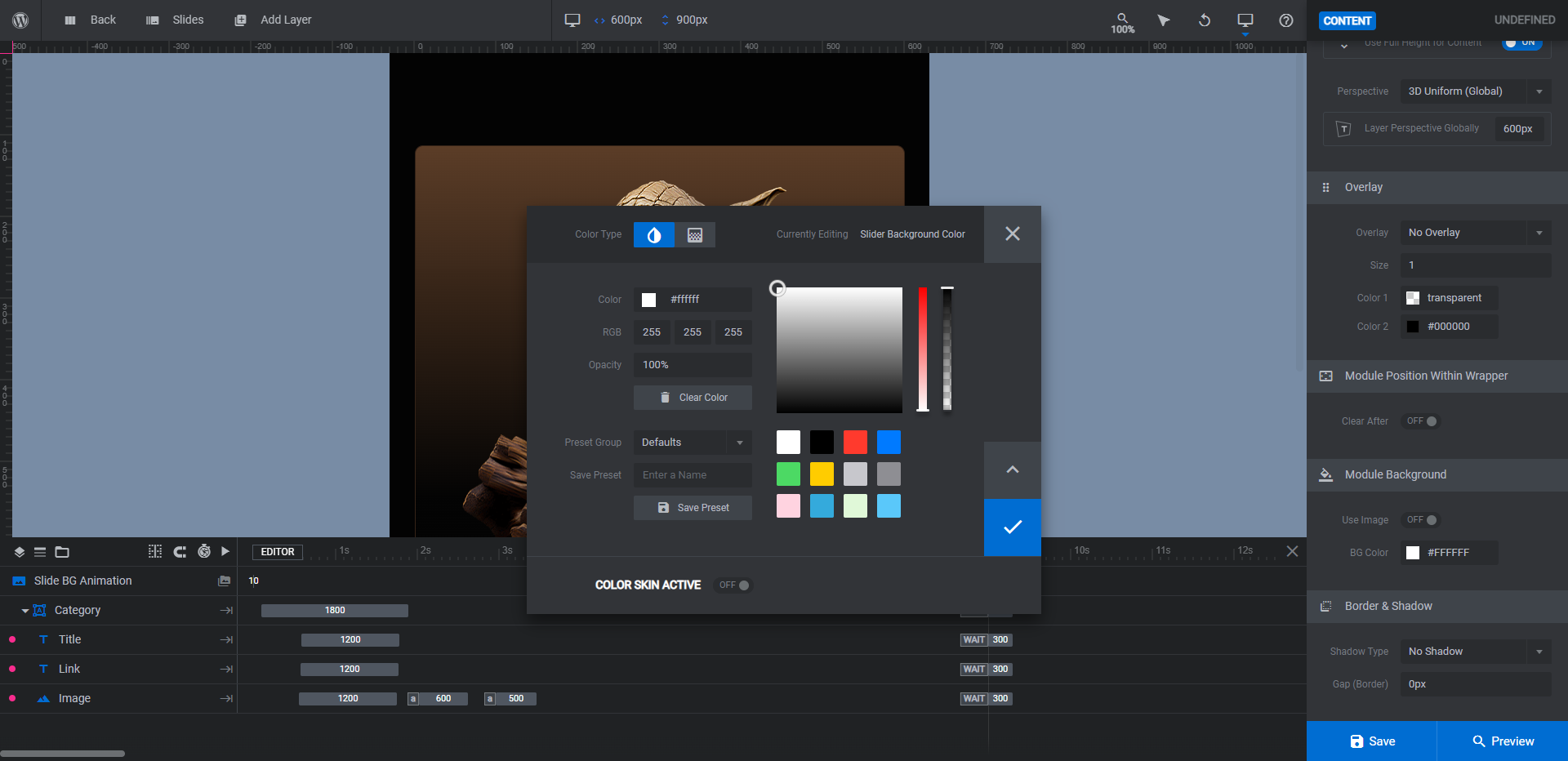
Save your changes when you’re done.
Learn more:
Step 2: Edit the carousel gradient color
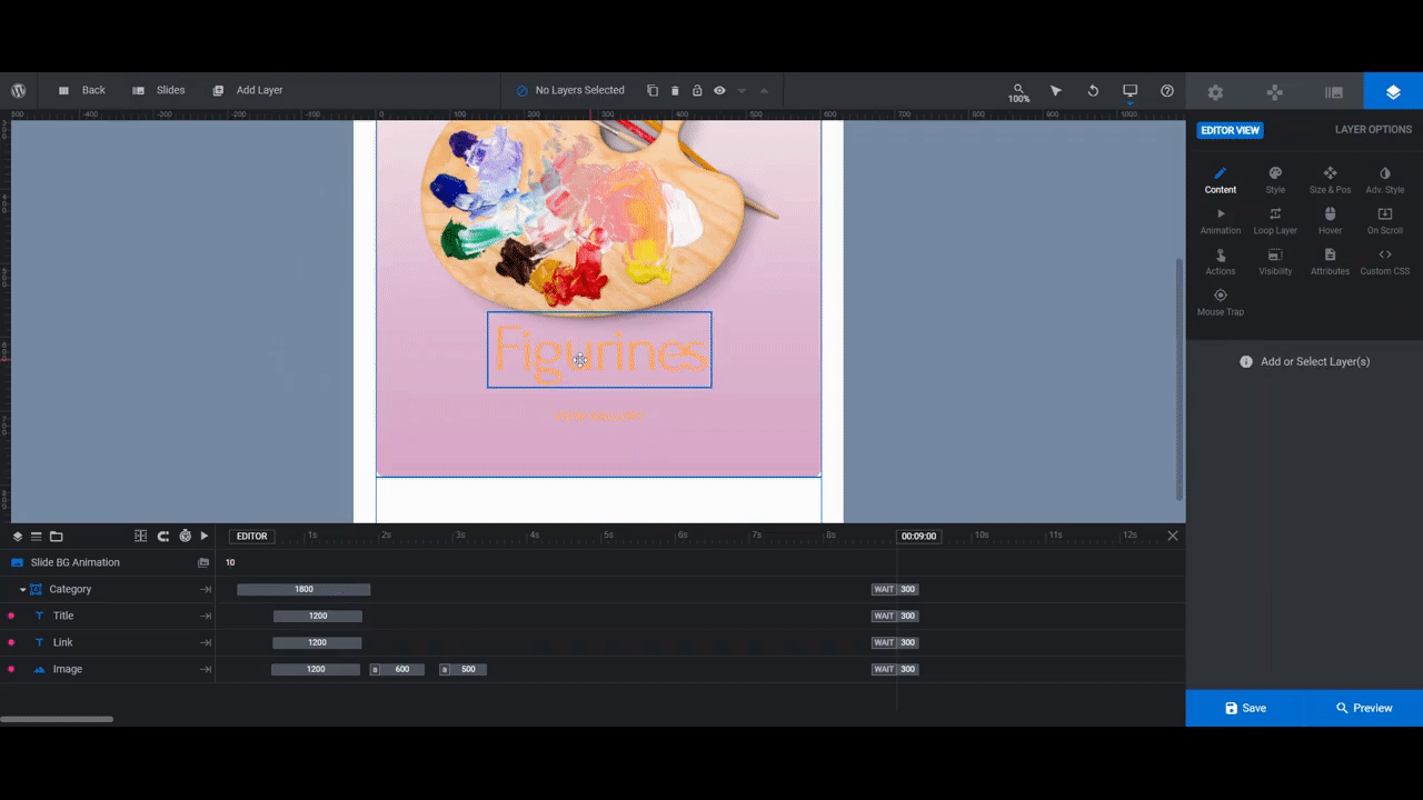
To customize the background gradient in each of the carousel’s slides, go to the timeline editor and select the layer called Category. Under “Layer Options”, go to “Style”, click the color block next to BG Color.
While you can pick a premade gradient from the bottom-right corner, you’ll have to make fewer changes to the gradient settings if you simply swap out the colors.
Pro tip: If you go this route, use a tool like uiGradients to pick your custom gradient colors.
You’re going to be applying this same gradient to each of the slides in your carousel. To quickly edit the other slides, go to the bottom-left corner of the color selection dialogue. Switch the Preset Group to Custom. Give the gradient a unique name in the text field. Then click Save Preset.
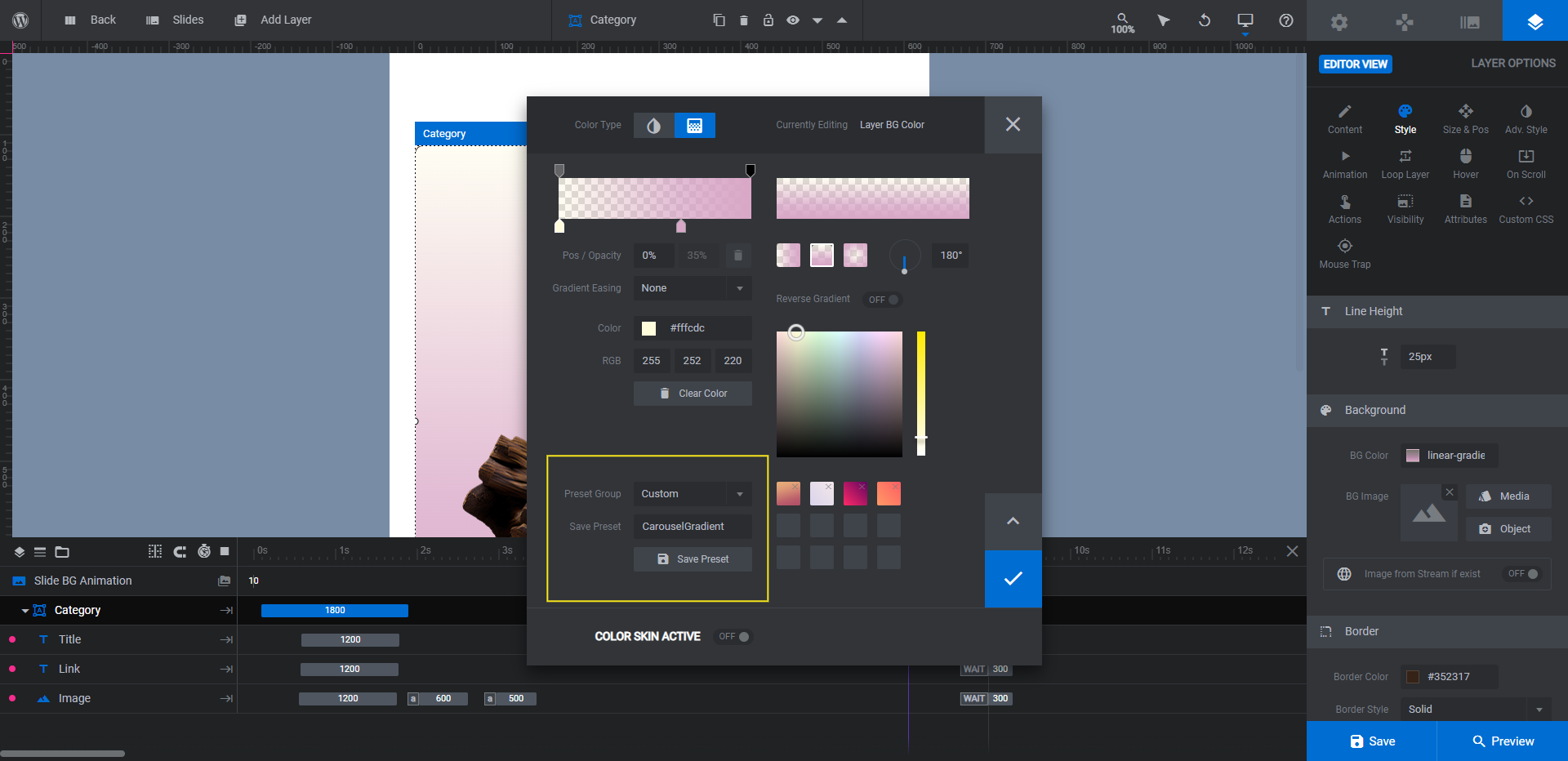
Before you wrap up with this slide, scroll down to the “Border” settings. Click on Border Color and update the color so it matches your new palette.
Save your changes. Then go to “Slides” in the top toolbar and apply the same gradient and border colors to the Category layer in each.
Learn more:
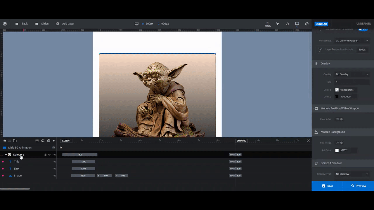
Step 3: Update the images
There are five slides in the carousel. Each card represents a different category of products.
Note: If you want to add or remove cards and categories, you can control this from the “Slides” menu in the top toolbar.
To create the category images for the carousel, do the following:
- Make them no bigger than 475px x 500px. You can play around with the dimensions and layout aside from that.
- Make sure each photo is a 3D cutout so that visitors can see edges and shadows around the product.
- Export the images with a transparent background.
To replace the existing category product images with your own, select the Image layer from the canvas or timeline. Then go to “Layer Options” and “Content” to upload your replacement to the media library.
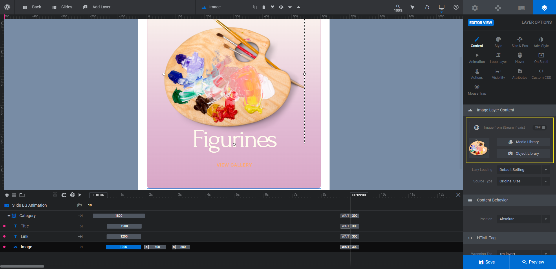
If you need to make changes to the size or position of your graphics, go to the “Size & Pos” settings to do so. Save your changes when you’re done and then repeat the process for the other slides.
Learn more:
Step 4: Edit the category and link text
There are two text layers that appear at the bottom of each slide. Title is the name of the product category. Link is the link that opens up the gallery.
Note: You don’t have to include the pop-up gallery in your carousel. Instead, you can link to the corresponding product category page in your shop. If you do that, you won’t need the Gallery modules in the next section. You’ll just need to edit the “Actions” in this step so that your category cards direct users to the right page.
There are three things we’re going to edit in each layer.
First, go to “Layer Options” and “Content” to edit what the text says.
Next, go to “Style” to update the font, text styling, and color.
Lastly, go to “Hover” to customize how the text looks when someone hovers over it.
If you go to the “Actions” tab, you’ll find that the template has already configured the correct actions to open the corresponding product gallery.
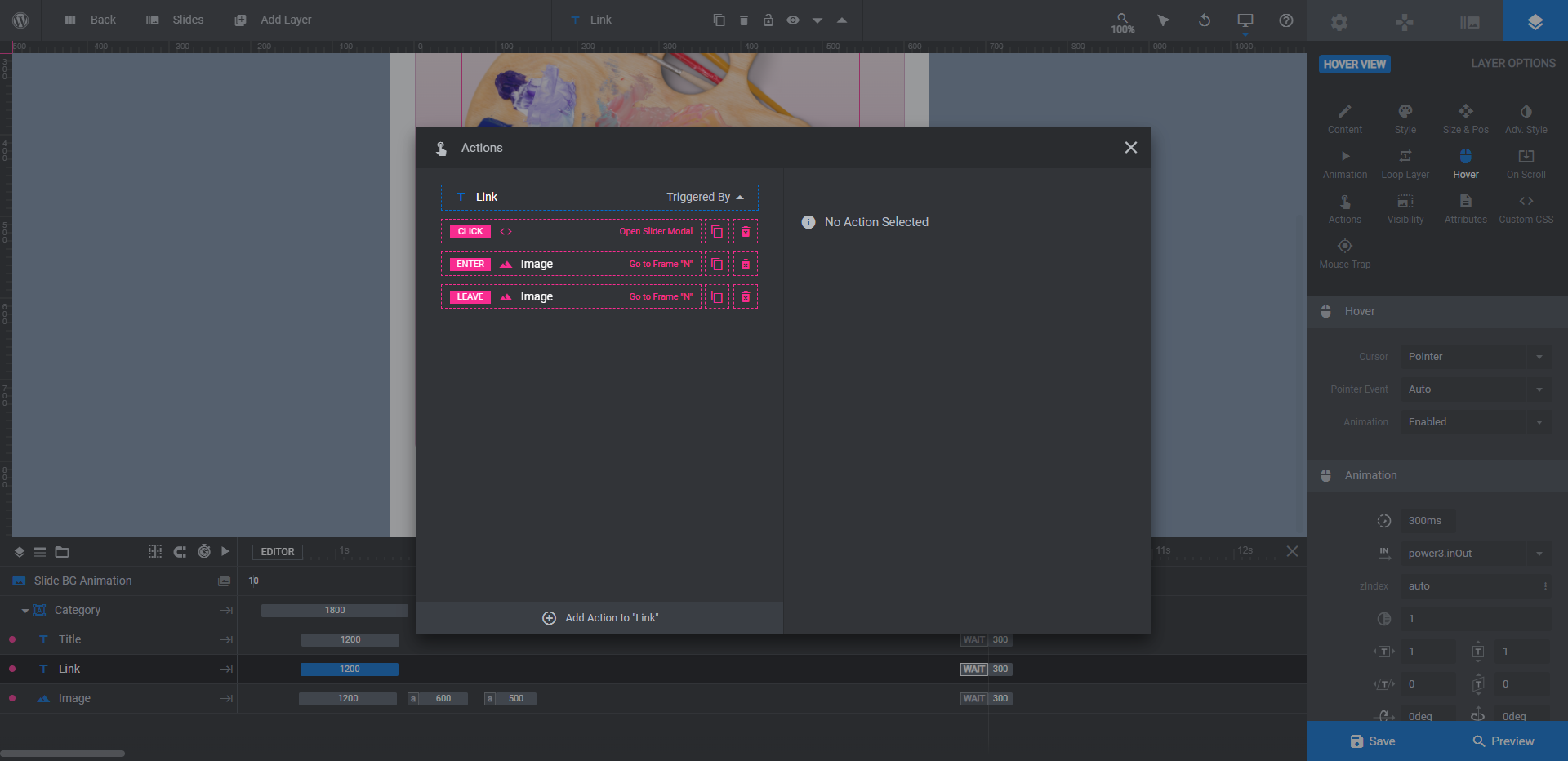
If you want to skip the gallery and direct visitors to your shop, delete these actions by clicking the trash can icons beside them. Then create a Simple Link.
When you’re done finalizing this slide, go through the others and make the same changes.
Learn more:
Step 5: Customize the navigation bullets
The last thing to edit in this Work module is the navigation bullets at the bottom of the carousel.
Click on “Navigation Options” and select the “Bullets” tab. From this panel, you can customize the bullet style, size, animation, and color.
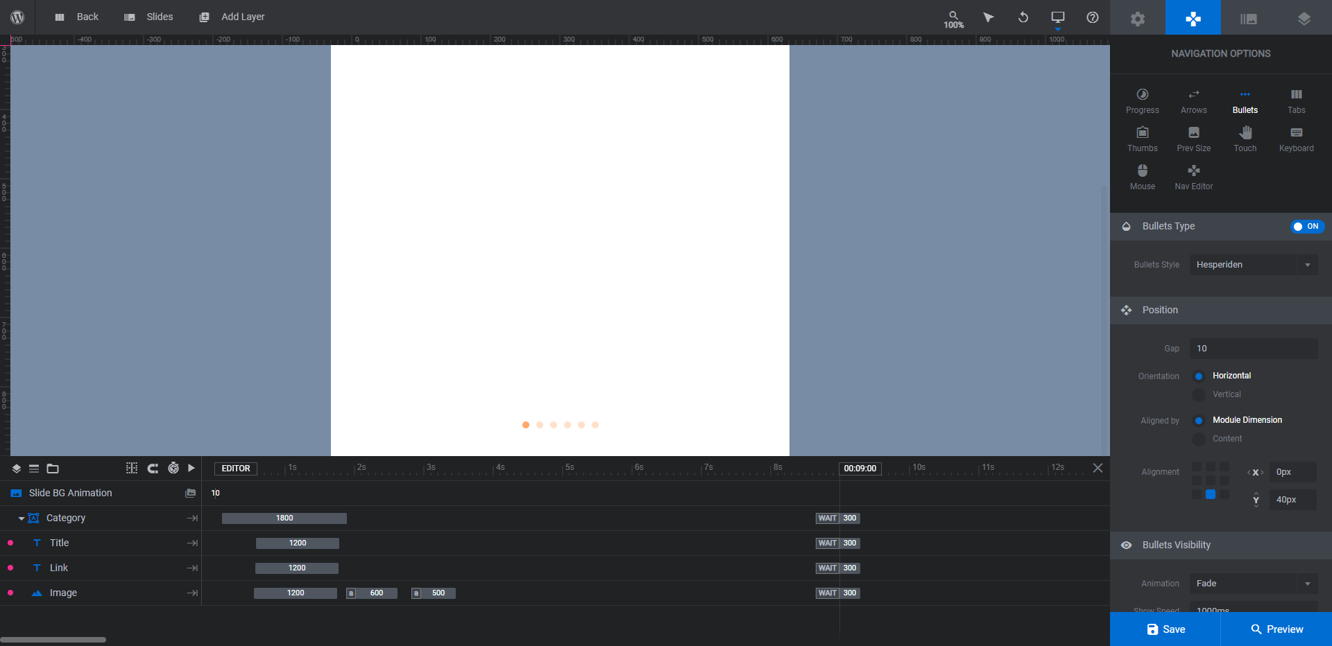
Make any adjustments that you need. Just keep in mind that the carousel can also be controlled by touch. So the bullets don’t need to be super prominent in order for users to take control of the sliding motion. They can always pull the carousel along with their mouse or finger or scroll to the next slide using their keyboard.
When you’re done, save your changes and preview your work. If you’re happy with how the 3D product carousel turned out, move to the next part.
Learn more:
How to customize the Gallery
The Gallery modules correspond to the slide numbers in your carousel (i.e. gallery11 goes with Slide 1, gallery21 goes with Slide 2, and so on). Make sure to update them in the same order as your slides.
Note: The following section will use one gallery as an example of how to customize this template. However, all the changes you make in the first gallery will need to be repeated in all of them before you’re done.
Step 1: Update the background color
Whatever color you used for the background of your carousel section will work just as well in your product gallery. This time, you’ll need to update it in two spots.
The first is under “Module Options” and “Layout”. Go to “Module Background” to edit the BG Color.
The second is under “Slide Options” and “Background”. Edit the BG Color here.
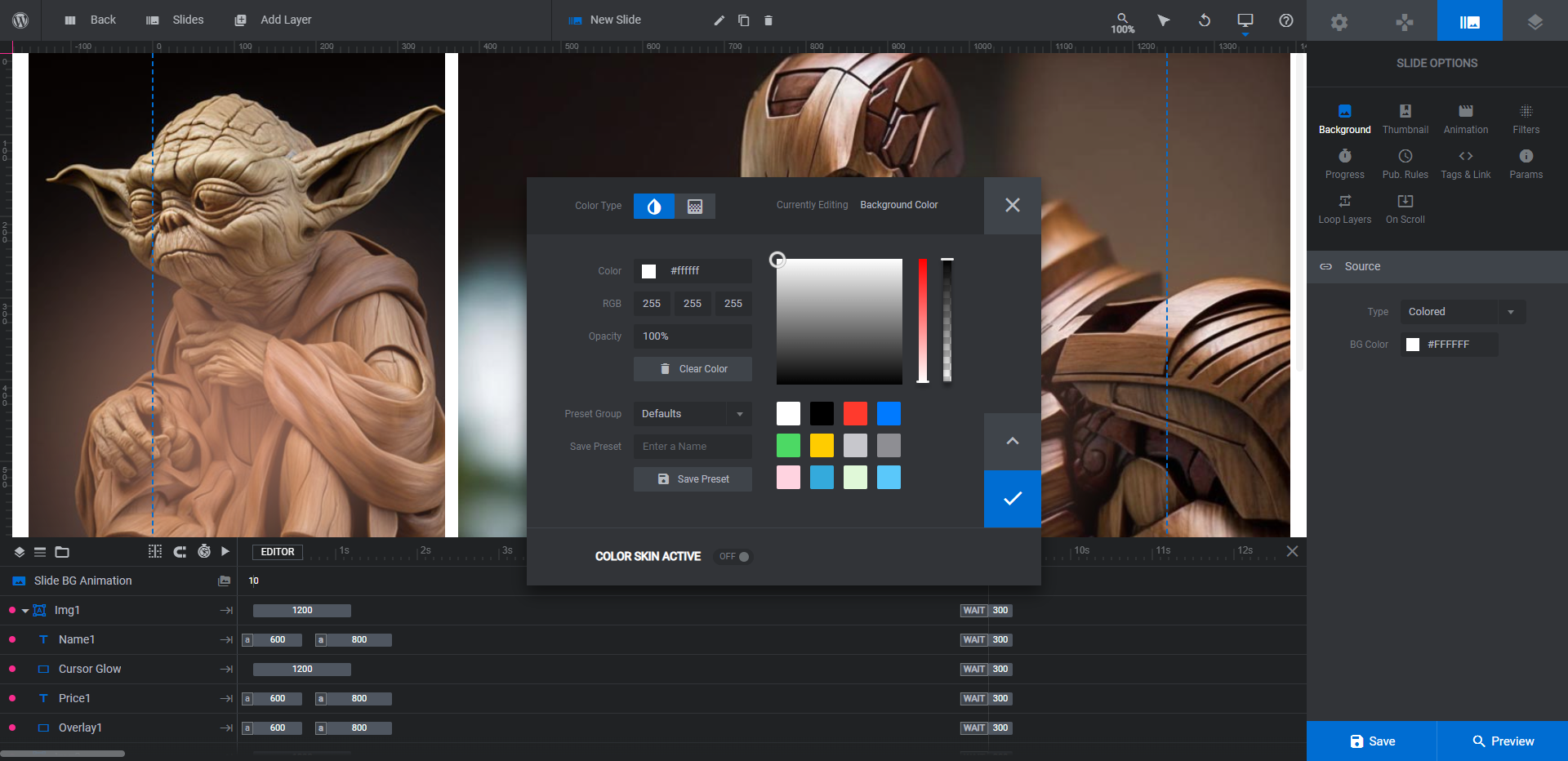
Go through each slide in the gallery to adjust the slide’s BG Color.
Step 2: Change out the product images
Preparing the images for your gallery will be a slightly different process than the previous one. For starters, you don’t need to use cutout images or transparent backgrounds. This gallery can show your products in their full context.
In terms of sizing your images, you should go through each slide and take note of the images that are there. Most of them are one of two sizes:
- 806px by 806px
- 1411px by 806px
If you can replace each image with one that’s similar in size and dimensions, that would be ideal. It’ll reduce the amount of editing you’ll have to do to the layout. It’ll also allow you to keep the spotlight effect (i.e. the Cursor Gradient layer) as it is.
Once you’ve chosen the product photos for your gallery, edit the Img# layers in each slide one by one. Go to “Layer Options” and “Style” to upload your new photos to the media library.
Note: We added white borders around our product images to give our gallery a funky, haphazard digital art gallery look. Feel free to play around with your imagery to find a style that works best for you.
Step 3: Edit the descriptive text
There are two text layers on top of each product image. Name is the name of the product. In this case, it’s the name of the painting included in the paint-by-numbers kit. Price1 is the call-to-action button.
Edit these same layers the way you did the text layers in the Work module.
The one difference is that you will need to update the link for the Price1 layer. To do this, select the layer and go to “Actions”.
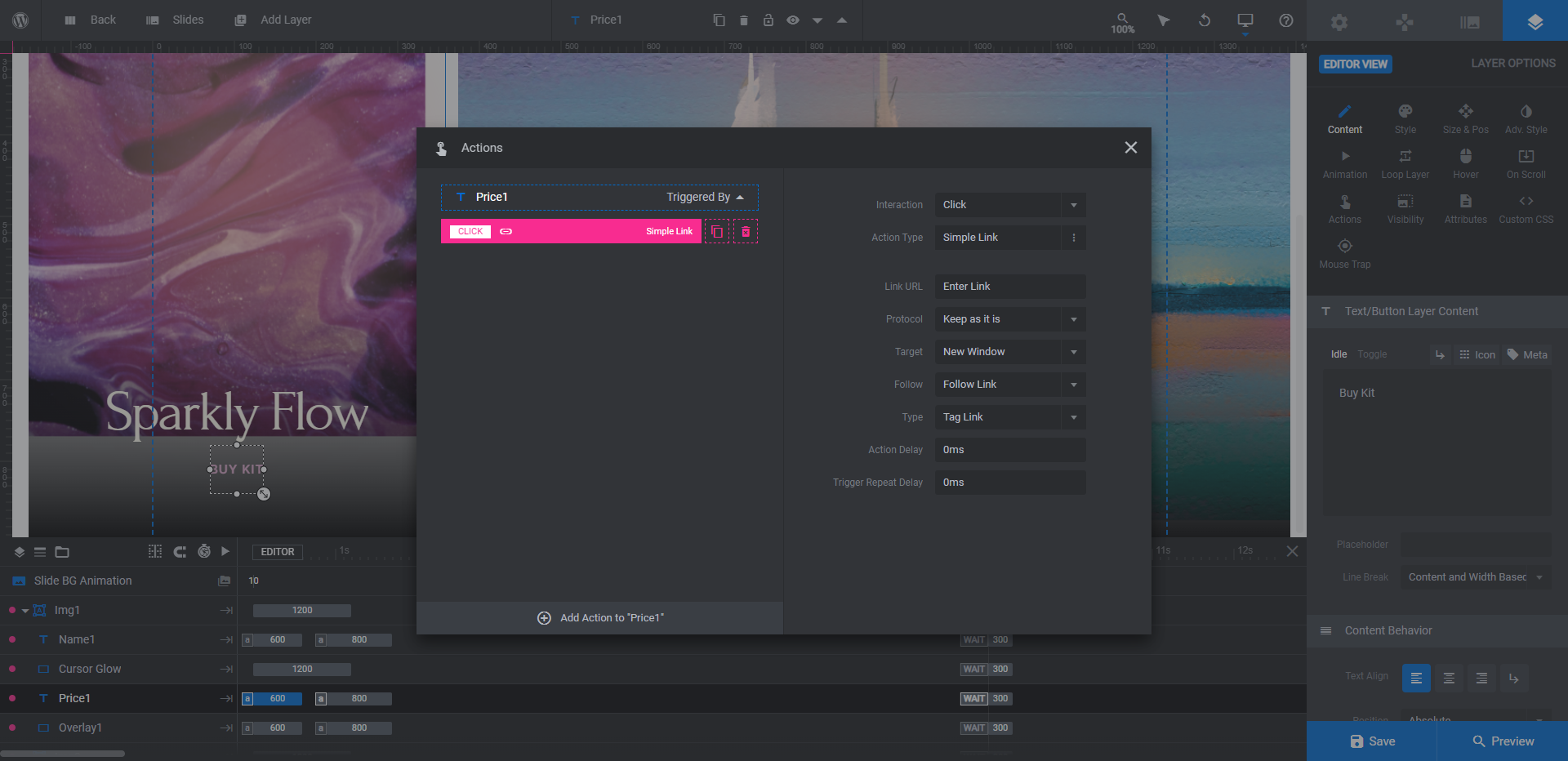
There is already a Simple Link generated. Click on it and update the Link URL (and other settings as needed) on the right. Since these are products, the links should go to their individual pages in the shop.
Step 4: Customize the spotlight effect
If you interact with the gallery in the Woodworking Website Template, you’ll notice a gentle spotlight that shines over the surface of the product images.
To customize the appearance or color of the spotlight, select the Cursor Gradient for each product image. You can update the color of the gradient under either the “Content” or “Style” tabs.
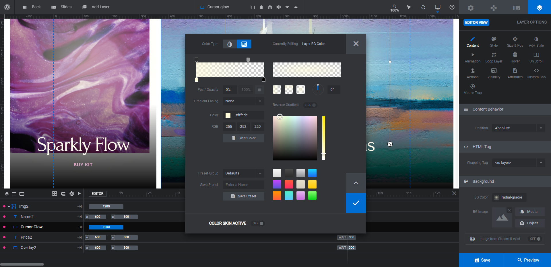
Similar to the color edits you made before, it’s going to be much easier if you update the individual colors in the premade gradient rather than to use a preset. This way, the transparent settings and radial shape will be preserved.
Repeat this for all the slides and save your changes.
Step 5: Preview the Work module to confirm it all looks good
The last thing to do is preview that your carousel and gallery work as intended. Exit out of the Gallery modules and return to the Work module.
Click the Preview button to give the whole thing a look.
Check to make sure that each category card links up with the right gallery, that the gallery images look good, and that the shop links are correct.
When you’re satisfied with what you’ve done, grab the Work module’s shortcode and embed it on the page you want it to go on. Conversely, use the Slider Revolution widget in your page builder plugin to insert it.
Infuse your ecommerce site with style with a beautiful 3D product carousel and gallery
While the luxury woodworking products from the template look amazing in this 3D product carousel and gallery, you don’t have to make or sell luxury goods to utilize this design. All it takes is a couple hours to do a complete transformation of the content and styles in the Woodworking Website Template and to make it totally your own.


