
It’s unfortunate when visitors end up on a page that no longer or never existed on your website. But it’s not always something that can be avoided.
When it happens, how do you want visitors to feel when they encounter the dead end? Disappointed and frustrated? Or curious enough to give your site another try because of how entertaining and creative your 404 error page is?
In this tutorial, you’ll learn how to create a fun, custom, and helpful 404 page that keeps visitors on your site. We’ll use the 404 Error Page Template as our starting point, so you don’t have to recreate the wheel.
Table of Contents:
- Step 1: Plan out your content
- Step 2: Update the rotating Earth graphic
- Step 3: Update the deep space background
- Step 4: Update the floating astronaut image
- Step 5: Update the revolving moon graphic
- Step 6: Edit the text layers
- Step 7: Edit the button
- Step 8: Add the 404 error page to your site
How to create a 404 error page that keeps visitors on your site
Errors are always discouraging, no matter what context we encounter them in. They can be particularly frustrating when we’ve had our hearts set on finding something specific on a website, only to discover that it’s gone or not where it should be.
Since broken or nonexistent links can’t be avoided, we should at least make the most of this opportunity and give visitors something to remember — as well as motivation to give the website another try.
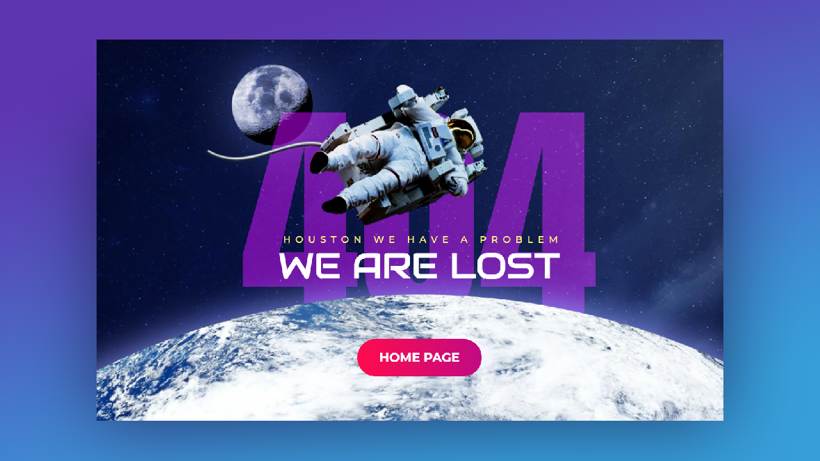
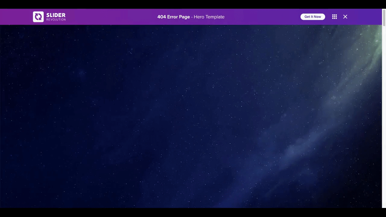
In this tutorial, we’re going to show you how to take the 404 Error Page template:
And turn it into this custom 404 error page:
If this is your first time using Slider Revolution or need a refresher, review these quick-start guides:
Then, get started on this tutorial:
Step 1: Plan out your content
The theme of this 404 page template is one that could realistically be used on a lot of sites. While you’ll have to fix the text layers so they align with your branding, everything else could stay as is and you’d have a fun error page to show visitors who hit a dead end.
Pro tip: If that’s the route you want to take, follow this tutorial instead. It’ll show you how to modify text layers in Slider Revolution.
That said, if you really want to create a memorable 404 page that puts visitors on the right path again, come up with a custom theme for it. That doesn’t mean starting from scratch. All you have to do is figure out which of the layers in this template can be repurposed for your needs.
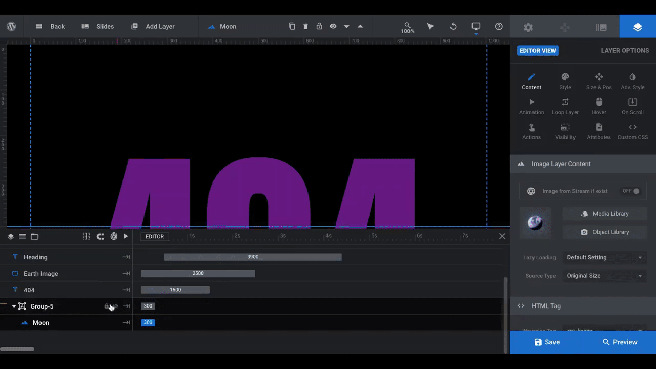
For example, here are all the moving pieces in this Slider Revolution template:
- Deep space background image
- Floating astronaut image
- Rotating Earth image at the bottom
- Revolving moon image across the top
- “404” notice behind the layers
- Heading and subheading text layers in front
- Call-to-action button
The zero gravity effect is a neat one, but you might not need or want all of these layers. So, before you start modifying the template, come up with a game plan for your own page. Look for elements that can easily replace the existing ones. Or figure out how to preserve some of the existing elements and then put your own unique spin on them.
As you read through the rest of the tutorial, you’ll see how we’ve chosen to do this for a restaurant website.
Step 2: Update the rotating Earth graphic
In order to replace the Earth image while preserving its looped animation, find a circular cutout image that’s the same size — 2560 x 2560 pixels. It’s also a good idea to find one that has a transparent background so you won’t have to do any manual border trimming inside of Slider Revolution.
To make the switch, click on the Earth layer, open “Layer Options”, and go to “Content”. There you can upload the new graphic:
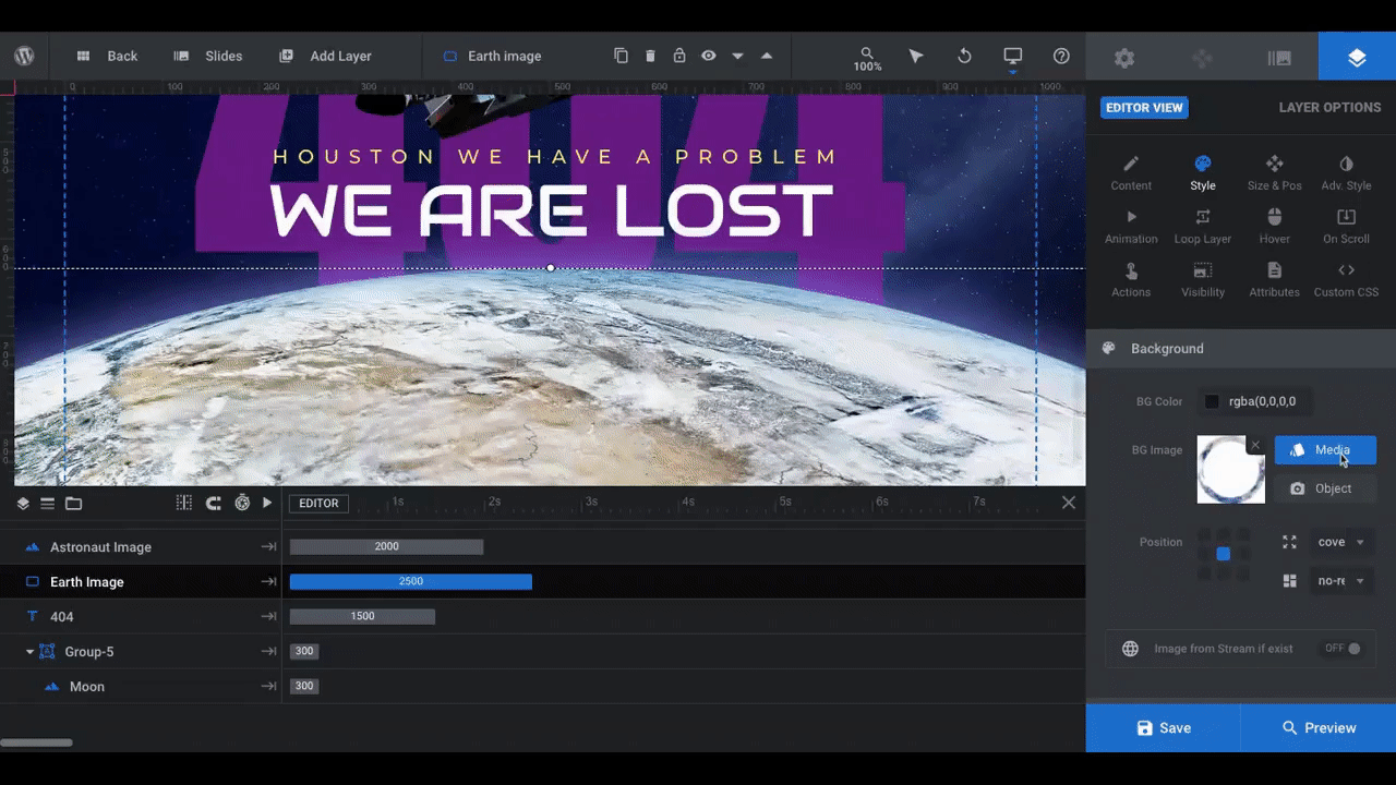
As you can see, our pizza graphic needs a slight bit of adjustment since we wanted more of the pizza to be showing. So what we did was update its “Size & Pos”.
We changed the y-axis position from -2730px to -2650px, pushing it a bit farther up on the page. This means we’ll have to push the text layers up a bit as well, but that’s okay. We’ll address that in a later step.
If there’s anything else you want to change about the look of your rotating image, you can do so under “Style”, “Size & Pos”, and “Adv Style”. To adjust the rotation of the graphic, use “Loop Layer” settings:
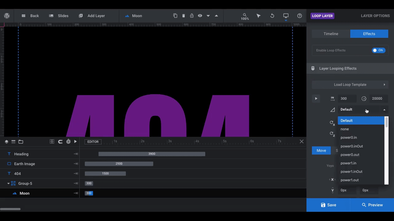
If you’d like your graphic to do something other than spin in a circle, you’ll find the “Layer Looping Effects” here. You can edit:
- When the loop begins
- How long the animation lasts before starting over
- The smoothness (ease) of the animation
- Where the pivot point of the graphic is on the x, y, and z axes
Because we want our pizza to behave just like the Earth, we’re going to leave everything as is.
Note: If you choose to use a different type of graphic (like one that’s not rounded or rotating) at the bottom of the page, feel free to do so. There’s nothing stopping you from modifying the composition of this template. It’s just easier if you find ways to preserve the existing traits so you have less work to do.
Learn more:
Step 3: Update the deep space background
To update your background slide, go to “Slide Options” and “Background”. From here you can replace the existing deep space graphic with an image, video, color, gradient, or transparent background:
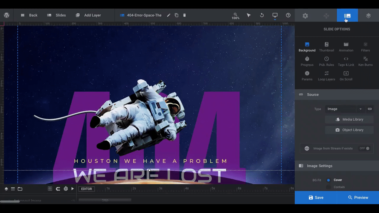
We’re going to keep it simple and use a black background to go with the dark theme on the rest of our site.
Pro tip: Depending on what your main theme ends up being, you might want to use an atmospheric or environmental background. For instance, we could use a restaurant or kitchen photo as our background. However, that might end up being too much visual stimuli for visitors with all the moving objects. So keep that in mind when choosing what goes in the background.
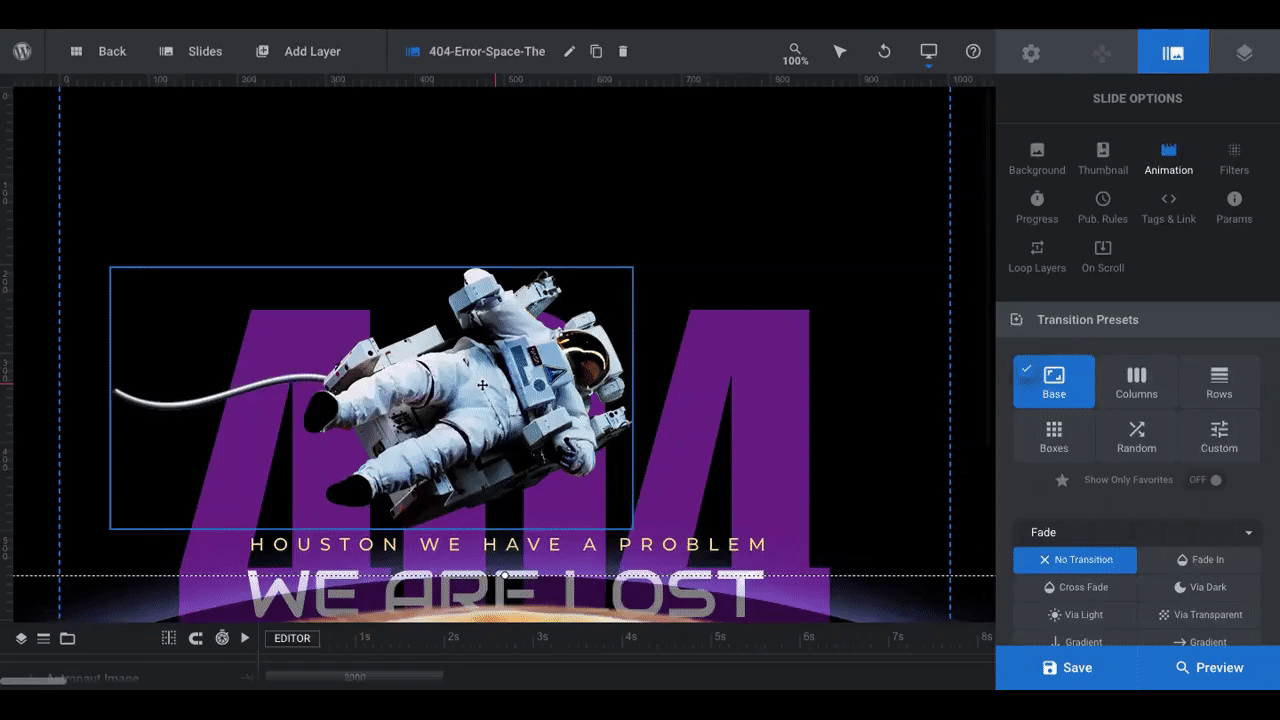
There are other settings available under “Slide Options”, like animation, filters, and loop layers. If there’s something more you want to do to the background image, do it here.
Learn more:
Step 4: Update the floating astronaut image
There isn’t really anything we want to replace the astronaut with, so we’re going to remove it altogether. To remove this or any other element from the template, click on it in the visual editor above or the timeline below and hit the “delete” button on your keyboard:
To replace the astronaut with an image of your own, repeat Step 2.
Pro tip: If you decide to keep a bobbing graphic in the center, make sure it’s no bigger than the astronaut (586 x 293 pixels). Unless you’re going to reposition it, that’s the perfect size for an image to capture attention without it covering up too much of the text behind it.
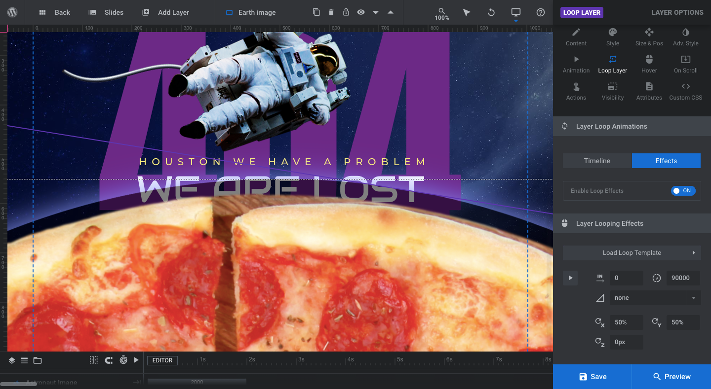
Step 5: Update the revolving moon graphic
You won’t be able to see this image in the visual editor, so locate it in the timeline and select it to open “Layer Options”. You can then replace the image under “Content”:
Pro tip: To get the best results, use an image with a transparent background that’s similar in size to the moon graphic, which is 377 x 378 pixels.
To edit the way the image looks or to change the style of the loop effect, repeat what we did in Step 2. For our 404 page, we’re going to modify the “Layer Loop Animations” since we don’t want our pizza slice to move in a smooth arc.
Under “Layer Looping Effects”, we experimented with a number of easing styles and ended up choosing the “slow” setting:
In addition, we activated the “Scale” feature for the layer loop:
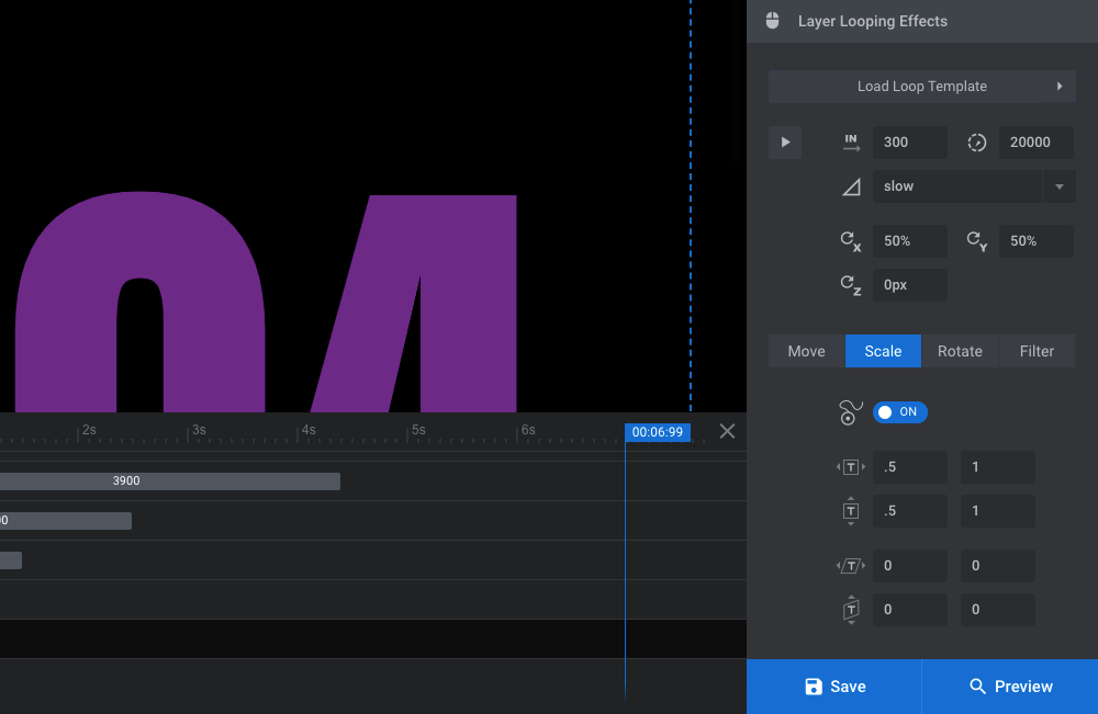
By setting the intro x and y values at .5 and the exit values at 1, our pizza slice will grow larger and smaller as it makes its way across the screen.
As you can see here, though, scaling isn’t the only special effect you can apply to your loop. You can also make the layer “Move” (like the yoyo-ing astronaut), “Rotate”, or you can add a “Filter” to it.
Learn more:
Step 6: Edit the text layers
There are three text layers to edit in this step. The first is the “404” layer.
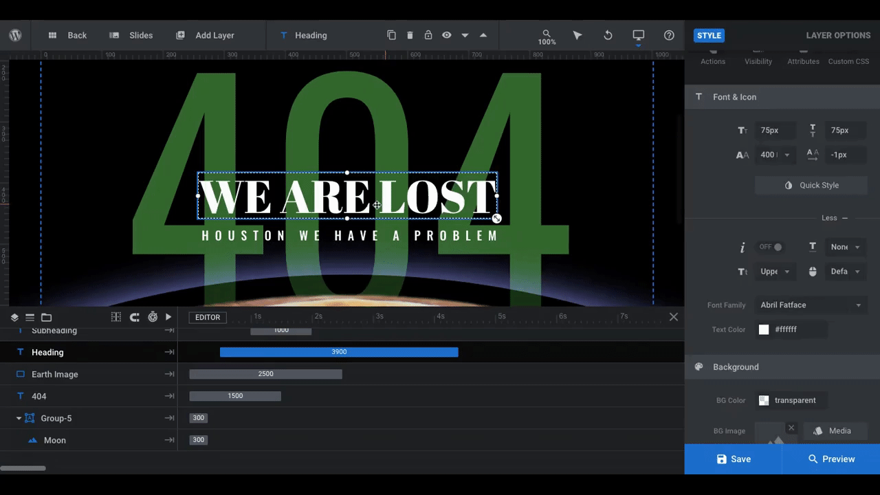
Since you want visitors to immediately realize they’ve landed on a nonexistent page, the “404” message should stay there. However, we need to give it a style that’s closer to our brand and not so futuristic looking. We also need to adjust the position since the bottom layer is higher than in the template.
To adjust the position of the “404” and other text layers we’re editing, go to “Size and Pos”. Then update the “Y” value:
Pro tip: Don’t forget to check your slide in responsive view to make sure your positioning edits don’t negatively impact how the text looks in the mobile and tablet experiences:
Next, to change up the look of your text layers, go to “Style” and edit the font, color, size, shadow, and other style settings:
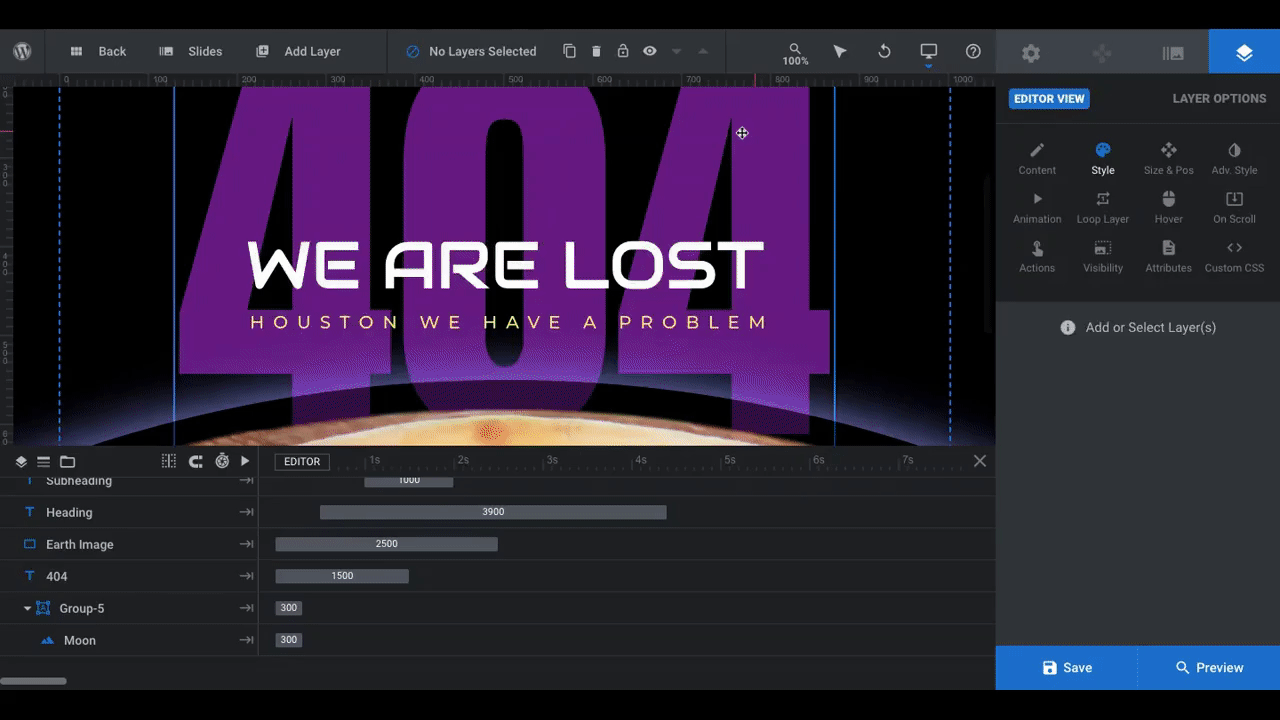
The last thing to attend to is the content in these text layers. “404” we’ll leave as is. The other two need to be updated to fit better within the context of our theme and brand.
To edit what the layers say, select each and then go to “Content”. Replace the existing text in the editor:
After doing this, if you feel like you need to resize your text layers in order to make them look good, go back to “Size & Pos”. Just make sure that the smallest font size is no smaller than 16 pixels as you want all of the text to be big enough to read.
Don’t forget to check the mobile and tablet views again to make sure the new fonts and sizing work. You may need to make some more tweaks.
Learn more:
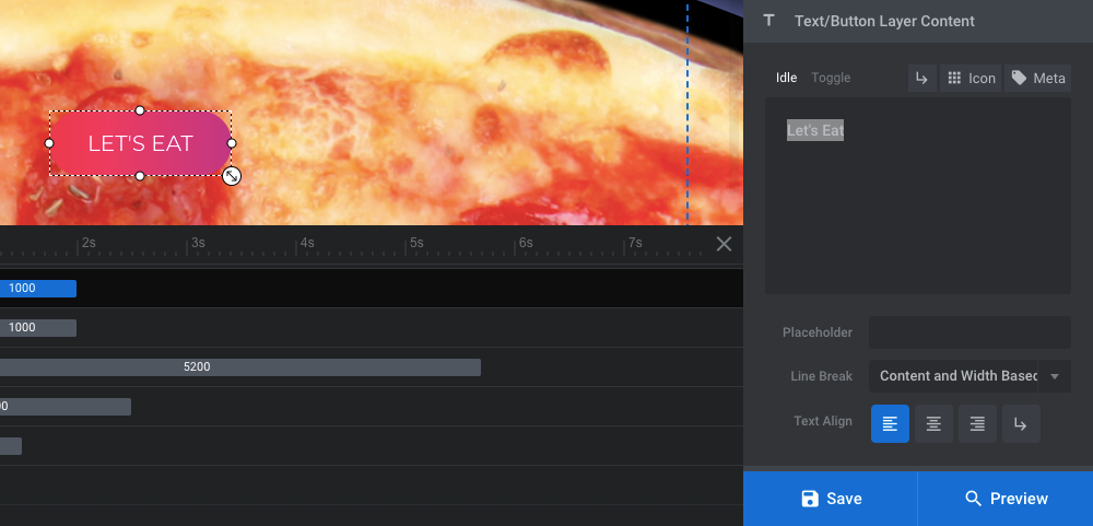
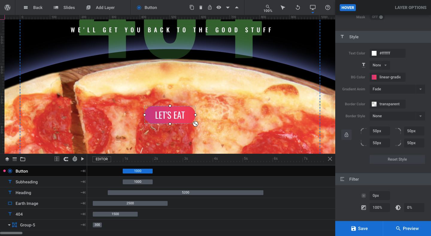
Step 7: Edit the button
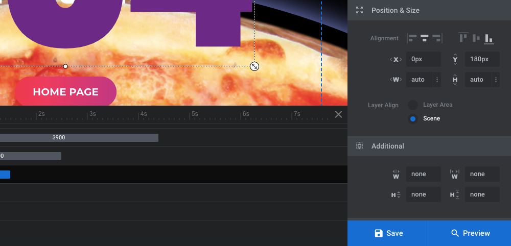
The last piece to customize in our template is the button, which appears over the bottom graphic. You’ll edit this element the same way you did your text layers.
Under “Content”, change what the call-to-action reads on the button:
Under “Style”, change the look of the button, including the font, text size, text color, button color, and border style:
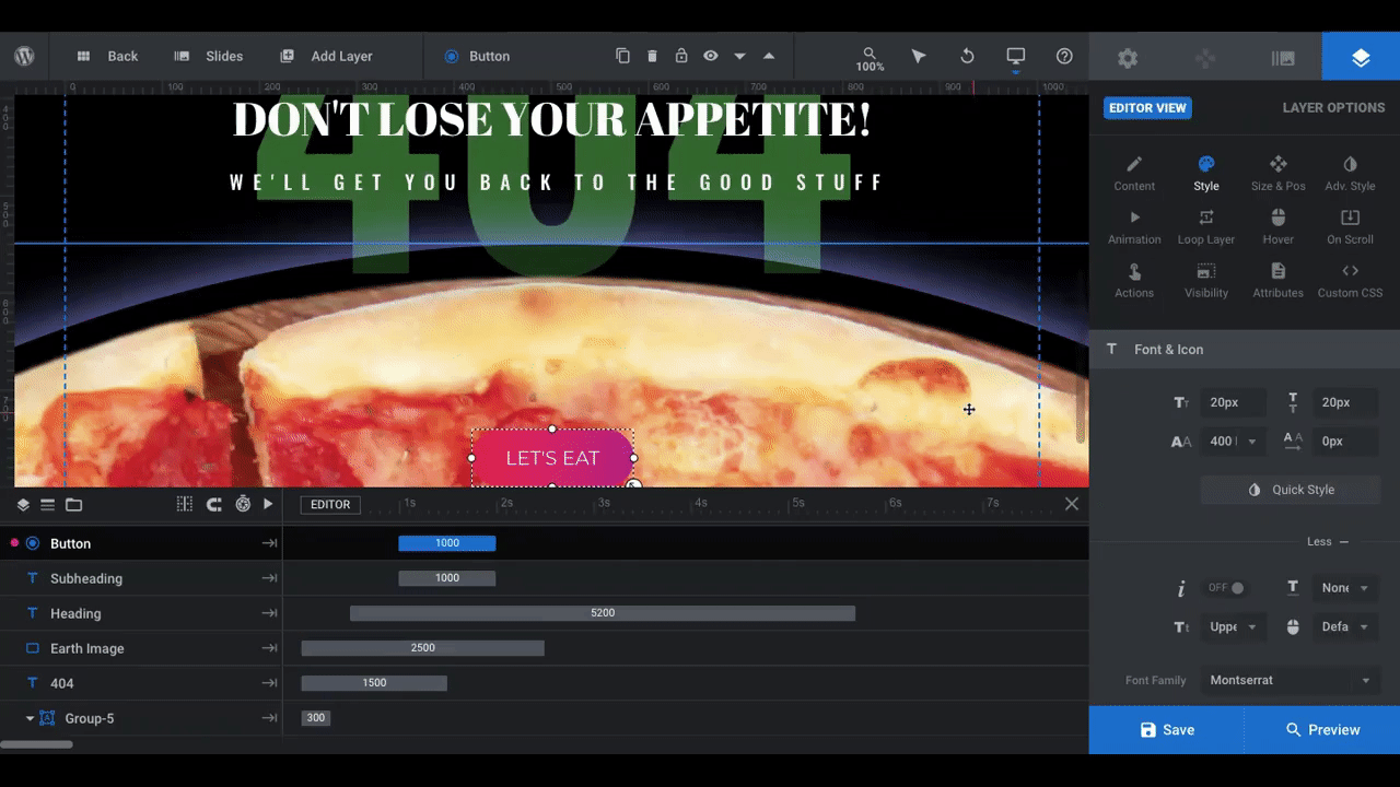
The gradient looked nice in the template, but we wanted something that would contrast well with the brighter pizza and text. So we applied a black gradient to it.
Note: The button currently has a hover effect in place, so that needs to be updated, too. To edit this setting, go to “Hover” and “Style”:
If there’s anything else you want to do — like add a shadow or edit the animation — you can do so from within “Layer Options”. However, there’s already a lot going on in this design, so it’s probably best to keep additional styling to a minimum.
Learn more:
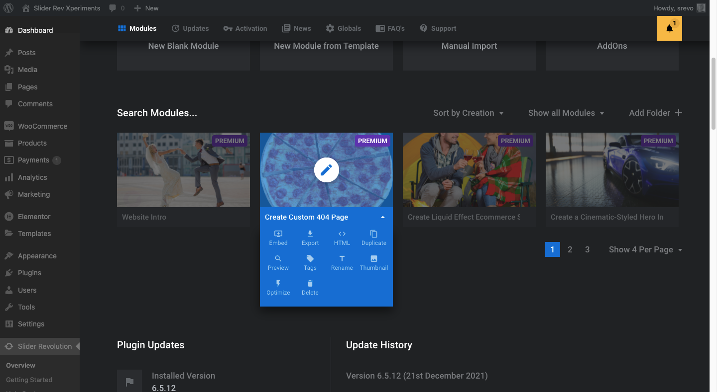
Step 8: Add the 404 error page to your site
There are a few basic steps you’ll need to take in order to add this newly designed 404 design to your site.
First, go to the Slider Revolution dashboard and open the dropdown for the 404 module you just created:
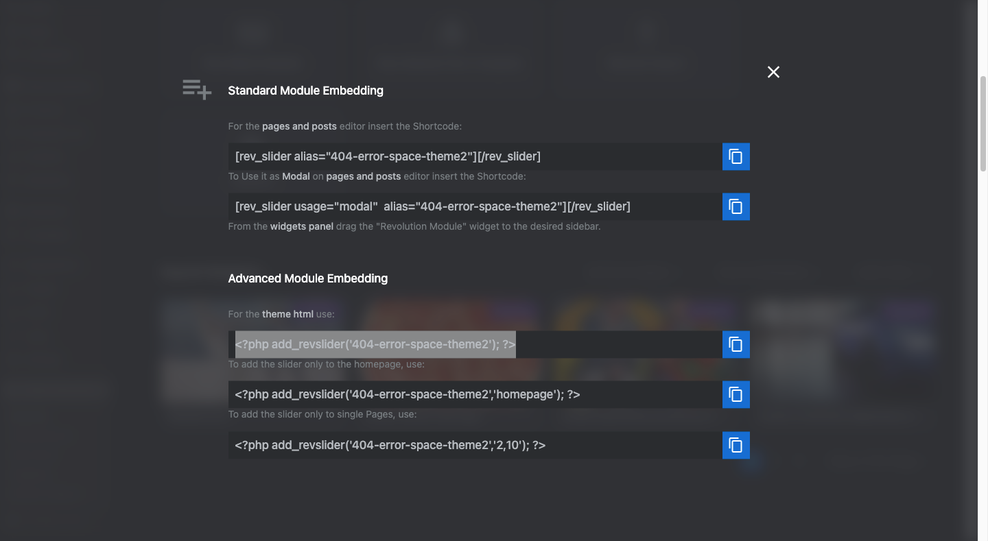
Click “Embed” and copy the PHP code for the “theme html”:
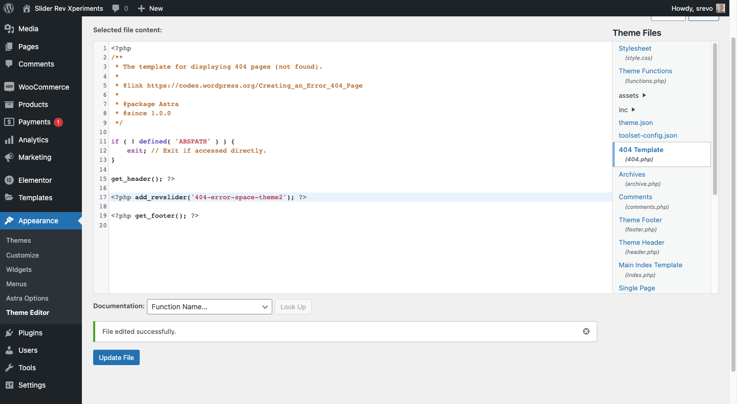
Your theme may or may not automatically generate a 404 page template. To find out if you have one, open your theme files and look for one called 404.php:
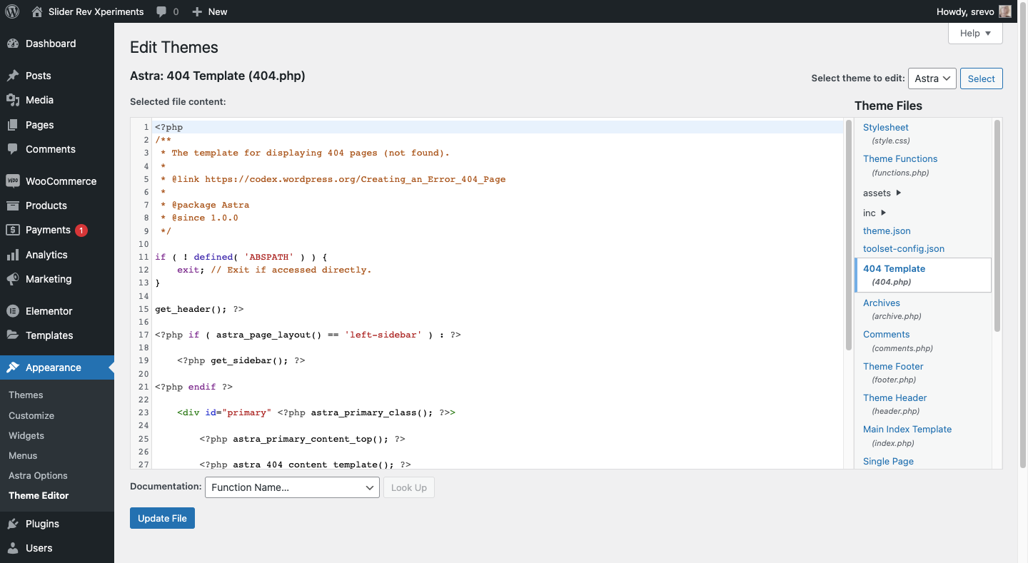
Pro tip: While we’re showing you the 404.php file located in the WordPress “Theme Editor” tool, it’s better to edit the file from your FTP server (which you can access via the web host). This way, when the theme updates in WordPress, it won’t override your edits.
Remove the default content rows. Depending on the theme, there may be H1s and body text in there or it may call on a template from the theme as Astra’s does in the example above.
Regardless, remove the text between the header and footer lines (the if and endif statements) and replace it with the embed code you copied from Slider Revolution. Update the file to save your changes:
To test out your new 404 page, go to your website and then add a nonexistent page name to the end of it. For instance: https://mywebsite.com/jfjielms/. This will trigger the site to open the 404 error page and you should now see your Slider Revolution design there.
Learn more:
What kind of error page will your visitors encounter?
Sometimes a 404 page visit can’t be avoided. When it does happen, how do you want your visitors to respond?
A basic error page provided by WordPress might leave them feeling annoyed and frustrated, and it might be enough for them to leave your site. However, a custom error page with an on-brand message, fun imagery, and maybe even a humorous message could potentially keep more visitors on your site.
With Slider Revolution’s 404 Error Page template, you can get one up and running in no time at all.


