

Typically, when you give visitors two choices in the CTA section or hero section, you design the primary action as a solid button and the secondary action as a ghost button. This subconsciously signals to visitors which option is the most important or best one to take out of the two.
But what if you want to offer up two equally attractive choices?
In this tutorial, we’ll show you one way to design the CTA section that won’t involve the traditional primary/secondary button design. Instead, we’ll use the Startup Website Template to create a fun and interactive experience.
Table of Contents:
- Step 1: Install the module
- Step 2: Delete extra layers
- Step 3: Update the text
- Step 4: Add your mascot
- Step 5: Replace the floating options
- Step 6: Add links to your CTA buttons
- Step 7: Customize the mascot background
- Step 8: Edit the section background
How to design the CTA section with two equal options
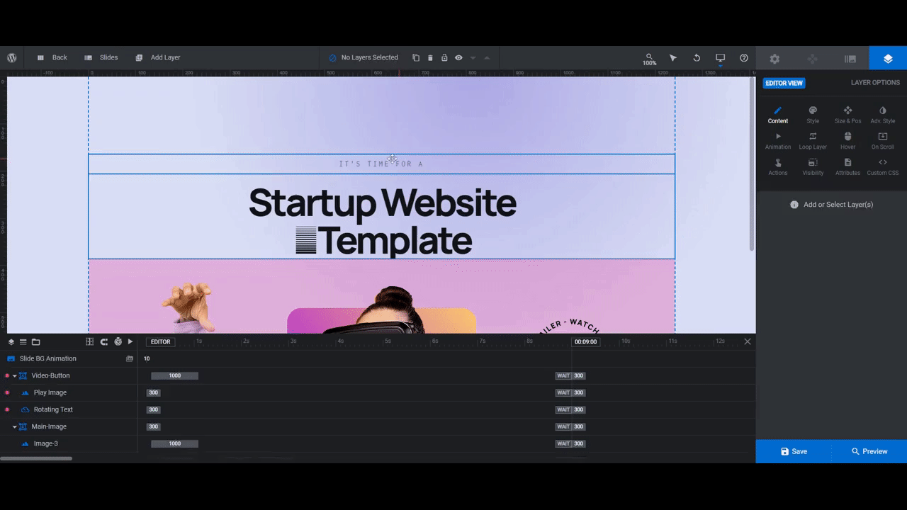
The hero image in the Startup Website Template doesn’t have a single button or arrow directing visitors to the next section on the page. This section gives visitors two options to consider straight away:
If you’d like to create a similar effect as you design your CTA section or hero image, it can easily be done using this template. In the tutorial below, we’ll show you how to strip out the techiness of this design and repurpose it for an ecommerce pet supplies store:
Want a little Slider Revolution refresher before you begin? Check these out:
Step 1: Install the module
Go to “New Module from Template” and do a search for “startup”. You don’t need the entire website template in order to create this CTA section.
Select the purple module called Startup Hero. Then click Install template and Addons:
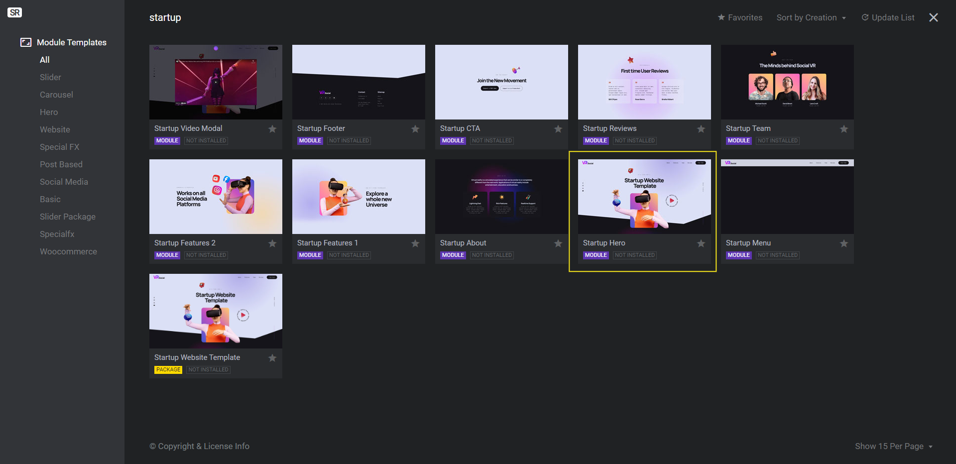
Note: Even though this is the hero section in this template, you can use it for a CTA section on any page of your website.
Step 2: Delete extra layers
We want to keep our website visitors focused on our two call-to-action buttons. The more you can limit how much they have to focus on and the number of choices to choose from, the better.
As such, we need to get rid of the other clickable options in the design. This will include:
- Scroll Line (layer)
- Scroll (group)
- Social-Media (group)
While we’re at it, we’re also going to delete Heart-Image as it’ll only distract visitors from the clickable options below.
To delete all these layers at once, hold down the Ctrl or command key. Then select them in the timeline editor at the bottom.
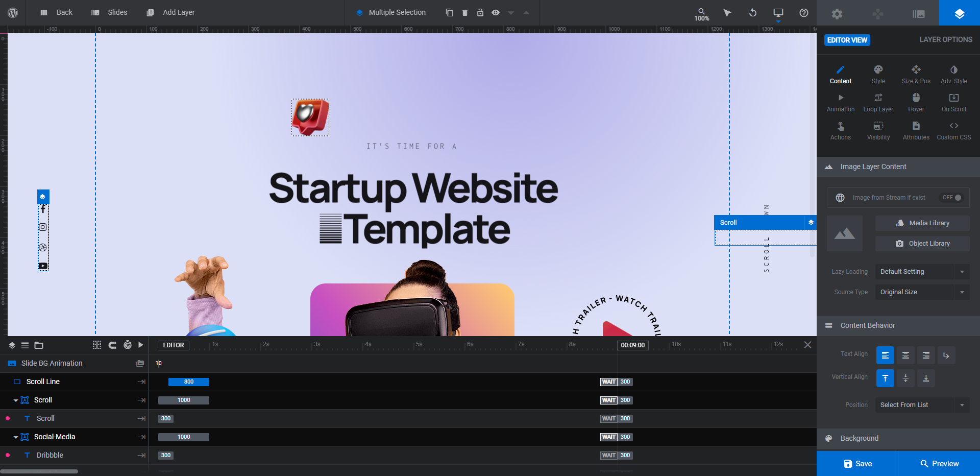
Hit Backspace or delete to remove the layers from the module.
Learn more:
Step 3: Update the text
There are two text layers to edit. Caption is the smaller text at the top that reads “It’s Time For A”. Headline is the bigger text in the middle that reads “Startup Template Website”.
To update what each text layer says, go to “Layer Options” and “Content”. To change the font and text styling, go to the “Style” settings panel.
Note: The Headline text won’t wrap until it reaches the edge of the page. To force the text to wrap, either enter <br /> at the breaking point or click the return icon above the text editor block.
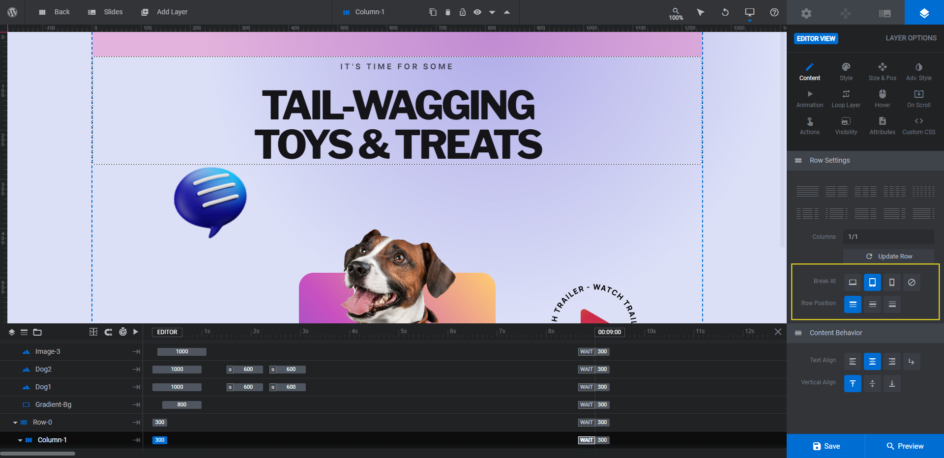
Depending on the size of your new mascot and floating options, you may want to add some breathing room between the headline and imagery. The most effective way to do this is to select the Row-0 or Column-1 container. Under “Content”, set the row position to top-align:
You can then increase the top margin space under “Style” if needed. Just keep in mind that major changes to the template require a responsive check and perhaps some editing.
Open the responsive variant switcher in the top toolbar:
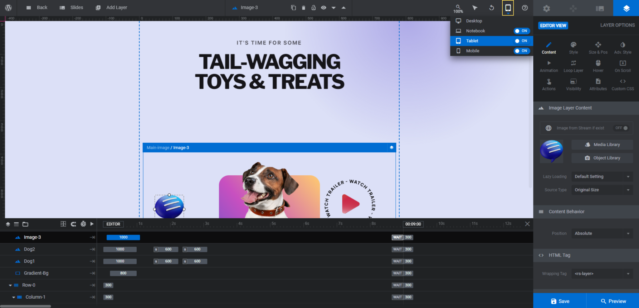
Go through each variant to confirm that your text styling and repositioning hasn’t negatively impacted the design on smaller screens. If it has, make your modifications from those views. Then return to Desktop when you’re done.
Learn more:
Step 4: Add your mascot
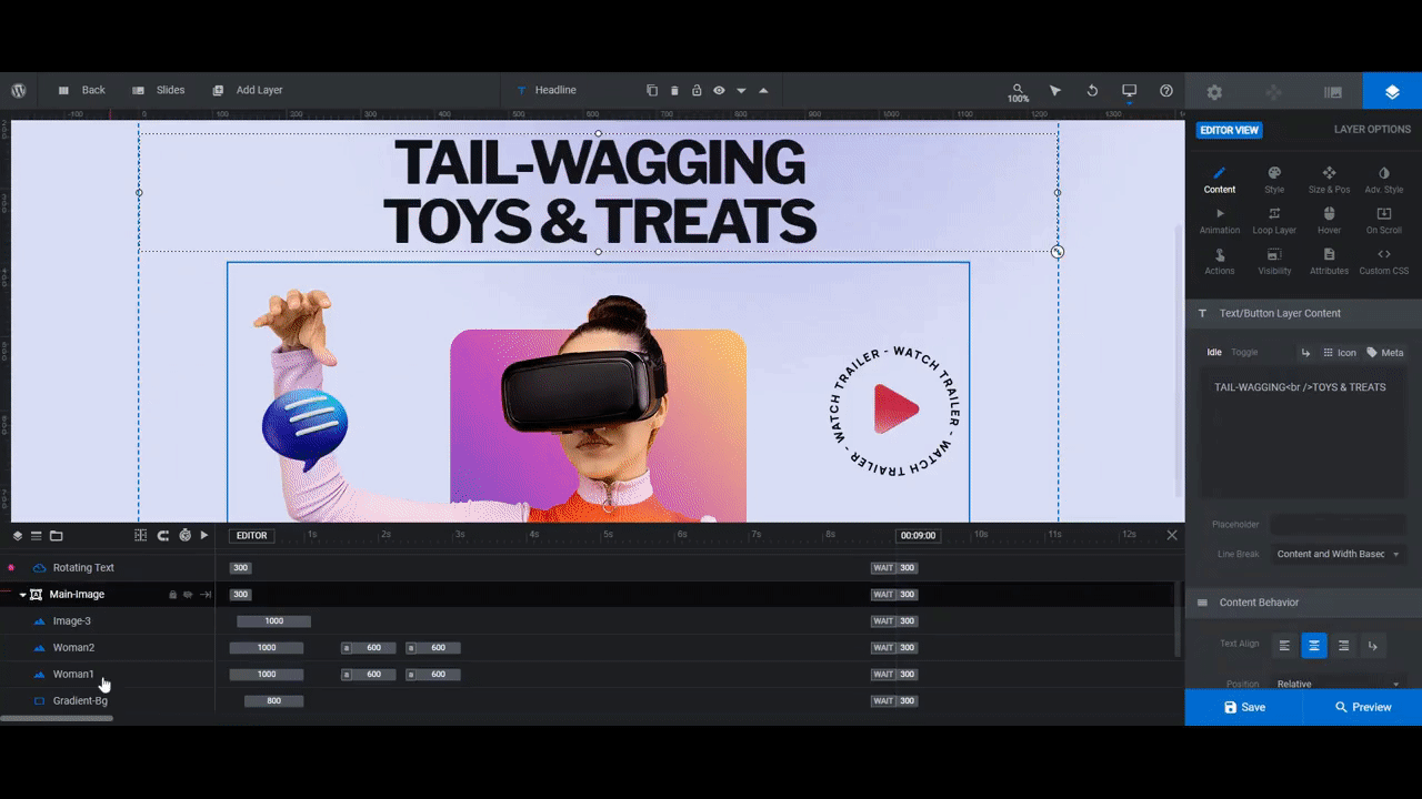
Go to the timeline editor and you’ll find that there are two Woman image layers.
Woman 1 is the image that visitors see when they first encounter this section. She has her hand hovered over the floating blue icon. Woman 2 (which you won’t be able to see in the canvas) is the image that visitors see when they hover their mouse over the play icon and rotating stamp.
Keep these tips in mind when replacing these images with your own mascot/subject:
- Use images that appear three-dimensional. Flat photos or illustrations will take away some of the allure of this design.
- Find images that are about the same size as the template’s. For instance, the images we’re about to import are both 850px by 600px.
- Export the images with a transparent background.
To replace the current images, select them in the timeline. Then go to “Layer Options” and “Content” to upload your own:
You won’t be able to see the Woman 2 layer in the canvas, so it’s a good idea to open the Preview to make sure your second image looks good.
Learn more:
Step 5: Replace the floating options
Your new mascot needs two new options to focus on.
The first one is Image-3, the blue chat bubble icon on the left.
The second one has a couple components to it. Video-Button is what the group of layers is called in the timeline. Play Image is the video play icon and Rotating Text is the rotating stamp around it.
Let’s edit these one at a time.
When picking or creating the image to replace the left option (Image-3), try to find a 3D photo or icon. You may have to play around with the size of the image based on the theme of your design. However, 150px by 150px works for us.
When you’ve found your replacement, export it with a transparent background. Then go to “Layer Options” and “Content” to make the update:
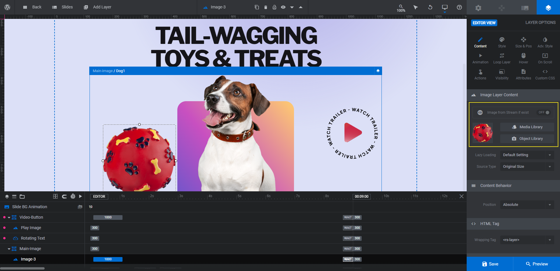
You can see that the image of our dog toy is too big and too far below the dog’s eye line. To fix this, use the “Size & Pos” settings to resize and reposition the layer.
When you’re done, move over to the Play Image layer. Prepare this new image the same way you did Image-3. Then upload it.
This time, if the image is too far down on the screen, don’t reposition it. You can resize it from “Size & Pos”, but hold on moving it to a different location for now.
The last layer to replace is the Rotating Text around the play button (or whatever your new image is). Unlike the other two, this is an Icon/SVG layer so it needs to be edited differently.
Double-click on the Rotating Text layer. The SVG library screen will open. Click “My SVG Library”. Then click the blue “Import SVG Files” button that appears at the bottom of the panel.
Upload a transparent SVG file to the library and add it in place of the old rotating stamp:
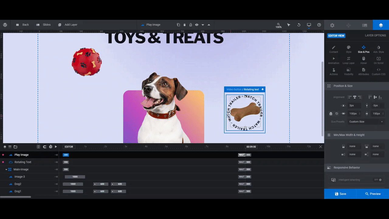
If your new SVG is too small, go to “Size & Pos” to edit the dimensions. We set ours to 200px by 200px so that it neatly wraps around the bone image.
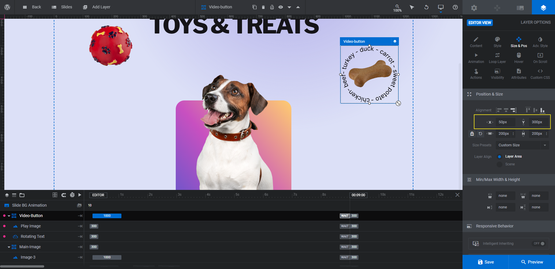
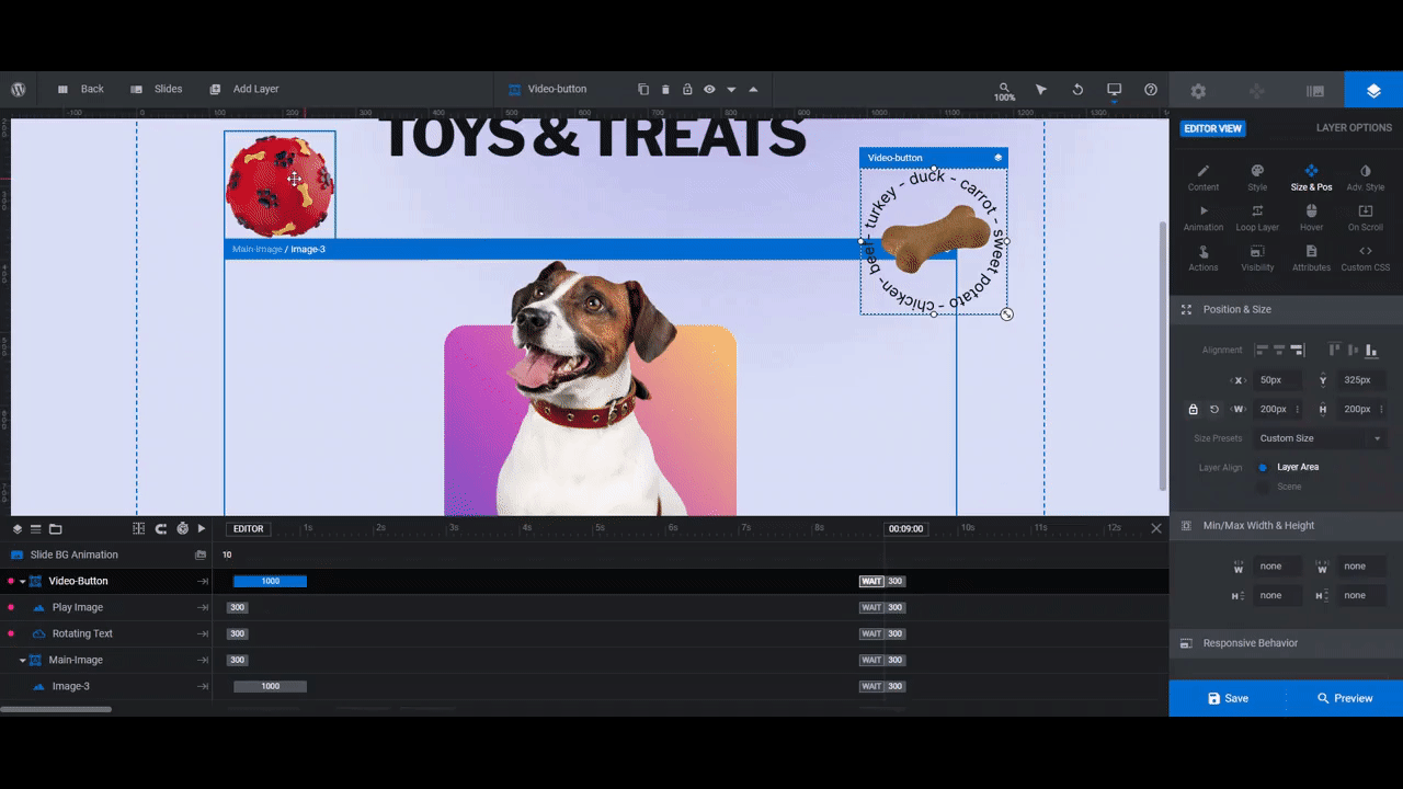
In order to move the bone and rotating stamp, we want to move them as a group, not one at a time. To do this, click on the Video-Button group. Then go to “Size & Pos”. Manually enter a new X and Y value to perfect the position of your second option.
Before you wrap up this step, do one more responsive check.
Learn more:
Step 6: Add links to your CTA buttons
As of right now, the right CTA button is the only one programmed to do anything. We need to fix up the actions for that button and configure a new one for the CTA on the left.
To edit the links, edit the Image-3 layer and Video-Button group. Then go to “Layer Options” and “Actions”.
To add a link, choose the Simple Link option. For the floating ball on the left, for instance, the link will take visitors to the Toys page in the shop. For the bone on the right, the link will take them to the Treats page.
When editing the Video-Button group link, you’ll notice that there are already five pre-programmed actions in there:
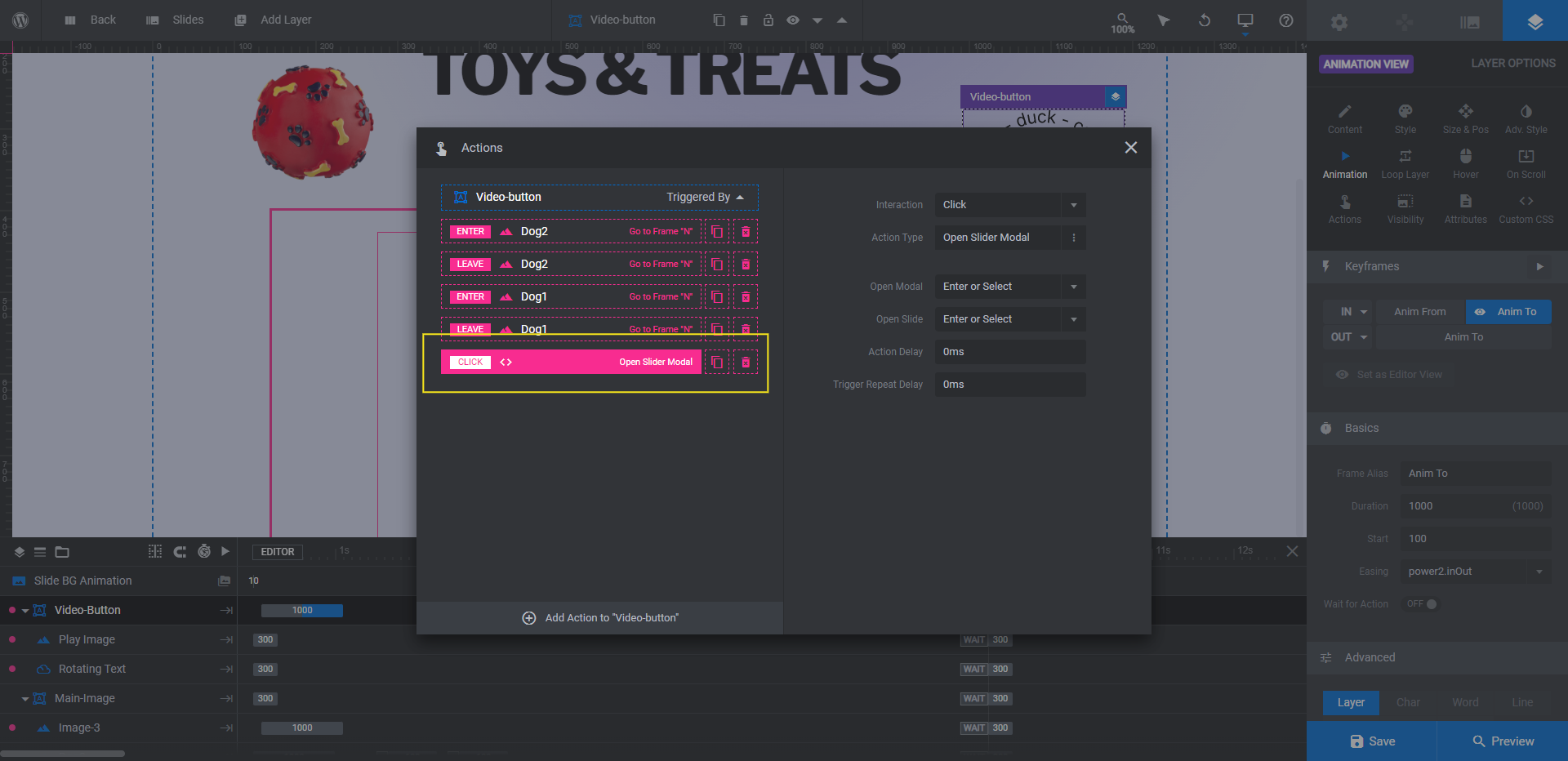
Keep the first four. This is what makes the dog (i.e. your mascot) appear to move when you hover over the button.
Delete the last one by clicking the trash can to the right of it. In the template, this opens the video modal.
Click Add Action to “Video-button” at the bottom and create a new Simple Link for it.
Learn more:
Step 7: Customize the mascot background
There’s a rounded rectangular shape behind our mascot. To edit this, select the Gradient-Bg layer. Then go to “Layer Options” and “Content” or “Style” to customize the color of the shape.
If you’d like to use a gradient, choose one of the presets from the bottom-right corner or create your own using the tools in the top-left corner.
If you’d like to use a solid color instead, switch the Color Type at the top to solid. Then enter the HEX code of the color you want to replace the gradient with.
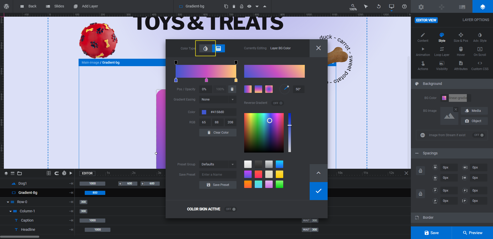
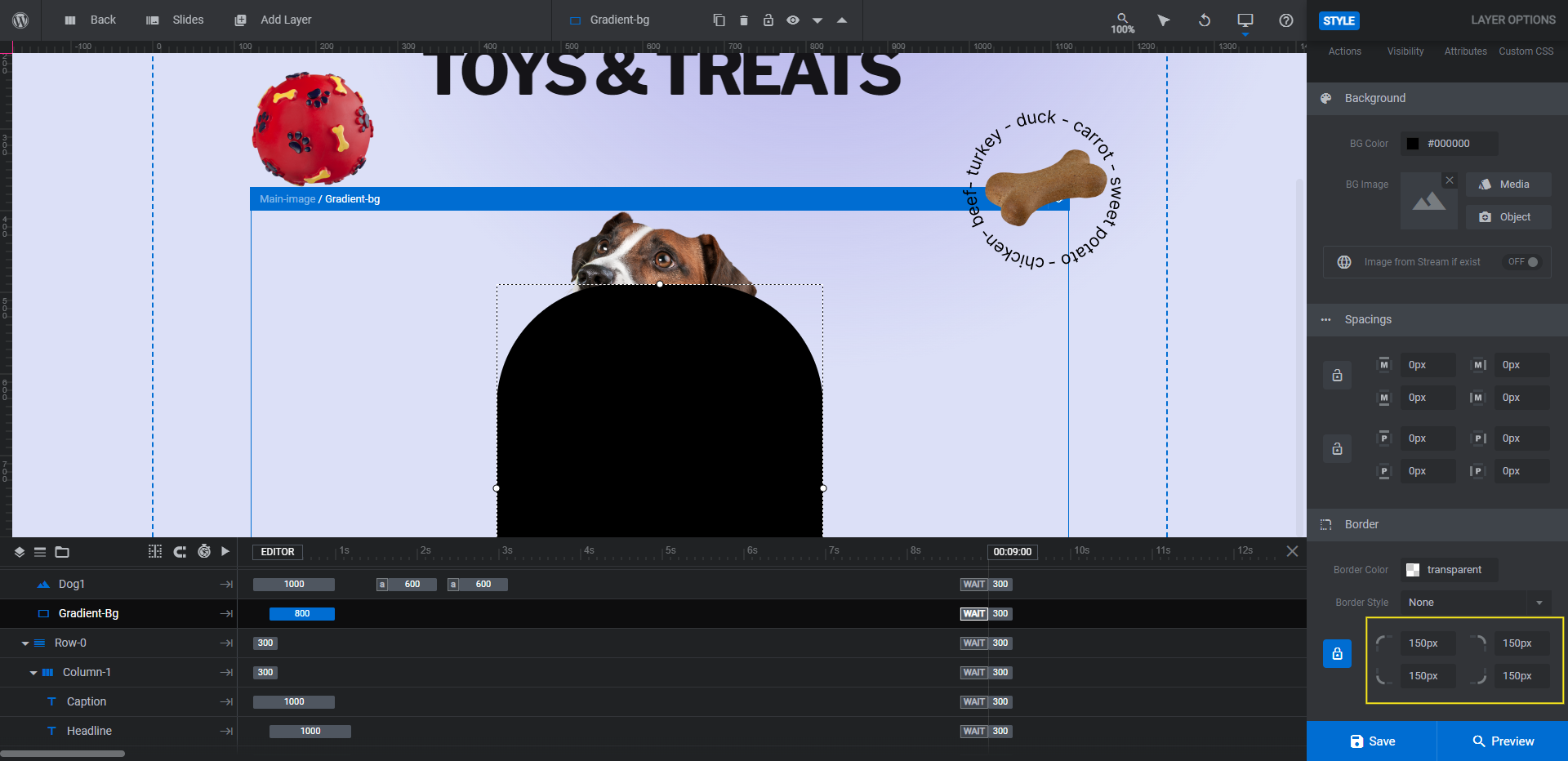
You can leave the shape as is or you can make further modifications to it using the “Style” panel. For instance, we want ours to resemble a door in a doghouse. To do this, we’ve edited the shape border:
When you’re done, save your changes.
Learn more:
Step 8: Edit the section background
Last but not least, we need to edit the background of our CTA section. There are a few areas to modify.
First, go to “Slide Options” and “Background”. Open up the color selection dialogue and add your custom background color:
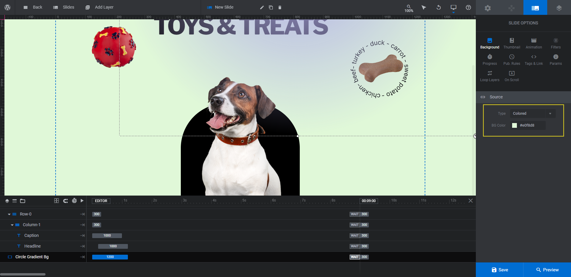
You’ll want to do the same thing under “Module Options” and “Layout”. Set the Module Background color to the same as your slide.
When you’re done, go back to your layers and select Circle Gradient Bg. This is a small area towards the top of the screen with a semi-transparent gradient.
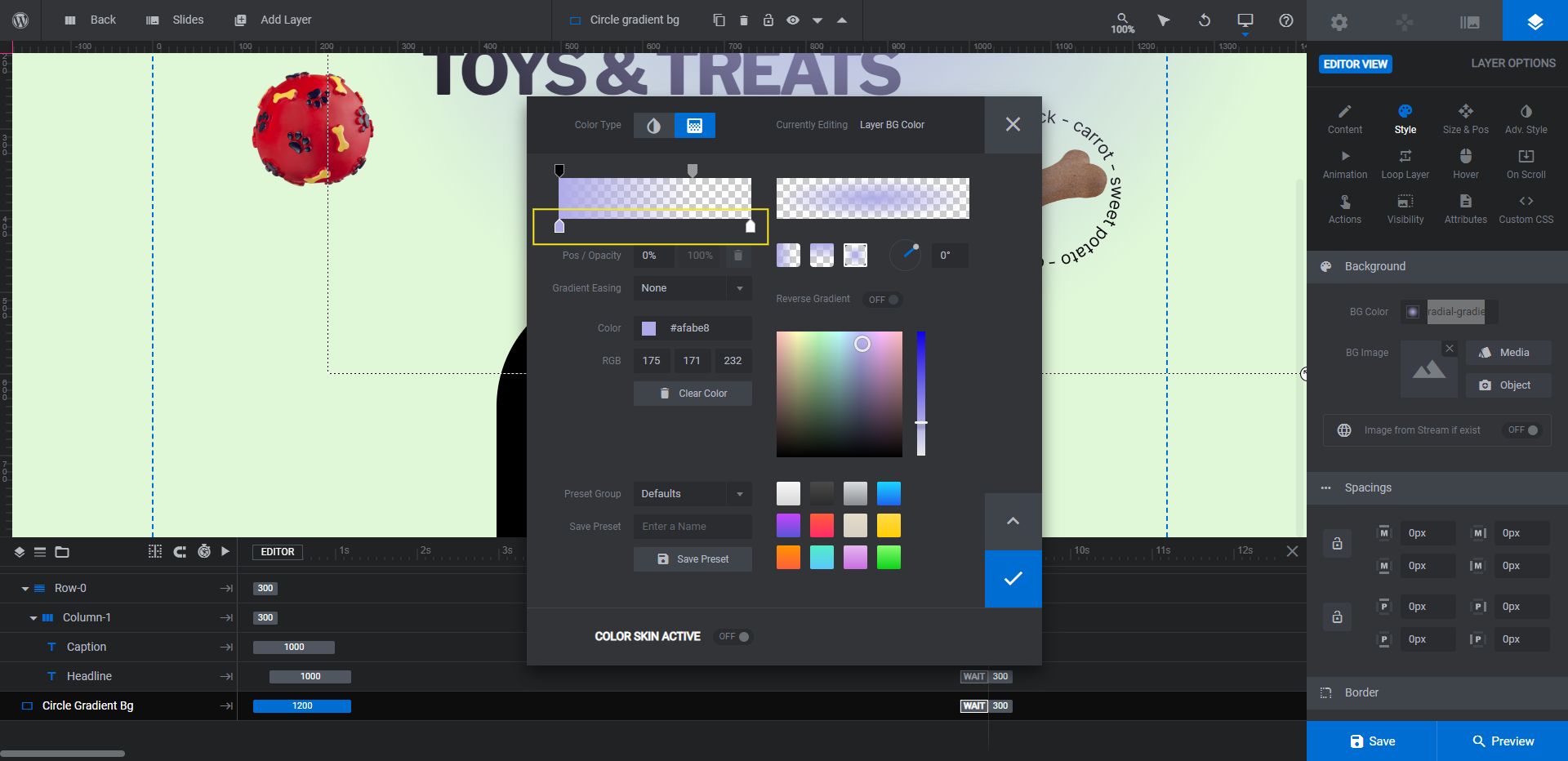
To preserve the transparency effect and radial shape, update just the colors of the gradient (instead of using a preset).
Preview your design and play around with the new CTA buttons and links. When everything is good to go, take the module shortcode and embed it on the page it belongs on. Alternatively, you can embed this module using the Slider Revolution widget in your page builder.
Learn more:
Put a fun twist on your CTA section with interactive image buttons
Want to offer your visitors or shoppers multiple options to consider in your CTA section? You could go the typical route and add two buttons — one solid and the other a ghost button. Or you can put a fun twist on it by using the Startup Website Template, turning your buttons into images, and adding a mascot to respond as visitors choose one option over the other.


