

Digital reports are all the rage these days. It makes sense. Not only do they offer a more user-friendly format than PDFs, but you can design them to be more fun and interactive than a static page.
That said, unless you have a really short report, it can be difficult to create a landing page that loads quickly. It won’t matter how engaging the data or its presentation is, if it takes too long for visitors to see the content, they’re likely to bounce and get their data elsewhere.
One solution to this issue is to create a preview of the report instead. Provide users with a high-level overview along with data highlights from it and then link out to the full report. In this tutorial, we’ll show you how to do just that — create a digital report teaser with the Gaming Stats Presentation Slider template.
Table of Contents:
- Step 1: Write your teaser copy and add it to the slides
- Step 2: Create the charts for the digital report
- Step 3: Update the graphics for the summary and closing slides
- Step 4: Change the slide backgrounds
- Step 5: Update the icons on all the slides
- Step 6: Edit the color palette
- Step 7: Adjust the font styles
- Step 8: Fix text alignment
- Step 9: Edit the Global Layers as needed
- Step 10: Customize the navigation as needed
How to create a digital report teaser with Slider Revolution
In order to create your digital report preview, all you need is the Gaming Stats Presentation Slider template. With just one module, you’ll be able to create a scroll-triggered report teaser like this:
In the following tutorial, we’ll preserve the components that make this module feel like a complete landing page. But we’ll repurpose the rest in order to create our healthy living report:
Note: This is a somewhat advanced tutorial because there is a lot of content to edit. To keep this tutorial short and easy to follow, we’re going to simplify some of the steps. While you might not see a corresponding graphic for every step, we’ll provide guidance on how to complete it without issue.
Before you begin, make sure you have a solid understanding of the Slider Revolution basics:
We’ll provide additional documentation along the way if you need help implementing anything.
Step 1: Write your teaser copy and add it to the slides
The copy is the easiest part of this slider to handle, so we’ll start there.
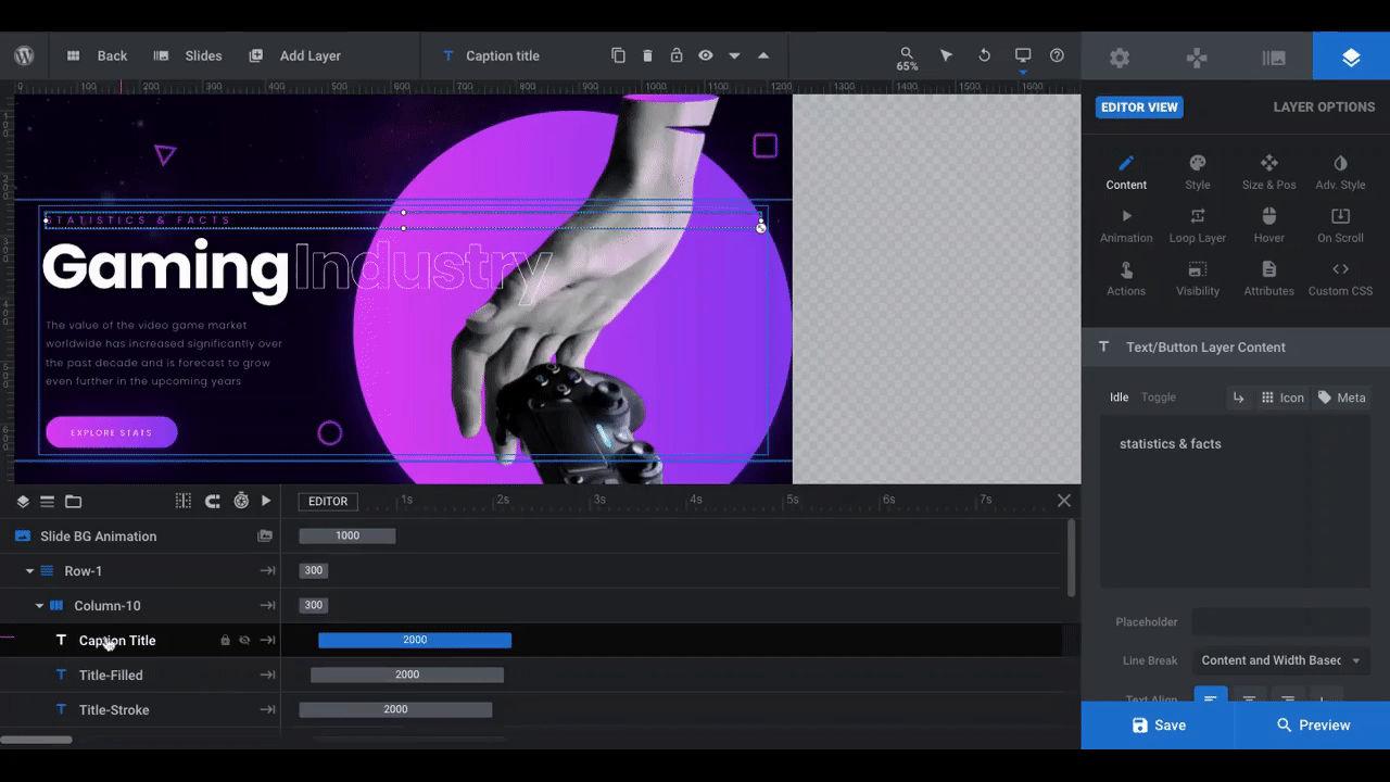
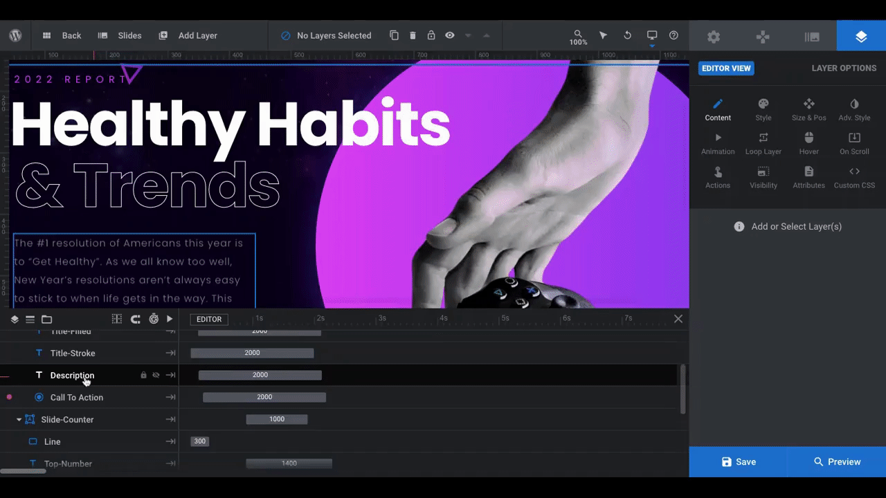
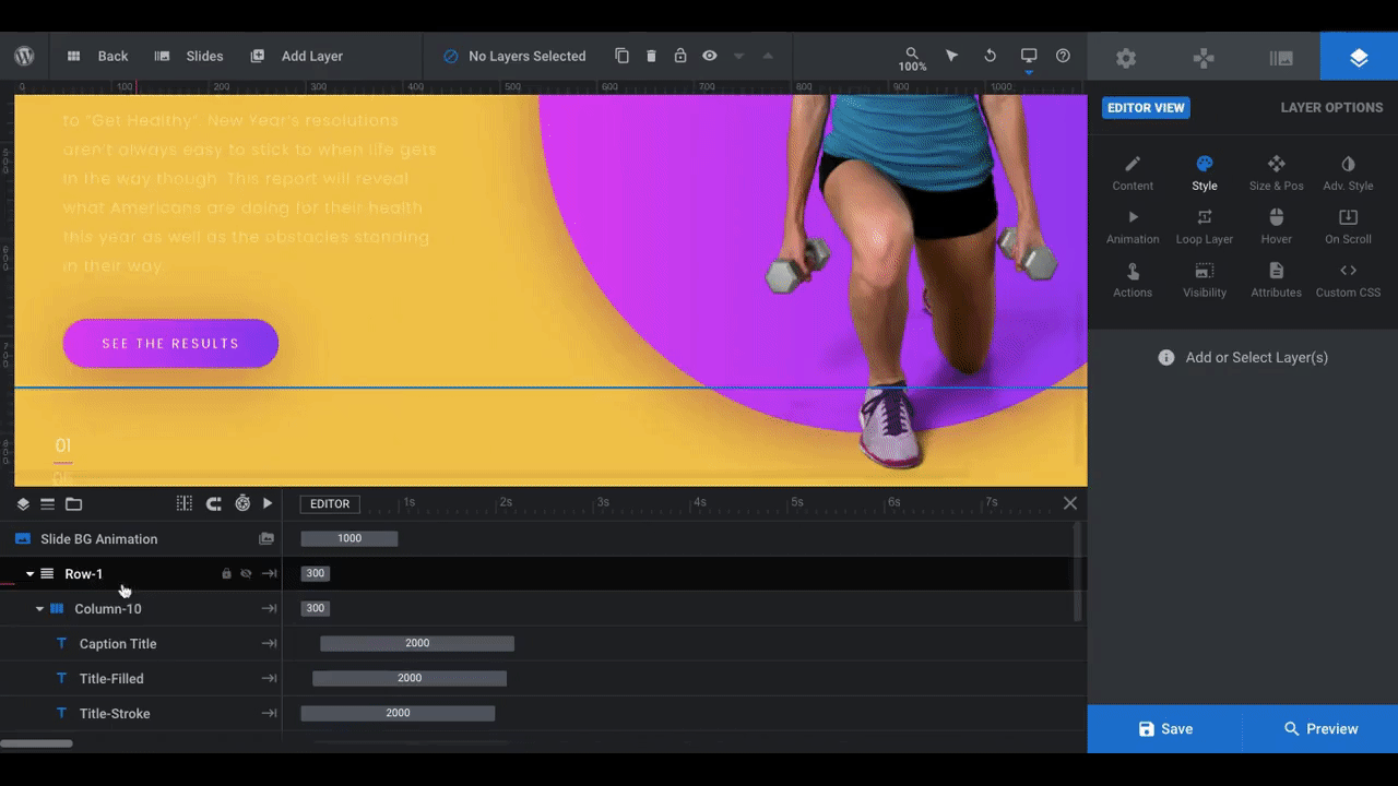
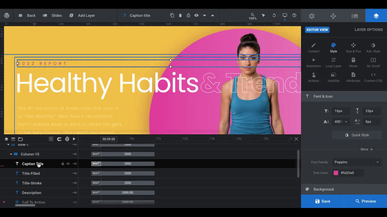
To edit what the copy says in each slide, click on the individual text layers from the timeline editor:
- Caption Title: The subtitle or lead-in in smaller purple text.
- Title-Filled: The solid words in the big white headline.
- Title-Stroke: The outlined words in the big white headline.
- Description: The small off-white description paragraph.
- Call To Action: The white text inside of the purple button.
Edit what they say under “Layer Options” and “Content”. Here’s an example of how to edit Slide #1:
Pro tip: You don’t have to use all the text layers if you don’t need them. For instance, if you want a completely solid font in your headline, delete the Title-Stroke layer by selecting it from the timeline and hitting the “delete” button on your keyboard.
As for coming up with the copy for your digital report, think of it like a sandwich:
Slide #1 should be the high-level report summary:
- Add the name of the report to the headline.
- Write a short paragraph (no more than a few lines) that summarizes the report’s findings.
- Invite visitors to explore the data.
Slides #2 to #4 should provide eye-opening statistics that lure visitors into the full report. For each slide:
- Create a header — It could be the question that’s answered by the data or a catchy description of it.
- Add a supporting paragraph. This is optional.
Pro tip: The template uses four different formats for the data slides.
- Slide #2 — Chart on left, copy on right.
- Slide #3 — Headline up top, two charts below.
- Slide #4 — Copy on left, chart on right.
- Slide #5 — Headline up top with description, one chart below.
You’re free to keep the formats as they are if you have the same kind of data and insights to swap out. However, you can delete any slides with formats you won’t be using.
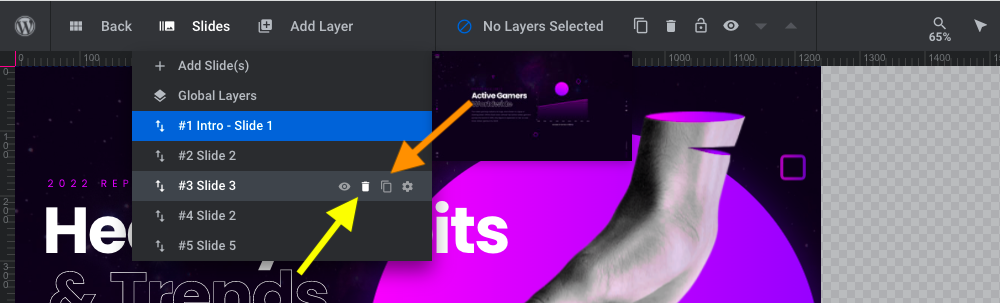
To do that, open up “Slides” from the toolbar and click the trash icon next to whichever slides you want to remove (where the yellow arrow is pointing). If you want to replace the deleted slide with one of the existing slide formats, click the duplicate copy icon next to it (where the orange arrow is pointing).
You can also drag-and-drop the slides if you want to change the order of them, too.
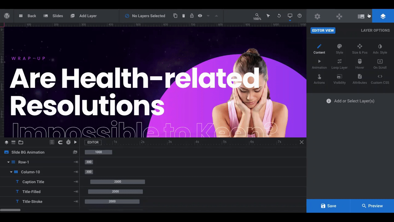
Last but not least, Slide #5 in the template is an additional statistic slide. Whether you’re creating a short digital report or linking out to a more comprehensive one, your final slide should be a call-to-action. This will be the bottom bun to our sandwich.
To turn this slide into a CTA, you can either duplicate Slide #1 and drag it down to the #5 spot. Or you can keep the existing format for Slide #5, remove the data visualization, and add a button or form to the bottom.
Pro tip: You’re going to be moving between these slides a lot. To keep from getting confused which slide is which, rename them.
Open up “Slides” in the toolbar. One by one, click on the gear icon next to each. Rename the slide in the field in the middle of the toolbar.
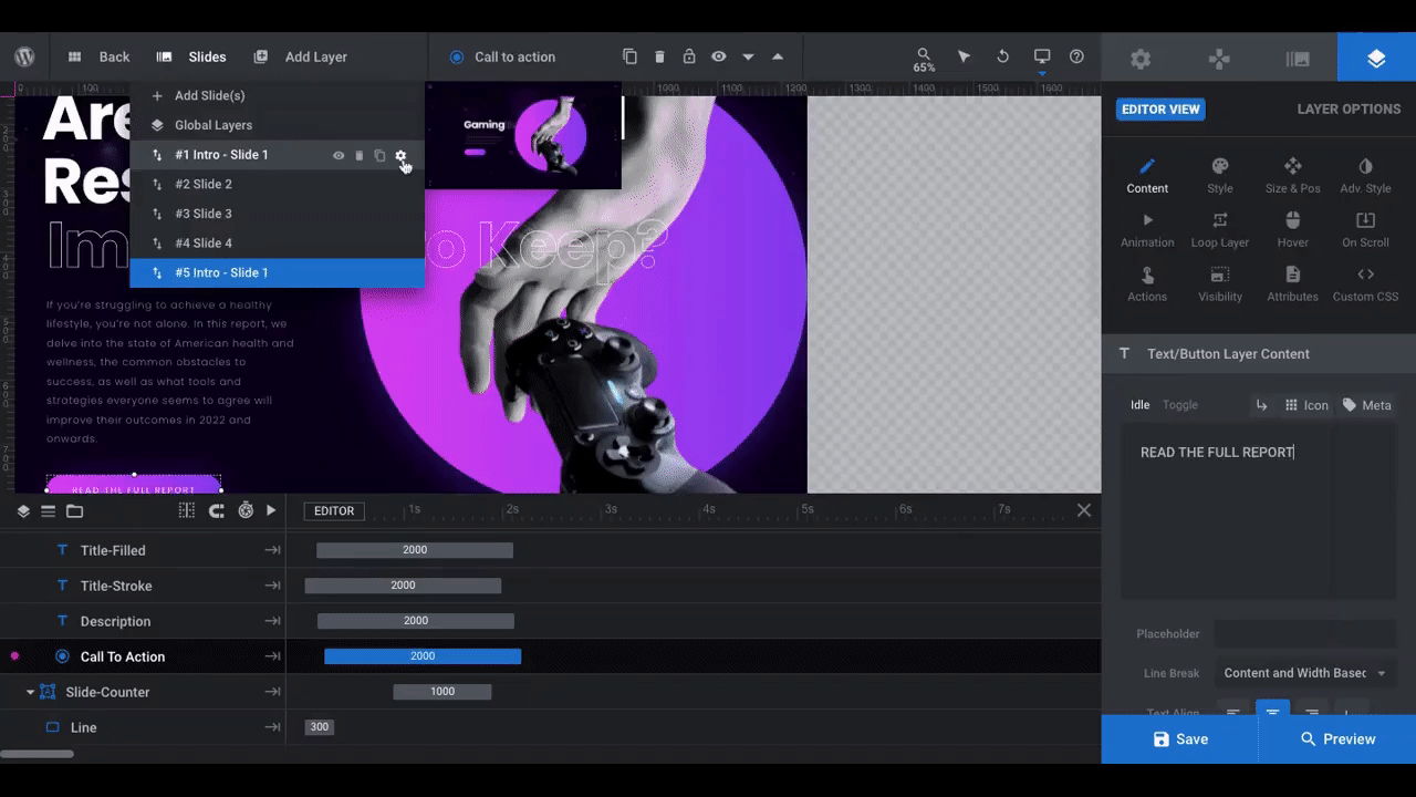
When you’re done renaming all of them, click “Save”.
Learn more:
- Editing Text from Template Modules
- Adding, Deleting and Duplicating Slides
- Top Toolbar: Extra Controls and Bonus Tools
Step 2: Create the charts for the digital report
In Slider Revolution, the Charts Addon gives you the power to add beautiful data visualizations to any page of your website.
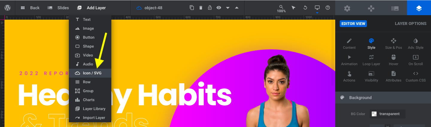
Note: You can either edit the existing charts in the template or you can add a different chart template by opening up “Add Layer” in the toolbar and hovering over “Charts”:
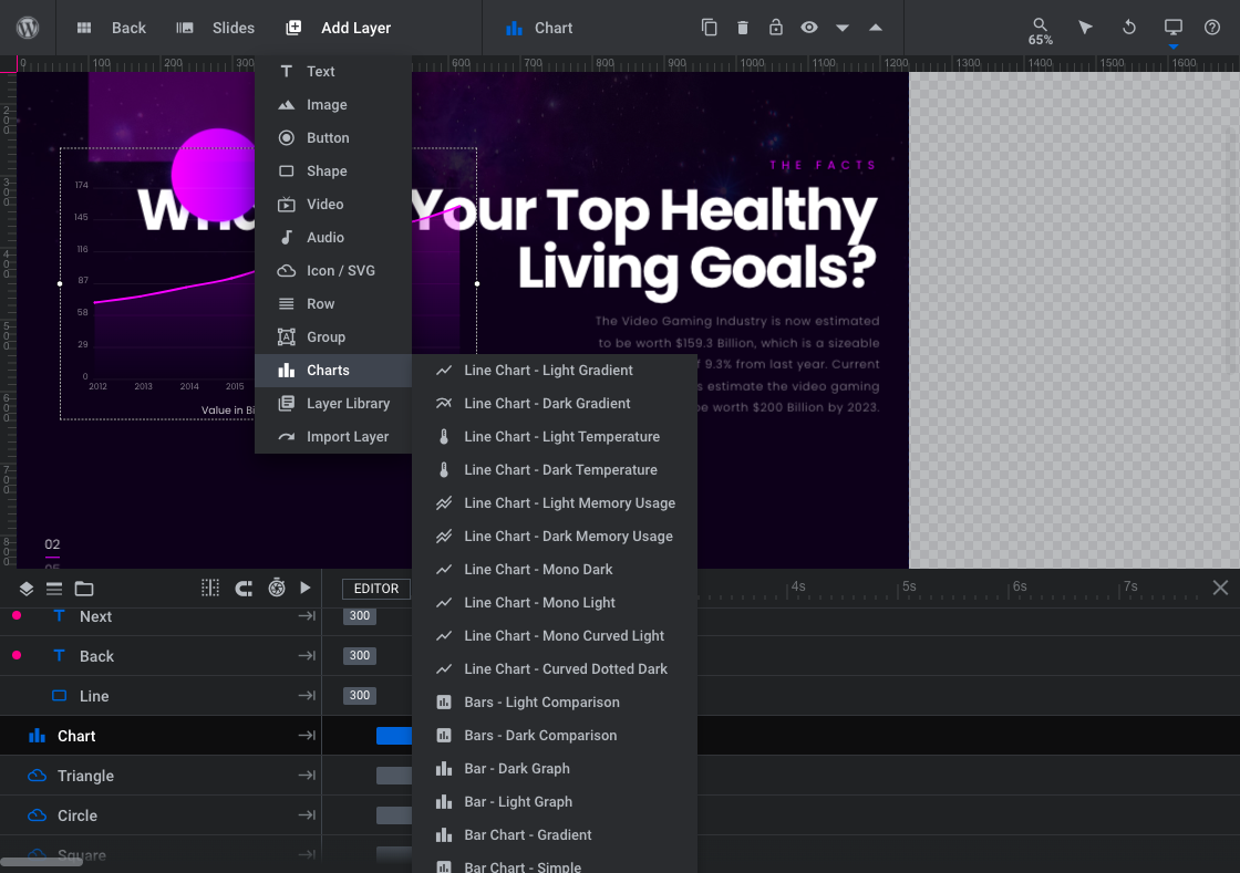
There are line charts, bar graphs, and bar charts here — designed using different color schemes, textures, as well as data set types.
We need to replace the line charts with bar graphs since our data is represented by percentages. However, we want to keep the existing style of the template. So what we’re going to do is this:
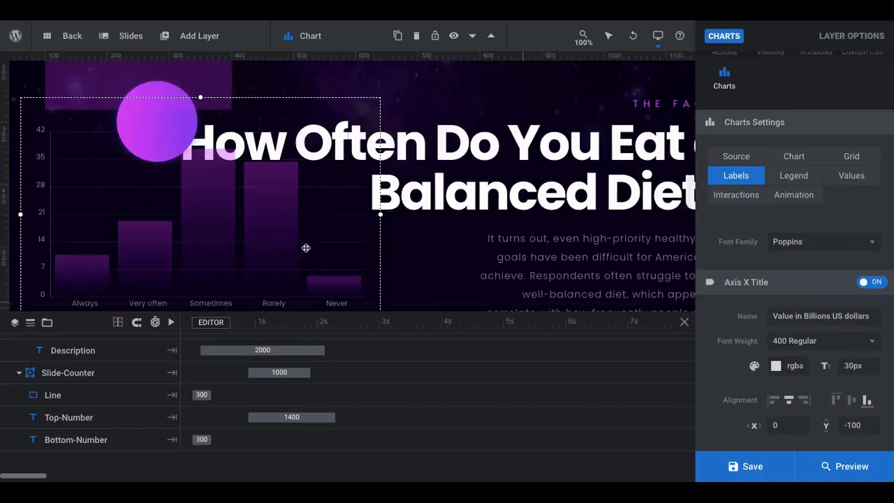
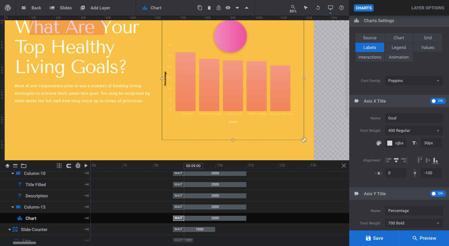
Open Slide #2 and select the layer called “Chart” in the timeline editor. Go to “Layer Options” and “Charts”.
Click on the “Chart” tab and open the “Chart Type” under “Basics”:
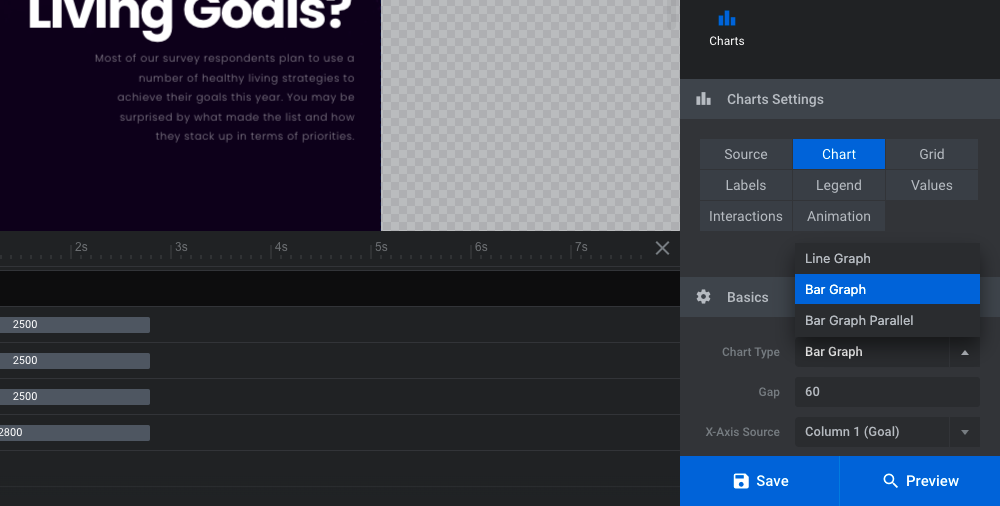
Select “Bar Graph” or “Bar Graph Parallel” to reformat the data visualization.
Now go back to the “Source” tab. You can enter your data one of two ways under “Imported CSV”:
- Upload a CSV file.
- Enter it manually.
Your data should end up looking like this:
Goal, Percent
Eat well, 73%
Maintain weight, 65%
Visit doctor, 63%
Better sleep, 62%
Regular exercise, 57%
The top row represents the x and y labels for the graph. A comma will separate the corresponding values for each data set.
Note: When you’re done inputting your values, the graphic may not correctly reflect your data or show a completely empty chart. Go back to “Chart” to switch the sources around:
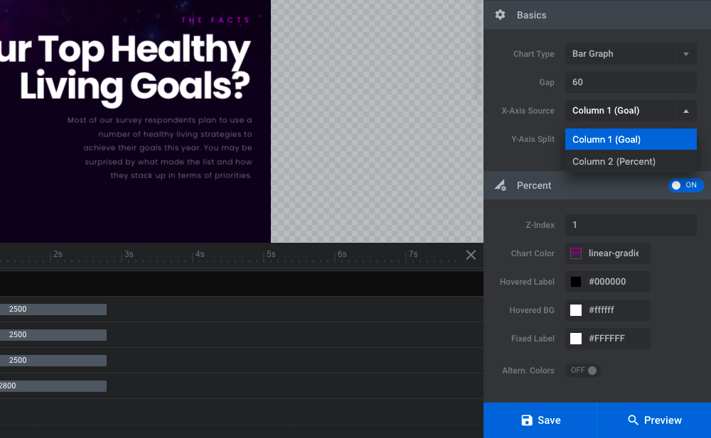
We’ll adjust the color palette and fonts in a later step. The only other thing to change in this step is the labels for the x- and y-axis.
Open the “Labels” tab. Update the “Name” for the bottom “Axis X Title”. Then, toggle on the “Axis Y Title” and do the same:
Repeat this process for your other data slides. Save your changes before moving on.
Learn more:
Step 3: Update the graphics for the summary and closing slides
Let’s turn our attention to the imagery in this digital report teaser next. If you duplicated Slide #1 to make Slide #5 like we did, then you’ll need to update both of these slides with new photos or illustrations.
Here are some tips on how to choose or create the graphics for these slides:
- Avoid using imagery with objects or people where their form is not completely visible (e.g. you can see the person’s body, but not their head).
- Use images with portrait/vertical orientations.
- The original gamer photo is 480px x 832px. Try to make your new image as close to those dimensions as possible.
- Find images that are cut-outs (i.e. without backgrounds).
- Download the images with transparent backgrounds.
To swap out the images, click on the layer called Front-Image in the timeline editor. Go to “Layer Options” and “Content” to upload your new image to the Media Library:
Do this for both slides.
If you need to make any adjustments to the position of the image, go to the Size & Pos settings. If you resized your image close to the original photo’s dimensions, you shouldn’t need to do this. It’s okay if you do though — resizing images in Slider Revolution is a simple task.
Learn more:
Step 4: Change the slide backgrounds
The template uses the same image background for each slide. It’s a dark purple cosmos-inspired design.
To change this, open up “Slide Options” and “Background”. You can upload a different image or add a color background.
While there are also options available for video and gradient backgrounds, they’re going to be too much for this design. To keep it simple, stick with a lightly textured background image or a solid color.
Pro tip: If you’re using a solid color background, save it as a preset from the color settings modal:
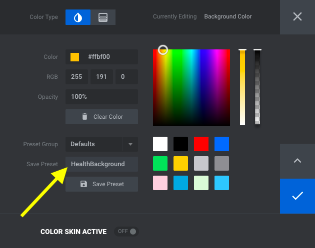
Ideally, the background for each slide will be the same, giving the entire module the feeling of being on a whole page. So when you go to apply this color to each slide, all you’ll have to do is select it from your presets.
Learn more:
Step 5: Update the icons on all the slides
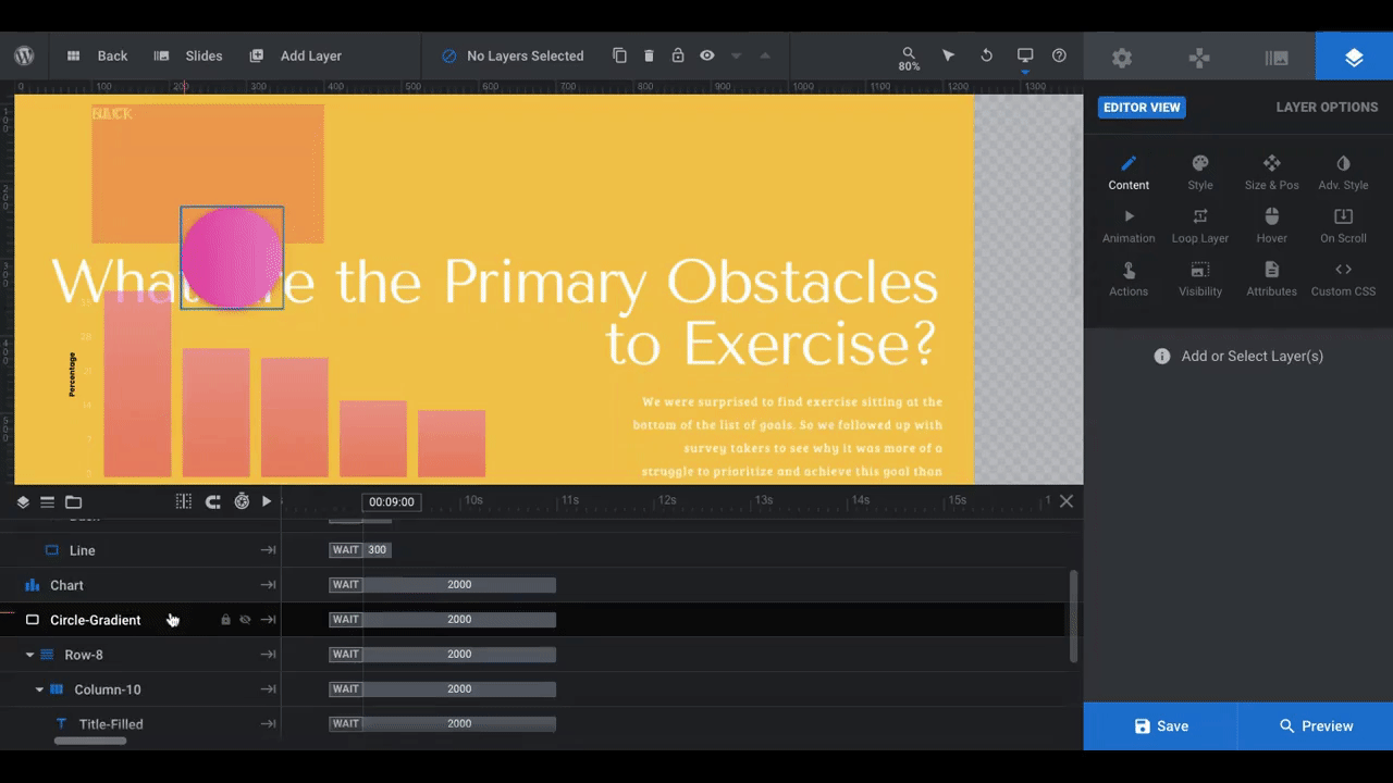
The small floating icons in the template are shapes that appear on a gaming controller. If they fit with the theme of your digital report teaser, then you may decide to keep them as is. If not, you have a couple options.
You can delete them entirely or you can add ones of your own. Note that if you want to add your own, it’s not a simple click-and-replace the way it is with images. You’ll have to add a new icon layer to the slide and then apply custom styling and animation.
The icons aren’t a necessary component for our design, so we’re going to remove them altogether. To do this, we select the icons from the timeline editor — Circle, Square, Triangle, and Cross — and delete them.
Pro tip: If you have multiple layers to delete at once, hold down the Command or CTRL button on your keyboard and then select all the files..
You can leave the Circle-Gradient layer where it is to create a nice backdrop for your graphics.
Learn more:
Step 6: Edit the color palette
Half the battle is over since you’ve already laid down a background for your slides. Now you need to figure out what accent color to use on top of it.
This will apply to the following layers when they’re present in the slide:
- Caption Title
- Call to Action
- Line (under Slide-Counter as well as Navigation Mobile)
- Circle-Gradient
If you’d like, you can preserve the gradient used for the Call to Action and Circle-Gradient or you can turn these layers into solid colors.
To edit the colors, click on each element one at a time and go to “Layer Options” and “Style”:
With the exception of the caption, you’ll find the colors to edit under “Background” and “BG Color”. For the Caption Title, go to “Font & Icon” and “Text Color”. Remember to save your accent colors to the custom presets so you can quickly apply them to all of your slides.
You’ll also have to update the color of the button’s hover state on Slides #1 and #5. Click on the layer and go to “Layer Options” and “Hover”. Scroll down to “Style” and you’ll see “BG Color”. The template uses a solid color, but you can always switch this to a gradient.
You may also want to create a different color palette for your charts in this step. To do this, return to your Chart layers and open the Addon’s settings. Under the “Chart” tab and “Percent”, you’ll have the chance to update your colors:
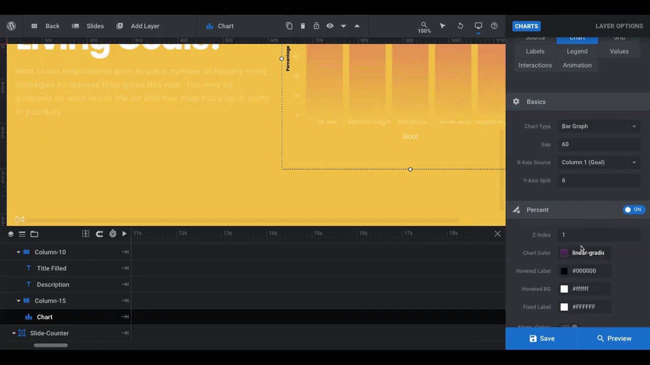
In the template, the charts were designed with a heavy amount of transparency. You’ll find those settings on top of the color bar here:
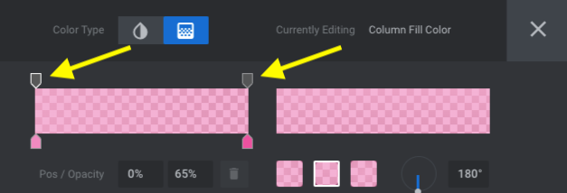
To increase or decrease the transparency in the chart, click on the tabs above the color bar and then change the second value in the “Pos / Opacity” settings beneath. The lower the value, the more transparent the color will be.
Step 7: Adjust the font styles
In this step, we’ll edit the descriptive copy in the report as well as the text that appears in the data visualizations. Aim for:
- One font for the headlines and captions
- One font for the descriptions and buttons
- One font for charts
To edit each of your text layers, click on them in the timeline editor. Go to “Layer Options” and “Style”. Change the font as well as the color, size, weight, and style of it there:
Next, let’s customize the text inside of the charts. Open up “Charts” settings and go to “Labels”:
Edit the font family. Then update your axes to ensure that the font styles show up well against your new background and are consistently applied from the x-axis to the y-axis.
Repeat this process under the “Values” tab. You can also adjust the colors under “Chart”, “Grid”, and “Interactions” if you think it helps improve the usability of the graphic. Repeat this process for all data slides.
Step 8: Fix text alignment
If you run into issues as we are with text running over images or charts, there are a few ways to fix this. The easiest, however, is to turn your text row from one column to two. Some of the data slides have already done this.
To implement this in your slides, do the following:
- Click on the Row layer in the timeline editor.
- Go to “Layer Options” and “Content”.
- Choose the “Row Settings” that look like two equal-sized columns.
- Click “Update Row” to see the changes reflected in the slide.
You may need to rearrange your layers so that they appear in the right column. To do this, go to your timeline editor and drag-and-drop the layer beneath the corresponding column layer.
For instance, in our example above, we wanted the chart to be on the left and the copy to be on the right. To do this, we moved the column layer above the other one in the timeline editor in order to invert the order in which they appear.
Note: When you move a row or column layer in Slider Revolution, all of the sub-layers within it automatically move along with it.
If there are any layers you need to place inside of your new column (like the chart graphic), grab the layer in the timeline and drag it down under the column in the timeline editor. It’ll then stick to the column and go wherever it goes.
Learn more:
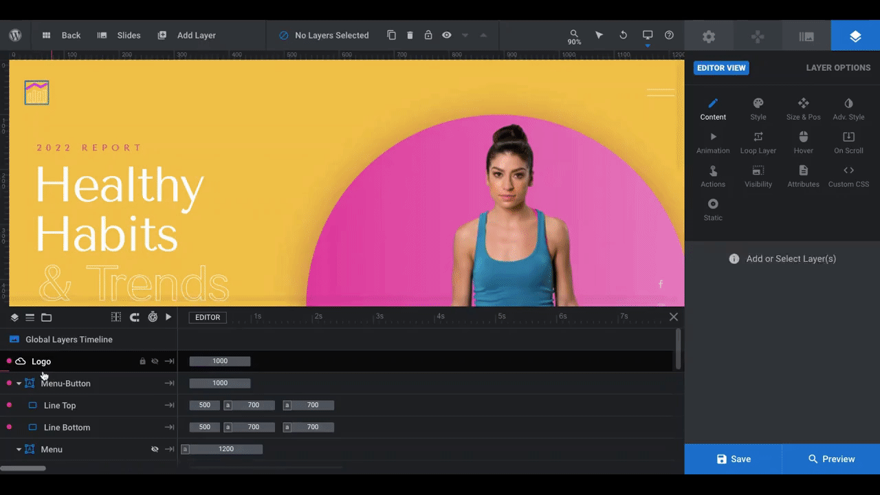
Step 9: Edit the Global Layers as needed
The goal in using this template is to create a landing page or microsite for your digital report teaser. Because of this, you want this module to be equipped with a header, menu, and other branded elements.
Rather than use WordPress to do this, Slider Revolution gives you the ability to do this using Global Layers. In fact, this template already has what you need built right in.
To access the Global Layers, go to “Slides” in the toolbar and click on the corresponding option:
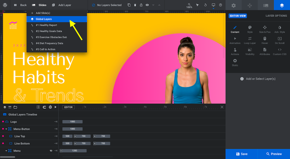
This template includes the following Global Layers:
- Logo
- Menu
- Icons (the same ones that appeared in the slides)
- Circle Gradient (same as the one from the slides)
- Social media links
- Scroll CTA
Let’s go through these one-by-one:
The Logo layer is actually an SVG icon. You can either replace it with another icon by clicking on it and selecting the new file under “Style” or you can delete the layer and add a logo image of your own from the content media library:
Use the “Size & Pos” settings to resize and reposition as needed.
Note: When you resize new image layers in the default desktop view, Slider Revolution will automatically scale the size of the graphic for smaller screens. However, it’s still a good idea to check their appearance and placement using the responsive viewer from the toolbar:
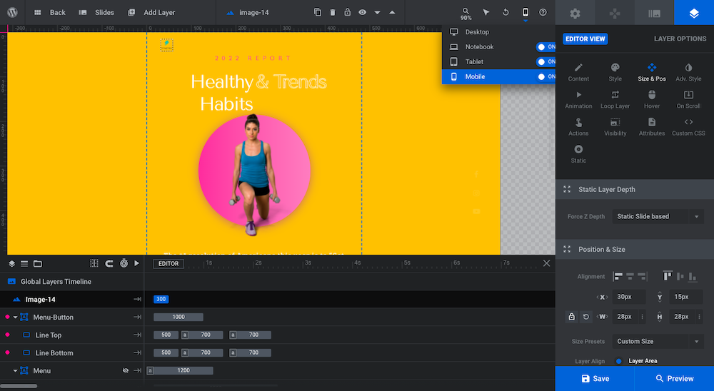
You should also preview your module using the blue “Preview” button in the bottom-left corner to ensure that your new logo won’t overlap any of your text or graphic layers.
The Menu layer has a number of components.
The Menu-Button is the hamburger icon that appears in the top-right corner of your digital report teaser. There’s no need to edit this element unless you want to change the color.
The Menu layer is the overlay screen where the different “pages” (i.e. sections) of the landing page appear. There are a number of things to edit here:
First, if you deleted the game controller shapes (Square, Cross, and Triangle) from your slides, do the same here.
Next, edit the Link content layers so they succinctly describe what each of your slides is about:
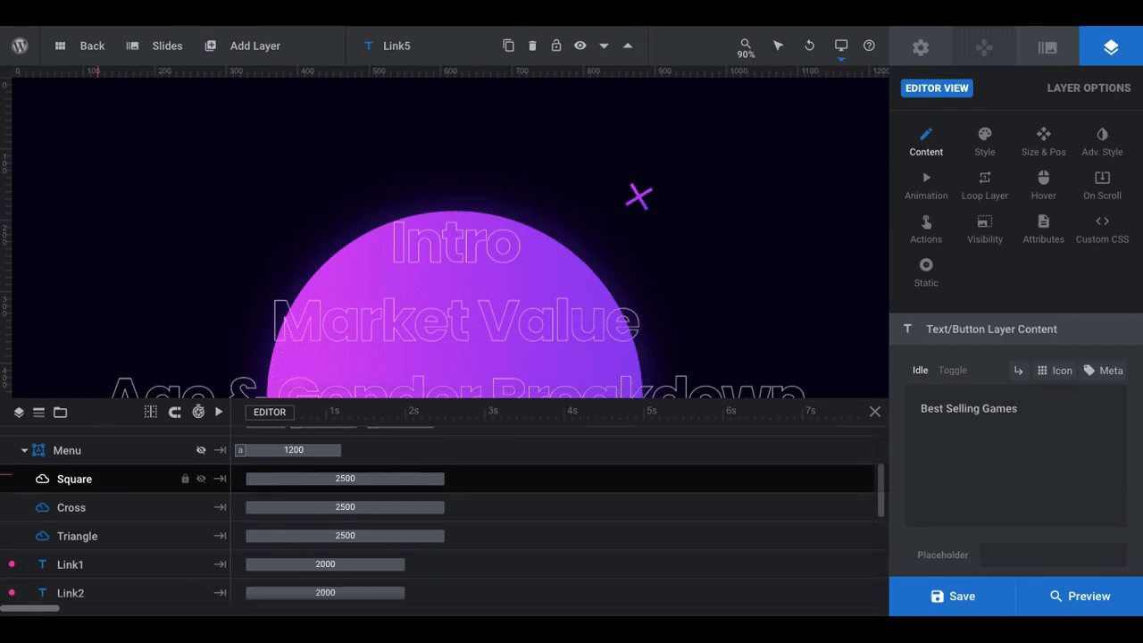
If you’d like to style them differently, go to “Style” settings and make your adjustments there.
You’ll need to program each of these links to move users to the corresponding slides in your design. To do this, select each Link layer from the timeline editor and click on “Actions”. The following modal will appear:
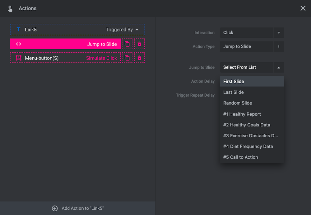
Click on the action setting (second down) and then choose which slide to jump to from the list.
There’s a Circle Gradient layer that appears in the menu. If you’d like to keep it, update its colors to match the ones that appear in your slider.
Next, turn your attention to the social media icons. If you have social media accounts to promote, update the icons accordingly. If not, click on the Social-icons layer and delete it.
The last element to update is the scroll CTA. Leave the functionality and placement of this layer as is. However, if you’d like to make the text or line a different color, you can do so by clicking on the individual Scroll and Line layers and then update their styles.
Learn more:
Step 10: Customize the navigation as needed
The last part of this slider template that may need adjusting is the “Navigation Options”. This is where you’ll control the Bullets navigation dots that appear on the left side of the digital report teaser:
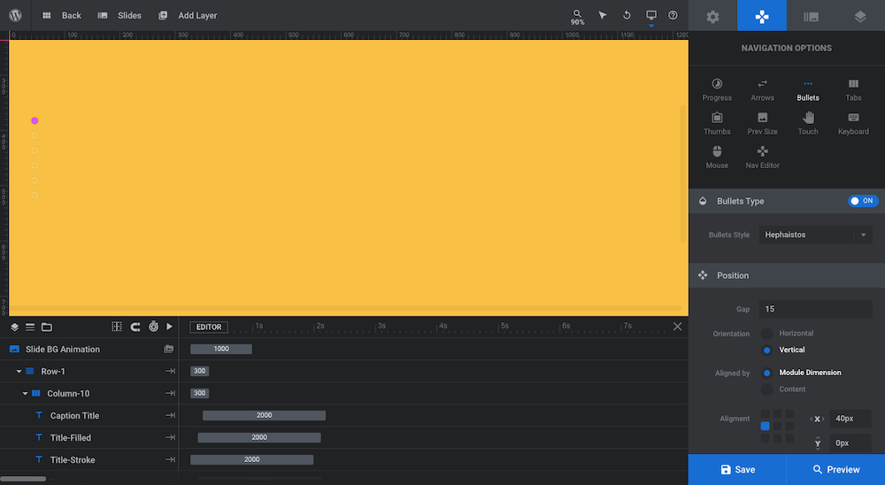
Unless you have a different type of bullet you want to switch to, the only change you really need to make to these settings is to the “Navigation Style” colors for:
- Hover-Background
- Hover-Border
This will change the navigation bullet color. Go ahead and configure those two settings to match the accent color you used everywhere else.
Learn more:
Generate interest over your data with an attractive report teaser
Want to get people excited about clicking the link to your digital report or filling out the form that gives them access to it? Then you’re going to need more than just a simple summary paragraph.
With the Charts Addon Presentation Slider, you’ll have an impressive foundation to start from. Just add your custom copy and graphics, give the slider’s design some extra tweaks, and your digital report teaser will be ready for publishing.


