
Additional Text Content Options
In this guide, we'll learn about all the extra content settings available for customizing text layers.
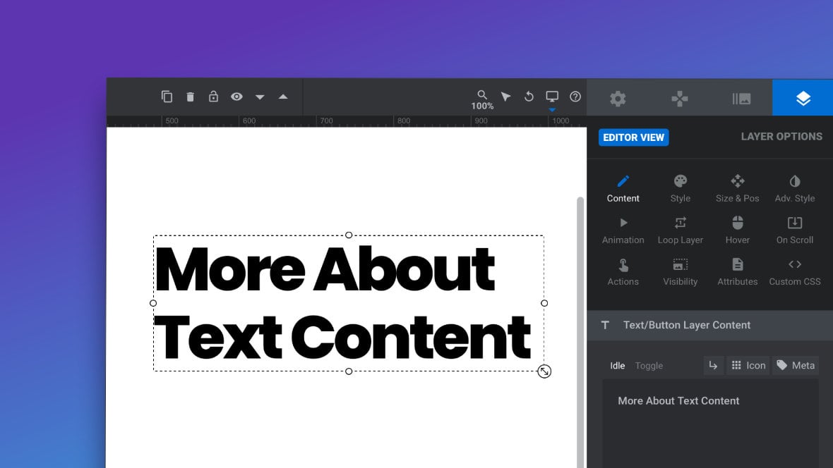
Table of Contents
- Introduction
- Toggle Content
- Add Line Break
- Add Icon
- Add Meta Data
- Placeholder
- Line Break
- Text Align
- HTML Tag
- Convert Layer Type
Introduction
In addition to the text content editing basics we covered previously, there are a number of options available to you in the Content sub-section of each text layer that provide further avenues for customization:
Let’s learn what these options are and how to use them.
Toggle Content
Every text layer [?]
Layers are containers for visual, audio or layout items and are added to slides. For example, text, button, image, audio, video, group and row are all types of layers.
Layers are added to slides via the module editor. has two “states”:
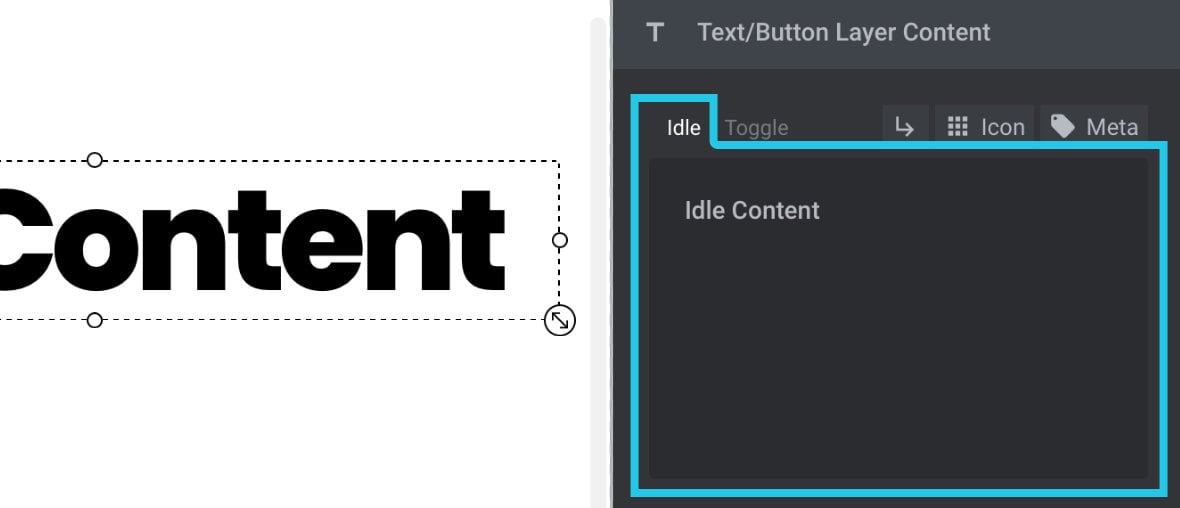
1) The “Idle“ state – displays default text content
2) The “Toggle“ state – displays alternative text content if the layer is clicked
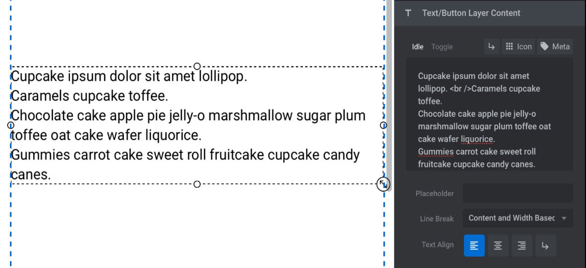
The Idle field is the default text area you’ve already used previously to control text layer content:
Above that field you can click “Toggle” to access the Toggle field:
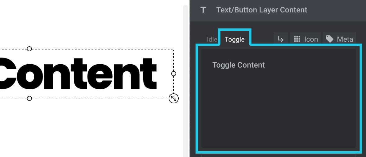
The Toggle field allows you to specify what that alternative text content should be. You can enter anything in the Toggle field that can be added in the default Idle field.
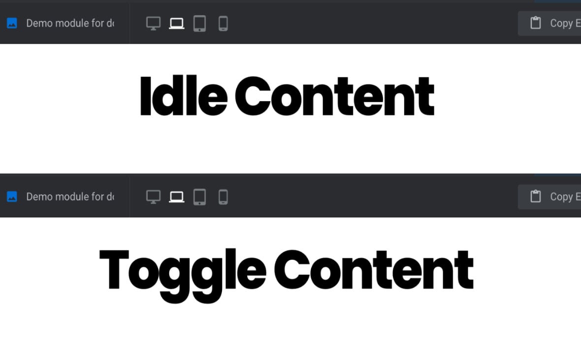
By default the layer will initially show Idle text, then it will alternate between Idle and Toggle text each time the layer is clicked.
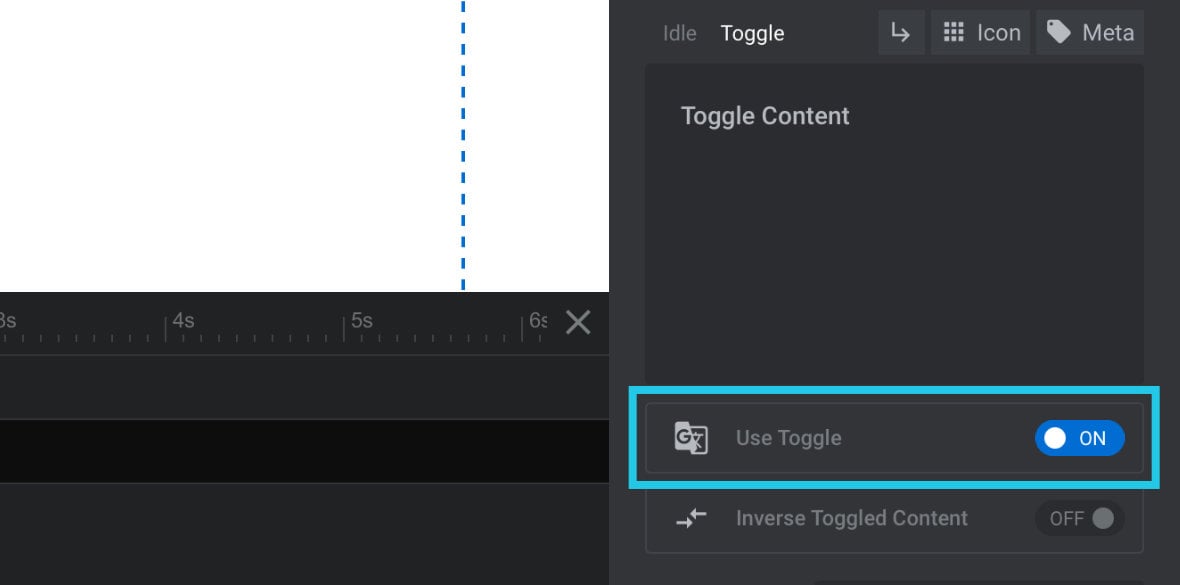
Use Toggle
Even after you’ve added text in the Toggle field, you will still need to manually activate toggling functionality. Toggling behaviour is off by default, so if left inactive nothing will happen when a user clicks the layer.
To activate toggling behaviour set the Use Toggle option, found below the Toggle field, to ON:
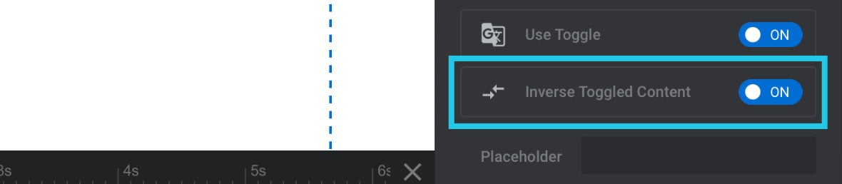
Inverse Toggled Content
As mentioned above, by default a text layer’s Idle content is shown first, then it switches to the Toggle content when clicked.
If you need to swap this around, so the Toggle content shows first then switches to the Idle content, set the Inverse Toggled Content option to ON:
Add Line Break
By default your text layer’s content will appear in single line, but with the Add Line Break button you can manually add a fixed line break at a specific point in your text.
Note: It’s also possible to configure lines to automatically break at dynamic points, which we will cover a little further down the page.
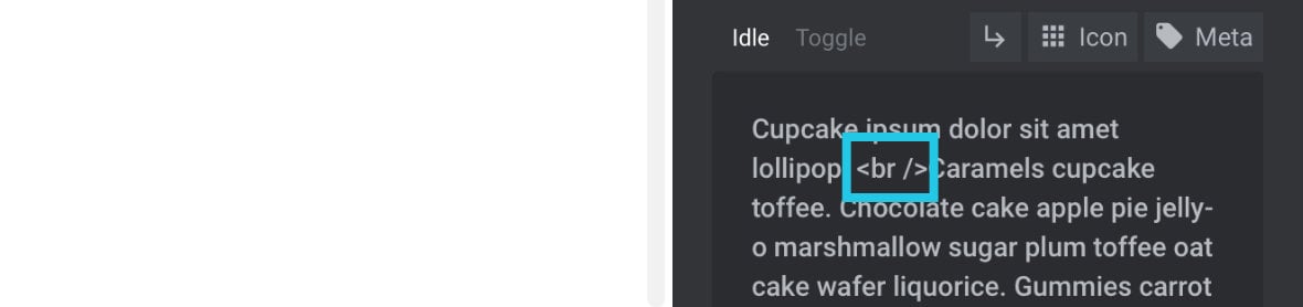
To add a line break, first place your cursor in between two words of your text content, at the location you want the line break to be added:
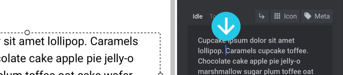
Then click the small Add Line Break button above the field, the one with the arrow icon that points down and to the right:

You will see a small <br /> snippet has been added to your text:
This <br /> snippet is the HTML code for creating a line break. When added it will push subsequent text onto the next line:
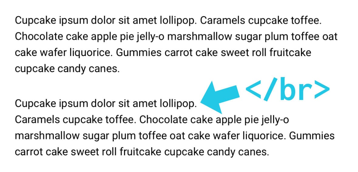
If you decide you no longer want the line break you can just highlight that <br /> snippet and delete it.
Add Icon
It’s possible to add font-based icons inline with your text content:
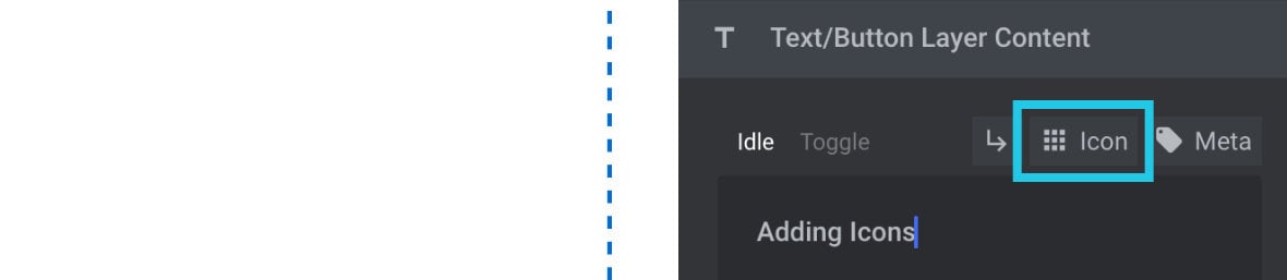
To do so, click the small Icon button above the field, the one with the little 3 x 3 grid of dots:
A collection of icons will appear in a dropdown:
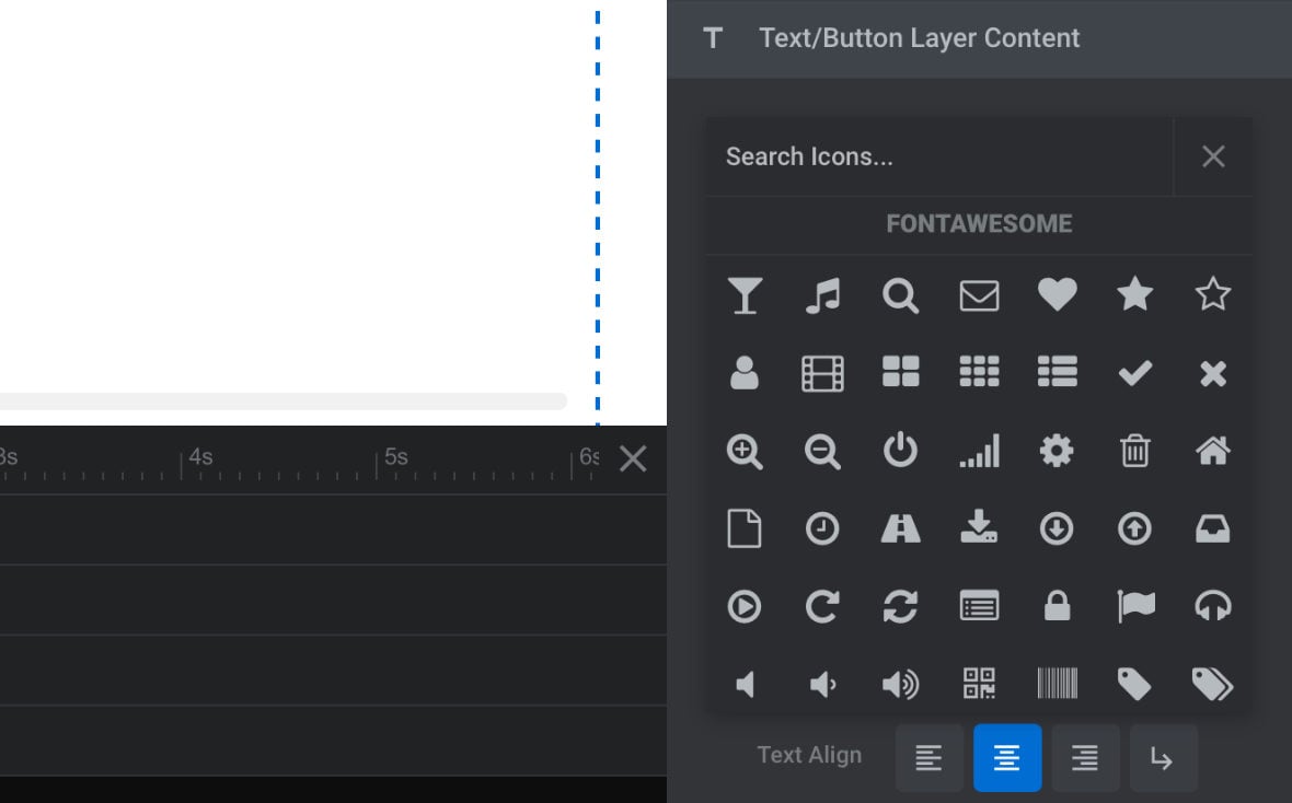
Browse through these icons to find one you would like to use. You can also enter search terms in the field above the icons to help narrow down the results. When you have found an icon you’re happy with, click it once and you will see it appear in your text layer on the canvas:
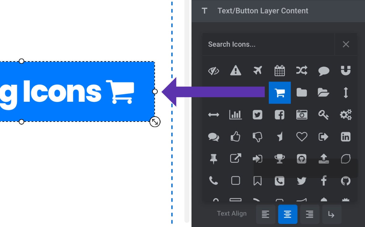
Note: The dropdown showing available icons will stay open after you add an icon, and its position obscures your text content field, so watch the canvas to monitor the changes you are making. When you’re done, click the “X” at the top right of the dropdown to close it.
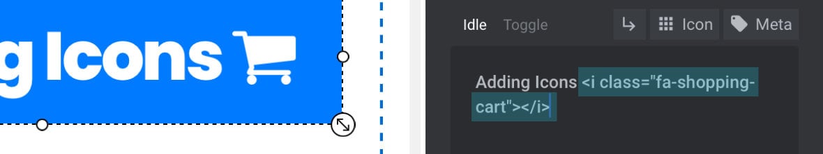
As is the case with adding a line break, adding an icon to your text inserts a small snippet of HTML that looks something like this:
<i class="fa-shopping-cart"></i>
In this case <i>...</i> is the HTML element representing the icon. To remove it, select and delete everything from the opening <i> tag to the closing </i> tag.
Add Meta Data
Adding “meta data” to text content is a method through which you can pull information in from other parts of your WordPress site and display it as part of the layer.
For example, you might want to show a link to your site’s homepage, display details about a product from your WooCommerce store, or fetch some post content.
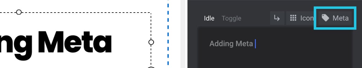
To add meta data based content to a text layer click the small Meta button above the content field, the one with the little tag icon:
A dialogue box will appear with six tabs along the top, each one grouping a collection of meta data snippets you can choose to insert:
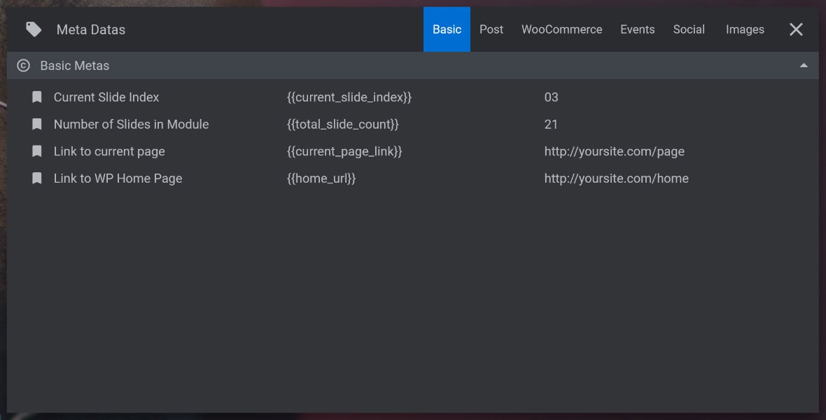
Click any snippet once and it will be added into your text content.
Note: The Meta Datas box will remain open until you manually close it by clicking the “X” button at the top right. After inserting a meta data snippet it’s a good idea to close this box so you can clearly see the canvas and check on what you’ve inserted.
Each meta data snippet appears as a piece of text wrapped in two curly braces: {{text}}
When the module is previewed or published, that snippet will be replaced with the content it pulls in from WordPress.
For example, {{home_url}} will be replaced with the URL of your site’s homepage.
When you are viewing your text layer on the canvas, the meta data snippet will be replaced with placeholder text instead of live content.
However, to enable your canvas preview to be as accurate as possible you can customize what the text layer displays using the Placeholder option.
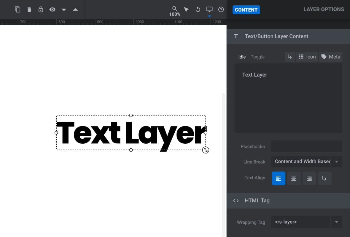
Placeholder
Sometimes you may want to control exactly what content your text layer shows on the canvas, such as when using meta data as described above. This is when the Placeholder field comes in handy. Whatever text you enter in that field will be exactly what appears on the canvas.
For example, you might use the meta data snippet {{title}} to display a wordpress post title in your text layer. By default it will appear on your canvas as “Title”. You could instead copy and paste one of your real post titles into the Placeholder field, then it will appear on the canvas [?]
The canvas is the point and click design space in the module editor. It forms the largest area of the module editor.
In this area layers can be selected, moved and resized. Animations can also be previewed. and give you a more accurate representation of how the module will look once published.
Line Break
Earlier we covered how to add a fixed line break into your text, but you can also have dynamic line breaks added in automatically, through the Line Break option. The option is located below the placeholder field and has four available settings. Let’s see what each one does.
Only Manual
With the Only Manual setting you will only ever have a line break in the text if you manually add it using the Add Line Break button to insert a <br /> snippet.
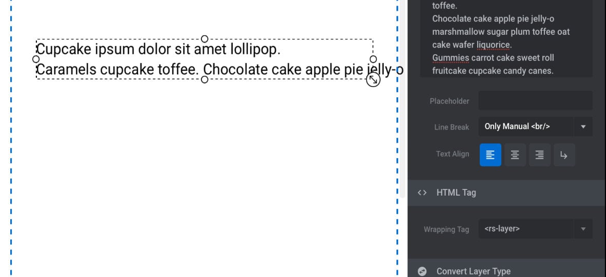
If you added line breaks in the content field by pressing your Enter / Return key, those line breaks will not be reproduced in the layer.
Width Based
The Width Based setting is designed to be used in conjunction with a fixed pixel layer width, set in the Size & Pos sub-section, and will automatically wrap lines to ensure they fit inside that prescribed width.
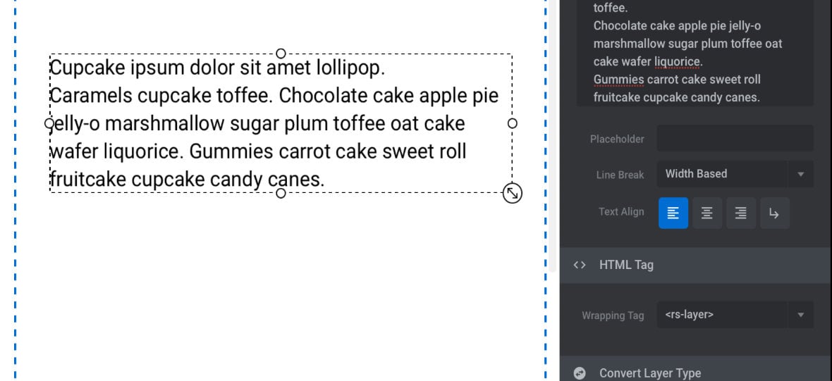
If you added line breaks in the content field by pressing your Enter / Return key, those line breaks will not be reproduced in the layer.
Content Based
The Content Based setting is designed to be used in conjunction with a layer width of “auto”, set in the Size & Pos sub-section, and allows the text layer to automatically adjust its width to match the longest sentence or line in the content.
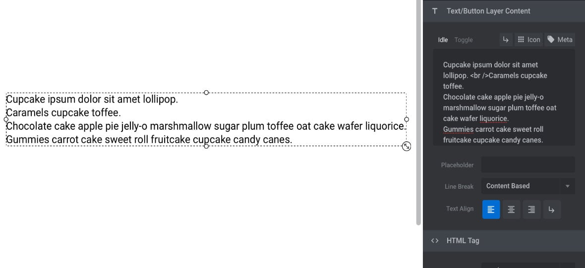
If you added line breaks in the content field by pressing your Enter / Return key, those line breaks will be reproduced in the layer.
Content and Width Based
The Content and Width Based setting is the default, and combines the behaviours of Content Based and Width Based line breaks. It should be used in conjunction with a layer width of “auto”, set in the Size & Pos sub-section.
If you added line breaks in the content field by pressing your Enter / Return key, those line breaks will be reproduced in the layer, as is the case with Content Based line breaks.
If you move your layer to a position where it would otherwise move partly out of bounds, its width will automatically be trimmed to keep it fully visible. Text will be wrapped to stay inside that width, as is the case with Width Based line breaks.
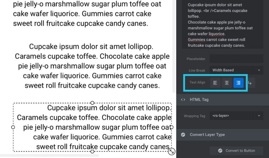
Text Align
The Text Align option allow you to horizontally align your text within the layer to either the left, center or right by clicking the alignment buttons:
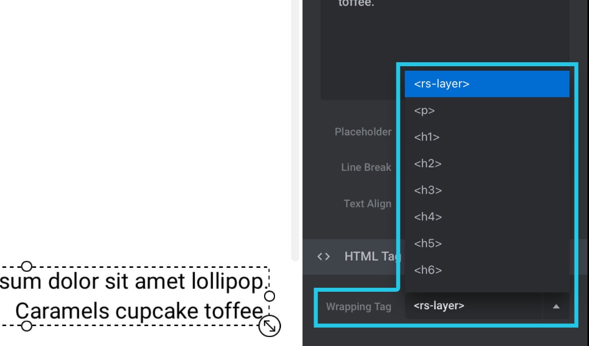
HTML Tag
By default your text content will be wrapped in our special, custom HTML tag. However for SEO purposes, sometimes you may wish to use a different HTML tag instead.
From the Wrapping Tag option you can opt to use a <p> tag, or any headings tag from <h1> through <h6>:
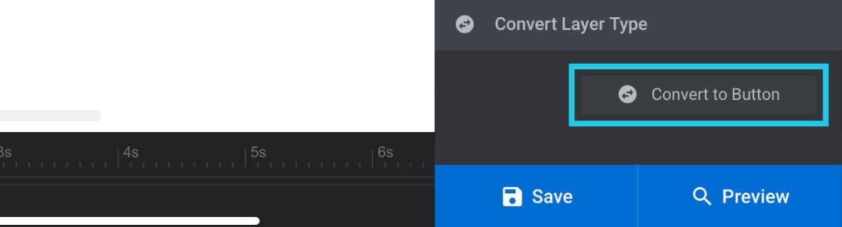
Convert Layer Type
Text and Button layers have a lot in common, so in the Convert Layer Type sub-section you’ll find a button that lets you convert your text layer into a button, retaining many of its current settings:
Next: Text Styling
Now you have all the ins and outs of how to control what appears in your text layer, the next step is to learn all the ways in which you can control how that content looks.
We’ll be covering precisely that in the next guide on additional text styling options.